White Space In Graphic Design: A Detailed Guide with Examples

When you work on design projects for clients, you often receive feedback about using whitespace in your designs. Does this resonate with you? Do your clients constantly poke you with the same question – why do they see ‘too much space’ in your designs? But have you ever wondered why most of your clients express the same thing?
What is White Space in Design
- Definition: Area between design elements.
- Visual Impact: Enhances clarity and balance.
- Strategic Element: Creates hierarchy and contrast.
- Macro White Space: Large gaps between blocks of elements.
- Micro White Space: Small gaps within elements.
- Active White Space: Intentional spacing for emphasis.
- Passive White Space: Natural gaps around fixed objects.
The truth is that non-designers might not be familiar with the standard design principles regarding white space and its active or passive use. They might perceive whitespace as an unnecessary void. However, white space in graphic design is more than just an empty space; it profoundly impacts visual communication, bringing clarity, balance, and elegance to your designs. It’s an indispensable aspect of visual design, inspiring you to create more impactful and engaging designs.
Discover the power of white space in graphic design. Learn how to utilize it for maximum visual impact with best practices and template examples.
Table of Contents
What Is Whitespace in Design
In design, whitespace, sometimes interchangeably used as negative space, is crucial. So, what are white space examples? Although labeled as the ‘white space,’ it’s not always white in designs. It covers the area between design elements, including within typography glyphs. It creates distinctive sections between every element on the page, i.e., the headline, the text, one block of element from the next, and unrelated descriptions.
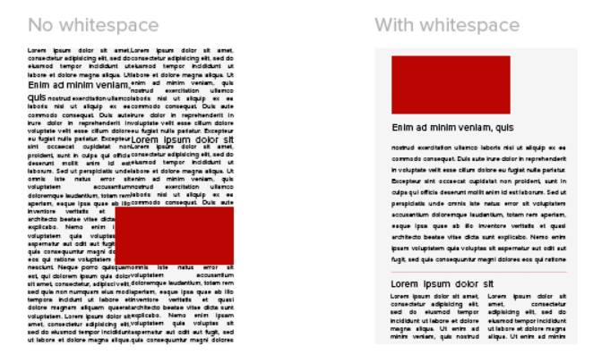
Indeed, whitespace is integral for balancing design elements and enhancing visual communication. But did you know it also plays a significant role in creating hierarchy and contrast in your designs? In simple terms, white space isn’t just empty space; it’s a strategic design element. Therefore, embrace its power in your graphic design projects and witness how it enhances clarity and professionalism in content layouts.
As a designer or a cutting-edge marketing enthusiast, you should master its use and experiment to find the optimal balance. Understanding this can truly elevate your design game.
Therefore, let’s discuss the different kinds of effective white space design and learn the best practices for creatively using it. But if you are experiencing a fresh camaraderie with content design, you might have an obvious question regarding the difference between natural white space and whitespace graphic design, right?
What is Whitespace vs Space?
When you hear white space in graphic design examples, the first thing that strikes you is, well, isn’t it just a blank space? Also, when we write a sentence, we maintain uniform space between every word. Well, isn’t that space too? To end this dilemma, let’s just understand that space is generally any blank space around some object. Do you have space in your room? I’m sure you have a lot of space left even after furnishing your room with all your favorite chattels.
Now, is space a whitespace? Yes, any space in your content refers to white space! In contrast to its name, white space isn’t always white. Moreover, it refers explicitly to the empty areas in a design, surrounding and separating elements. According to the white space principle of design, it can be in any color or texture, simply representing the lack of other design elements within a specific area.
So, space is any space around any object you notice, but white space only exists in your content.
Is Whitespace Negative Space?
There’s another kind of space in graphic design that we haven’t yet discussed. Negative space isn’t just the absence of elements; the silent force shapes and enhances compositions. From framing to balancing, it is crucial for designs that need to communicate effortlessly with the audience.

Negative space in design becomes strikingly evident when the area surrounding the subject, rather than the subject itself, forms an intriguing or artistically relevant shape. This technique is artfully utilized to make the void the image’s focal point. If you look closely, you’ll see a small gap between the letters E and X, representing a precise arrow shape that only exists for such a unique juxtaposition.
Different Types of White Space In Graphic Design
The brief details of white space are just the start for a designer. To completely understand the standard practices of using white space and its influence on graphic design, you must be familiar with terms like macro and micro whitespace and active and passive space.
Sometimes, the white space design principle is associated with its size and density, which correlate with the content. These are commonly known as macro and micro white spaces.
Macro White Space
Macro white space, the distance between different related and unrelated elements within a design, serves multiple purposes. It divides content sections and accentuates elements to keep the layout organized, fostering balance and visual clarity. Prime examples of macro white space include margins, gutters, and the areas surrounding visuals, such as images and CTA buttons.
Micro White Space
As its name implies, micro whitespaces are tiny gaps within design elements, including the space between letters, lines of text, and grid images. This subtle technique ensures the legibility of text and prevents visual clutter within the grid or patterned layouts.
Example
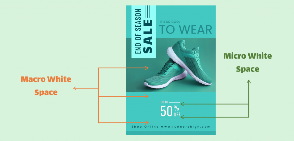
Look at the simple example; it will help you easily understand the concept of macro space and micro space in design.
The macro white space is the expansive area between key layout elements in the DocHipo advertising poster design. Notice the generous white space around the image to its right and left and the ample space separating it from adjacent text blocks.
On the other hand, the subtle yet crucial gaps between the elements, like closely packed text lines, are the micro white spaces. They ensure legibility and coherence in the design without sacrificing aesthetics.
A Rule of Thumb
- More Macro White Space = Minimalism, Modernity, and Luxury.
- More Micro White Space = Informative, Serious, Detailed.
When you classify whitespace according to its utility in the design, you talk about the active and passive whitespace.
Active White Space
When discussing active white space, you have to shift your focus from the density of graphic elements to the intention of the space in the design. Active white space is used as deliberate spacing with a particular function to emphasize specific elements within a design. Therefore, this space in your design is intentionally added to highlight and organize elements.
Passive White Space
Alternatively, passive white space naturally occurs between words and around fixed objects like logos. It is formed automatically and without deliberate effort when graphic elements or text are placed. This inactive blank space enhances readability and aesthetics, creating a polished and professional design.
Example
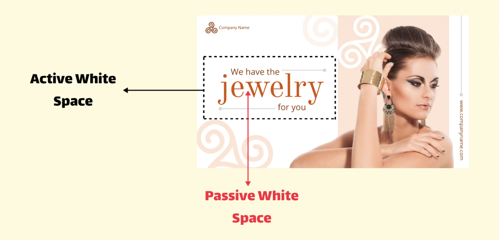
This example easily explains the concept of active vs passive white space.
Look at the brief black space around the heading; it is purposefully kept around the title to capture everyone’s attention. Also, creative lines are added around the heading text box to intentionally reduce some white space and bring more focus to the bold text. So, the white space around the title has a particular function: to bring focus to the title. This space is known as the active whitespace.
Passive white space is the space between paragraphs or sections of text in this design. It is naturally created after texts and related graphic elements are placed in that area. This subtle gap allows for better readability and visual organization, enhancing the overall user experience without drawing attention away from the content.
A Rule of Thumb
- More Active White Space = Emphasis, Boldness, and Focus.
- More Passive White Space = Tranquility, Simplicity, and Elegance.
Striking the Perfect Balance
The equilibrium between micro and macro and active and passive white space hinges on the following factors:
- The Message: What are you trying to convey?
- The Audience: Who are you designing for?
- The Context: Where will your design live and breathe?
The usage of white space depends on the desired reaction and emphasis. Hence, strive for a balance that attracts attention and enhances content readability. Additionally, ensure key design elements aren’t overlooked because of extra white space. So, beware of excessive white space, as it can drain the design’s vitality and coherence.
Why Is White Space Important
Effective use of white space is not just a design preference; it’s a powerful tool that brings order, clarity, and focus to your creations. Here’s how:
1. Enhances Visual Hierarchy
You can create a visual hierarchy in your content with white space. Larger spaces emphasize significance, spotlighting key elements or crucial messages, while smaller gaps direct the viewer to navigate through your design to see the right message.

Get This Template and More
This advertising poster has a vibrant backdrop that creates a canvas of calm, where the spotlight shines brightly on the star of the show: the Autumn Collection 2020. This chic, colorful text code sits flawlessly within a rectangle, amplifying its importance by the generous breathing room around it. The left corner acts as a visual nudge, guiding the eye from the bold image straight to the main event – the new Autumn Collection. And then, your eyes land on the CTA flash in the right corner. With the strategic use of white space, you can create an appealing and comprehensive hierarchy of graphic elements.
Wondering what percentage of the space in an advertisement should be white space? To create a compelling advertisement, aim for 20-30% of the space for white space graphic design.
2. Emphasizes Bonds Between Visual Elements
White space in design principles can sometimes separate visual elements. It can also group similar graphic elements, a cluster that denotes an organized visual structure. Following the proximity design principle, objects in close proximity are perceived as unified entities. If you merge white space with this principle, you can present information more cohesively through strategic sections of grouped elements.

Get This Template and More
This beauty poster is an excellent example of how white space is carefully used to bring focus and comprehensiveness to the design with the proximity principle. Grouping related elements and separating them with white space creates a clean and uncluttered design, making the message easier to understand.
3. Increase Readability and Legibility
Whatever the design, legibility should never be sacrificed for creativity. Meanwhile, you can master the mix of micro and macro white space for your design’s message, content, audience, and context to increase its legibility for viewers.

Get This Template and More
The delicate dance of letter and line spacing is more than aesthetics in this 4th of July poster template—the linchpin of readability. In that case, micro and passive white space matter the most to secure readability in your design, with sufficient space between each letter, word, and text block. Also, group things to fill space on a poster like this, which, in a way, creates more space between two highlighting elements.
When letters are squeezed or stretched too far, readability suffers. While there are no strict rules for spacing, if reading feels like a struggle, it’s a clear sign that adjustments are needed. Moreover, for optimal readability and use of white space, use margins
4. Create Harmony with Uniform Gaps
White space weaves balance and proportion in a design. If you want to avoid a sense of heaviness or overwhelm for your viewers, add blank space uniformly in your design canvas. White space also allows a design to breathe, ensuring visual harmony and cohesion.

Get This Template and More
As you can see in the above cookbook cover design, harmony is vital as it adds a touch of unity and completeness. Among all the other factors, white space in design principles is considered the most recommended concept for achieving harmony in your design.
5. Provides Spot-On Focus
The more distractions you remove from your design space, the better your readers will understand the texts and images as separate design elements.

Get This Template and More
Using enough active and micro white space in your design stops the viewers from getting distracted. It invites them to focus on what they see in front of them.
6. Improves Aesthetics
White space holds immense potential in shaping your design’s character. Applying ample macro white space can bring unmatched sophistication, minimalism, and elegance to your content. The following carwash flyer design is an excellent example of using macro white space for nuanced details.

Get This Template and More
Conversely, reducing white space infuses your design with a playful, dynamic vibe. Pick your poison according to the flow of your design theme!

Get This Template and More
7. Reflects Professionalism
White space plays a pivotal role in graphic design. It creates a polished look for your content and balances sophistication with readability. By incorporating white space, you can enhance the visual appeal of your designs, making them more engaging and user-friendly, as in the case study template below.

Get This Template and More
8. Excellent User Experience
You can improve your UX by using the transformative power of whitespace in graphic design. White space acts as a guiding light, inviting users to scan information effortlessly.

Swiftly direct them to the correct step-by-step information and prevent the dreaded feeling of overwhelm. Ultimately, this smart approach backs your site up with an unparalleled user experience, paving the way for enhanced conversion rates and lasting engagement.
White space is the best solution when you desperately need to turn your cramped design into a clutter-free, spot-on message for the users.
9. White Space Elevates CTAs to Drive Conversions
White space is the secret ingredient that amplifies the call to action for more conversion. Strategic white space invites viewers to pay attention to the CTA to take the desired action.

Get This Template and More
White space transforms CTAs from mere buttons into irresistible invitations for specific actions by providing visual clarity and enhancing readability. Use more white space to place your CTAs effectively. But don’t overdo it; just because you have extra space doesn’t mean you should overcrowd it with CTAs.
10. Use White Space for Contrast
White space works its magic by being the ultimate show-off for creating a stunning contrast. Imagine a flyer bursting with muted expanded background color and icons and texts that pop in bold colors.

Get This Template and More
Strategically surrounding key elements creates a halo effect, drawing your attention to the saturated stars. This subtle spotlight contrast with light background color in active white space elevates the entire design, transforming your idea into a masterpiece.
How to Use White Space in Design Effectively
Now that you know the importance of white space in art and content design, I will share how you can use it in your content. Here are some essential tips you can follow with the following examples of white space in graphic design.
1. Group Elements Thoughtfully
Logical grouping involves organizing information into logical categories. White space serves as a visual separator, distinguishing between elements and fostering coherence in your design. Exercise caution when employing white space to group relevant aspects.

Get This Template and More
Look how elegantly and logically related elements form a block that defines meanings through relevance.
Check out the resume template with strategically grouped elements below.

Get This Template and More
2. Use White Space to Separate Elements for Different Meanings
Sometimes, you can use whitespace to differentiate between elements. This space can be used to separate graphics, making room for different layers of meaning.

Get This Template and More
3. Use Z Layout or F Layout to Prioritize Visual Hierarchy with White Space
There are two main things to consider in a content design: information scanning patterns and typography hierarchy. Visual hierarchy is one way of prioritizing content information you desperately want to spread.
The F-pattern layout is known as the typical way people scan text-heavy content, such as news sites, blogs, infographics, and presentations. Surprisingly, I will showcase a business book cover design for this example.

Get This Template and More
On the other hand, the Z layout is a design strategy that aims to guide users’ attention and prompt them to take action swiftly by minimizing distractions. It’s commonly used in web pages and design documents that focus on something other than written content. Here is a real estate Facebook ad with a prominent Z layout pattern guiding your eyes with visual hierarchy toward conversion.

Get This Template and More
4. Highlight One Element with a Bigger Size in Macro White Space
You can establish a hierarchy in your design by making some elements bigger. Indeed, try to make one element significantly larger to draw attention and dictate the viewer’s focus path.
For example, I increased the size of a key element like the text ‘Anniversary’ in this anniversary card design to prevent design clutter while keeping other elements minimal. This creates more white space, enhancing clarity and focus on the critical message.

Get This Template and More
5. Appropriate Text Formatting
If you apply uniform text formatting in the design, you can utilize white space properly and make it look balanced with visibly adequate alignment.

Get This Template and More
6. Enough Space Between the Letters
Adjusting the space between letters can make text look neat and unified, as shown in the beauty Facebook cover template. This improves readability and helps in utilizing white space effectively in design.
If you don’t use enough space within your words, your design will look clumsy and illegible, something like this.

Adding spacing within the letters gives you a readable and balanced design.

Get This Template and More
7. Use Fewer Elements & More Whitespace for Effortless Minimalistic Design
Let your design breathe with enough margin space. Also, add a luxurious, minimalistic theme to your creative feast with generous use of macro white space.
The following beautiful YouTube banner shows the magic of using macro white space to set a simple, clean, luxurious tone in the design.

Get This Template and More
8. Don’t Overuse White Space
Keep it simple, not boring! Finding the right balance between white space and content is crucial for a meaningful visual. While you should always avoid clutter, be wary of creating a barren look by using too much unnecessary white space in the background. It ensures elements flow seamlessly, enhancing the visual creativity of the design for the viewers.
Look at the pitch deck to compare how crucial white space balance is.

An overly empty page can confuse users because of a lack of personality. Moreover, the whole design looks bland!
If you add interesting elements to enhance your design, it not only improves the design but also sets an excellent example for using white space in design.

Get This Template and More
9. Use Solid, Flamboyant Colors in White Space Accordingly
A solid-colored background offers plenty of room around graphics and text, drawing attention to your content. In that case, make the most of active white space to emphasize text and design elements.

Get This Template and More
10. Zoom in Background Image for Jaw-Dropping Aesthetics
Sometimes, using an overcrowded picture as the white space for your design can distract viewers while they read the text.
Opt for background images with plenty of space for text overlays.

Get This Template and More
Alternatively, enlarge the image to ensure it becomes part of the leading graphic element to complete its meaning. As demonstrated below, adequate pictured white space and its zoom-in effect create enough room for breathable text designs. Additionally, incorporating images boosts viewer attention.
What if you like a picture with a busy composition? You can still create a breathable design.
Look at the motivational Instagram post. What do you read? See how challenging it becomes to read the texts and feel the vibe of the white space while the design looks cluttered, though it uses minimum graphic elements.

Now, the trick is to zoom your white space in the design and free up space around texts to let it breathe. You can share a clear, powerful message without distractions with a harmonious order of design elements.

Get This Template and More
11. Try to Make Contrast with the White Space
Color contrast can make your text and graphics pop without any extra effort! This Easter card template is an excellent example of using color contrast with a cool-toned background as white space.

Get This Template and More
12. Remove Borders or Frames to Make Space That Matters
To create more white space, simply remove unnecessary elements like borders around graphics. Only include borders, frames, shapes, icons, and other aspects if they enhance your design. The following 15th of August square template is all about keeping your design theme uncluttered!

13. Plan Wisely to Exercise Either Passive or Active White Space
As I mentioned before, passive white space is simply the area between other elements in your design. It enhances legibility without directly influencing the overall design. On the other hand, active white space is more significant and attention-grabbing, highlighting specific design parts within a busy layout.
Take a look at the following example: the breathable Real Estate LinkedIn banner. You can sense that implementing active white space in this template took a lot of planning.

Get This Template and More
14. Use Padding Technique
In a well-designed layout, every element should have padding or margins—also known as white space—around them. Look at the consistent padding around the text “Skincare Routine; Skincare Videos Everyday.” The image has separate padding, ensuring two blocks create a single theme for the design.

Get This Template and More
15. Design Techniques That Allow More Space and Less Text
Explore diverse techniques to free confined white space and create a unified design. Converting trapped white space into negative space can enhance design functionality. For instance, if excessive text causes trapped white space, integrate design elements to achieve visual equilibrium and direct focus to critical areas.
Look at the Instagram ad. With limited text and fantastic imagery, the design perfectly expresses its offer without making it clumsy with heavy ad copy.

Get This Template and More
16. Think Beyond the Box
Use unconventional layouts and design elements and juxtapose them in a way that naturally adds different layers of meaning to the design.
This car wash flyer template evokes a sense of creativity, as it cleverly uses negative space to create the spotlight effect layout.

Get This Template and More
Also, look at the adorable Instagram post template for Father’s Day. Doesn’t this tiny negative space help you to create a clear resonance with the ideal Father’s Day message?

Get This Template and More
17. Use the Proper Page Size to Add Graphic Elements
Every content type has a particular dimension that brings harmonious aesthetic play. Before experimenting with white space in design, choose the page size or dimension correctly for easy and optimized customization for content types with multiple formats. From captivating web pages to sleek marketing materials like flyers and posters, strategic white space ensures maximum impact, effortlessly elevating user experience and visual appeal.
If you have less information to highlight, choosing a landscape format in A4 size can go wrong with extra white space in the margins, making it look flimsy.
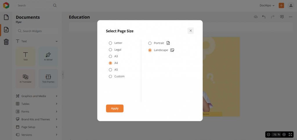

Hence, the correct format depends on balancing content volume and the white space area. Here, I have used an A4 portrait format to present the same amount of information and see how suddenly it gets a complete look with proper space in the design.

Get This Template and More
Watch this video to learn more about how to change a page size.
Hopefully, you have gained enough clarity regarding the importance and use of white space in design. I’m not being preachy; these 18 recommended techniques are the backbone of the white space in principles of design.
5 Outstanding Real-world Examples of White Space Design for Inspiration
Let me clarify something – I didn’t suggest those 16 ways to use white space because they’re the simplest or best. They’re popular among graphic designers for a reason. Out of countless brands, I’ll show you five that use various types of white space exceptionally well.
1. Pittsburgh Zoo
As you glance at the screen, notice how the bright, spacious white space as the webpage picture immediately captures your eye.
When you briefly observe the Pittsburgh Zoo logo, you’ll likely spot the white tree and birds first. But take a closer look, and you’ll uncover a hidden image: a gorilla facing a lion within the negative space. This clever use of white space makes the logo and its brand unforgettable. The unique negative space adds an element of surprise, leaving a lasting impression on visitors.

2. Udemy
Observe how headings, subheadings, and body texts are structured in this Udemy course. The mix of soft-colored blocks, bold headers, and ample spacing between lines ensures learners can easily navigate the content.

3. Salesforce
As a web UX designer, ensuring your website forms are user-friendly is key. Often, these are the lead forms that get you closer to your prospects. So, you want to do it correctly! Take this Salesforce free trial form, for example. Notice how the ample spacing around each field makes it feel inviting? This white space helps users focus on one field at a time. Plus, when they start filling out fields, labels move above them. If errors occur, relevant messages pop up below.

4. Tinker
Tinker creates unique watches from various colors, styles, and finishes.
To showcase their customizable options, Tinker features a captivating image of their top products, dominating the screen to make a lasting impression. A clear “shop now” call-to-action complements the image.
In contrast, the rest of the page maintains simplicity, with only a logo, a discreet search bar, and a neatly tucked-away navigation menu at each corner of the user interface.

5. Seedlip
Crafting content for non-alcoholic beverages can be a challenge for many. However, Seedlip simplifies this with clever white space design, showcasing its unique selling points (USPs) through concise copy. The minimalist approach lets stunning photography take center stage as users explore these alcohol-free spirits.

These examples of white space in graphic design are so unique that you find it hard not to get inspired.
Conclusion
White space in graphic design is one of the thirteen major design principles you must know. It adds depth and character to your content, lending it a distinctive voice. DocHipo templates harness this feature creatively, offering free access for you to explore and utilize its potential. Sign up now to customize and download watermark-free designs effortlessly.
FAQ
Is empty space a principle of design?
Yes, empty space is a principle of design. It is often referred to as “negative space” as well. It is the area around or between design elements and is crucial for creating balance, emphasis, and clarity. Proper use of negative space enhances visual hierarchy and ensures that the design is aesthetically pleasing and easy to understand.
What is white space, and why is it important for readability?
White space refers to the empty or unused areas in a design. It’s crucial for readability because it helps to separate and organize elements, making content easier to scan and comprehend. White space enhances clarity by providing a visual breathing room and allows key information to stand out.
What are white space characteristics?
White space characteristics refer to the attributes of the space within a design. These include its size, placement, density, and impact on the overall composition. White space can vary in color and texture and plays a crucial role in enhancing readability, guiding the viewer’s eye, and creating visual balance in a design.
What is the principle of white space?
The principle of white space in design refers to the strategic use of empty space within a layout. It involves intentionally leaving adequate areas free of content or visual elements to create balance, enhance readability, and guide the viewer’s focus.
What are examples of white spaces?
Some common examples of white space in design include the areas between paragraphs, margins, and padding around images or text. White space helps to create balance, enhance readability, and draw attention to key elements.
Why is white space good in design?
White space in design serves multiple purposes: enhancing readability, guiding focus, and improving aesthetics. It provides visual breathing room, allowing elements to stand out and facilitating better organization. Ultimately, white space creates a balanced and harmonious layout, elevating the overall impact and effectiveness of the design.
How do you fill white space in graphic design?
To fill white space in graphic design, consider adding relevant content, such as text, images, or graphics, that complement the overall design theme. Utilize this space strategically to enhance visual balance and guide the viewer’s focus effectively.


