Visual Hierarchy: A Detailed Guide to Lead Viewers’ Attention

Visual hierarchy—isn’t it everywhere in the content we consume? Think of it as Newton’s law of design. This essential principle brings order to visuals, making them easy on the eyes. You simply can’t ignore it in visual marketing or art. Just like “The Force” guides Jedi, design hierarchy guides our perception, making everything look seamless and cohesive.
Visual Hierarchy Basics
- Visual Hierarchy Definition: Arranging elements to prioritize viewer focus.
- Visual Composition vs Visual Hierarchy: Composition balances elements; hierarchy prioritizes importance.
- Importance: Captures attention, improves user experience, simplifies content.
- Rule of Thirds in Visual Hierarchy: Guides eye to key design elements.
- Hierarchy in Typography: Organizes text for clarity and emphasis.
- Bad Visual Hierarchy Example: Overcrowded design elements lose impact.
- Good Visual Hierarchy Example: Effective white space, repetition, grouping, and contrast highlight key information.
- Principles of Hierarchy: Size, perspective, color contrast, font, typography, alignment, space, negative space, proximity, repetition, grid, composition, lines, etc.
But why do we often get it wrong? Why is visual hierarchy so crucial in every design? What’s the difference between composition and hierarchy? And most importantly, how can you tell if a design is a good or bad example of visual hierarchy? Knowing this will make you more artistically aware and help you master visual hierarchy in your work! That’s why I’m back with some top-notch secrets to help you master visual hierarchy in design.
Table of Contents
- What is Visual Hierarchy
- What is the Difference between Visual Composition and Visual Hierarchy
- Why is Visual Hierarchy Important
- What is the Rule of Thirds in Visual Hierarchy
- What is Hierarchy in Typography
- What is a Bad Visual Hierarchy
- Good Visual Hierarchy Example to Begin Your Journey
- What are the 13 Principles of Visual Hierarchy
- What Can be Used to Improve Visual Hierarchy
- FAQ
What is Visual Hierarchy
As the visual hierarchy definition suggests, it is all about arranging elements so the audience knows what to focus on first. Imagine you’re crafting a social media post: you use size, color, and contrast to make sure the design grabs attention, the imageries create a cohesive theme, and the message hooks the viewer.
Look at the picture below to see how visual hierarchy guides your way of reading!
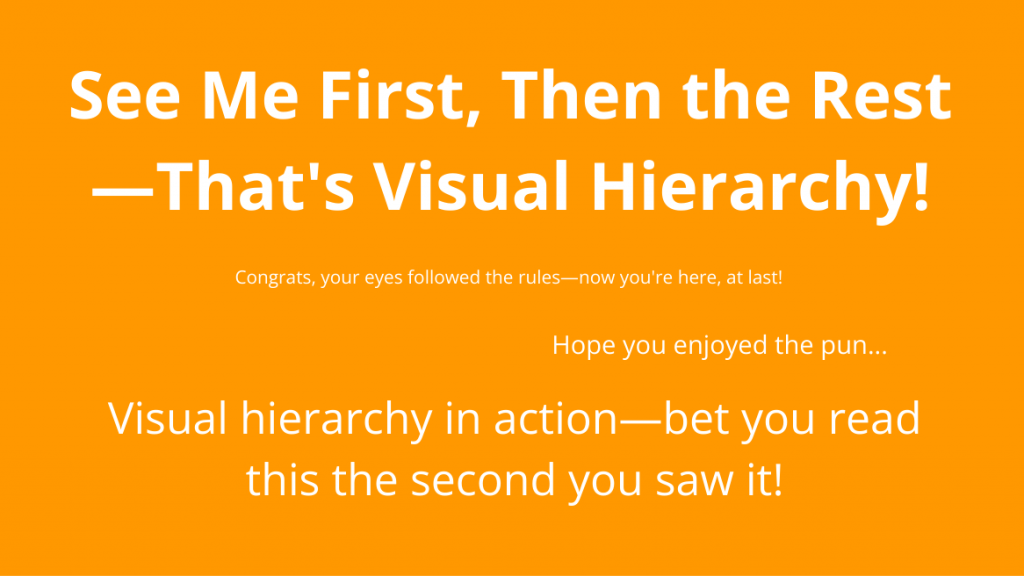
Visual hierarchy isn’t just a design principle; it’s your winning secret behind everything from eye-catching graphics to sleek websites. It’s like the GPS for your user’s journey, guiding their eyes to where you want them to go.
So, when you’re diving into your design project, ask yourself:
- What’s the main attraction?
- What action should users take next?
- Where does their gaze naturally drift?
Place these, and you’ll discover the magic of visual hierarchy, which naturally draws engagement to your must-see masterpieces.
What is the Difference between Visual Composition and Visual Hierarchy
Visual composition is all about arranging visual elements, like setting the stage for a show. But visual hierarchy? It’s about the strategic arrangements of graphic elements according to their importance.
So, let’s break it down!
Visual composition in design:
- Focuses on the overall arrangement and balance of visual elements.
- Deals with the aesthetic aspect of design.
- Creates a visually pleasing layout.
Visual hierarchy in design:
- Organizes elements based on their importance.
- Directs the viewer’s eye flow within the design.
- Strategically arranges elements to convey information effectively.
Why is Visual Hierarchy Important
Visual hierarchy isn’t just a passing trend; it’s a design principle that’s been around for millennia. From ancient stone tablets and papyrus scrolls to today’s sleek digital layouts, arranging elements by importance has always been a common practice. Fast-forward to the digital age, visual hierarchy in graphic design is more crucial than ever—especially when the average attention span is now shorter than a goldfish’s!
Let’s understand why following visual hierarchy design principles is important for sending a compelling visual message to your audience.
1. Grabbing Attention in Seconds
In today’s fast-paced digital world, you’ve got about 8 seconds to capture someone’s attention. If your design doesn’t stand out immediately, it’ll get lost in the endless scroll of online content.
Check out this buzz-worthy Black Friday poster from the DocHipo library, which showcases a standout visual hierarchy for maximum impact!

Get This Template and More
This template is easily adaptable for a powerful Black Friday campaign. The design masterfully draws all eyes to the central product display, while the bold Black Friday text ensures everyone knows exactly what this post is about. The magic lies in the visual hierarchy, using size, color contrast, and alignment to capture and keep attention.
2. Enhancing User Experience
When your design is easy to navigate, people are more likely to engage with it. It is very important for UI/UX designers, who literally have to create a visual pathway for visitors and take them to their desired content or action button. Visual hierarchy guides the viewer’s eye, making it clear what’s most important. It doesn’t just improve user experience—it also makes your message more compelling, turning casual viewers into invested readers.
3. Simplifying Information Complexity
In the attention economy, less is more. A cluttered design will overwhelm you, while a well-structured layout makes the same information digestible and easy to perceive. Thanks to visual hierarchy, things are kept simple and appealing to your viewers. Therefore, it’s a key player in visual advertising as well. It’s about creating a clean, aesthetic look that draws people in without overwhelming them with information.
You can design your business book cover with a strong visual hierarchy, like the following example, making it easier for viewers to grasp the topic of the book quickly and clearly. By breaking down information step by step and highlighting key points with visual cues, you guide your audience straight to what matters most, getting them easily excited.

Get This Template and More
4. Boosting Marketing Effectiveness
A well-ordered design doesn’t just look good; it drives results. When your audience can quickly grasp your message, they’re more likely to stick around and even convert into paying customers. The hierarchy principle of design gives your visual the structure to hold attention and drive action.
This next business large rectangle ad template catches the eye of online browsers and inspires them to take action. Its visually appealing layout grabs attention without missing out on the essential details your audience needs to know. It’s the perfect blend of style and substance, guaranteed to get people clicking on your ad!

Get This Template and More
5. The Details Make the Difference
The beauty of visual hierarchy lies in the details—text size, color combinations, alignment, and white space all play a part. Understanding these elements, even if you’re working with a professional designer, can elevate your digital marketing strategy and improve your content’s impact.
The food Instagram ad design nails it perfectly with vibrant color contrast, smart sizing, centered alignment, and a clear layout. This combination creates a visually striking hierarchy that pulls everything together seamlessly.

Get This Template and More
If you’re new to graphic design, these insights should be real eye-openers. That’s why I’m about to take you on a quick tour of both the best and worst examples of visual hierarchy so you can learn from their mistakes and draw inspiration from the most successful designs!
What is the Rule of Thirds in Visual Hierarchy
The rule of thirds is a popular theory in design and photography. It’s all about crafting that perfect visual balance. As a visual artist, this practice is crucial for making your focal point pop in your designs. This concept lets you split your image into a grid with three horizontal and three vertical lines. You need to place your key elements along those lines or where they intersect. This simple hack can turn your layout from “meh” to “wow!”
But how does this technique actually come into play when setting up a visual hierarchy?
The rule of thirds is significant for setting up a visual hierarchy because it guides where the eye goes first. Placing essential elements along those grid lines or intersections naturally draws attention to what matters most in your design.
Check out the next picture. Notice how you instantly move your attention to the bird in the picture without straying anywhere else. It is a perfect example of how effective visual hierarchy can guide your focus exactly where it’s intended.

What is Hierarchy in Typography
New designers often overlook the importance of typographic hierarchy, but it’s an important practice in making content easy to read. Imagine two designs: one where it’s hard to tell the header from the body text and another where the hierarchy is crystal clear. Which one would you prefer? The answer is obvious. Take a look at such an example:
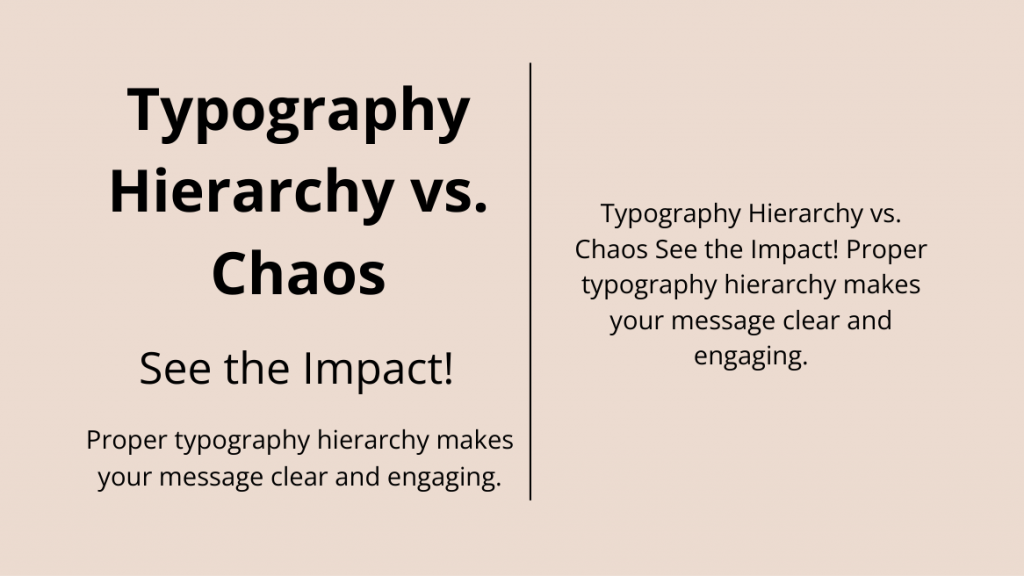
Typographic hierarchy guides the reader’s eye, highlighting what’s most important and what supports the main points. Typography hierarchy involves correctly formatting titles, subtitles, and body text to help viewers understand which information is important and how it’s connected within the design.
This business poster showcases a clean layout, delivers a clear message, and maintains a well-structured composition through effective typographic hierarchy.

Get This Template and More
Mastering these elements will help you create designs that not only look good but communicate effectively. So, if you want your visual stories to stand out, make sure your typographic hierarchy is on point!
What is a Bad Visual Hierarchy
When it comes to visual hierarchy, there’s a golden rule: if everything screams for attention, nothing gets noticed. Visual hierarchy design is all about ranking the information according to its importance to the design and visual marketing context. Without clear distinctions, the result is a cluttered mess—a classic example of bad design.
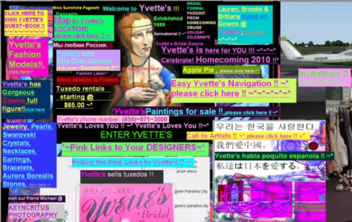
Imagine stumbling onto a chaotic website—the above picture is one such visual hierarchy example with poor website design. It’s a visual catastrophe packed with blinding colors and no clear focus. Your eyes don’t know where to land, and finding anything is a headache. This is what happens when visual hierarchy goes wrong—it’s like a neon sign overload that leaves you overwhelmed and lost.
So, remember, effective design isn’t about throwing everything at the wall; it’s about purposefully arranging all the details in the design.
Good Visual Hierarchy Example to Begin Your Journey
Mixing design elements, big with small, thick with thin, and bold with subtle, is a surefire way to use contrast and hierarchy to spotlight your crucial info.
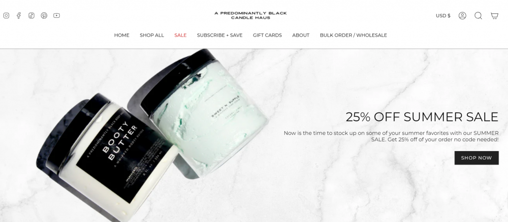
Take “Predominantly Black,” for instance. This site nails the grouping design principle and uses proximity to build a clear visual hierarchy. Products and page categories are neatly arranged under one main title with minimal space between them, making it crystal clear that they’re all in the same category. The website’s clever grouping creates eye-catching blocks that guide your attention exactly where needed.
And guess what? The flashing discount is the first thing you’ll spot when you land on the site. It’s a perfect example of how a smart visual strategy can make a big impact!
Now, let’s discuss the most common visual hierarchy principles of design that you can’t afford to get wrong!
What are the 13 Principles of Visual Hierarchy
Creating clear and compelling visual messages with creative graphic design is not easy! The following thirteen principles of visual hierarchy are essential for designing any persuasive marketing collateral.
1. Size Makes a Statement
Size is a big deal in hierarchy design. The largest element always grabs the most attention, the common psychological trick. Whether it’s a product, a logo, or a headline, make sure it’s big enough to shine. Everything else should add meaning to the focal point.
Check out this eye-catching restaurant flyer! It expertly uses the design principle of visual hierarchy to draw attention to its central theme—spotlighting the star product for its audience with the most significant text element in the design.

Get This Template and More
2. Perspective Packs a Punch
Perspective can make or break your design. Positioning key elements opposite each other can tell a powerful visual story. For example, using visual hierarchy, you can add perspective by arranging the design elements by their significance. Simply adjust the size of the images to show which features are the most important, like the following real estate Facebook ad. This way, the viewer’s eye naturally gravitates to what matters most.

Get This Template and More
3. Color and Contrast Catch the Eye
Color and contrast are your best friends when it comes to making elements pop. Just like a spotlight on a performer, bright colors and bold contrasts make certain parts of your design stand out. Check out this Thanksgiving card template that uses soft nude hues, creating a striking contrast and giving the design a strong, defined structure!

Get This Template and More
Check out the next example to see how to use vibrant colors to craft bold contrasts and convey powerful messages. This approach not only grabs attention but also aligns with your audience’s deeper aspirations.
Highlight how eco-friendly solar energy can save the planet by pairing it with symbols of natural vitality and color contrast. Look at this clever approach: the solar energy business card template uses a neon green color and natural icons to emphasize the eco-friendly theme. Its vibrant color contrast draws attention to your main message, making it stand out, especially in ads and marketing materials.

Get This Template and More
4. Fonts Tell a Tale
Fonts aren’t just about looking good; they organize and emphasize your message. Choose a big, bold font for crucial information to ensure readability. Using bold and large font styles, like in the beauty brochure template below, can emphasize the subject, clearly conveying what the viewer can expect from the content design.

Get This Template and More
Remember, using too many fonts to jazz up your content can confuse your audience, so stick to a few that complement each other.
5. Space Sets the Stage
Space isn’t empty; it’s the gap between two design elements essential for adding clear order to your document. Proper spacing adds emphasis and guides the viewer’s eye. The education flyer below demonstrates how white space can effectively structure the information hierarchy in design. The more room you give it, the more important it feels.

Get This Template and More
6. Proximity Reveals Relationships
How close elements are to each other can suggest their relationships. Group related items together to clarify connections. Remember, proximity helps viewers understand the message and how parts fit together.
Check out this real estate Facebook post—it’s a prime example of hierarchy in graphic design. Notice how sleek and organized it looks, with separate images, logos, titles, and contact info groupings. By applying proximity and grouping principles, the post creates a clear, cohesive message.

Get This Template and More
7. Negative Space Highlights
Negative space is also essential in designs to create arresting effects that demand attention. It gives your design a classy, focused look. Premium brands often use it to highlight their products while using enough background space.
Look at this adorable Instagram story featuring plenty of creative negative space, stunning overall composition, and a heartwarming message for your father, all in the glory of visual hierarchy principles!

Get This Template and More
8. Alignment Guides the Gaze
Alignment is your design’s roadmap. Proper alignment ensures everything falls into place and naturally guides the viewer’s eye. Whether it’s a left-to-right scan in an F pattern, Z-pattern, or vertical alignment, it helps direct viewers’ gaze where they should pay attention.
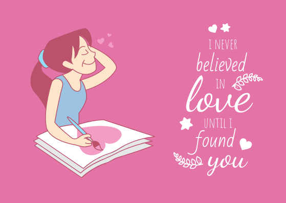
Typically, centered alignment is the go-to for drawing focus. Still, this Valentine’s Day card design flips the script with an off-center, vertical alignment on the right side to grab attention and surprise viewers!
Get This Template and More
9. Repetition Reinforces the Message
Repetition isn’t boring—it’s reinforcing. It adds more meaning to the key message and creates visual consistency. Repeated elements can highlight the main idea, like in this Easter Facebook post, where the theme is reinforced with a pattern of colorful eggs.

Get This Template and More
In the food Facebook ad below, repetition takes center stage. By placing a big, mouth-watering image of donuts next to a bunch of small, cute donut icons, the ad creates a pattern that draws you in. This clever design trick not only makes the ad more persuasive but also directs your attention straight to the main focus—the delicious donuts.

Get This Template and More
Further Reading
10. Grids Create Order
Using gridlines helps organize your design. It’s like using a map to plan your route—everything falls into place where it should. Key elements should align with these guides for a well-structured, visually appealing layout.
11. Typography: More Than Just Text
Typography is more than choosing fonts; it’s about creating a hierarchy. Like a good book uses headlines and body text, your design should incorporate different font styles, weights, and sizes to highlight and organize information. Your fonts should set the tone and guide the viewer’s reading experience.
This restaurant flyer perfectly showcases a typography hierarchy, blending different font styles and sizes with a creative flair.

Get This Template and More
12. Composition: The Big Picture
Composition techniques, like the rule of thirds and the rule of odds, help create dynamic and engaging designs. As mentioned before, the rule of thirds places focal points on intersecting grid lines, while the rule of odds uses an odd number of elements to create visual interest. These classic tricks help keep your design lively and engaging.
This Facebook fashion post for your audience captures attention with its vibrant composition. The rule of odds, paired with three bold color contrasts, adds a touch of magic to the design.

Get This Template and More
13. Lines that Guide Your Way
Linear direction is a powerful tool to grab viewers’ attention, even in a static design. Lines naturally guide the eye and highlight key elements, but they don’t always need to be bold or obvious. Just a hint of a line can subtly direct focus and make your design pop. The 4th of July Instagram post is one such example!

Get This Template and More
These visual hierarchy principles of design are elementary practices for creating impeccable content and ad designs.
What Can be Used to Improve Visual Hierarchy
You’ve heard enough about the principles of design hierarchy to enhance your brand experience for the target audience. Now, I’ll share some tips that can significantly improve the display of visual hierarchy in design.
Here are some must-know tips to create a strong visual hierarchy:
1. Think Mobile-First
Always consider how your work will look on a mobile screen when designing. With users browsing on the go, it’s crucial that important elements pop up and the navigation stays seamless. You want your audience to engage, not bounce.
2. Choose Typography Wisely
Fancy fonts can grab attention, but be careful – they shouldn’t overshadow other vital elements. Keep your typography stylish yet readable to ensure it complements your overall design.
3. Stay True to Your Purpose
Never lose sight of your design’s core message. As you build your visual hierarchy, constantly ask yourself if your design aligns with the original intent of the target audience. Make sure every element contributes to effectively communicating your main idea.
4. Use Common Reading Patterns in Design
In design, understanding how people read visual information is key, and eye tracking has shed light on this. There are two main patterns—the F Pattern and the Z Pattern—that guide how we process visuals.
What is the F and Z pattern in visual hierarchy?
The F Pattern is common in text-heavy designs. It mimics the shape of an ‘F,’ starting at the top left and moving horizontally to the top right.
Check out this stunning example of the F pattern in design. This fashion magazine cover design effortlessly guides your eyes, helping you read and absorb all the details in a flash.

Get This Template and More
On the flip side, the Z Pattern is used for less dense designs. It follows a ‘Z’ shape: starting at the top left, moving across to the top right, then slanting down to the lower left corner, and finally sweeping across to the bottom right.
Here’s a real estate Facebook ad that masterfully uses a Z-layout pattern, leaving visual cues with strategic visual hierarchy to drive conversions effortlessly.

Get This Template and More
These patterns show you where to place your most important elements to align with natural reading habits.
By keeping these tips in mind, you’ll be able to create designs that not only look great but also showcase information accurately.
Conclusion
In a nutshell, mastering visual hierarchy is key to guiding your viewers’ attention and delivering your message effectively. With these principles in your toolkit, you’re set to create designs that not only catch the eye but also communicate with clarity and impact. Keep sharpening your skills with DocHipo templates that showcase an exemplary display of visual hierarchy principles in every design. Sign up now and give these templates a try!
FAQ
What are the two examples of media that use visual hierarchy?
Two examples of media that use visual hierarchy are websites and advertisements. A website’s visual hierarchy guides users to the most important information, like headlines and call-to-action buttons. On the other hand, visual ads using visual hierarchy direct the viewer’s attention to key elements such as the product image or slogan.
How do you explain visual hierarchy?
Visual hierarchy is the arrangement and presentation of elements in a design to signify their order of importance.
What can be used to create hierarchy?
You can use a combination of visual hierarchy principles such as size, color, contrast, alignment, and typography to create visual hierarchy.
How to visually show hierarchy?
You can visually show hierarchy by arranging elements based on their importance using techniques like size, space, contrast, grid, and proximity placement.
How and why to create a visual hierarchy?
Create a visual hierarchy to guide the viewer’s eye flow, convey information effectively, and make the design visually appealing. Use rules like size, color contrast, typographic hierarchy, repetition, and other visual hierarchy principles to establish hierarchy.
What is a rule of visual hierarchy?
The rule of visual hierarchy is to prioritize important elements over others using various design principles to guide the viewer’s attention.
What are the benefits of visual hierarchy?
The benefits of visual hierarchy include capturing attention, improving user experience, simplifying content, and creating visually pleasing layouts.
What is the hierarchy of visual perception?
The hierarchy of visual perception refers to organizing visual elements based on their importance to guide the viewer’s eye flow effectively within the design.
What is visual hierarchy in web design?
Visual hierarchy in web design refers to organizing and prioritizing elements on a webpage to guide the user’s attention and create a more effective user experience.


