Using Different Typefaces to Sizzle Up Your Visual Marketing Design

A typeface is a specific design to express the printed or displayed letters and their associated components. Hence typeface designs are important elements of typography, impacting the expression of the visual message. The typeface is important in determining brand personality and tone. So, it is necessary to use a typeface that will sync and resonate with your intended message.
What is a Typeface
- Definition: A typeface is the underlying visual design used in text representation.
- Distinct from Font: While a typeface is a design, a font is a specific implementation of that design.
- Consistency: Provides uniformity in the appearance of text.
- Variety: Can exist in multiple typesetting technologies.
- Examples: Times New Roman, Arial, and Helvetica.
In this article, I will discuss the importance of typeface design in making a visual marketing strategy successful. We’ll dive into the differences between typeface, fonts, and typography. After this, I will also share some basic rules to keep in mind while typeface pairing.
This is an intense topic, so read while sipping a nice cup of coffee!
Table of Contents
Font vs Typeface vs Typography
Font, typeface, and typography are different terms that are often misused. These terms might seem similar but are adapted through their distinct roles in forming a visual message. To break it, fonts collectively form the typeface, which becomes one of the key elements of the typography anatomy.
Let me further clarify.
It was in the 1400s when Gutenberg invented the first printing press. The press would use a metal movable-type printing process, bringing in typefaces. In its initial phase, the distinction between fonts and typefaces was unclear and limited to Roman designs. In the 1700s, typefaces began to develop into distinct type families.
As different type designers created more and more typefaces, variations started to evolve. By the 20th century, typefaces were distinguished from fonts by Morris Fuller Benton. The different varieties of types in a particular typeface were termed fonts. Hence, the visual message design that involved fonts constituted from different typefaces led to the art of typography. It also involved key elements of space, word, and letter placements. In short, typography can be defined as an artistic way of reflecting the visual message.
You can now understand these key terms’ differences through the typeface history. A font is defined as a particular type’s style (width, size, and weight) under the typeface. The combination of typeface and type style is called a typography design.
What are the Different Types of Typefaces
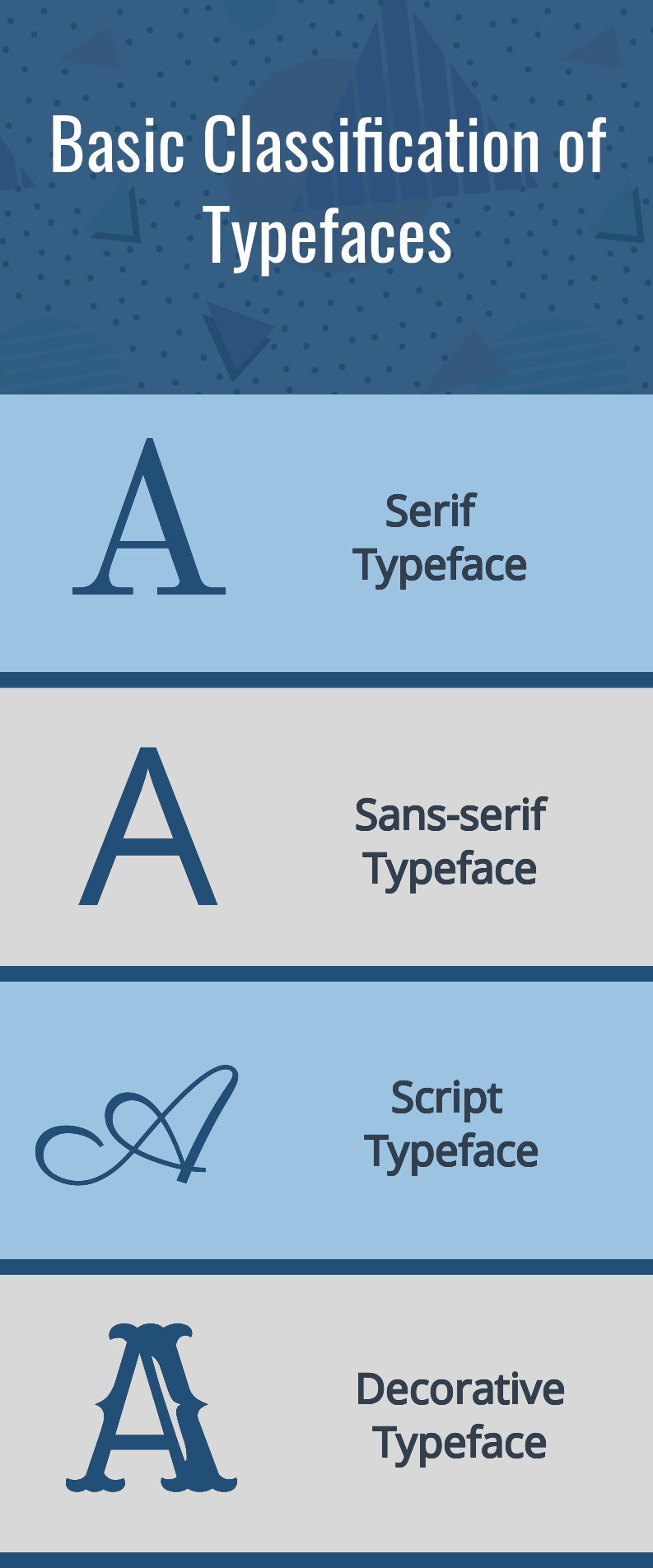
The typeface classification is based on Serif, Sans-Serif, Script, and Decorative.
Serif: This is a typeface in which small ornamentation appears in a way where the end strokes protrude outwardly. Serifs are convenient to use as the viewer’s eyes can follow the extended end-strokes of the letters, making them readable. Hence, this advantage makes serifs to be an ideal font to use in the body text.

Get This Template and More
Sans-Serif: Unlike Serifs, the fonts appear as blocks without the extended end-strokes. The fonts in the sans-serif family are extremely popular and can be used to express many kinds of messages. It is not only used for titles but can also fit well in the body text. The typeface is convenient for the viewers to read, even if the fonts are smaller.

Get This Template and More
The serif and sans-serif font combinations are perfect for creating a typography layout. For example, check out the Food X/Twitter Header Template below.

Get This Template and More
Remember this key point if you are new to typography and seem clueless about font combinations.
Script: It is a typeface that looks like handwriting and comes in many cursive styles. It tries to capture the personalized writing patterns that have the essence of calligraphy. These fonts are selectively used, often as titles and short notes, as they might obscure typeface readability.

Get This Template and More
Decorative: It is a typeface that applies a style to characters. It includes all creative fonts that have a distinct personality. Often the looks and first impression of these fonts automatically determine their role in the visual design. Moreover, it is limited to headings and is cautiously used in the body text based on the design.

Get This Template and More

Get This Template and More
Typeface Design Guidelines
The basic rules of typeface combinations are to pair sans-serifs with serifs. But if you have a keen creative sense, explore typefaces.
If not, these basic guidelines will help you create your typographic layouts, boosting the visual marketing designs.
x-height
This is an important element that is related to typeface readability. More commonly, x-height can be defined as the overall height of the lowercase fonts. So, the next rule for typeface pairing is to match the x-heights of the different fonts. This will make the design look balanced and well-synced. Maintaining the x-height rule will also ensure that you choose fonts from typefaces that will be compatible.
Typeface Stroke Contrast and Thickness
Different typeface designs have different combinations of stroke contrast and thickness. Hence, while font-pairing, make sure that the difference between the contrast and thickness of two different fonts is not extreme. Also, similar font contrast and thickness will take away the design impact and might make it look bland. So, maintain the balance. Another tip that you must remember! Keep the fonts with thick strokes as headings and thin strokes as the body text.
Typeface Moods
Typeface determines the tone of the message and helps to enhance the impact of the visual design. So, the fonts need to be combined carefully. If your marketing design involves a serious message, sans serifs and serifs are typically combined.

Get This Template and More

Get This Template and More
If you have a more playful and creative visual marketing message, use fonts from the decorative typeface. You can combine this typeface with serifs or sans-serifs.

Get This Template and More

Get This Template and More

Get This Template and More

Get This Template and More
Finally, if you aim for a casual message, you should opt for a script typeface. Even in this typeface, you can combine serif or sans-serif typefaces. But, try not to mingle decorative typeface with script typeface unless confident about your choice. Also, both these typefaces release a distinct mood and tone to the viewers.

Get This Template and More

Get This Template and More
Color Combinations
I often struggle to maintain the color combination rules, as the arrayed colors sway me away. But that is the point! Many colors can be confusing and overwhelming. So the basic rule is to select colors of the font that are contrasting with the background. A perfect example is the classic black-and-white combination.

Get This Template and More
For beginners, you can use dark color fonts against light backgrounds and vice-versa.

Get This Template and More
Check out the best color combinations and how to use them in your design for a detailed guide.
Typeface Brand Guidelines for Marketing Visual Designs
Now, let’s see how typefaces can be used to create stunning posters, flyers, social media posts, and web banners. To better understand these concepts, check out the creative document templates available in DocHipo.
Poster Artwork Typeface
Get This Template and More
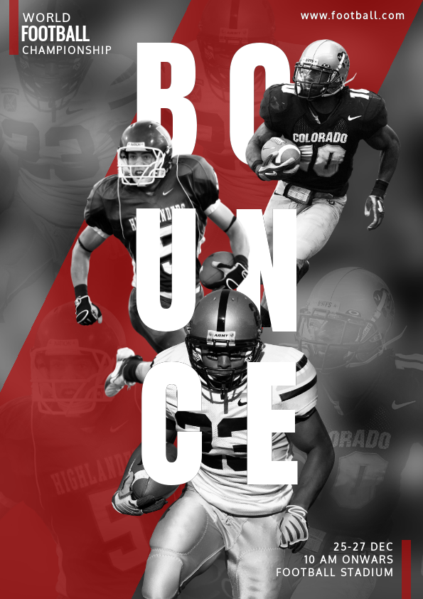
What indirect message and feel do you get while watching this poster?
Simple! The feeling of playfulness.
The background has set the mood and, most importantly, the placement of the font. The text, “BOUNCE,” is in “Anton” font, a modified version of sans-serif. The block-like font design immediately transfers the feeling of sturdiness, and the letter placements bring a bouncy effect. The other fonts include “Oxygen” and “Oswald,” all under sans-serif typeface. You will notice that the text “RUGBY” has bolder strokes for quick visibility. Here the combination of different fonts and the manipulation of font thickness creates the desired effect. Now, let’s check the color of the fonts. The white font against the background makes the poster readable and aesthetically pleasing. As the typeface is sans-serif, the x-height is completely in sync.
Further Reading
Flyer Artwork Typeface

Get This Template and More
Flyers are all about marketing messages. Hence typography plays an important role in the creation of an attractive flyer.
In this flyer, the typeface is primarily sans-serif, as it can be read even if the font size is small. The dominant font of this flyer is “Open Sans.” This font reflects a professional tone to the message, setting the brand’s identity. The front and back of the flyers have a color combination of yellow and black, with white dominating the text body. The font colors are in the same color scheme to maintain the tone of the flyer. The space in and around the texts ensures clear readability.
Social Media Marketing Typeface

Get This Template and More
Social media posts are an important marketing strategy. Hence the visuals need to grab attention and quickly transfer important clues immediately.
The fonts in this social media post have been placed strategically, with the keynotes highlighted by the yellow background. The font combinations are “Oswald,” “Parisienne,” and “Open Sans.” Here both “Oswald” and “Open Sans” are of sans-serifs typeface, and “Parisienne” is of script typeface. Hence, you can see how the sans-serif and script typefaces combinations make the visual design look gorgeous. The fonts maintain the color contrast against the backgrounds, making the visual quick to read. The x-height has not been entirely maintained due to the script typeface. But the font of the word “Istanbul” gives the text a distinct character and emits a casual touristy vibe.
Web Banner Design Typeface

Get This Template and More
Social media banners project your brand personality. Hence banners are potential gateways for your clients to engage with your business.
This banner has a clear mingle of serif and sans-serif typefaces. The fonts used are “PT Serif” under the serif typeface and “Open Sans” under the sans-serif typeface. These typefaces are placed alternatively, strikingly bringing out a clear message without overloading the visual with unnecessary fonts. The serif and sans-serif typeface have similar x-heights, making their combination look stable. Also, the font thicknesses are balanced to appear comforting to the eyes. The font colors contrast white and deep pink against the two different shades. This soothing visual resonates with the tone of the brand and the business.
Conclusion
Are you still stuck with the typeface terminologies and guidelines? Then don’t worry! DocHipo is here for you.
You must sign up and download your templates for free without bothering much about the typeface. Also, if this article has awakened your innate creative abilities, you can make a visual design from scratch in DocHipo.


