
Typography in Graphic Design: A Complete Guide with Examples

We often hear catchy slogans in advertisements and appreciate fantastic lines in social media posts. However, we need to consider the typography involved in the text. Typography is the arrangement of text in any design that enhances the appeal for the viewer.
It’s a canvas for a designer’s imagination and creativity, breathing life into words. So, if you want to be inspired and bring life to your words, let’s explore typography in graphic design.
Typography in Graphic Design
Typography refers to arranging text to be readable, legible, and aesthetically pleasing to the viewer.
- Elements of typography: Typeface and fonts, line length, leading, tracking, and kerning.
- Importance of typography: Accessibility, creating visual hierarchy, establishing brand identity, drawing attention, setting the tone, and creating aesthetic appeal.
- Principles of typography: Legibility and readability, contrast, hierarchy, color, rhythm, alignment, proximity, consistency, and white space.
In this comprehensive guide, delve into the world of typography in graphic design. Discover the crucial elements and principles that form the foundation of effective typography. Explore template examples demonstrating these principles in action for various purposes and effects.
Additionally, learn best practices to elevate your typography skills and uncover common mistakes to avoid, ensuring your designs are flawless and impactful.
Table of Contents
What is Typography
Typography refers to arranging text to be readable, legible, and aesthetically pleasing to the viewer. Creating typography is an art that involves various things, such as font type, typeface, and visual appeal.
When you have to define typography in graphic design, it plays a crucial role in both print and digital media. It affects a design’s overall look and feel and how effectively it communicates its message to the audience.
What is Typography in Graphic Design
If you are a newbie at designing, you may ask yourself, “Is typography the same as font?” Not at all. The definition of typography in graphic design refers to the particular style of the type, such as size, thickness, and weight. Typography in graphic design is the combination of typestyle and typeface that complements a design.
Combining design and typography does not necessarily require creating a new font. Instead, you must select from pre-existing typefaces like serif, sans serif, script, or decorative, along with the point size, and align the type with different design elements. It sounds like a lot of work, doesn’t it?
Don’t worry; you can easily create beautiful designs using professional templates with charming typography using graphic design tools like DocHipo, even with zero design experience.
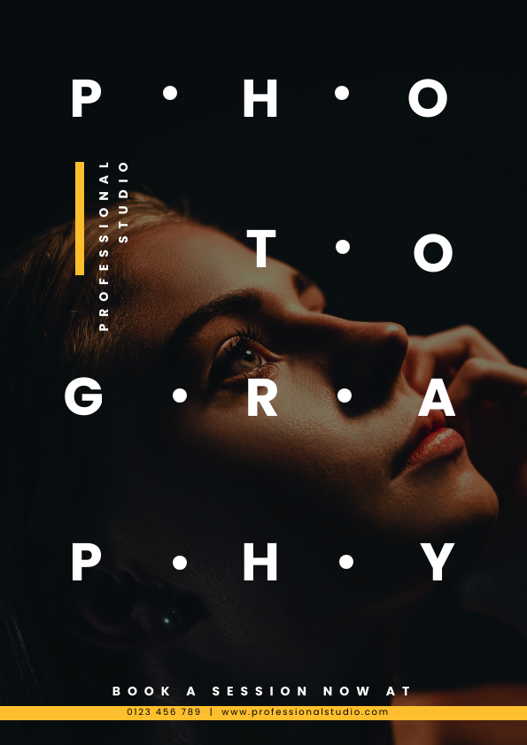
DocHipo takes the weight off your shoulders with pre-designed templates for every purpose. For inspiration, here is a typography design for the 4th of July Post ideas.

Get This Template and More
Why is Typography Important in Graphic Design
In graphic design, everything revolves around the visual perception of all the elements in the design. Therefore, instead of simply writing the text, you dress it according to the theme. After understanding the definition of graphic design typography, let’s understand why it is essential.
Let’s consider one of the typography design examples from Invitation Templates, which creates hype for the pizza party. When you read the type in this invitation, the visual voice of ‘pizza party’ sets the excitement.

Get This Template and More
Typography establishes the premise for any design and informs the viewer. Let’s find out why typography is essential with some graphic design typography examples.
Accessibility to the Message
Typography ensures the legibility of the text in the design so that the message gets across to the audience. However, lousy typography can ruin the design and give the wrong impression. Using appropriate line and letter spacing along with a suitable font style can help with the readability of the type.
Take inspiration from this design’s graceful and minimalist typography from Facebook Event Cover Templates, which is ideal for conveying the wedding mood.

Get This Template and More
Create Visual Hierarchy
Creating a typography hierarchy simply means dividing the text copy into heading, sub-heading, and body text, thus giving weightage to the most critical information in the design. For example, a design from Square Post Templates illustrates different text hierarchies. Observe how specific words catch your eye in the design due to variations in fonts, sizes, colors, and strategic placement, forming a hierarchy.

Get This Template and More
Establish Brand Identity
Undoubtedly, the importance of typography in branding lies in bringing out the brand’s personality. Typography is critical in branding, reflecting and enhancing the brand’s identity. Your brand archetype can be fun, professional, friendly, or caring.
For instance, observe these two Flyer Templates to get a better idea of how typography dictates different brand personas.

Get This Template and More
For easy access to the brand assets for your team, you can save all the important elements with DocHipo’s brand kit. Check out this video to know more.
Draw Attention
Most viewers skim through a page full of words, especially on the web. We have a handful of things to arrest the viewer’s attention with images, colors, and videos. However, when it comes to the text, typography helps to break the monotony of words.
For instance, look at this design from DocHipo Poster Templates and observe how typography draws attention to the mega sale.

Get This Template and More
Here is another example of an educational flyer where typography helps to highlight the most crucial information with a glance.

Get This Template and More
Set the Mood and Tone
Making your type visually appealing is not just about adding beauty. You can express much more with the flair of your fonts imbued with thematic icons. For instance, look at this spooky Facebook post template where typographic and illustrative text together resonates with the theme of Halloween.

Get This Template and More
Further, aligning the typography with the meaning of the text enhances the effect on the viewer. To illustrate, here is a pleasant design from Tumblr Graphic Templates.

Get This Template and More
Create Aesthetic Appeal
Good typography is like the cherry on top of your designs. When you have ornate typography, you don’t have to do much; just place it with a suitable image and have an appealing design. Here is a design from Pinterest Graphic Templates with an aesthetic typography. Observing the flair of typography enhances the overall appeal of the design.

Get This Template and More
Elements of Typography
Before you work with typography in design, it’s essential to define typographic rules in graphic design. Typography elements will help you structure your type copy better to create professional designs. In this section, we have illustrated all the terms with good typography examples graphic design using Card Templates from DocHipo.
Typeface and Fonts
Typeface and fonts form the body of your text copy in the design. Many of us use both terms interchangeably, but there is a difference between typeface and font. Here is a typeface Roboto with multiple Roboto font styles for better understanding.

Line Length
Line length refers to the width of the design’s text block. First, we need to define body text/copy in graphic design. Determining the line length gives the lines of text a definite structure and helps distribute the text’s weight according to the design. For example, look at the text copy aligned in the confined space on this Christmas card.

Leading
Leading is the space between two lines in the text. Properly leading the text makes it more legible for the viewer. As this Birthday Card illustrates, the lines’ leading will differ depending on the text’s point size. Note that while measuring the leading, we always consider the distance from one baseline (the imaginary line on which the text rests) to another between two parallel sentences.

Tracking
Tracking refers to the space between two letters in a word. Manipulating the tracking space helps the typography breathe into the design. For inspiration, look at the Thank you card design to understand tracking better.

Kerning
Kerning is the space between individual letters in the type. Usually, you need to manipulate kerning in the heading of the text where you have arranged the letters creatively. For example, here is a Valentine’s Day card with aesthetically type definition graphic design to showcase kerning.

Principles of Typography in Graphic Design
There is a difference between including a text copy in the document and designing typography. Designing typography in the document involves some design principles that make it extraordinary. You may not use every principle in your design; you must strive for balance and harmony when creating a typography. So, let’s explore these principles and their application with typography graphic design examples.
Legibility and Readability
The legibility and readability of the typography are of the utmost importance. Therefore, you should adjust the line length, kerning, tracking, and leading of the type for effortless readability. Besides these elements, you should consider the type size and type case in the heading and body case.
Notice the typography in this Invitation template design and observe how all the elements ensure legibility.

Get This Template and More
Contrast
The contrast in graphic design helps to divide the viewer’s attention. Similarly, the typographical contrast draws attention to the crucial part of the message. You can create contrast in type by adjusting the size, color, spacing, and font variety. Besides, it also helps to distribute the weight of the text in the design.
To illustrate, here is a fine example of typographic contrast in this Birthday invitation card template. Note the contrasting colors, fonts, and type sizes, creating a vibrant and energetic vibe.

Get This Template and More
Hierarchy
You notice the large and bold text first rather than the smaller body text in a document. That’s because of the hierarchy of the type. The typographical hierarchy refers to the importance of the information in a design.
Look at this corporate flyer template design to understand. Notice how the type, size, and arrangement help readers understand the agenda at a glance.

Get This Template and More
Color
Color is one of the most crucial elements in any design. Different colors evoke different emotions in the viewer, eliciting responses. Thus, when choosing color combinations, always consider the audience, the message, and the aesthetic appeal. In addition, colors in typography also depend on the brand identity.
In typography, colors can make the critical information stand out. Further, you can induce creative appeal to the type by creating contrast with the background elements. For example, notice the richness of colors in the typography of this Facebook Cover template.

Get This Template and More
Rhythm
Rhythm in design refers to the sense of movement achieved with visual elements. It helps to bring harmony and balance to the design. To achieve rhythm in typography, you need to adjust the size, font, space, and colors.
For better understanding, notice the typographical rhythm in this design from Infographic Templates. Observe how the typography helps to achieve rhythm by alternating between colors and text size.

Get This Template and More
Alignment
Alignment may be of little concern for typography but significantly impacts the text’s perception. Properly aligned text gives a professional and organized feel and makes the text body more legible. However, alignment can be tricky for text-heavy documents. So here are a few tips that can come in handy:
- For a lengthy text block, choose left alignment.
- For headlines and small text blocks, you can select a center alignment.
- For numbers and data, choose the proper alignment.
- Adjust leading in the typography for different text formats.
Look at this adequately aligned layout of the Case Study template for inspiration. Also, note the variation in the alignment throughout the document.


Proximity
Proximity in typography means the proximity of the text to other text and graphics in the design. This principle helps the reader perceive some words as group text more than others—proximity and alignment work hand in hand to create harmony in typography.
For example, take this design from Magazine Cover Templates to understand how proximity segregates different text blocks. To adjust the proximity, the manipulation of tracking and kerning in the heading, subtitle, and body text should be observed.

Get This Template and More
Consistency
Consistency in typography is crucial for a harmonious visual appearance. One of the easiest ways to maintain consistency is to limit the number of fonts and use the same typeface for the heading, subheading, and body text throughout the design. In addition, the typography should also have consistent alignment and proximity.
Observe this design from Brochure Templates to understand how consistency brings a balanced look to the document.
White Space
Cluttered designs cause viewers to feel uneasiness. Therefore, your design elements require ample breathing space to have a calming effect. White space in graphic design for typography involves strategic placement of the type with ample kerning, tracking, and space beyond the line length.
Take a look at this simple design from Large Rectangle Ad Templates. With all the text aligned in the center, the ad has a clean appearance and a concise message. The evenly spaced letters manage the white space while creating a symmetrical look.

Get This Template and More
Examples of Typography in Graphic Design
Typography is everywhere; you just need to observe typography in various designs. We have brought some creative typography ideas for different purposes. These template examples will help you to understand how to create the right mood for your designs. So, let’s dive in to find some eye-catching typography examples.
Typography for Posters
Posters are handy for attracting an audience at a location. They are also powerful tools for advertising, informing, communicating, celebrating, or promoting an event. Nonetheless, making a poster with striking typography is tricky in all cases.
Besides, poster typography should be catchy and visible from a distance, informing the audience about the theme at once. So, here are two Poster Templates with stunning typography.
In this Music poster design, the large type occupies most of the background, creating intrigue for the audience.

Get This Template and More
Look at this Birthday poster with camouflaging typography, which helps create a hierarchy with contrasting colors. You can also use this template design to incorporate thematic elements portrayed within the design.

Get This Template and More
Typography for Logo
The typography in logo design must be legible and thematically on point, leaving a mark on your audience. Typographic logos leave a lasting impact while getting your message across. However, creating a logo design while experimenting with typography requires mastery of typeface logo design. Besides, you should be mindful of the size of the typo logo when you make a typography logo. Let’s explore some typography logo ideas.
For example, this logo template’s typography projects the brand colors to complement the graphical illustration. Also, when designing a brand, you should always refer to the brand assets and consider different ways to incorporate them into the typography logo design.
Get This Template and More
You can use DocHipo templates for typography logo creator. While creating your logo, avoid any logo typo. Incorporating thematic icons is another way to add a creative touch to your with the help of typography logo maker. Look at this stylish typographic and illustrative logo together that imitates brush strokes.
Get This Template and More
Typography for Books
After looking at various typography logos, let’s look at some book cover typography ideas. A striking book cover on a shelf full of books compels you to explore the story. Typography can help you drop a hint about the book, making the reader curious. Nonetheless, your type on the book cover should resonate with the genre of the book.
Look at this love storybook cover design, which features simple and cute typography. Notice the imperfections in the font, which give the design a handmade feel.

Get This Template and More
Some book covers bring very picturesque images in which you can place the typography. Here is a typography design with contrasting alignment and fonts to inspire you.

Get This Template and More
Typography for Magazines
Magazines have vibrant graphics and offer a variety of font pairings. Therefore, creating a hierarchy and contrast between text groups is imperative to keep the design organized. Designing a magazine cover requires meticulous attention to design principles to ensure everything is clear.
Rather than discussing the details of magazine typography, it’s better to show you these Magazine Cover Templates.
Take a look at this Wildlife magazine cover typography. Notice the text’s layering and the blue and gold color combinations complementing the image.

Get This Template and More
Here is another template example of a Travel magazine cover. Notice the use of white space and text placement to create a bold effect.

Get This Template and More
Typography for Web Banner
Web banners offer you opportunities to express and highlight your profile. Although they come in various shapes and sizes, every banner contains minimal text. Yet, creating a web banner with attractive typography will help set your viewers’ mood.
For example, take this X/Twitter header template, which is perfect for travel enthusiasts. This design uses a casual tone with font and beach icons to create a beach vibe in the typography. Also, the alignment and design elements have a sense of rhythm. Overall, the copy sets the mood for a relaxed vacation.

Get This Template and More
On the other hand, this YouTube banner brilliantly uses white space in typography, creating a sense of balance within the design. It’s clean and on-point, clearly telling the viewers about the page.

Get This Template and More
Typography for Social Media
Social media platforms offer a highly visual medium; the more you show, the more you catch attention. Minimal yet striking text can help you connect better with your audience. It’s all about the art of visual storytelling that helps to evoke the intended sentiments. So, let your creative juices flow through your feed when you upload posts and stories. But first, let’s look at these template examples for your social media posts.
Look at this Facebook post template and observe the illuminating typography that captures the mood for Diwali. Nonetheless, the type complements the illustration in the design, too.

Get This Template and More
This design from Instagram Story Templates creates an exciting design that, too, is without any image. The typography celebrates Father’s Day with an organized alignment and easy-to-read text. Despite text-centric graphics, you can feel the warmth of the design—minimal yet impactful.

Get This Template and More
Typography for Advertising
In advertising, you must use captivating typography that explains the message well. You can choose a simple text with a plain background or incorporate typography within the image. Take this design from Large Rectangle Ad Templates, for example; look at the play of lines in this typography. Also, the contrasts and use of white space enhance the appeal of the ad design.

Get This Template and More
Here is another example of typography embedded within the picture’s white space. Look how the text pairs well with the image using the colors in the Facebook ad. Also, the typography colors and fonts in the ad encourage a binge-worthy experience.

Get This Template and More
Before creating the typography for your ad, you need to look around and observe how ads in your niche use typography. Note the type, colors, and other details that help retain familiarity within the typographic design.
Handwritten Typography
Handwritten words convey a sense of personal touch and uniqueness, making them stand out in design. They are particularly effective when aiming to evoke the playful spirit of childhood in typography. Some template examples illustrate handwritten typography, which is ideally suited for the education industry.
Consider this design from the Tumblr Graphic Templates library: the typography incorporates the textures of chalk and blackboard, creating a relatable and nostalgic feel for the audience.

Get This Template and More
In this design from Facebook Cover Templates, the disoriented typography imitates the handwritten appeal of a child’s handwriting. Nonetheless, the typography uplifts the design, bringing attention to the child’s learning.

Get This Template and More
Vintage Typography
Some styles always stay on trend, like old-school vintage, which always brings back memories of the good old days. The vintage typography exudes sophistication with compelling typefaces and timeless elegance.
Experience the grandeur of this design from Instagram Ad Templates, showcasing a medieval example typography with its elegant and decorative font style.

Get This Template and More
Here is another vintage font in the X/Twitter header, this time in a decorative font style that conveys a sense of nostalgia, authenticity, and timelessness.

Get This Template and More
Modern Typography
Unlike vintage typography’s aesthetics, functionality and minimalism inspire modern typography designs. Sans-serif fonts aligned with simplicity are the hallmarks of contemporary type, which aims to exhibit professionalism and objectivity.
For a better understanding, consider this typography from Zoom Background Templates with ample white space and orderly proximity of text from one another. Such typographic design examples are ideal for backgrounds, causing the slightest distraction to the viewer.

Get This Template and More
Look at another example from Presentation Templates and notice the futuristic appeal of the design emphasizing innovation.

Get This Template and More
Elegant Typography
Elegant typography offers much room to style your type and add creative elements. The type displays the extravagance of swirls and loops, creating iconic typography. Especially if you wish to uplift the mood, elegant copy designs have a calming effect on your viewers.
Consider this Thanksgiving post from Facebook Post Templates. Observe the smooth calligraphic strokes accompanied by autumn imagery.

Get This Template and More
Check out this Instagram post featuring typography inspired by the festive occasion of Eid.

Get This Template and More
Typography Best Practices
After going through several examples of typography, you are ready to apply your skills. Before you jump onto designing, there are some things that you need to take care of. So, here are the best practices for typography in graphic design.
Choose the Right Typeface for Your Purpose
First of all, you need to understand the purpose of your design. You need to ask a few questions to get the clarity about your content:
- What is the format of the design? (poster, flyer, social media post, advertisement, etc.)
- Who is your target audience?
- What will be the tone of your copy?
- What kind of mood or vibe do you want to create?
Based on your questionnaire, pick a limited number of typefaces (typically 2-3) to maintain consistency.
Balance the Typography Principles
We have listed various principles of typography that might seem daunting to you as a beginner. You can use pre-designed templates with attractive typography to make your job easier. Or, as a thumb rule, focus on legibility and white space for a clean typography design.
Optimize Line Length
The line length should extend to only some of the document. Keep the text block confined to a space while maintaining adequate distance between other design elements.
Limit the Number of Fonts
Using too many fonts for your typography design can cause an imbalance. Thus, limit your design to two to three fonts, creating a clear information hierarchy.
Fine-Tune Kerning and Tracking
While designing, consider minor details like kerning and tracking to create harmony. By manipulating the kerning and tracking in various type sizes, align all the text within the line length.
Consider Font Licensing
After creating beautiful typography, you would want to retain the fonts’ uniqueness. Thus, consider licensing your fonts to avoid misuse and protect the designers’ rights. There are different types of font licenses for desktops, websites, apps, e-books, servers, etc.
Common Typography Mistakes
Despite following the best practices, you may need to correct typographical mistakes. Take a quick look at some of the most common mistakes to avoid them while designing:
- Choosing out of the place or mismatched typefaces.
- Using too many fonts.
- Neglecting readability of the fonts.
- Ignoring typography hierarchy.
- Poor alignment and spacing.
How to Choose Typography for Your Brand
Crafting a perfect typography in graphic design can take years of practice. Meanwhile, you can design with DocHipo templates and choose from various designs that suit your purpose. Sign up with DocHipo and create a layout graphic design with typography within minutes.
1. Choose a Template
You will land on DocHipo’s homepage as soon as you sign up. Here, search for the document format you wish to create.

Find templates easily in DocHipo.
Now, choose your niche industry in the template categories.

Choose a template to customize in the DocHipo editor.

2. Customize the Template
In the editor, you can use various design widgets to edit the template of your choice. You can customize your text, font, type size, etc.

You can also upload your custom and brand fonts in the editor to make your document on brand every time.

Learn more about custom fonts in DocHipo.
You can experiment with many more text customization options, such as arranging widgets, letter spacing, and adjusting opacity.

Align your typography with precision in the DocHipo editor. Watch this video to learn all about arranging widgets in your designs.
Moreover, if you want to copy the style of a text to another in your document, you can do it quickly. Explore the copystyle feature in the DocHipo editor and transform any text in the design.
In addition, you can add creative text effects, gradient colors, and mixed colors to make your text vibrant.

Watch this video to learn more about mixed color effects.
Further, explore gradient color in DocHipo.
3. Download Your Design
After customizing your design, you can download the document by clicking on the three dots in the upper right corner of the screen.

Now, choose the document’s format and download your design with a single click.

Watch this video to get started with DocHipo.
Wrapping Up
In this guide, we explored the fundamental concepts of typography in graphic design, including its definition, elements, and principles. We delved into practical tips for designing typography and common mistakes to avoid. The template examples illustrate how you can apply the principles in real-world scenarios.
Remember that practice and experimentation are essential as you refine your typographic skills. However, you can kickstart your journey with professional templates until you master the skill of typography. So, sign up with DocHipo without further ado and create professional designs for your brand today.
FAQs
What are the three types of typography?
The three types of typography are headline, subheading, and body text.
What is an example of typography?
One of the most common typography examples is Comic sans, a sans serif typeface modified into a casual typography.
What does typography involve?
Typography majorly involves font size, typeface, spacing, and alignment.
What are the four rules of typography?
The four rules of creating any typography are:
- Choose the suitable typeface for your purpose
- Balance the typography principles
- Limit the number of fonts
- Fine-tune kerning and tracking
What are the three elements of typography?
Typography elements include typeface and fonts, line length, leading, tracking, and kerning.
Is typography a logo?
No, typography and logo are different. However, typography can be a logo of a brand.
What is the use of typography?
The typography in a design helps with accessibility, creates visual hierarchy, establishes brand identity, draws attention, sets the tone, and makes aesthetic appeal.
What is typography classification?
Here are the classifications of typography– serif, sans serif, script blackletter, monospaced, and display.
What is the format in typography?
Formatting in typography includes various things like font, point size, typeface, alignment, and spacing.

