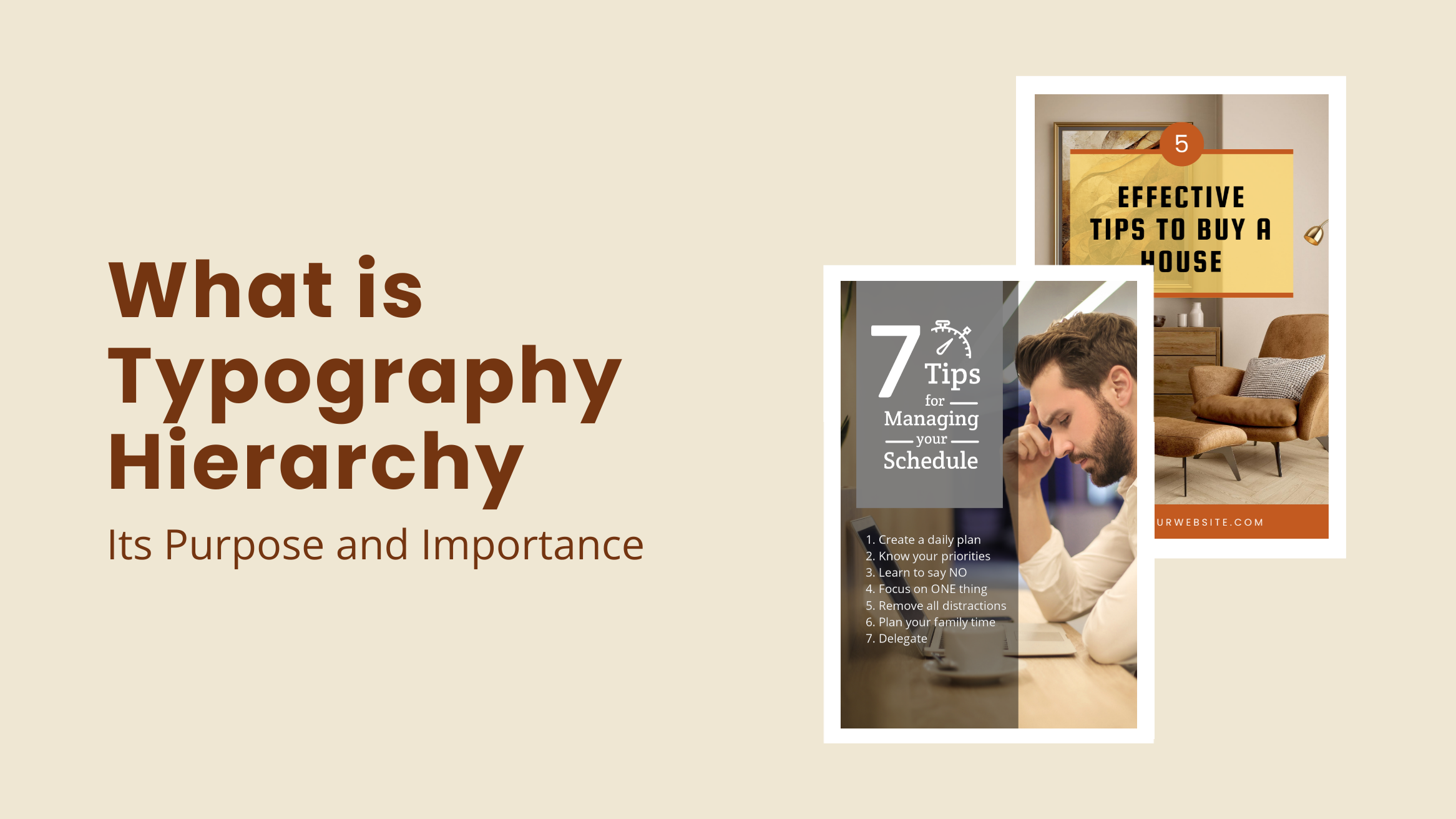
What is Typography Hierarchy: Its Purpose and Importance

Typography plays a vital role in conveying information via posters, flyers, infographics, and other documents. While plain old text is enough to convey information if you are looking at making your information visually appealing and, more importantly, super easy to understand, it is not enough. Welcome to the world of typography hierarchy!
What is Typography Hierarchy
- Definition: Makes designs readable according to the different levels of importance in information.
- Engage Audience: Communicates crucial information quickly.
- Grab Attention: Highlights key messages effectively.
- Set Tonality: Affects audience mood with font choices.
You might wonder why we should emphasize typography hierarchy and what role it plays in graphic design. We’ll answer all that in this post with stunning templates from our library. Furthermore, you’ll understand how to create a typography hierarchy in your documents.
Table of Contents
What is Typography Hierarchy
While the word ‘Hierarchy’ may have a little formal connotation attached to it, it simply means (in the graphic design world) attaching different levels of importance to your information to make it easy to understand.
How? Look at the following Corporate Flyer Design. The headline offers the most important piece of information, the one you want your audience to notice at a glance. The subheading then offers more details, and the text offers supporting information.

Get This Template and More
Why is typography hierarchy important? The human brain is hardwired to recognize structure, patterns, and logic. In the 1920s, a group of German psychologists studied this and developed Gestalt’s principle of perception. According to this study, human beings perceive information better or connect with any message better when visually structured.
The hierarchical division of text can help achieve exactly this. Typography hierarchy helps you in achieving three important things:
- guiding the users to look for a particular piece of information
- establishing order
- the systematic layout of typography, size, and font
Displaying typography hierarchy helps prioritize the information and serves as a reading or scanning guide for the readers.
Purpose and Importance of Typography Hierarchy
Typography hierarchy has more crucial roles than making your text look interesting and creative. Read below to understand what they are.
1. Engage Audience and Grab Attention
Today, we are living in a world of information overload. Most people do not have the time or inclination to go through every word of any document. The average human’s attention span is only 8.25 seconds. As a result, most of us skim through any document looking for the most important information. If that is something that we are interested in, we read further.
Typography hierarchy helps you communicate what’s most important. This is crucial for engaging your audience and grabbing their attention. It is vital for documents like posters, social graphics, or flyers where you need to communicate ideas or information to an audience who are probably just browsing through.
Using a clear hierarchy of information will help you engage with the audience here. Look at this DocHipo Template below:

Get This Template and More
Bigger and bolder fonts are used here to convey the primary idea (i.e., Christmas Fair), and smaller fonts are used to share the finer details. The typographic chemistry is created to intrigue the audience by shouting out the primary message and giving more details.

Get This Template and More
2. Set a Tonality for Your Document
A study by Kevin Larson and Rosalind Picard shows that typography can certainly affect the mood of your audience. Therefore, you can very easily set the tonality of your message via typography hierarchy. Look at these DocHipo templates below:

Get This Template and More

Get This Template and More
The above two templates show us how fonts set the mood of the content and help you connect with your audience. The template on the left is a cool travel guide and thus uses a playful font style. The right-hand side is from our Education Facebook Cover Templates. The style of typography on it matches the corporate look and feel.
Provides Context
Typography hierarchy not only makes your text more readable but also gives context to your content.
In the text below – the readers cannot determine which text to focus on. Either the reader will take the pain to go through the whole content without knowing what it is exactly about, or the reader will not go through it at all.
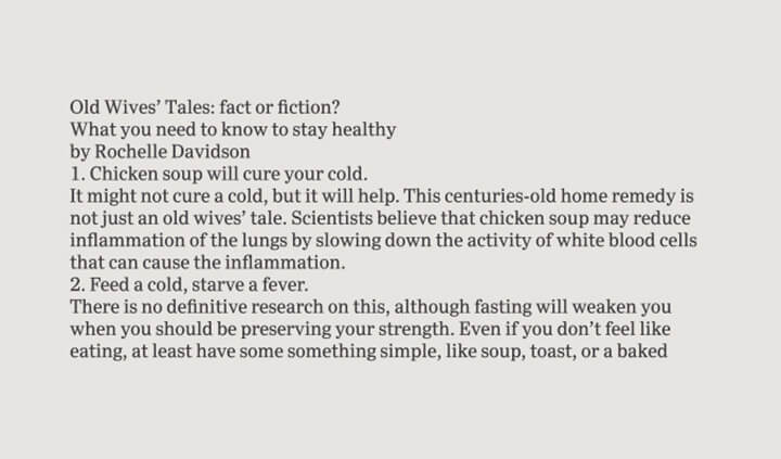
Now, let’s create some hierarchy with typography here.
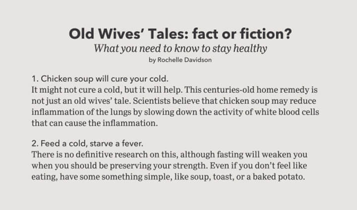
The same content but a much better context!
The title, subheading, and body of the text are separated from each other with the use of different fonts, and it keeps the readers interested. The bold heading will give the readers an idea about the nature of the information in the content.
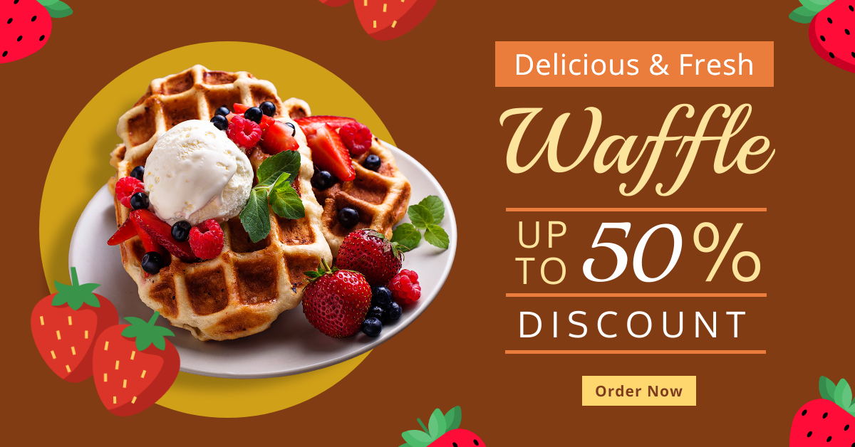
Get This Template and More
How to Create Typography Hierarchy in Your Documents
Well, it’s not rocket science; with some tips and a little practice, you can be a pro too! Here are some simple yet effective ways to create a hierarchy in your documents!
Font Size
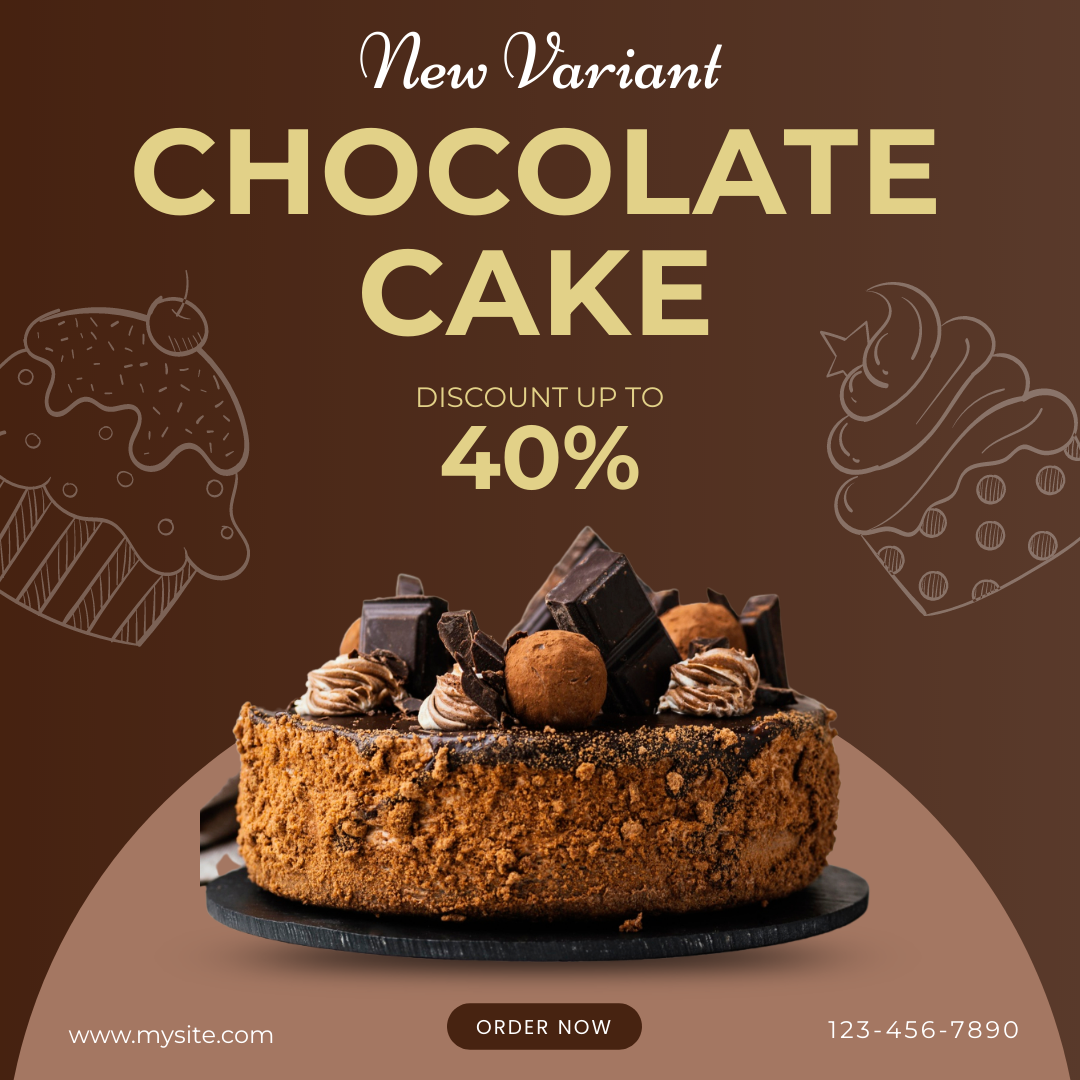
This is a no-brainer. Bigger, bolder fonts have always been used to highlight the most important information. While you can use distinguishable fonts for headings and sub-headings, you can also use them to assign importance within a single line of text.
Get This Template and More
See how the word ‘CHOCOLATE CAKE’ is in a bigger font, followed by ‘40%’, to attract attention and intrigue the audience here.
Font Type
Often designers mix and match font types to create awesome visual chemistry. You can do that in order to create an information hierarchy and add more context to your documents.
Look at the Beauty Instagram Ad Template below for how the designer mixes sans-serif and script fonts for such a sophisticated and professional look.

Get This Template and More
Similarly, the Christmas Facebook Ad Template below showcases a perfect blending of serif and cursive fonts to create not just a great design but also to create context and assign importance.

Get This Template and More
Font Colors
When assigning context or importance to your content, colors, too, can play a vital role. However, a little bit of caution… Using too many colors can make the design look chaotic. The best choice is to create a color scheme and stick to it.
See how these DocHipo templates below use colors in typography to highlight particular words.

Get This Template and More

Get This Template and More
How to Marry Design and Typography is an interesting read you’ll love.
Further Reading
Conclusion
No matter what kind of document you are designing, the goal is always to make it more readable and easy to digest for your audience. And typography hierarchy plays a vital role in it. Whether using a template from DocHipo or creating a design on your own, using different font sizes, styles, and colors can give the much-needed context to your message. Sign-up to DocHipo today and explore the stunning templates to transform your documents. DocHipo is free to get started!


