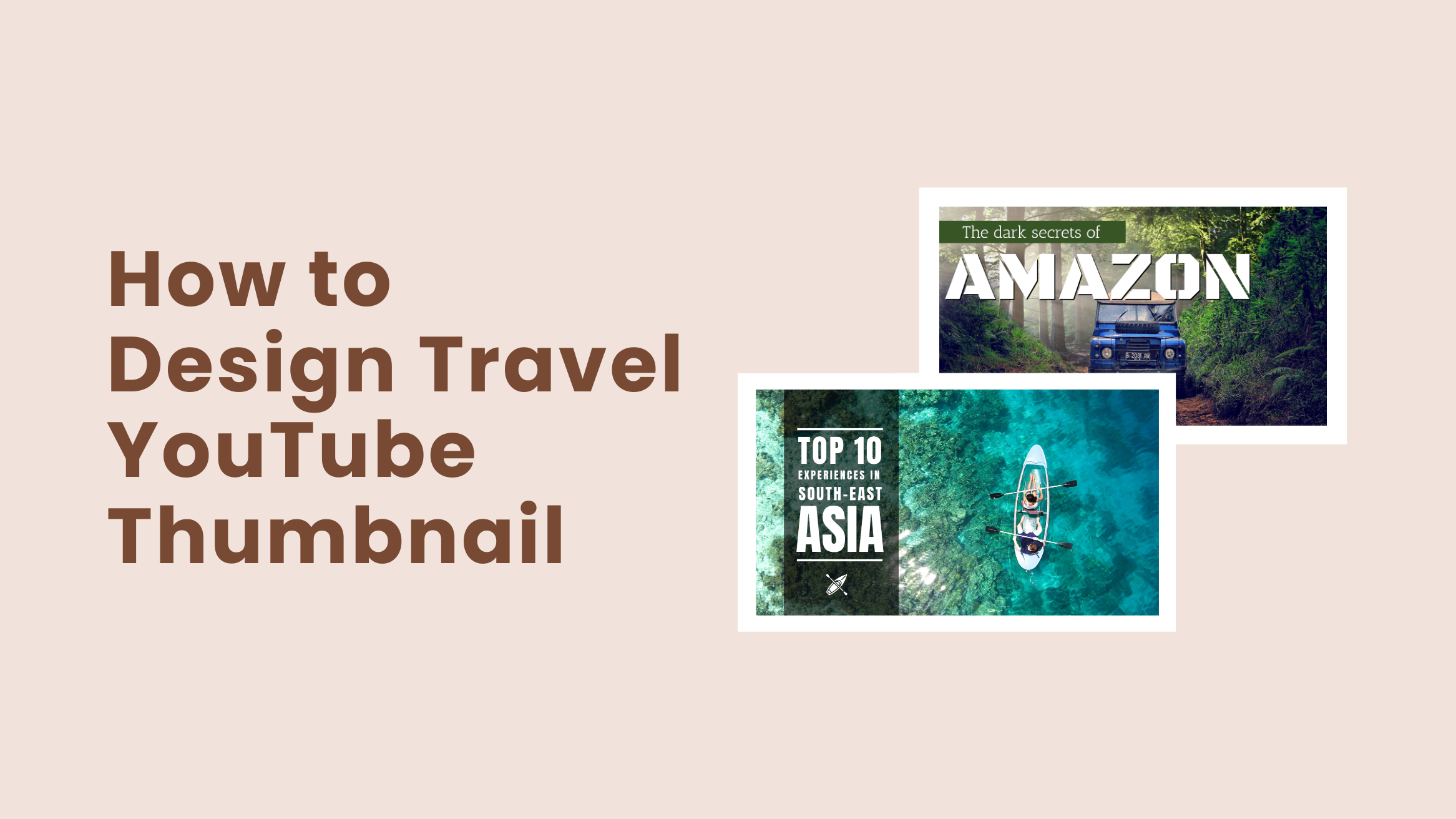
Learn How to Design Travel YouTube Thumbnail in 2025

Maybe you are uploading the most exciting videos on your travel YouTube channel that are far better than your competitors but still not getting the views they deserve. The culprit behind this can be your YouTube thumbnail. If you are using a simple freeze-frame to tell viewers what the videos are about, your hours of hard work will go in vain. Therefore, you should be serious about travel YouTube thumbnail design for your channel.
How to Design Travel YouTube Thumbnail
- Include Title Text: Add a brief title text to your thumbnail to help your viewers have an idea of what’s inside.
- Choose The Best Font Style: Use bold fonts that make your title text clear and easy to read.
- Choose The Right Colors: Choose contrasting but unique colors to draw attention.
- Create A Contrasting Background: Use contrasting backgrounds to make the text stand out.
- Use a Relevant and Stunning Image: Use a stunning image that helps your viewers relate to your channel.
- Include An Image Of Your Face: Build a strong connection with the audience by including your image with expressions.
With over 2.3 billion active users worldwide and over 1 billion hours of videos being watched each day, YouTube is the second most popular social network and the most popular video-sharing platform in the world. Hence, your videos might be buried in the ocean of other videos from other channels if you can not attract your viewers.
Furthermore, nowadays, one of the most demanding creators on YouTube is a travel vlogger, as people love watching videos of distant places and feeding their travel lover soul. Therefore, if you are a travel vlogger, a travel agent, or anyone with a travel YouTube channel, travel YouTube thumbnail design is a must for you. Keeping that in mind, DocHipo comes with a YouTube Thumbnail Maker.
Continue reading to know more about Travel YouTube thumbnail design and how to design a YouTube Thumbnail in DocHipo.
Table of Contents
What Is A Travel YouTube Thumbnail?
YouTube thumbnail is the small, clickable snapshots that viewers come across before watching a video on YouTube. And the thumbnails that are intended to be used for any videos related to travel or tourism are called travel YouTube Thumbnails. The YouTube thumbnail can be as important as the video’s title as it provides a preview of your video and entices viewers to click through. Here are some other crucial reasons to design YouTube thumbnails for your travel YouTube channel.
5 Reasons Why YouTube Thumbnail Design Is Important
Undoubtedly, YouTube is super competitive. So, you need to find a way out to make your videos stand out from the thousands of hours of videos uploaded every minute. Though creating high-quality and engaging videos is essential, those videos are of no use if people don’t click on them. Even YouTube claims 90% of their top-performing videos have custom YouTube thumbnails. Thus, making it super crucial to design thumbnails for your travel YouTube channel.
Let’s dig deeper into the same to learn more about the importance of YouTube thumbnail design.
1. First Impression
We all have heard the phrase “The First Impression Is The Last Impression” a thousand times in our lives. A YouTube thumbnail is the first thing that viewers see when scrolling through YouTube videos. Therefore, the thumbnail is the only thing that can help you create a great first impression on your viewers. And a study by Forbes shows that it takes only 7 seconds to create a first impression.
Besides being the leading video-sharing platform, Youtube is the second most popular search engine after Google. People watch your videos not because of entertainment but for their knowledge as well. Hence, viewers will look at your thumbnail before reading the title because they are looking for solutions. Thus, making this the most important reason to design YouTube Thumbnails.
2. Keep Up With The Trends
Like any other social media platform, there are trends in YouTube thumbnails as well. However, keeping that in mind, you need to make your thumbnails attractive enough to stand out. For example, there is an ongoing trend where creators put a picture of themselves with some sort of expression on their faces. It makes your viewers curious about your video.
Numerous other trends include images, texts, colors, and many other design elements. Following trends is crucial when it comes to social media. And as a travel YouTuber, designing thumbnails can get the job done for you.
3. Portray Your Content Accurately
This is another critical reason that makes travel YouTube thumbnail design important. YouTube thumbnails help you portray your content accurately so that your viewers don’t get confused. For example, if you don’t use a customized thumbnail, YouTube will automatically pull freeze frames from your video and make it your thumbnail. This way, you might end up showing your content irrelevant to the viewers.
Ultimately, YouTube will not distribute it through the “Recommended Videos” feed, and your videos will become cornerstone content.
4. Demonstrate Credibility and Professionalism
In today’s world, YouTube videos without any custom thumbnails are not imaginable. However, anyone can post videos about anything on YouTube but only the professionals design thumbnails. Thumbnails will make your viewers assume that you are a professional and may be interested in seeing what you are posting.
Since people are looking for answers to their questions, they need someone whom they can trust. For example, you are a travel agent offering holiday packages to the Maldives. If you post your videos of some of your past tours with eye-catching travel YouTube thumbnails, people might immediately click on your videos whenever you post them.
5. Increase Click-Through Rate
According to a recent study by Hubspot, click-through rate is one of the critical metrics that matters the most when it comes to measuring the growth of a YouTube channel. It helps you measure your video’s ability to prompt people to watch your videos after seeing them on the Trending Section, Recommendation Section, or Homepage of YouTube. A high click-through rate means your thumbnail and title were compelling enough to drive your viewers’ eyeballs.
Ultimately, If you are not getting enough clicks and views on your YouTube channel, all your hard work goes in vain. Fortunately, with stunning YouTube thumbnails, you can achieve that.
Travel YouTube Thumbnail Design Ideas To Get More Views
We have talked about why YouTube thumbnail design is essential. Now, we are going to talk about some of the practical Travel YouTube thumbnail design ideas. It will make sure that you can design YouTube thumbnails in DocHipo without any design skills.
Include Title Text
There are many benefits of including title text in your Travel YouTube thumbnail. However, we will discuss how the title text reflects the context of the videos. Since you have a travel YouTube channel, images matter a lot. But they are not going to explain the context of the video.
Adding title text to your thumbnail helps your viewers have an idea of what’s inside. Furthermore, thumbnails come in handy when you want to add more text than you did in the title.
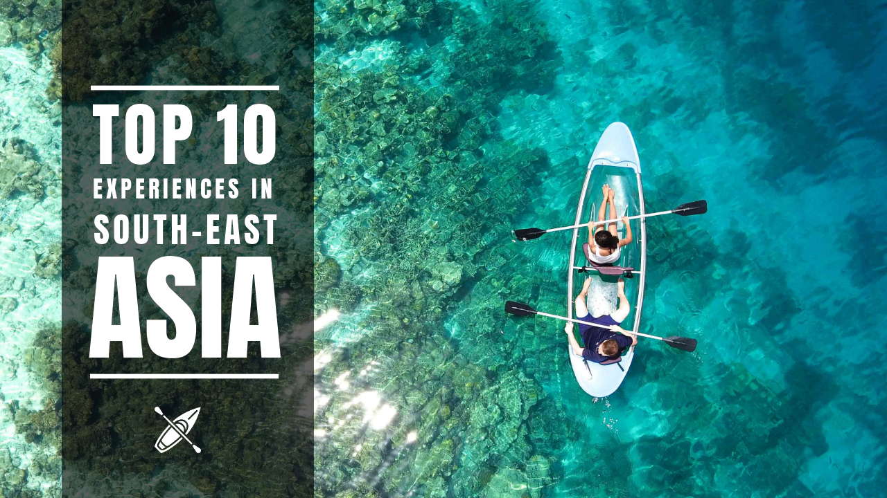
Look at these two YouTube thumbnails. The first thumbnail describes a context, and if you remove the text, then the second thumbnail is still a beautiful picture, but the viewers can not get anything.
With Title Text:

Get This Template and More
Without Title Text:

Choose The Best Font Style
Since we were talking about the title, we should be careful about the font style as well. As we have mentioned before, using title text in the thumbnail ensures that the viewers understand the context. However, if the font style is not catchy and clear enough to grab people’s attention, the title text will not work.
Therefore, make sure that the font you use makes your title text clear and easy to read when your video sits among many others on your viewers’ screen. Avoid using common fonts. Instead, you can use something unique and impressive. It’s always better to give your fonts a bold look. However, as we always recommend, don’t use more than three different font styles in a single YouTube Thumbnail design.
Get This Template and More
Choose The Right Colors
Using the right color combination goes a long way in getting more clicks and views on your YouTube videos. Even colors are the reason behind 60-90% of a first impression. So, you need to be very careful and spend some time choosing the right color combination for your travel YouTube Thumbnail design. This includes using contrasting colors.
When it comes to combining texts and images on your design, contrasting colors can draw the eye in. This makes a crucial impact on increasing the click-through rate since you compete with thousands of other YouTubers.

Get This Template and More
Notice how the blue and white color combination in this thumbnail attracts your attention. If the fonts’ color were anything other than white, it might not look so bright and fresh.
However, please don’t make your travel YouTube Thumbnail design over-saturated so that it looks unnatural and unprofessional. Try choosing your brand colors (If you have any), or consider choosing the colors that complement each other.
Still, if you are unable to choose the right color combination for your thumbnail, this article on the best color combinations will help you out.
Create A Contrasting Background
As we have already discussed, the title text on your thumbnail is crucial, and so is making it readable. Now, we are going to discuss contrasting backgrounds. The primary reason for using contrasting backgrounds is to make the text stand out. Since YouTube is a video platform, undoubtedly, high-quality images are the best to make a stunning YouTube thumbnail background.
Still, it would be best if you chose or edited your pictures in a way that they can create a contrasting background. DocHipo Photo Editor will help you do that easily.
If you look at the two YouTube Thumbnail design templates below, the text on the second template is more readable because of the contrasting background.


Get This Template and More
Click Here to learn about creating stunning backgrounds for your travel YouTube thumbnail design using DocHipo.
Use A Relevant and Stunning Image
As a travel YouTuber, visualization is everything for you to grab the attention of the viewers. Hence, if you use a relevant and high-quality image on your thumbnail, it will act as a demo of your video. Besides, it allows your viewers to relate to your channel.

Get This Template and More
Whether you are posting videos about “Explore New York City” or “Tips for the First Time Trekkers”, in all cases, you need to insert an image to make your travel YouTube thumbnail design more engaging.

Get This Template and More
Include An Image Of Your Face
The best way to build a strong connection with the audience is to include an image of your face with proper expression. This way, you will make contact with them and make them curious to explore the video in-depth. Moreover, eyes are the medium to communicate and read people’s emotions.
Also, we have already mentioned that this type of YouTube thumbnail is a super effective trend for the growth of your channel. Alternatively, you can add pictures of yourself with different poses other than your face but make sure that it perfectly matches the context of your video.

Get This Template and More

Get This Template and More
Mistakes To Avoid In Your YouTube Thumbnail Design
We have discussed the most practical YouTube thumbnail size and design ideas to design the perfect travel YouTube thumbnail for your videos. Now, let’s have a look at the mistakes that you should avoid while designing your thumbnails.
Using Too Much Text
You have probably heard the old proverb “Everything Excess Is Bad”. While a title text with subtitle text is suitable for your videos’ performance, don’t include too much text in your thumbnail. How will you understand that you are using too much text? When viewers can not read the text in your thumbnail at a glance, it’s too much.
You just need to include text to get your point across and nothing more than that. If necessary, you can add a concise subtitle.
Using Small Fonts
I have seen many travel YouTubers and vloggers include smaller fonts in their video thumbnails. They assume that this way, the fonts will not detract from the background image. But what is the use of it if the viewers can not even read the text?
If you don’t want to include text, then it’s absolutely fine. However, don’t try to include small fonts that are not visible enough. It will ruin your travel YouTube Thumbnail Design, ultimately reducing the click-through rate of your videos.
Choosing Irrelevant Images
This is one of the biggest mistakes that YouTubers often make while designing thumbnails. I once came across a YouTube video titled “How To Travel the World By Bicycle”. The thumbnail was a picture of many people cycling in a Road Race!
Therefore, even if you want to use a stand-alone picture for your YouTube thumbnail, always try to choose the relevant ones.
Now you might have understood how to design YouTube thumbnails to stand out from the crowd. So, let’s find out how to design travel YouTube thumbnails in DocHio using the templates.
How To Design YouTube Thumbnail In DocHipo
Designing YouTube thumbnails is easier than it seems with the free online YouTube Thumbnail Maker from DocHipo. Moreover, the beautifully crafted Design Widgets will make your design process super easy. Follow these three simple steps to design your travel YouTube thumbnail.
Step 1: Select a YouTube Thumbnail Template
Sign-up to DocHipo if you haven’t already. Go to the Homepage of DocHipo, either click on the Sign-up button or type your email address to create an account.
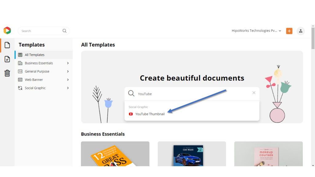
After landing inside the DocHipo application, type “YouTube” in the search box and then click on “YouTube Thumbnail” to go to the YouTube thumbnail templates section.
Click on the “Travel” template category from the many other different categories.
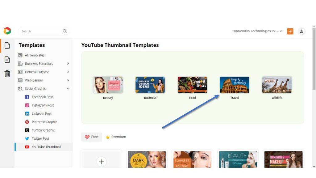
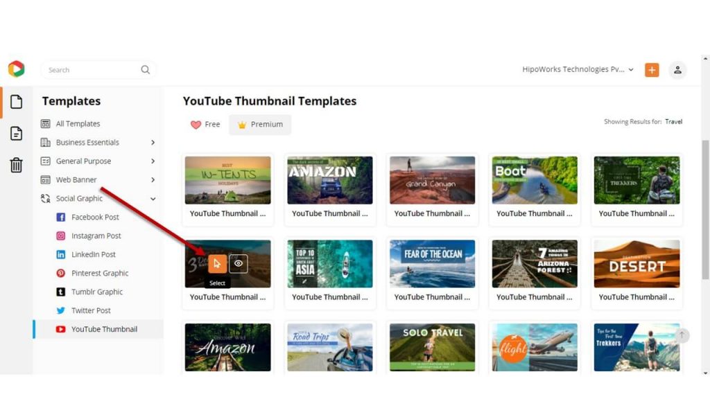
Once you find a template you like, hover your mouse over it and click on “Preview” to take a look at it.
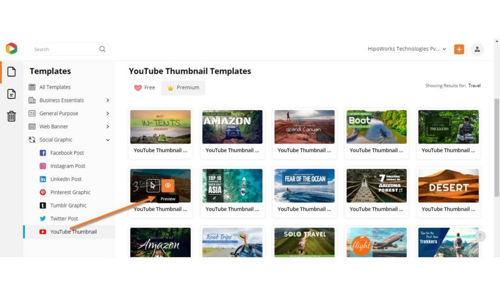
If you want to proceed with the template, click “Select”.
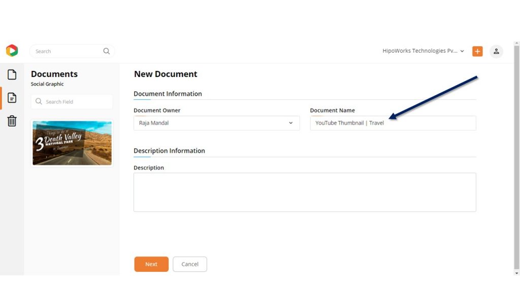
Now, you need to give the Document a name and a short description. Your name will automatically appear as the Document Owner.
We have revamped the All Templates page to make your template selection process more enjoyable.
Step 2: Customize the Template
Now you will customize the template you have selected, which is the most crucial part of your travel YouTube thumbnail design process.
Change Background
You can start by creating a background according to your needs. Since you are designing a travel YouTube thumbnail, your video must be focused on a tourist place. So, nothing can be better than a photograph of the place as a background.
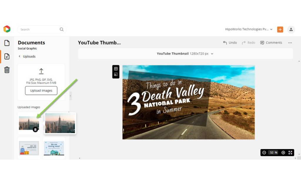
To do that, click on the Upload button under Graphics and Media from the left sidebar. Click on Upload Images to upload a photo from your system to DocHipo.
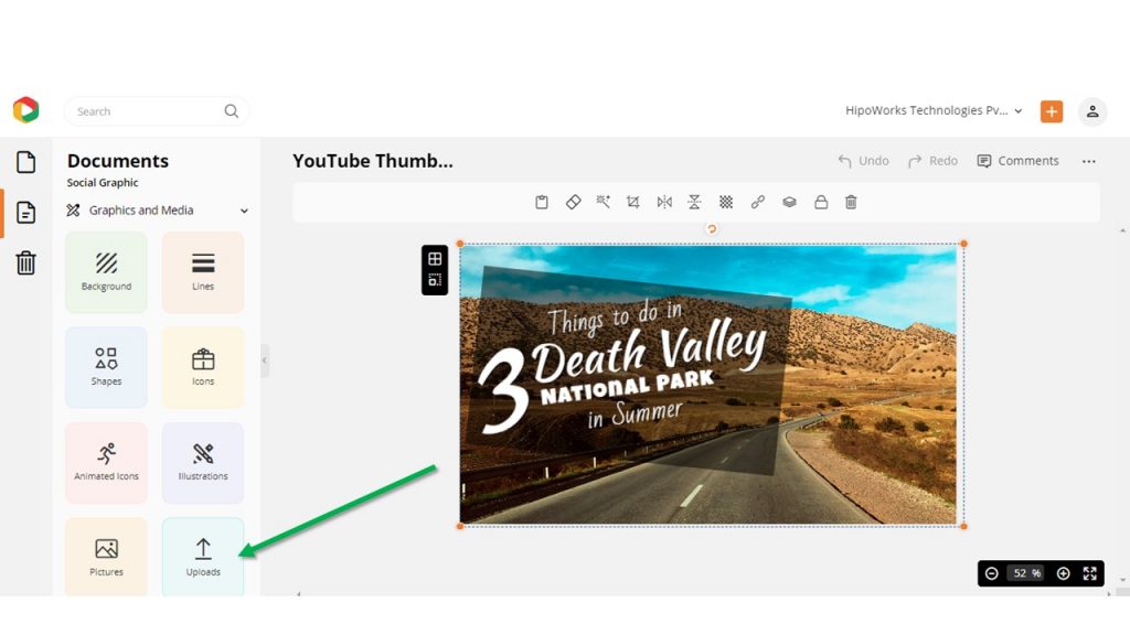
Click on the uploaded picture and drag it to the template and release. If there is already a picture, it will be replaced by the new one.
Additionally, consider watching the video below to understand how to change or add background color, add texture to the background, and all the other aspects of creating stunning backgrounds in DocHipo.
Add, Edit, Or Delete Text
Now click “Text” from the left sidebar to add text to the thumbnail template.
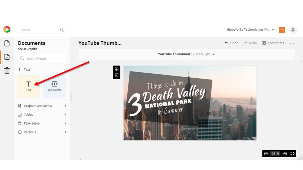
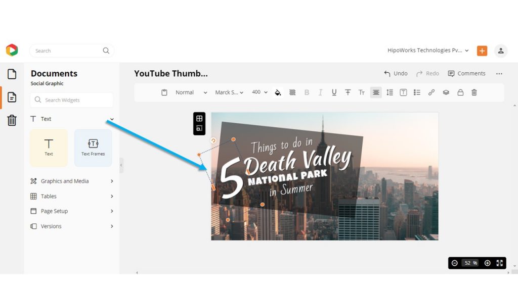
You can also click on the text in the thumbnail and change it accordingly.
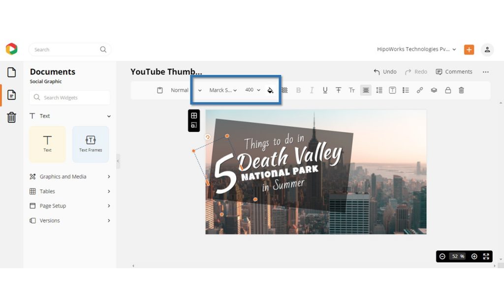
Once you are done, you can change the color, size, and style of the font as required using the edit panel from the top of the template.
Here is a video tutorial for you to understand how to do the same.
Other Design Element
To make your thumbnail stand out, even more, add other design elements like illustrations, icons, lines, text frames, and many others. Play around with the design elements until you are satisfied with the YouTube Thumbnail design.
Tip: If your photo background is bright, you can place it on top of a dark background and reduce the opacity accordingly. This will ensure your background has the perfect color contrast, and it will make your thumbnail pop. The same goes for dark images and bright backgrounds.
Here is the YouTube thumbnail template that I have customized for you.
Before Customizing:

After Customizing:

Step 3: Download Your Travel YouTube Thumbnail Design
Once you are done with the customization and satisfied with the YouTube thumbnail design, click on the three dots from the upper right corner of your screen and then select “Download” from the drop-down menu.
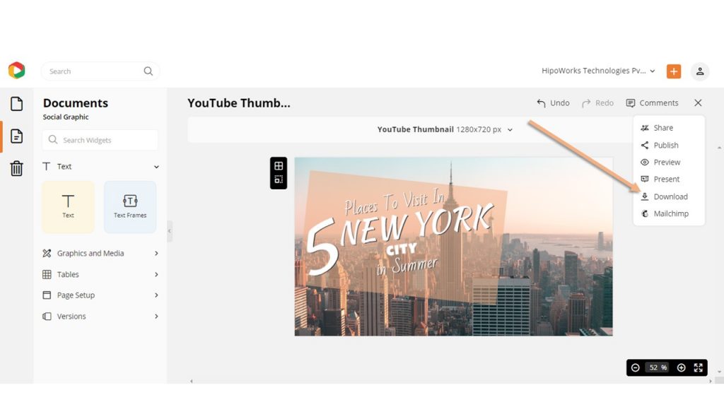
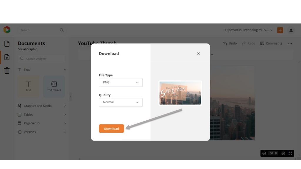
Choose your desired file format and quality from the Download Widget and then hit the Download button. The travel YouTube thumbnail design will automatically be downloaded to your system.
Additionally, you can click here to learn more about how to design YouTube Thumbnails in DocHipo.
As a vlogger or travel business owner, it’s crucial to have social media accounts and websites. DocHipo can help you design graphics for all your social media channels such as Facebook Post, Instagram Post, X/Twitter Post, Blog Banner, and many others.
Further Reading
Final Words…
There are many travel agencies and vloggers on YouTube that use automatic thumbnails instead of custom ones. This costs them the opportunity to get thousands of views and subscribers. With a custom YouTube thumbnail that takes only a few minutes to design in DocHipo, they could save that opportunity.
However, you are not one of those YouTubers. At least not after going through this article thoroughly. With the tutorial and the helpful design ideas, YouTube Thumbnail design will become just a piece of cake for you.
So, why wait? Sign-Up to DocHipo today and increase your viewers and subscribers with stunning travel YouTube thumbnails.


