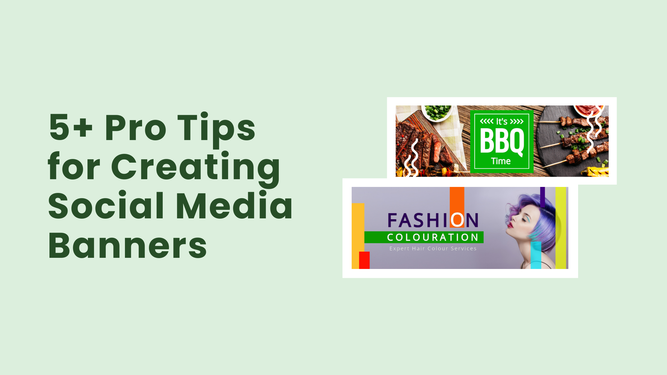
5+ Pro Tips for Creating Cool Social Media Banners

On social media business pages, what attracts your attention first? The social media banners, right? Yes, it is the prime real estate of your social media page that makes the first impression. No wonder most brands pour their love and care into designing the banner image. And, I’m pretty sure, your competitors are doing the same! How to stay ahead of the game, then? Why not start the year with a makeover of your social pages? First, create a cool banner image that attracts, intrigues, and converts!
Social Media Banner Tips
- Showcase Your Primary Offerings and Messages: Share your primary messaging about the product, event, or offers.
- Use Visually Appealing, High-quality Images: Use professionally shot pictures of your products.
- Choose a Never-seen-before Layout: Communicate your brand message or special offers to reflect its style and overall vibe.
- Use Brand Color to Foster Brand Identity: Stick to a consistent brand color in all your messaging.
- Be Innovative with the Typography: Balance the design and build a strong visual hierarchy.
- Use a Call to Action on the Banner: The call to action can be to visit the website, sign up, make a purchase, call your reps, and so on.
- Select the Right Image Size for the Banner: Check guidelines for the correct banner size on every social media page.
- Do Not Overcrowd Your Banner: Maintain the picture-text balance in your social banner.
- Abide by the Guidelines of All Social Media Platforms: Create one structure of the cover image and use it for your business page banners across different sites with some changes.
The good news is, it’s super simple! And you don’t need to hire any designer to do this too! Here are some tried and tested tips and tricks that you can use to create an awesome social media banner this year!
Let’s get started, folks!
Table of Contents
- Showcase Your Primary Offerings and Messages on Your Social Banner
- Use Visually Appealing, High-quality Images
- Choose a Never-seen-before Layout
- Use Brand Color to Foster Brand Identity on Social Media Banner
- Be Innovative with the Typography
- Call to Action on Social Media Banner
- Select the Right Image Size for the Social Media Banner
- Do Not Overcrowd Your Banner
- Make Sure to Abide by the Guidelines of All Social Media Platforms
Showcase Your Primary Offerings and Messages on Your Social Banner
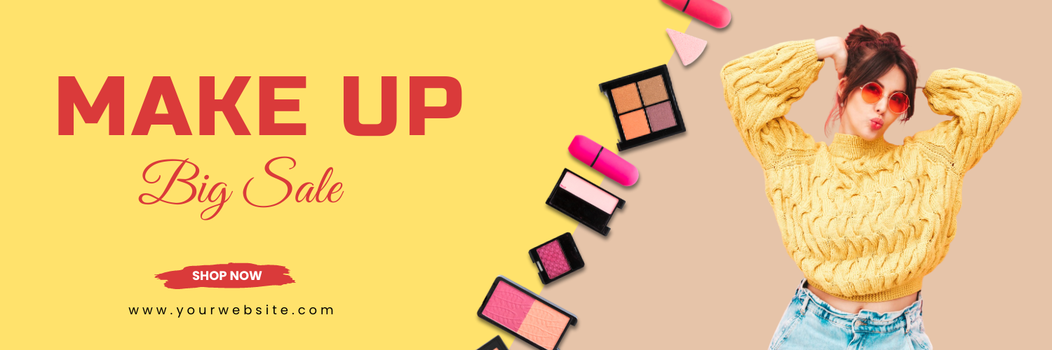
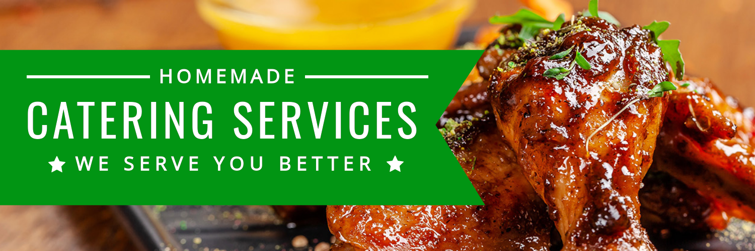
As mentioned above, your social media banner is your primary real estate. So, it is super important that you share your primary messaging on your banner. For a business, these should ideally be your offerings (whether a product or service).
You can also use your social media banner to announce an event, campaign, offer, etc. In that case, a crisp call to action is a must.
Here are some DocHipo templates that show you how!

Get This Template and More
Check out how to create an effective Facebook cover for your business page.
Get This Template and More
Get This Template and More

Get This Template and More

Get This Template and More
‘
Use Visually Appealing, High-quality Images
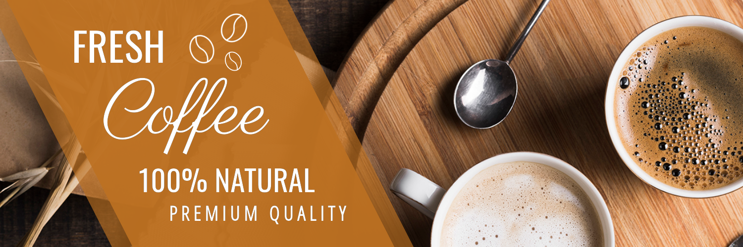
The images used in your social media banner must attract viewers and intrigue them to look closely at your business pages. Use professionally shot pictures of your products or images to represent your services.

Get This Template and More
Get This Template and More
Here’s how to upload images in DocHipo.
Alternatively, you can use stock images that perfectly convey your brand message. You can enhance images further to make them more eye-catching.
Choose a Never-seen-before Layout
The layout you choose to communicate your brand message or special offers reflects its style and overall vibe. Pick a layout where you can fit all your crucial information and images appropriately. You can go for cool, stunning layouts to stand out in your target viewer’s social media feed.

Get This Template and More

Get This Template and More

Get This Template and More

Get This Template and More
Use Brand Color to Foster Brand Identity on Social Media Banner
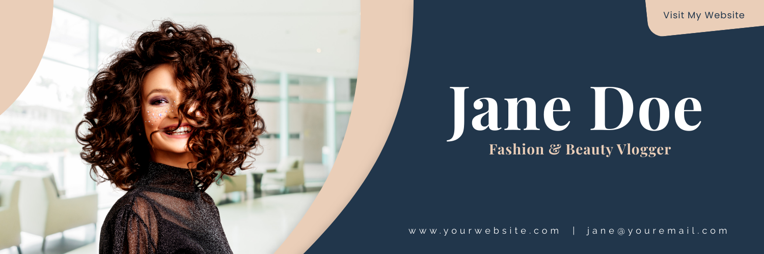
Colors have a significant impact on creating a brand identity. They not only foster brand recall but also give your brand personality.
So, it’s super important that you stick to a consistent brand color in all your messaging. And social media pages are no different!
How does that help? Color appeals to people at a subconscious level and often across geographical boundaries. Keeping your color scheme uniform in all your marketing messages creates that instant recall and connection that helps you engage better.
See how the DocHipo templates below use a particular color scheme and are oh-so-chic!

Get This Template and More

Get This Template and More

Get This Template and More
Get This Template and More
Watch the below video on changing background colors in DocHipo.
Be Innovative with the Typography
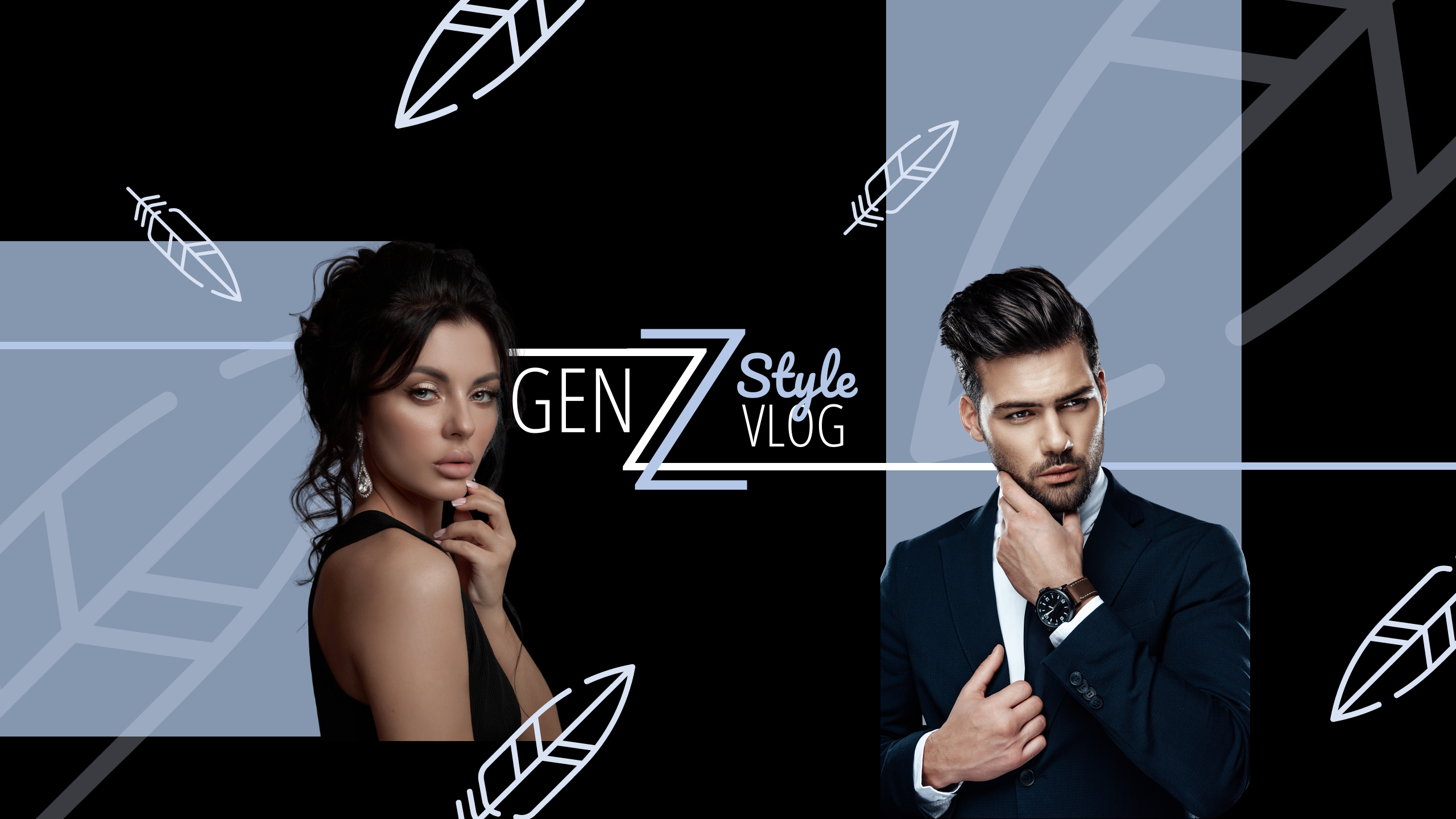
Typography is the art of arranging your text in a visually appealing manner. It adds to your design’s meaning and sets the tone and mood for the theme. While trying to be creative, don’t compromise the readability of your text. Great typography balances the design and helps establish a strong visual hierarchy.
Get This Template and More
Check out how to make a YouTube banner.
Alternatively, you can watch our quick video tutorial.

Get This Template and More
Call to Action on Social Media Banner
So, you have attracted your audience with a great design. Great! Now, what exactly do you want them to do? What’s the next step? Here comes the Call-to-Action!
Your banner must have a solid call to action! The call to action can be for visiting the website, signing up for an app or newsletter, or any other services, making a purchase, calling your reps, and so on. Putting a CTA on the Facebook page can give a click-through rate rise of 285%.
Depending on your goal, you may change the call to action occasionally! (BTW, these are DocHipo templates again; you can sign up for free and use the templates now!) Here’s how pros do it!

Get This Template and More

Get This Template and More

Get This Template and More
Select the Right Image Size for the Social Media Banner
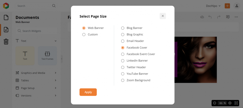
Every social media site has its recommended dimension for the banner/cover to fit in. Check guidelines for the correct banner size on every social media page. This way, you don’t end up with a banner with a disproportionate size or pixelated graphic.
While it can be a daunting task to remember the recommended sizes for all social channels, you can do it pretty easily with DocHipo. Here’s how you can choose the channels and have the right size automatically!
Further Reading
Do Not Overcrowd Your Banner
You know how the human brain processes visual impressions faster than texts. In fact, we humans process pictures 60,000 times faster than text. So, it is essential to maintain the picture-text balance in your social banner.
Well, I understand the temptation here. But refrain from using more texts than necessary. Look at the DocHipo templates below for inspiration! You can go minimalistic here.

Get This Template and More

Get This Template and More

Get This Template and More
Make Sure to Abide by the Guidelines of All Social Media Platforms
You know there are guidelines for creating a banner or cover image for any social media platform, don’t you? Failing to meet these guidelines can put you in trouble. These guidelines are similar for most social media platforms. Just go through them, and make them your rule of thumb for creating cover images for all social media pages.
I can suggest you a simple trick. Just create one structure of the cover image and use it for your business page banners across different social networking sites with some tweaking. You can instruct your designer accordingly. Or you can design it on your own.
Endnote
You probably create social media banners very often, don’t you? If so, keeping all considerations in mind while making them must be quite a task. Creating social media covers with DocHipo templates can simplify your job to a large extent. Hurry up; not much time is left before you can sign up for free. Have the joy of designing your own documents, and don’t forget to thank this humble blogger for all your convenience. Go ahead, happy designing!


