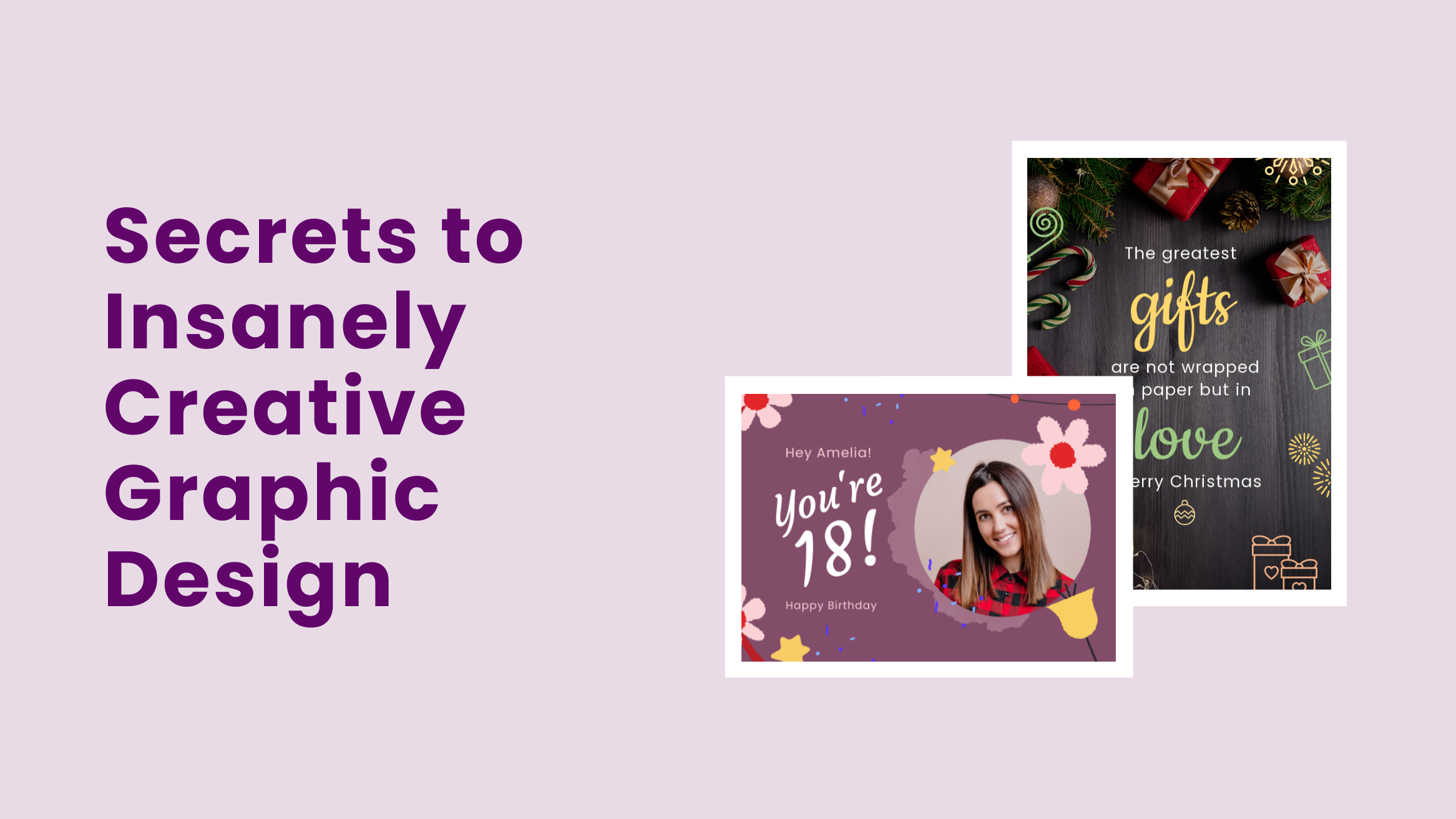
Secrets to Insanely Creative Graphic Design, Designers Won’t Tell You

You can design great documents even without a graphic design background. But how do you consistently create great graphic designs?
Secrets to Insanely Creative Graphic Design
- Use stunning pictures: Win people’s attention and convey the message quickly and effectively.
- Resize your pictures: Fit the desired design and get a professional-looking design.
- Apply photo filters: Create the right mood.
- Breathtaking backgrounds: Weave magic into your graphic design with stunning images, colors, gradients, textures, and patterns.
- Smart design elements: Incorporate relevant charming illustrations, icons, overlays, and typography patterns.
- Striking color contrast and combination: Create a beautiful rhythm, unity, balance, and harmony in your graphic design.
- Visual hierarchy: Create an order to guide the viewer’s attention, first emphasizing the most crucial element.
Read on to know more.
You feel like getting a fresh design course on several occasions. That has happened to me multiple times. But I could hardly get time for that. I was looking for an editor that was super-easy to handle and saved time too. With part doubt and part confidence, I tried my hand at designing. But only with the help of DocHipo.
As someone with zero experience, I chose the DocHipo canvas to start designing. I started using the editor a little but was never required to use it for a full-fledged document. I signed into my account and chose a beautiful template to work on.
First and most importantly, you must sign up to explore the magical world of DocHipo. Trust me; you do not need much for it. A valid email ID is fine. You can select a template from a beautifully curated list on DocHipo. Or maybe you would like a fresh design from scratch. Just put a title and description to the document, and gung-ho, your graphic design sets its journey.
Now, you must be thinking that if you would do everything on your own, what do I promise as help? Patience, buddy, I am right here, on your side.
You can design a document independently; DocHipo is easy for a novice. Do you want to brush up on your skills? It’s just a matter of a few documents. But you might want Designer-like perfection in your work from the very beginning. Is that possible? Yes, it is. I will offer you a few pro tips to gain engagement as professional designers do. So, ready to kill it? Well, you must be.
Table of Contents
- Use Stunning Pictures to Make Your Graphic Design World-class
- Resize Your Pictures to Add Fun to Your Graphic Design
- Apply Photo Filters to Create the Right Mood
- Weave Magic with Breathtaking Backgrounds to Your Graphic Designs
- Incorporate Smart Design Elements to Add that Pro-touch
- Use Color Contrast & Combination Consciously
- Create an Order with a Visual Hierarchy in Graphic Design
Use Stunning Pictures to Make Your Graphic Design World-class
Your choice of a picture can make or mar your graphic design. Therefore, you should crawl over and use stock images that best communicate your message. You can also use images of people and products on your graphic design documents.

Get This Template and More
This YouTube Banner Template shows how beautifully one image can build the viewers’ perception. Here, the image only reinstates the message of the YouTube channel.

Get This Template and More

Get This Template and More
Who won’t get attracted by such an eye-catching picture in the Real Estate Instagram Post Template below?

Get This Template and More
Similarly, the picture in the below Fashion Instagram Post Template compels target buyers to perceive the fashion brand as a classy and gorgeous one.

Get This Template and More
In the below picture, you can see that changing the image of a template on DocHipo is no big deal. While on the editor, select the Pictures widget under the ‘Graphics and Media’ section.
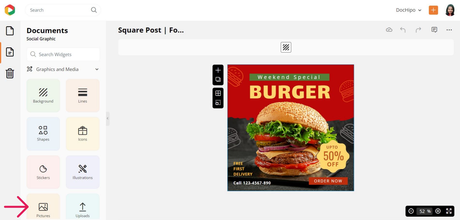
DocHipo’s integration with stock photo libraries lets you access unlimited pictures. You can explore the various themes or search for your picture in the provided search bar.
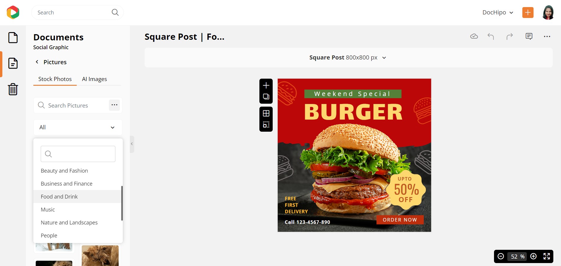
Choose the orientation and color of the picture you need and apply filters.
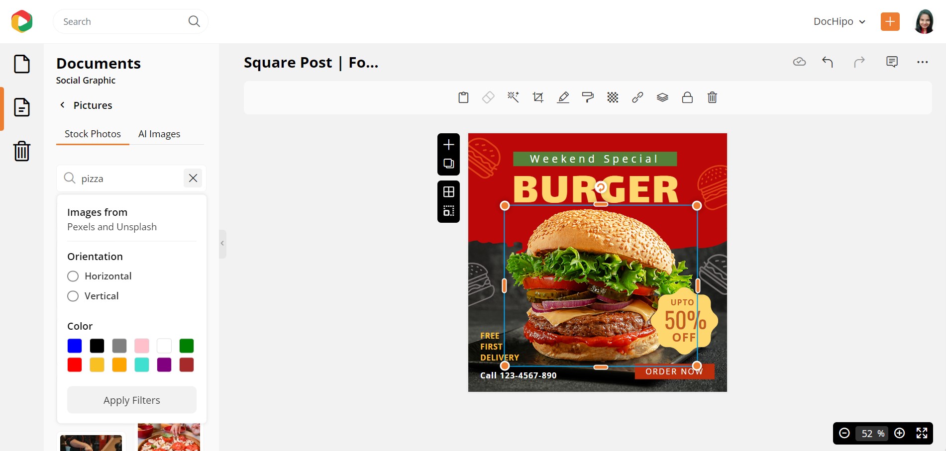
As you can see, we’ve searched for pictures of pizza here.
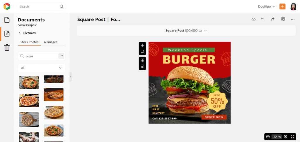
Watch our quick tutorial on leveraging DocHipo’s integration with popular stock photo libraries.
However, you can upload the image according to your needs as well.
Resize Your Pictures to Add Fun to Your Graphic Design
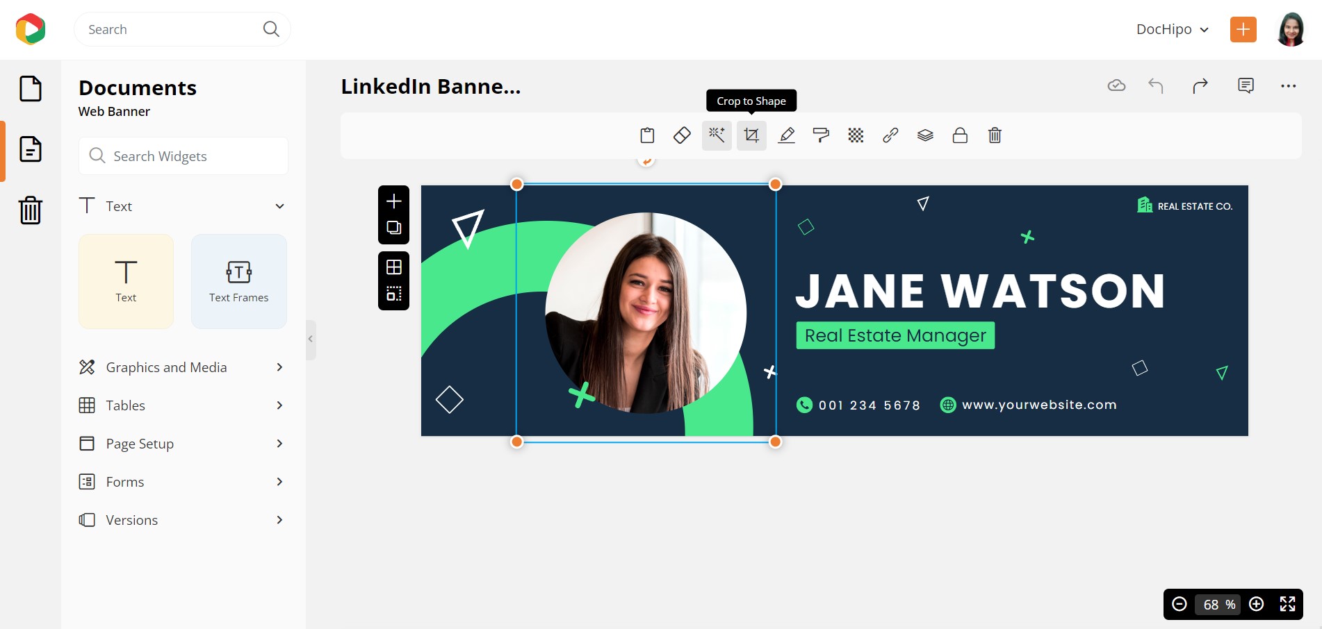
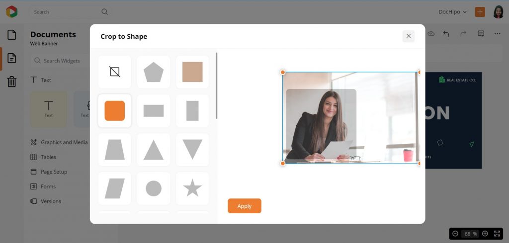
Resizing pictures is an integral part of graphic design. The other day I was exploring the possibility of resizing the pictures in a fun way. Enter the DocHipo Crop function! There is a wide list of shapes in which you can resize your pictures. Just use one to suit your need, and you can offer an amazing dimension to your document. The images below show how amazingly you can crop your image in different shapes.
Apply Photo Filters to Create the Right Mood
Have you ever noticed how an ordinary picture can look breathtaking in the right light? Oh, yeah. This is exactly what the filers do! And I’m sure you have used it on Instagram or at least on your smartphone camera!
You can use the same functionality within the DocHipo editor too. Using filters is another very important aspect of graphic design.
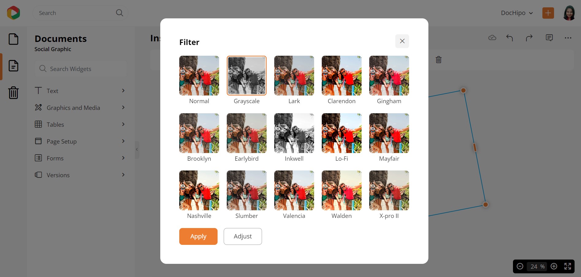
First, select the picture and then the filter option in the editing panel above.
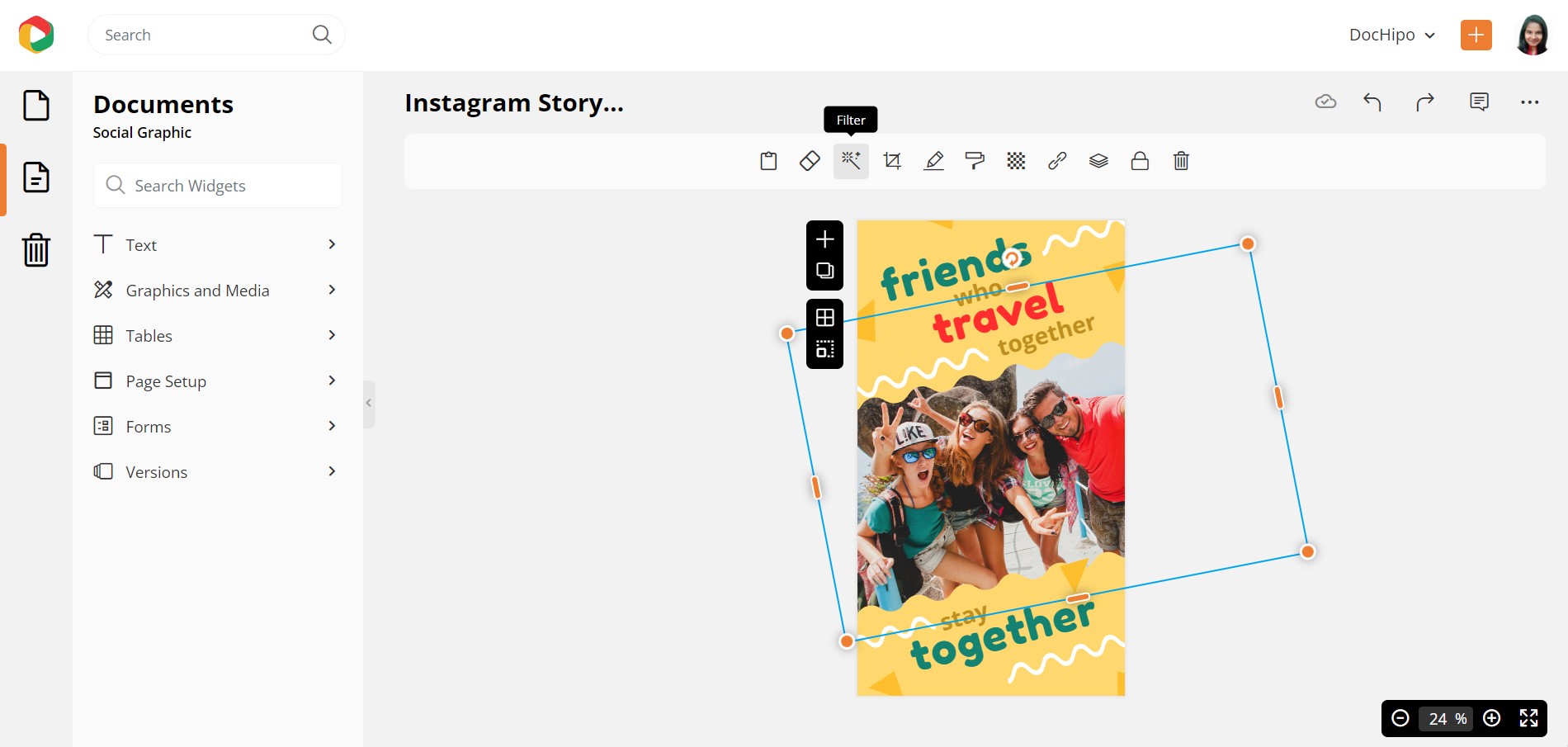
There is a list of options for using various filters for your images. Use the one that goes with the mood and purpose of your document, and you add a whole range of versatility and depth to your documents (not to mention the pro-designer-like touch to your documents!).
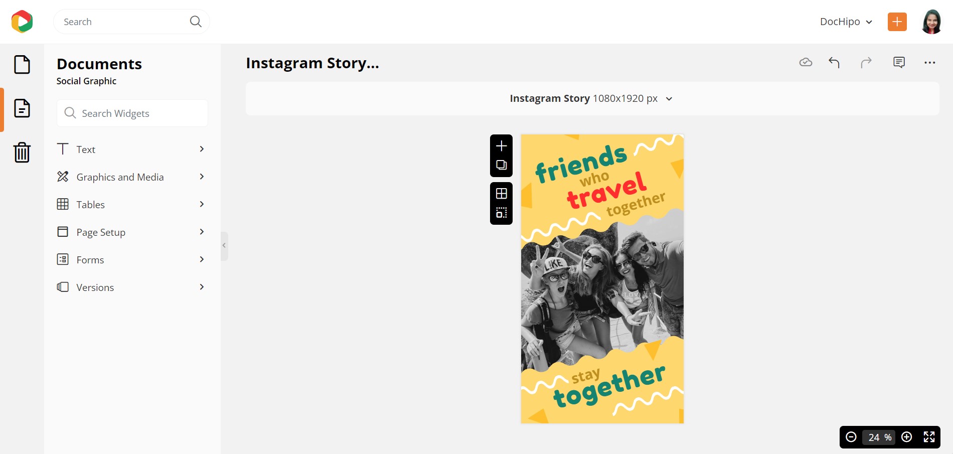
Below is how our Travel Instagram story looks after applying the Grayscale filter.
Watch our video guide for enhancing pictures with DocHipo filters.
Weave Magic with Breathtaking Backgrounds to Your Graphic Designs
You can experiment with various backgrounds, such as colored, gradient, textured, and so on, to bring in the right emotion for your message.
Gradients are very much in Vogue
You can use a gradient background to enhance the overall effect of your graphic design. While a number of well-known brands are returning to a gradient color scheme, this could certainly raise the ‘wow’ quotient effortlessly.

Get This Template and More
Add Character with Texture
While a flat mono-colored background is fine, textures (when used mindfully) can provide a character to your design and elevate it to the pro level.
DocHipo comes with a range of beautiful textured backgrounds. You can use them to your benefit too. Just check out the template on DocHipo to understand the impact of the textured background.

Get This Template and More
Look at the extensive stock of gradient and texture backgrounds in the DocHipo asset library.
Incorporate Smart Design Elements to Add that Pro-touch
Smart elements are needed to elevate the awesomeness of your design a few notches in no time. You can control Distance with SIZE, Depth with PERSPECTIVE, Attention of onlooker with COLOUR, CONTRAST, NEGATIVE SPACE, Engagement with F or Z-PATTERNED DESIGN.
With Illustrations
Working with illustrations is fun! And they are in trend too! More and more people are simply playing with illustrations of different sorts in their designs. The idea is to give images amiss for two reasons, 1 to avoid copyright breach and 2 to let your imagination fly.
Apart from the basic reason, you also play with illustrations for some technical rationale. See the below template, where the illustration of a forest has created a nice perception of DEPTH, DISTANCE, and SIZE in the entire design.
The designer has created a dense forest on a flat Facebook post using dark and lighter shades of green and different widths of trees. Magic…right?

Get This Template and More

Get This Template and More
Find the top ten illustration categories in DocHipo.
With Icons
Icons let you say more without cramping up your document. They quickly grab attention, add a degree of fun and convey meaning simultaneously.
There are different ways to use the cute icons available on DocHipo beautifully.

Get This Template and More

Get This Template and More
Here’s how to use icons in DocHipo to make your design look more appealing.
Overlays
Overlays, what you cannot do with them! Want to highlight a piece of text? Or maybe you are looking at grouping information together. Or maybe you want to add some depth to your graphic design! Overlays are the way you go!
Why? There’s a lot of flexibility in deciding the shape, color, opacity, and placement of the overlay. Within DocHipo, you can choose any filled shape, change colors, adjust opacity, and place it right to create a beautiful graphic design element.

Get This Template and More

Get This Template and More
Typography Pattern
Maintain an ‘F’ or ‘Z’ pattern while putting your message on the doc. The typography should maintain these patterns as it is the most convenient pattern for the eyes to follow. Experienced designers always maintain these patterns to make it easy for onlookers to decipher their message.
Here’s some inspiration on how you can use typography to put together and create that design you’ve always wanted!

Get This Template and More

Get This Template and More

Get This Template and More

Get This Template and More
Use Color Contrast & Combination Consciously
No matter what marketing collateral you are creating, its design will win with the aid of great ‘contrast’ and ‘a combination’ of colors. While choosing colors for your background, fonts, and design elements, only a lovely combination or a striking contrast can put your graphic design work on top. A little care in choosing color combinations or contrasts is fundamental to a vibrant, beautiful document design. Your design is sorted.
Remember that your color schemes, contrast, and combination must create a beautiful rhythm, unity, balance, and harmony in your graphic design. But while using different illustrations, shapes, icons, and even fonts on a single document, you can use different shades of the same color.
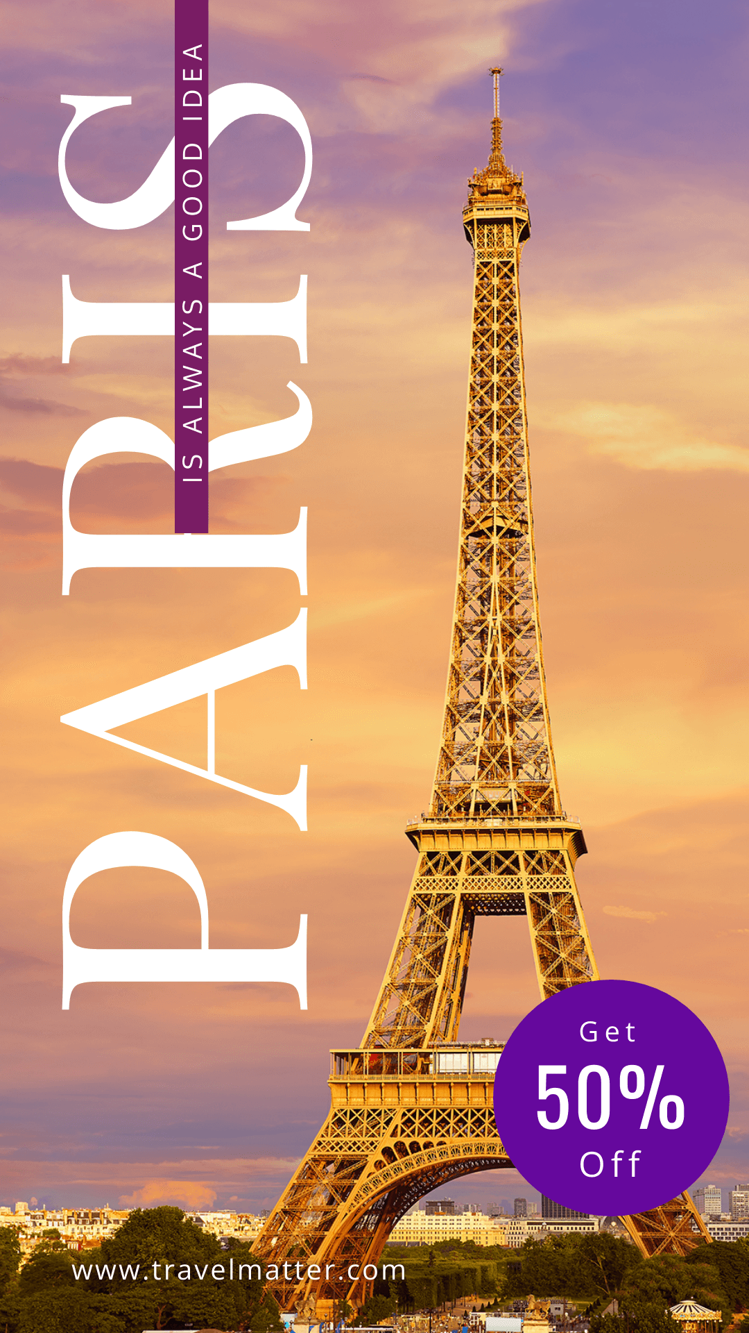
Look at the templates below and see how our graphic design team has created magic with colors!

Get This Template and More
The Black Friday Instagram Post Template creates a beautiful harmony for text in the background.

Get This Template and More

Get This Template and More
Get This Template and More
Create an Order with a Visual Hierarchy in Graphic Design
I was a bit confused at the beginning. “Should I add this point to this post or not.” Then I thought aloud, “Why not”? After all, this particular element is one of the most important factors that will decide whether your design wins.
However, the design hierarchy remains more in your brain than your canvas. You must decide first, what graphic design elements are the most important for your prospects and which ones are not. Intriguing? Let’s simplify this idea a bit.
First, you need to decide the focal point in your design. And then create the design in a way that complements that part.

Get This Template and More

Get This Template and More
Time to apply your skills…
You have finally reached the end of my post. I assume you have also started thinking about your designs rather than just choosing elements and putting them together on your doc. A conscious thought into it can make your design an amazing one. Now, it is time to push your limits and become a pro in creating documents that impact your audience.
So, sign up to DocHipo today and explore everything in its repository to create magic. I will wait to see you doing wonders. Till then, bye…


