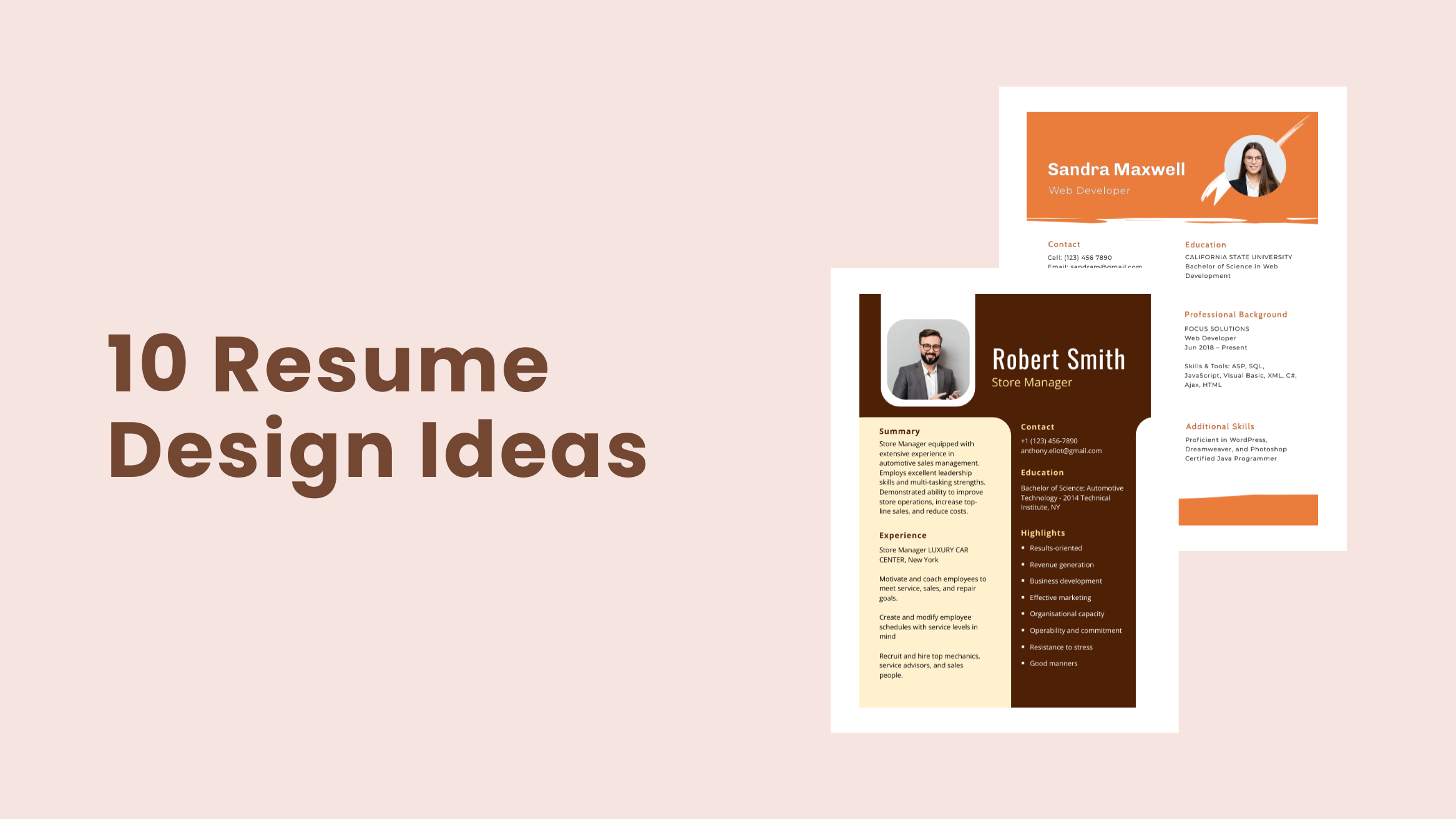
10 Effective Resume Design Ideas and Templates to Inspire Your Next Job Application

Finding a job is a full-time job in itself. And a resume is one simple document that can pave the way for your future career.
The average time a hiring manager spends reviewing resumes is just 6 seconds. So, you can realize that standing out in a pool of resumes requires a lot of effort.
You might be an experienced job candidate, but how you present all of that in your resume speaks volumes. So you can’t afford to take risks here. To make your well-crafted resume stand out, you need to pay attention to your resume design.
10 Resume Design Ideas
- Professional header: Include your essential information and make it look professional and visually appealing
- Minimalistic design: Formal, slick, and simple look for traditional company applications.
- Color scheme: Stick to a consistent color palette throughout the resume design.
- Sidebar: Add a sidebar for contact details or any extra information you want to highlight.
- Uncluttered professional look: Avoid information overloading, keeping only the most relevant and credible details.
- Border: Eye-catching border, especially for creative job roles.
- Two-column format: Symmetrical and balanced resume look for hiring managers to find information right away.
- Shape it up: Experiment with non-rectangular shapes in the layout if the aspiring company values and accepts creative freedom.
- Folial design: Fresh, beautiful, and colorful folial design if you are a botanist.
- Personal Touch: Showcase your individuality and add personality to your resume.
In this post, I’ve compiled a list of resume design ideas for you to leave a lasting impression on your employer and choose you over others. You’ll also get to see effective and eye-catching resume templates designed by DocHipo to get you inspired.
Table of Contents
- Make Your Resume Professional Header Pop
- Create a Beautiful Resume Design with an Eye-catching Border
- Stick to a Consistent Color Palette throughout Your Resume Design
- Colorful Folial Resume
- White Formal Resume with Minimal Design
- Shape it up
- Include a Sidebar
- Avoid Information Overloading
- Symmetrical and Balanced Resume Design
- Add a Personal Touch to Your Resume Design
I’ll discuss ten resume design ideas below, along with related DocHipo resume templates for ten different job roles. You can take bits and pieces from the inspiring resume examples, put them together, and give life to your resume that screams you. Let’s get started.
1. Make Your Resume Professional Header Pop
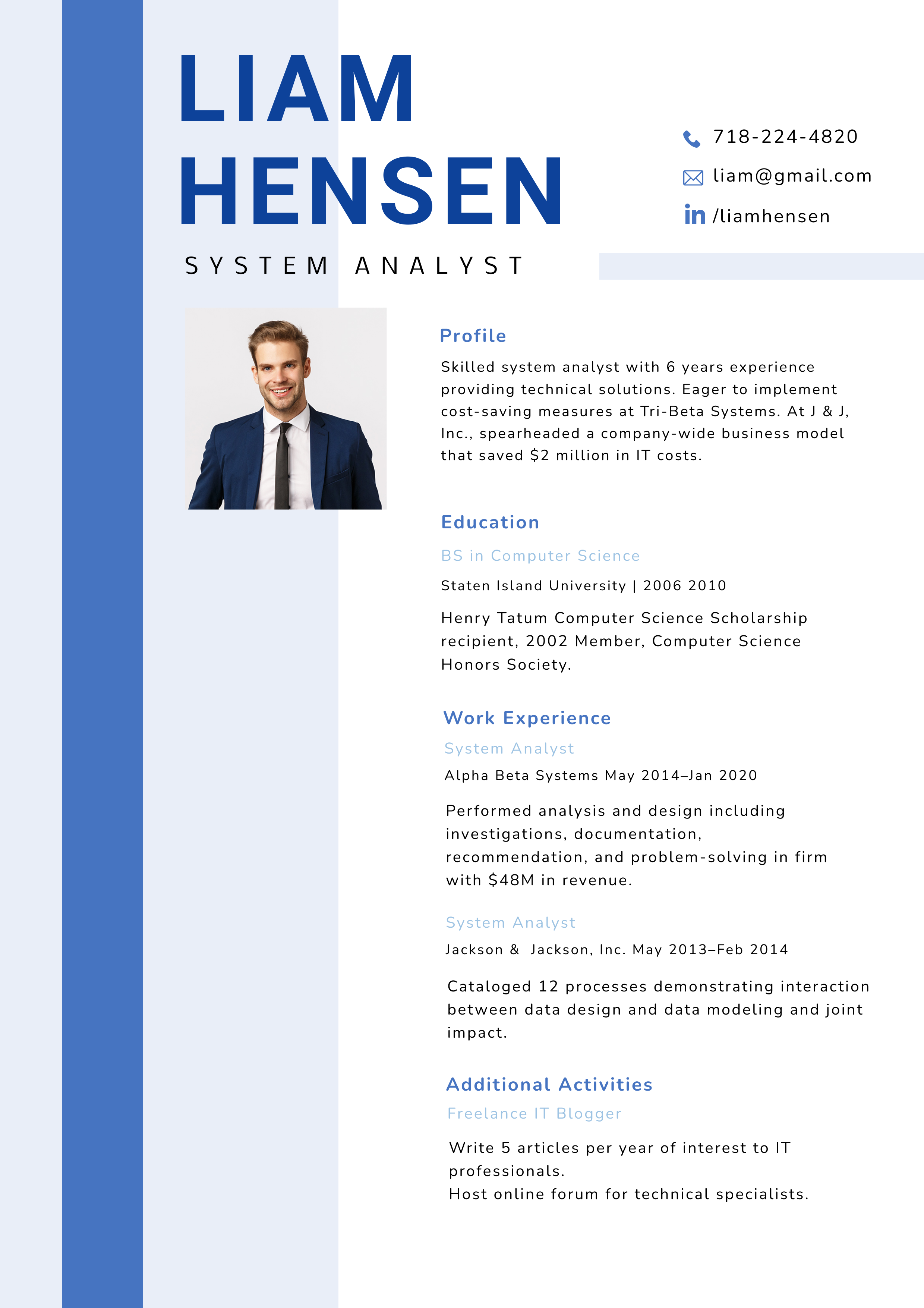
The most elegant resume will also go in vain if a professional header is absent from your resume. It is one of the most basic and essential parts of your resume. It contributes to catching the hiring manager’s attention and making a first impression. So style it right and make it look professional and visually appealing.
As for the content in the header, include your essential information such as full name, job position you are applying for, mobile number, email address, and location. You can also add extras like your LinkedIn profile link etc.
Firstly, for the resume header design, know your industry and express your individuality and creativity accordingly.
Starting with your resume design could be overwhelming, but if you mess it up, you’ll lose your chance of impressing your employer right in the beginning. So check out the guide to learn How to Create a Resume Header to start it right.
Get the look with the DocHipo resume template, having a bold header that draws attention to your name.
Get This Template and More
2. Create a Beautiful Resume Design with an Eye-catching Border
Are you aspiring to bring your skills and expertise to a creative role?
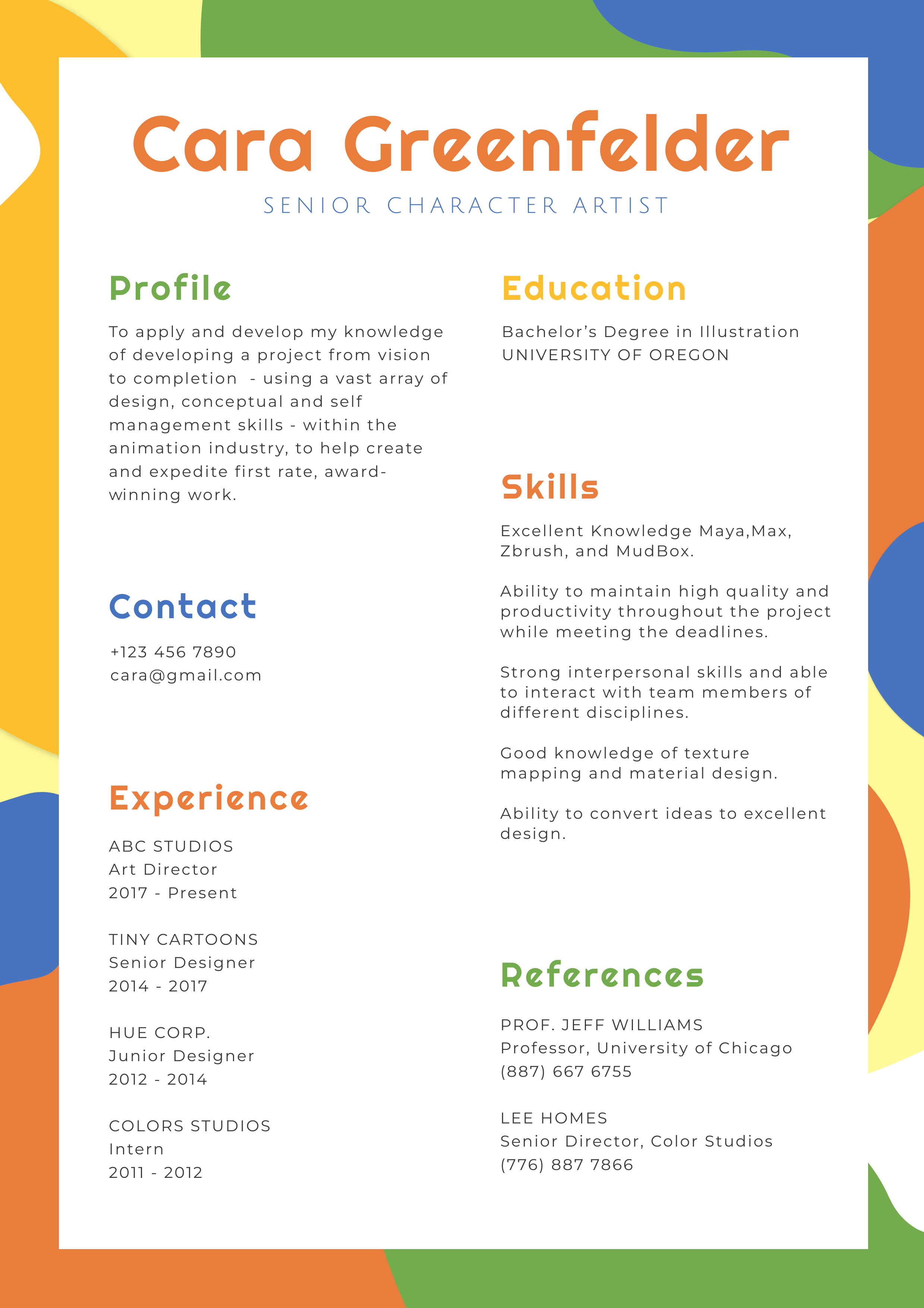
Working on the border of your resume may help your resume to stand out. You may use solid color(s), simple texture, or pattern as your resume border. Again, keep the company’s nature in mind while choosing a border. Implement your ideas and add your creativity to the resume without distracting the hiring manager away from the vital information.
Especially if you are applying for a creative job like a Senior Character Artist, you may showcase your artistry and ingenuity through a resume design like the below one.
Get This Template and More
In DocHipo’s Free Online Resume Maker, you can customize this template by replacing it with another image background or color to align with your needs.
3. Stick to a Consistent Color Palette throughout Your Resume Design
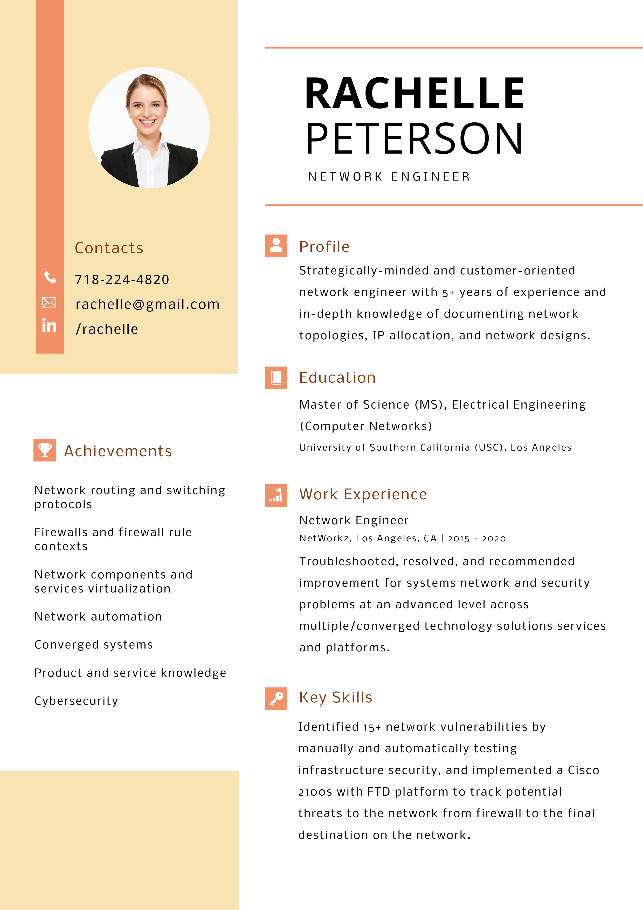
The beautifully consistent color palette in this Network Engineer resume design template looks pleasant and easily readable. The orange color interacts perfectly with the yellow and text headings in brown.
Get This Template and More
I recommend reading How to Pick Colors For Your Brand for your guidance.
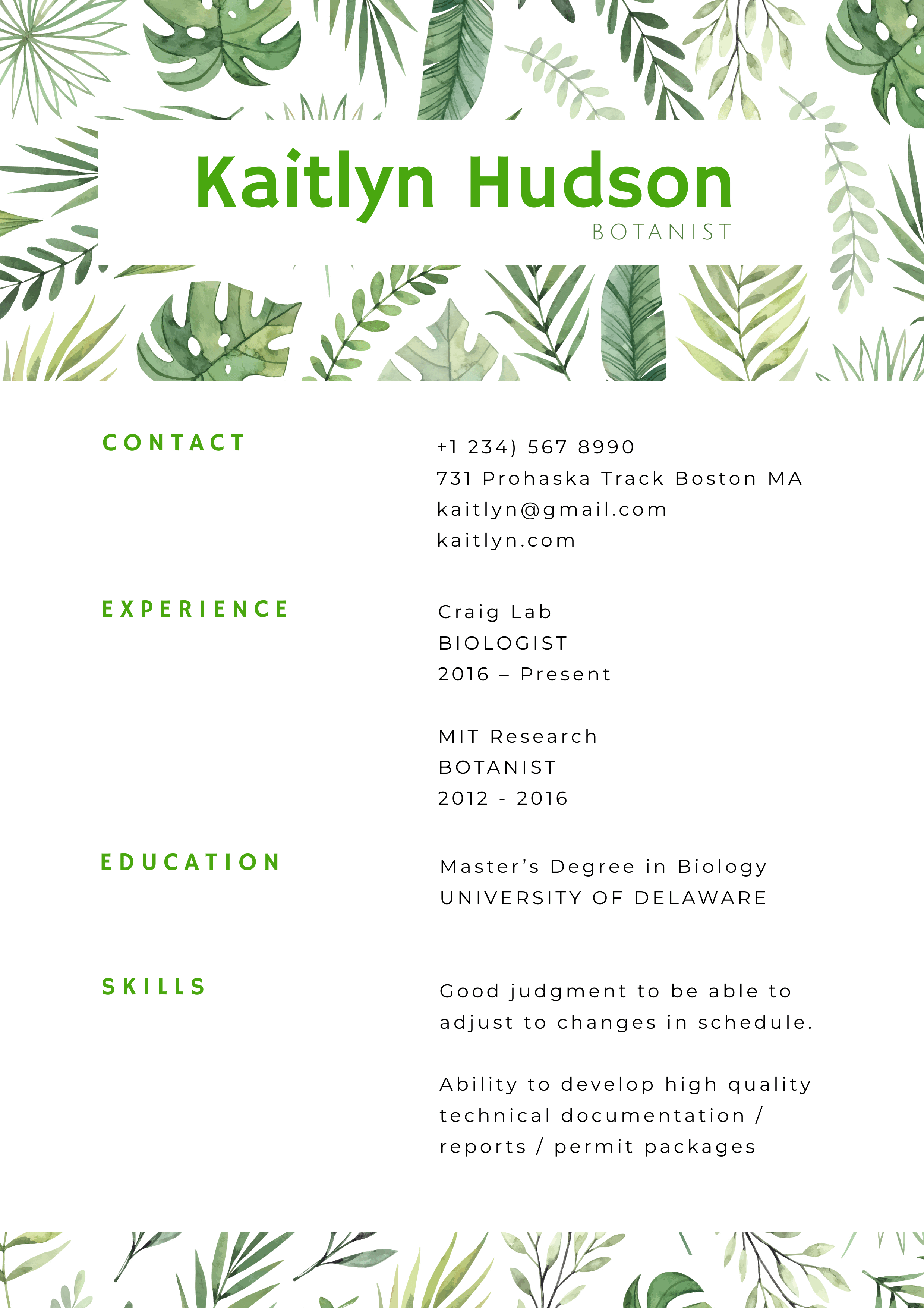
4. Colorful Folial Resume
You can add an image that reflects your industry for the company where combining creativity with professionalism is accepted and valued. Ensure keeping your creative resume design simple and legible.
Your efforts will be appreciated by a creative-driven company if you make a fresh and beautiful resume design, like the following.
Get This Template and More
The design of this resume template by DocHipo is geared toward the botany field. You can adapt it to any industry you’re applying to by changing it. The green leaves in the resume border are refreshing and enhance the colors of the text for your name and headers.
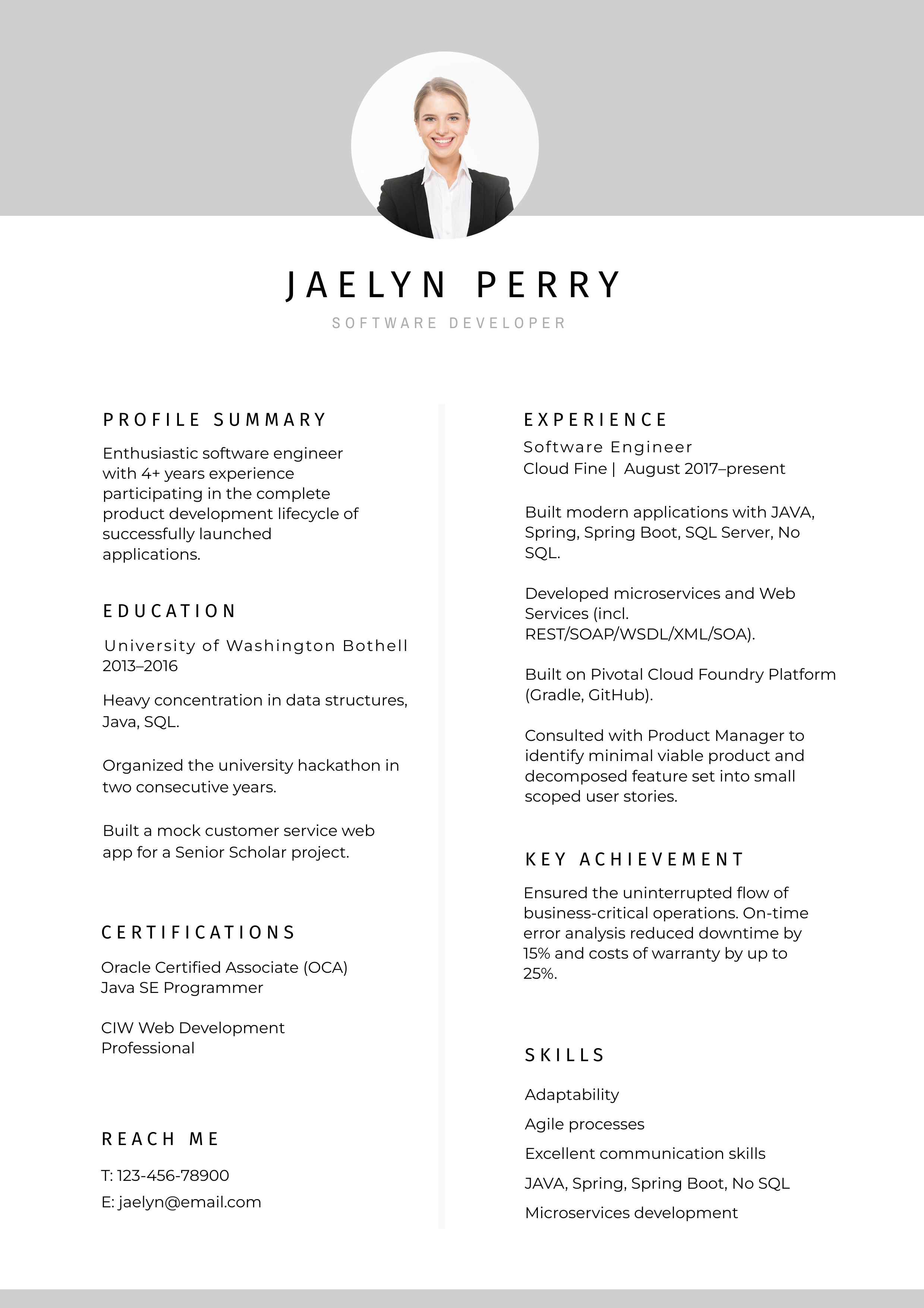
5. White Formal Resume with Minimal Design
Many companies prefer and accept only traditional resume formats. You can still create an elegant resume design and make a difference by keeping your style formal, slick, and simple.
This Software Developer resume design by DocHipo keeps things clean and simple, proving that you can make a great impression on your employer even without a fancy design.
Get This Template and More
This classic minimalistic resume design has a large and clear header, grey color at the header and footer, and has covered every vital section with relevant information. An ample amount of white space makes the design pleasing to the eyes. The layout and choice of fonts complement the simplistic style.
Related: How To Choose Fonts For Your Design
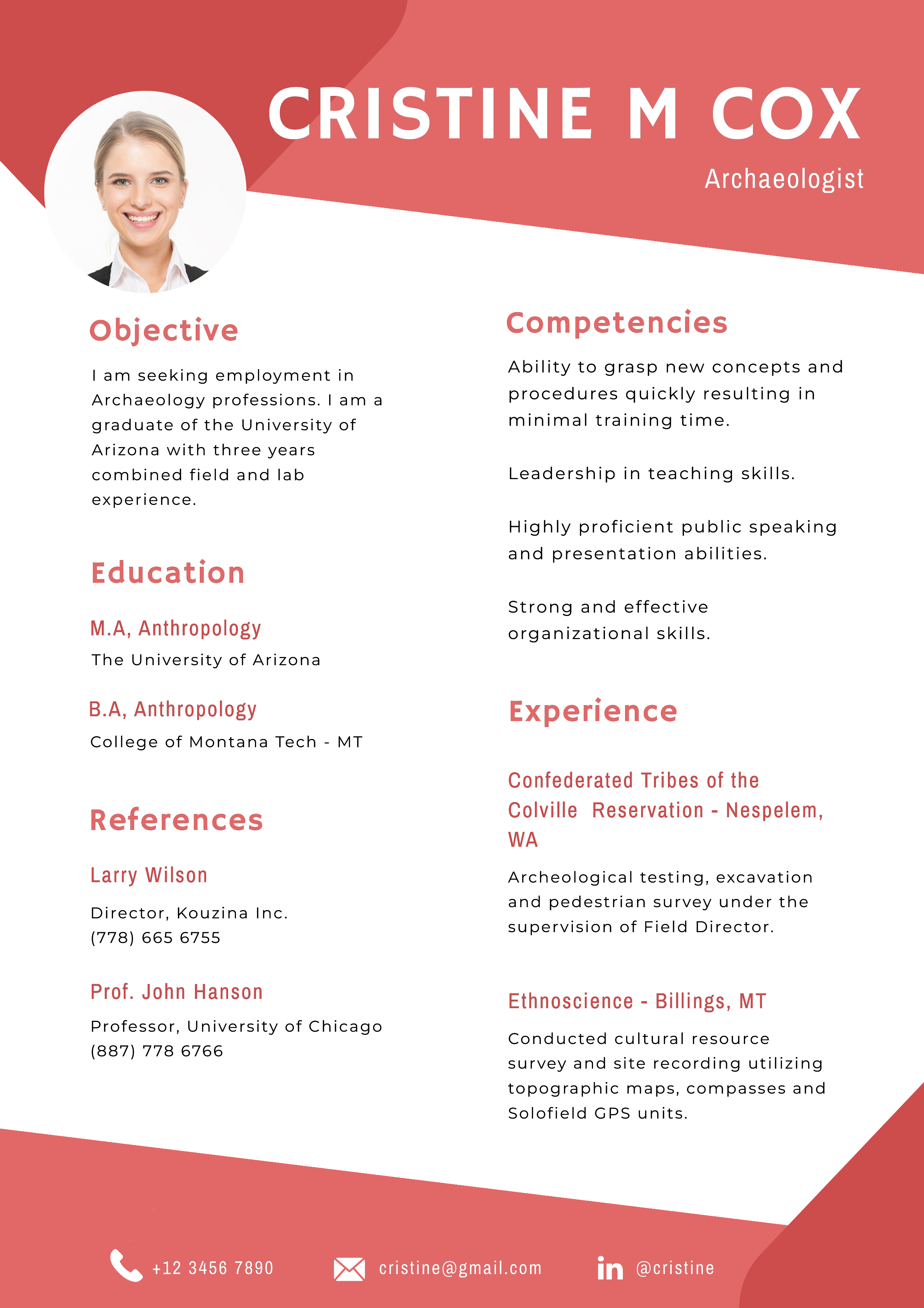
6. Shape it up
If you have some creative freedom for your resume design, you can experiment with non-rectangular shapes, like the following DocHipo Archaeologist resume template below.
Get This Template and More
While using abstract shapes, ensure you don’t compromise with the text readability and don’t go overboard with the design.
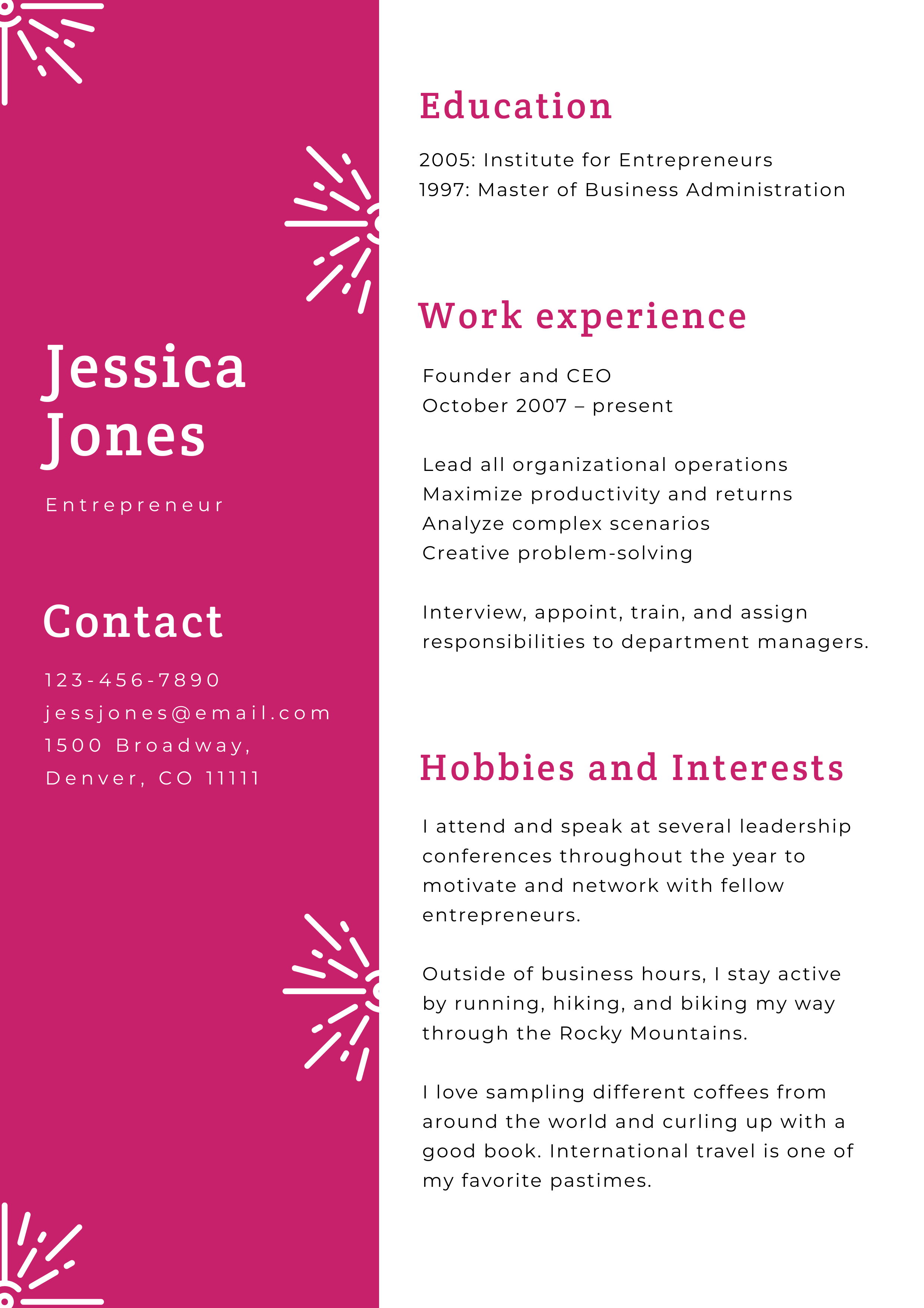
7. Include a Sidebar
You can use a sidebar to add important information like contact details or any extra information (if any) that you want to highlight.
Our design experts at DocHipo included a red-colored sidebar with additional design elements in moderation to separate contact details from professional information.
Get This Template and More
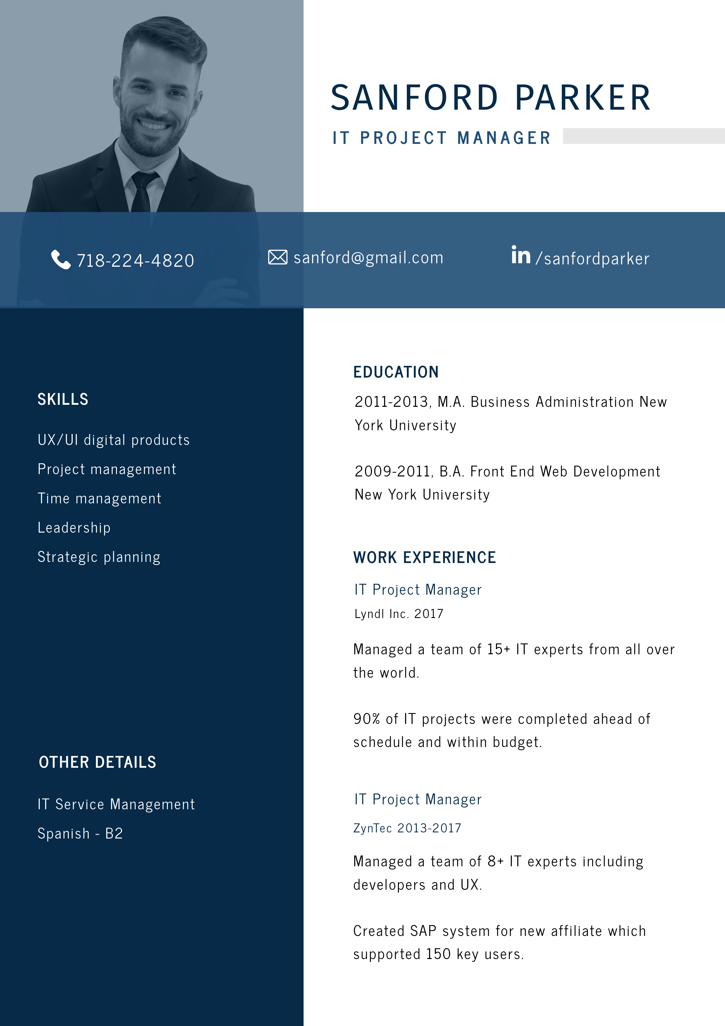
8. Avoid Information Overloading
Rather than overwhelming your hiring manager with more than the required information on your resume, condense it to only the most relevant and credible details.
For example, look at the IT Project Manager resume template by DocHipo, with a simple, neat, organized, and elegant design.
Get This Template and More
9. Symmetrical and Balanced Resume Design
Hiring managers spend very little time on each resume they receive and prefer to find information right away. So, follow the tried and tested one-column resume format for traditional or more conservative businesses.
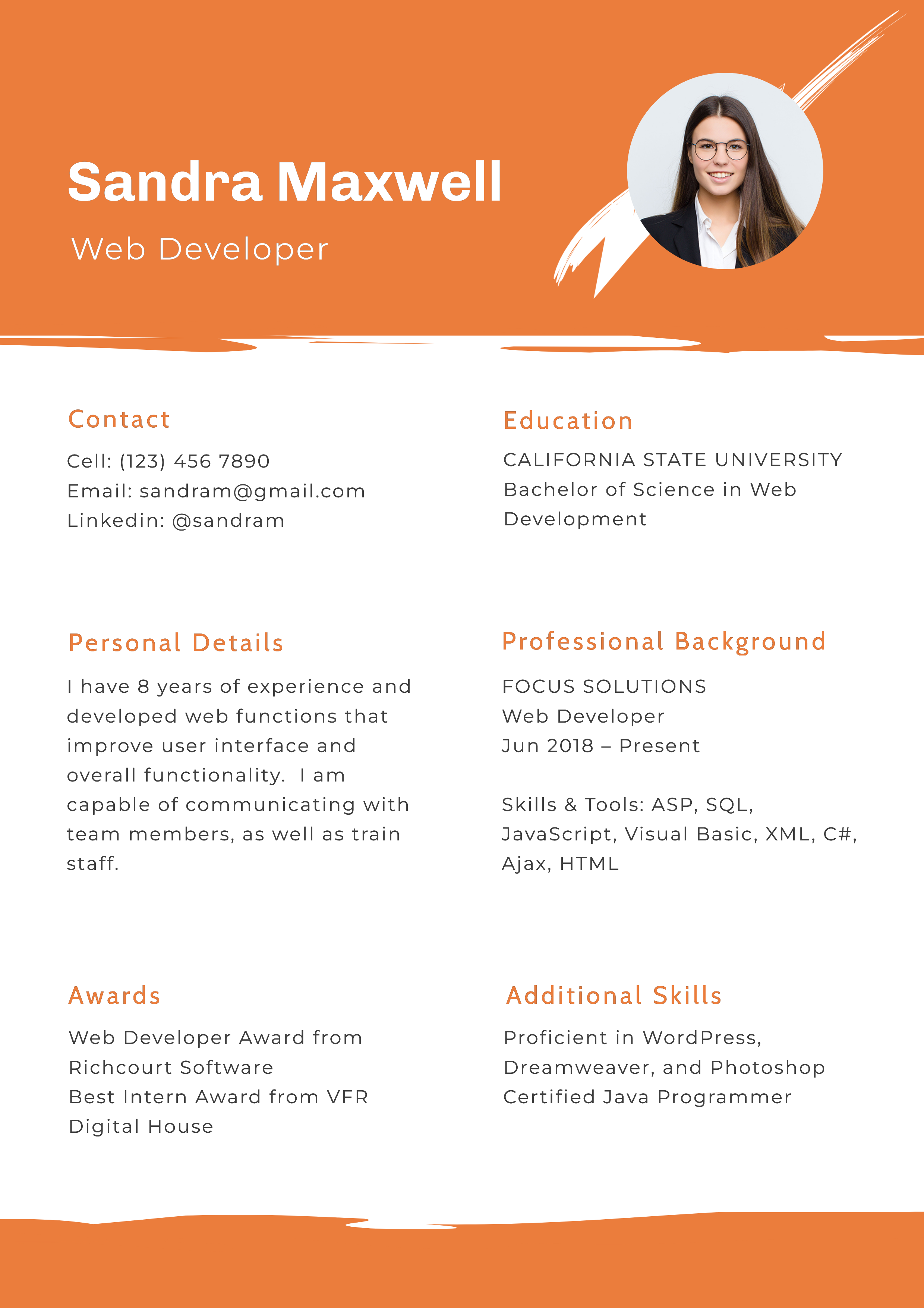
However, if you’re applying for companies that are open to innovation and creativity, you may choose the two-column resume format. If you deviate from the standard single-column layout, the two-column resume must look professional and be easily scannable.
The following DocHipo Web Developer resume template has two symmetrical columns with a balanced look, containing all vital information on a single page.
Get This Template and More
The abstract shape of the header and footer with orange pop-off color and the self-photo contribute to the personalization and make the two-column format visually appealing.
It looks clean, fresh, legible, and eye-catching and will definitely stand out in a pile of resumes.
10. Add a Personal Touch to Your Resume Design
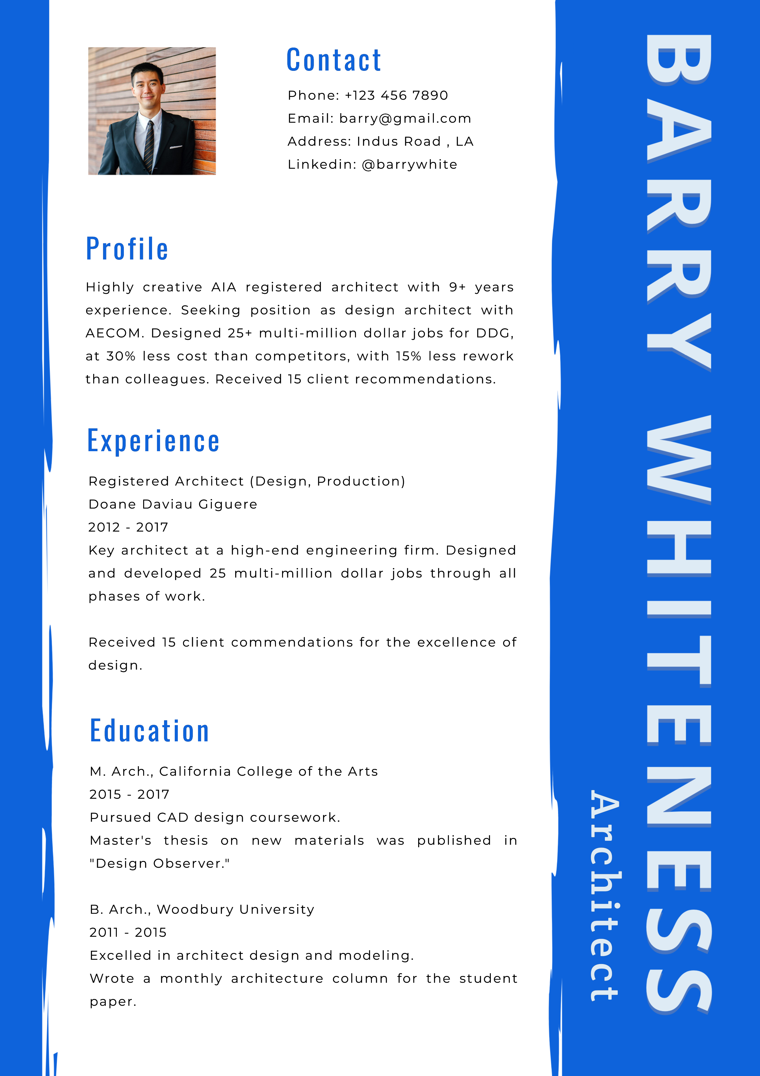
Try to find ways to showcase your individuality and add personality to your resume through design. You may add custom typefaces, borders, and pop-off colors that make it look professional and classy.
Get creative with your resume design with the below DocHipo Architect resume template.
Get This Template and More
Watch the YouTube video below to look at the Resume Templates of DocHipo at a glance.
Also, check out The Ultimate Guide to Using the DocHipo Editor to create your resume or any document you need.
It’s your turn now
DocHipo gives you a great starting point as you can choose from various stunning resume templates for varied fields and industries. You have the complete flexibility to customize the look and feel of your resume by leveraging its design widgets and drag-and-drop tool. Implement the resume design ideas discussed above or take inspiration from them to make a killer resume that speaks for you. Sign up now, and build your resume aligned with your skills and industry to get noticed and hired.
FAQ
What are some effective resume design ideas?
Your resume should have a neat, simple layout with ample space for a sleek and professional look. Some effective resume design ideas include using neutral colors like black, gray, and navy, adding a creative yet professional header and strategic use of sidebars and icons.
How can I make my resume stand out?
Tailor your resume for each job application with a compelling objective, emphasizing your career goals, key skills, and experiences most relevant to the position. Mention how your expertise led to positive outcomes. Use industry-specific keywords pertinent to the job position. Lastly, use a neat and professional layout, easy-to-read and consistent formatting, and a visually appealing design to make your resume stand out.
Which template do most employers prefer for resumes?
When it comes to employer’s preference for resumes, it may vary depending on the company and the job description. However, job applicants may opt for a neat and well-organized format without overly elaborate or creative layouts. They must use the same font style and size for headings, subheadings, and body text to reflect a polished and cohesive look.
How can I create an eye-catching header for my resume?
To create an eye-catching header for your resume, make your name stand out with a larger font size and bold it. Considering your job description, you can add a subtle touch of color around your name, professional title, or contact details to make them pop up. You can try the online graphic design tool DocHipo, where you’ll find ready-made templates, including eye-catching headers catering to various job positions.

