Process Infographics Design Guide with Best Templates and Tips

Process infographics are the unexpected masterpieces of visual storytelling. They turn complex stages into digestible, eye-catching designs that grip your attention. Process infographics are your go-to marketing collaterals if you’re looking to simplify workflows, showcase complicated methods, or explain step-by-step guides.
How to Create Process Infographics Design
- How to Show Process in an Infographic: Use flowcharts, icons, colors, or numbers.
- How to Write a Process Infographic: Focus on a clear, concise step-by-step explanation.
- Process Infographic Ideas: Design block-patterned layouts, use thematic icons, add numbered blocks, use abstract shapes, color code different steps, and more.
- How to Design Process Infographics: Select a template, customize it with brand colors, add texts, change font styles, use process graphics, download it in PNG, or share it on social media.
Who needs these infographics? Whether you’re a project manager, educator, or content creator, process infographics can clarify communication and intrigue audiences by breaking down the information with exciting visuals and bite-sized insights. But let’s be honest – designing them isn’t always a walk in the park. Challenges like overcrowding, unclear flow, or dull visuals can trip you up.
This blog has your back! Get ready for a full-blown guide, trending infographic templates, and expert design tips to help you create stunning process infographics quickly.
Table of Contents
What is Process Infographics
Process infographics visually simplify complex procedures by breaking them down into clear, easy-to-follow steps. Using a blend of icons, illustrations, colors, and text, they guide your viewers through each process stage, making even intricate workflows more digestible and engaging from start to finish.
If you are an infographic designer, you’ll know that the step-by-step guide of any process flow is the ideal layout. Its focus on serial progression sets infographic process flow apart from other types of infographic marketing content.
Unlike statistical or comparison infographics, which emphasize data and contrasts, a process infographic prioritizes flow and clarity, making them ideal for explaining procedures, instructions, or multi-step tasks in a structured and logical manner. The goal is not just to present information but to guide the viewer effortlessly from the beginning to the end of the process.
Let’s check out the following infographic workflow, which is utterly basic yet impactful for its simple and sleek design. The primary purpose of a process infographic is to deliver the most crucial information in a way that the viewers can easily comprehend and remember when performing actions.
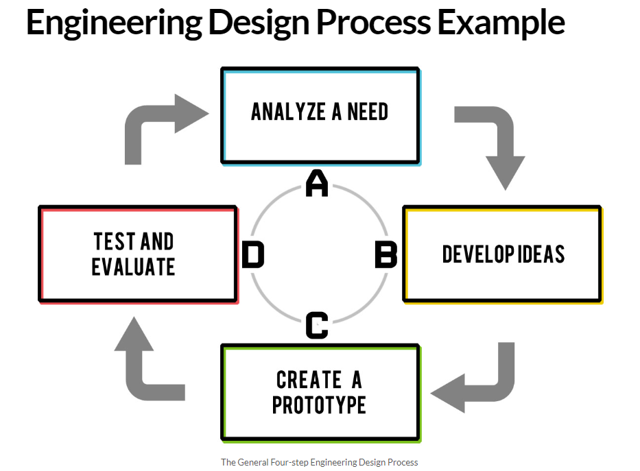
What is the Purpose of Process Infographic
Imagine training new employees, explaining a complex recipe, or outlining a science experiment – each one can feel overwhelmed by an unbearable amount of complex information. Process infographics take this information, structure it serially, and transform it into simple, visual roadmaps.
Whether you’re streamlining project planning, documenting audits, or teaching a concept, they break things down into mini steps that are easy to follow and digest.
How to Show Process in an Infographic
When you design process infographics, you’ve got options like flowcharts, timelines, or even a cool cycle diagram. Play around with these layouts to see what clicks for your subject matter and target audience. Don’t forget to toss in some eye-catching icons, quirky illustrations, or a splash of color-coding to keep things lively and grouped. Oh, you can be creative with ordinary numbers and arrows, too!
These design assets not only catch their attention but also emphasize the steps at each stage, making the process graphics smooth and easy to follow.
Also, using brand assets like thematic colors and fonts creates a synchronicity with other on-brand content. This way, you can help your brand to be more visible while enabling your audience to comprehend precise and streamlined information regarding a specific process flow.
How to Write an Infographic for Process
When writing a process infographic, you should keep things clear and focused. Start by choosing one main process you can easily explain step-by-step. Think like your audience – simplify the info to match their level of understanding, not yours. Ensure you’ve mapped out a clear starting point and a solid ending.
Just like any good story, your infographic needs a beginning, middle, and end, with each part distinct. Finally, trim any fluff or confusing details – clarity is key! Keep it crisp, and your readers will thank you for it.
Now that you’ve covered the basics of process infographic design, let’s explore some stunning templates to spark your creativity and help you present information in the most compelling visual format.
Best Process Infographics Templates with Design Tips
I’ve handpicked a few process infographic examples to show how easily you can create refreshing designs with simple design tips. This section serves as both inspiration for creative, visually compelling infographics and a way to keep up with the ever-changing graphic design trends in how audiences consume visuals.
Why take a closer look at DocHipo’s infographic templates? They’re not just a source of innovative ideas but a chance to view simple designs from a fresh perspective, emphasizing the functionality of process graphics while staying rooted in core design principles.
1. Block-Patterned Process Infographic
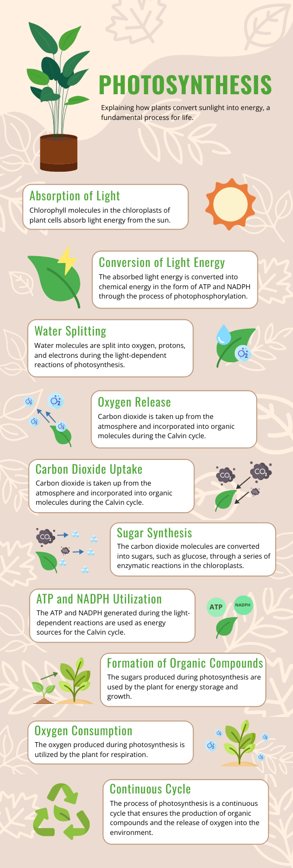
The first infographic on process flow uses a clean block pattern. This style simplifies and clarifies complex scientific information about photosynthesis. Its clean, structured layout helps organize data in an easy-to-follow, step-by-step format.
Get This Template and More
Each block distinctly separates different stages of the process, ensuring the content is digestible while guiding the viewer’s attention. The use of icons and stickers with vibrant colors adds visual appeal, making the information not only more engaging but also easier to comprehend at a glance.
Pro Tip:
Choose a minimal color palette and icons that match the theme, and always ensure enough white space for readability. Stick to simple fonts and highlight key points with colored graphic elements.
2. Visually Enhance Your Infographic Using Thematic Icons
The following process infographic excels in its simplicity and readability. Using vibrant thematic organic icons in each step of the process makes the design visually appealing while enhancing clarity.

Get This Template and More
Its thematic weather icons make it attention-grabbing, offering just enough visual interest without overwhelming the information presented.
Pro Tip:
To achieve this style, you should use a consistent and versatile icon library inspired by natural resources and phenomena and clean, legible fonts that reflect typography hierarchy. To take this design further, try using contrasting yet complementary colors for icons and headers to ensure each step pops.
3. Guide Your Eyes with Numbered Blocks
This infographic template is a prime example of a clean, unconventional design that enhances both simplicity and readability with an ordinary number system.

Get This Template and More
The numbered blocks make the process steps easy to follow, ensuring viewers can quickly absorb the information. Bright, thematic illustrations and numbers draw attention without overwhelming, giving the entire design an inviting, organized feel.
Pro Tip:
To achieve this look, focus on creating a consistent color scheme and using large, bold numbers to break down complex processes. To take it a step further, try experimenting with icon placement to balance visuals and text perfectly for maximum clarity!
4. Improve Clarity by Using Process Graphics in the Infographic with Steps
The following infographic design is an excellent example of how process graphics like icons, illustrations, and stickers can enhance meaning and make complex information more accessible.

Get This Template and More
The step-by-step structure simplifies the explanation of global warming by clearly breaking down each phase, from the introduction of greenhouse gases to their impact on climate change. The proportionate size of icons and illustrations alongside minimal text improves readability. The color palette and rounded shapes also create a warm, approachable visual style that encourages engagement.
Pro Tip:
Leave ample space between sections to maintain a flow that guides the reader naturally through the content. If you want to design a similar type of infographic for a scientific or natural phenomenon, focus on choosing clean, universally recognizable graphics to represent each step.
Also, watch the video to explore DocHipo’s stickers library, which is appropriate for quaint infographics.
5. Create a Harmonious Process Infographic Using Linear Icons
The next infographic design effectively uses linear icons to create a harmonious, clean layout that guides the viewer through the steps of making an effective web design.

Get This Template and More
Its neat and clear outline icons stand out with enough white space to make the design breathe. Each section is visually distinct and easy to follow, with alternate color combinations. The uniform line icons, with minimalist font pairing and a consistent color palette from the color wheel, make the content legible and professional without being heavy with creative graphics.
Pro Tip:
If you want to customize your design in the same format, focus on maintaining visual balance by evenly spacing out icons and text. To ensure cohesion, use simple wireframe icons in mono colors that match the overall theme. You can also incorporate subtle color variations or accents in key sections to draw attention without disrupting the design flow.
6. Guide Your Infographic Process Flow with Zigzag Diagrams and Color Codes
The next process infographic example template catches your attention due to its dynamic zigzag layout and vibrant color coding.

Get This Template and More
The use of different colors and the playful visual flow make the infographic with steps both eye-catching and easy to read, offering an intuitive journey from one step to the next.
Pro Tip:
Use bold, contrasting colors and common shapes to pad different text-heavy steps, maintaining clear graphics groups and naturally guiding the viewer’s eye along the zigzag path. Keep your icons and illustrations simple, matching the overall tone.
If you use this infographic for digital purposes, consider adding subtle animations to add more interactivity and engagement to the content.
Watch the video to apply animations.
7. Guide Your Process Infographic Design with Dotted Pathways
You’ve explored process infographic examples featuring icons, illustrations, color codes, and vibrant color schemes tailored to different layouts and reading patterns up until now.
Now, let’s dive into how different styles of lines can enhance visual impact. The infographic below uses dotted lines and tag-shaped padding to map out steps, effectively highlighting essential information.

Get This Template and More
The paper recycling process flow infographic smartly uses dotted lines to group related elements, creating clear, distinct layouts for each step.
Pro Tip:
You can use lines to create clean, cohesive infographic designs effortlessly. For a creative twist, experiment with different styles of line graphics to add an element of surprise! Explore the DocHipo line library, which offers a wide range of line styles, perfect for giving your designs a minimalist and professional finish.
Watch the short video to use different strokes of lines in your designs.
Also, try to add a gripping focus on some aspects by adding bold or blurry and convenient shadow effects to graphic elements. Watch the video to use the new widgets to edit your designs.
8. Use Abstract Forms to Highlight Info in the Process Steps Infographic
As a graphic designer, I would not blame you for your favoritism if you’re biased about abstract shapes. Like other geometric shapes in design, abstract forms add depth and creativity, allowing for open interpretation while conveying emotions and ideas beyond literal representation.

Get This Template and More
The above template uses iconic color palettes with the edginess of abstract shapes to draw your attention to the different book publishing steps.
Pro Tip:
If you like dazzling your designs with conventional and unconventional shapes, check out the new shapes library in DocHipo.
9. Emphasize Your Infographic Process Flow with Monochromatic Contrast
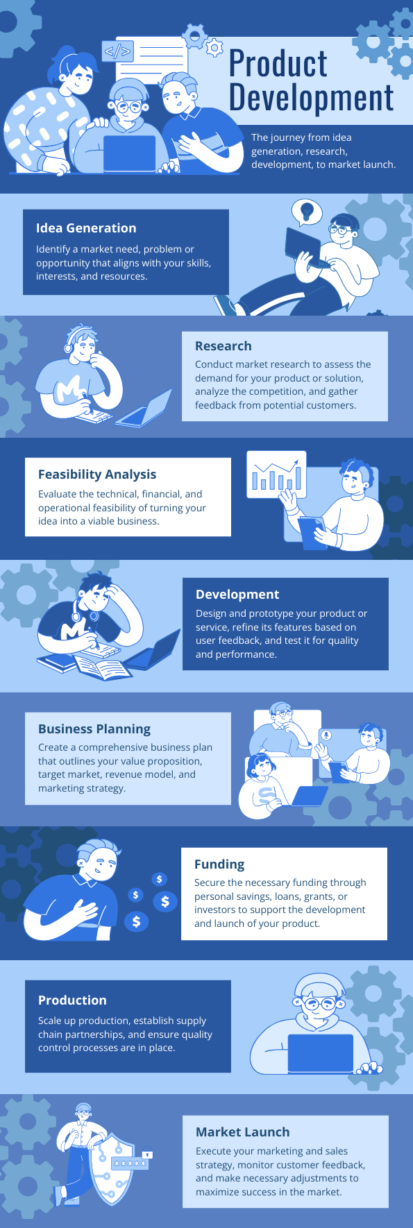
The following infographic template beautifully balances simplicity and sophistication with monotones. Using monochromatic shades creates a clean and cohesive look that is easy on the eyes.
Get This Template and More
This design emphasizes key steps in the process with well-organized blocks, alternative color tones, and a seamless visual flow, which are the hallmarks of an effective process infographic.
Pro Tip:
You can achieve this style by using a single color palette with varying tones, which helps maintain visual harmony. Also, add a variety of marketing and developer illustrations to emphasize the theme of your subject matter.
Watch this video to enjoy the variations available in the DocHipo illustration library.
10. Process Graphics with Spiky Text Frames and Website Box Aesthetic
The next design style of process infographics stands out due to its creative mix of modern and playful elements. The spiky text frames add a touch of dynamism, making each step feel important and distinct, while the website box-inspired sections keep everything organized and easily readable.

Get This Template and More
The consistent layout and minimal use of distracting colors ensure a clear focus on the information, seamlessly guiding the reader through each numbered step.
Pro Tip:
If you want to create a similar look, start with simple stickers with spiky or asterisk shapes to make important points stand out. You can be creative with innovative text frames, customizing their color and size and adding text to explain the steps of your infographics.
Watch the video to use text frames in your designs.
11. Realistic Process Infographic Designed with Bio Icons
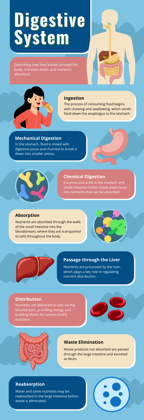
The next template combines detailed biological multicolored icons with a clean, approachable layout, making complex concepts like the digestive process visually engaging and easy to follow.
Get This Template and More
The use of vibrant colors and clear iconography helps the information flow seamlessly. The spacing between sections enhances readability, while the human figure illustration gives the infographic a practical and educational feel.
Pro Tip:
To achieve this look, you should use icons that clearly represent the process you’re explaining. Ensure your icons and illustrations are well-aligned with the text.
Additionally, use the arrangement editing tool to create layers with different shapes in your design for a shadowed backdrop, enhancing the emphasis on each icon and illustrated graphic.
Watch the video to use the layers feature.
12. Neon Color Palette for a Heightened Visual Experience
The neon color palette in the following infographic looks remarkable as its vibrant neon hues are set against contrasting backgrounds, making each section visually pop.

Get This Template and More
This design not only grabs attention but also provides clarity. Its gripping format with striking and vivid color play forces you to look at it in awe as you effortlessly go through the Software Development Life Cycle stages. The sharp, modern color scheme combined with minimalistic illustrations balances creativity and simplicity, enhancing readability.
Pro Tip:
Stick with minimal, clean fonts to balance the brightness of your design’s colors. If you like the splash of fresh colors in the design, try DocHipo color themes for the best combinations. From different moods to different dominant tones, find unique colors that set the core of your design.
Watch the short video to learn more about the color themes.
I hope these brilliant process infographic ideas, tips, and templates inspired you! Before diving into the key section that discusses the steps of designing process infographics easily, check out a few more creative hacks you can try with DocHipo templates.
How to Design Process Infographics in DocHipo
Do you want to design your own process infographics for instant on-brand content? But don’t know how to start from scratch? Don’t worry! Having process infographic ideas from the mentioned examples and creating process infographic design are two different things.
You can simply use the predesigned process infographics to save time and energy. Or, try the following steps to create stunning process flow infographics from a blank canvas. Create your own magic in just three simple steps. And guess what? It’ll only take you three minutes, maybe even less! So, let’s explore how you can design process infographics like a pro with DocHipo editor.
Step 1: Select Your Process Infographics Template
First thing, sign up for DocHipo to use its free infographic maker. Once you register, you’ll see an intuitive UI with a minimalistic design that will help you quickly find process flow infographics inside the design tool.
Go to the infographics template library and choose the “process” category for process infographic templates.
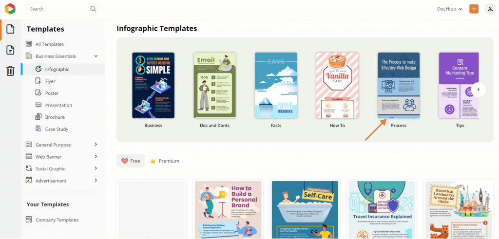
You’ll discover loads of process infographics for various process flows such as product development, SDLC, global warming, photosynthesis steps, etc. There are free and premium templates available for the users.
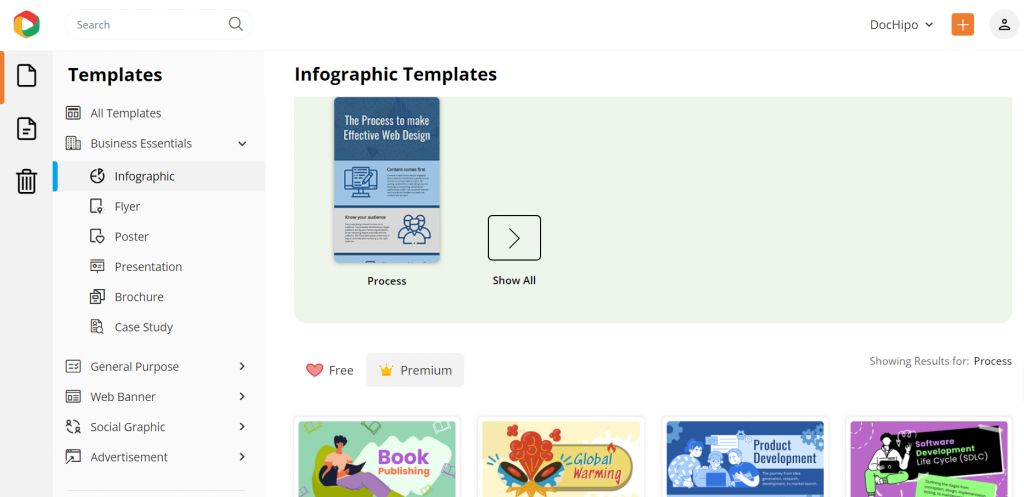
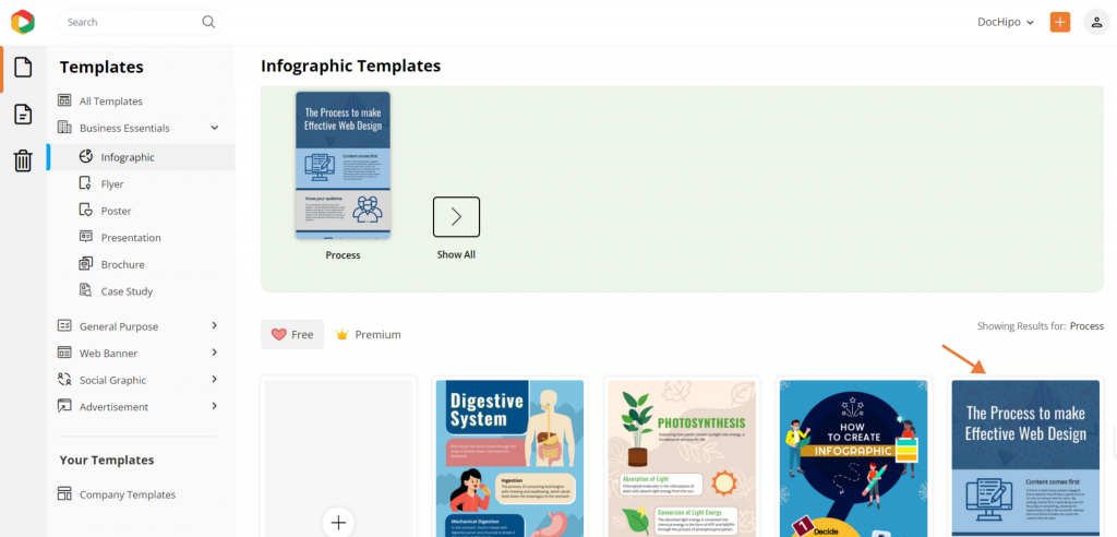
So, check out the free infographic templates to save your bucks from minutes.
Step 2: Customize Accordingly
Customization in the infographics process template is essential to leave a mark on your audience. Let’s explore how to redefine it with a blend of customization features and convenient drag-and-drop applications of design assets.
I’m choosing a web design process steps infographic template to show you the customization steps so that you can match your new infographic design with your brand’s themes and designs.
A. Edit Text, Add, or Remove Blocks
Start with sorting text in your design. Select any existing text box, edit the texts, or remove unnecessary text blocks from the editor with a click.
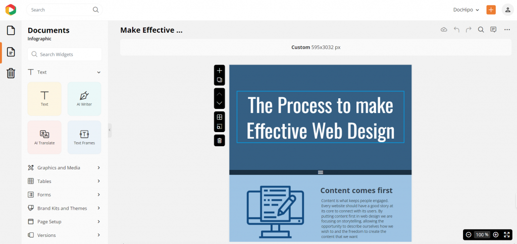
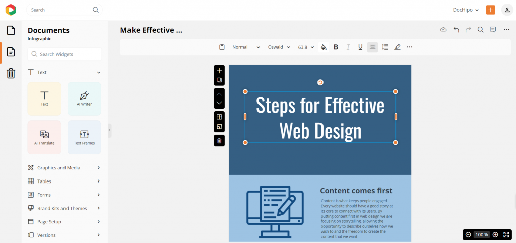
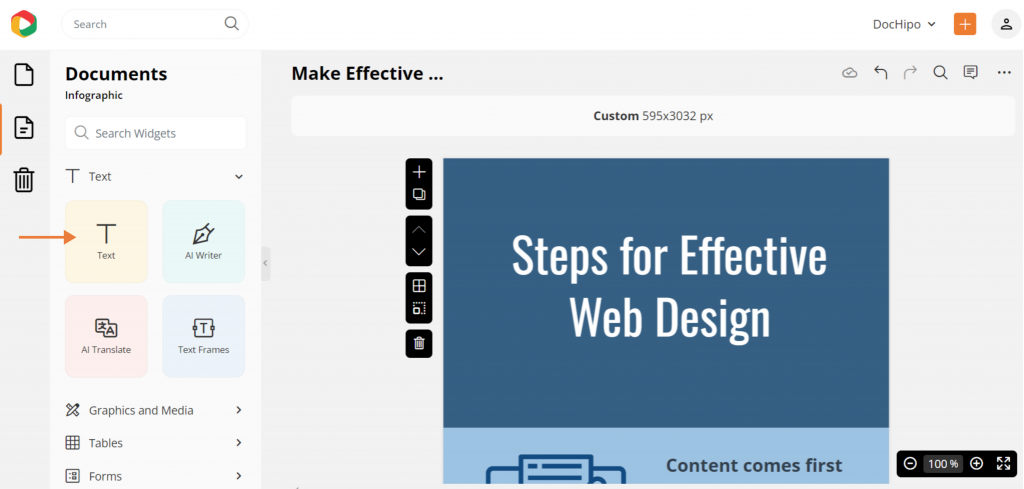
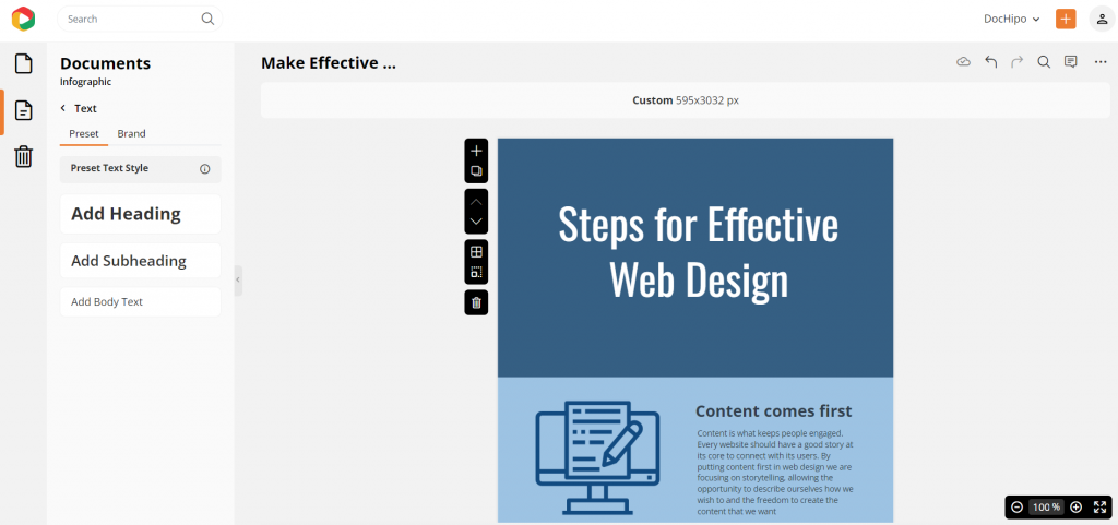
Add another text box for a new text; go to the text widget to add a text block according to the format of your text, i.e., a heading, subheading, or paragraph.
If you want a new block for design, click on the “+” icon to add a new, clear canvas.
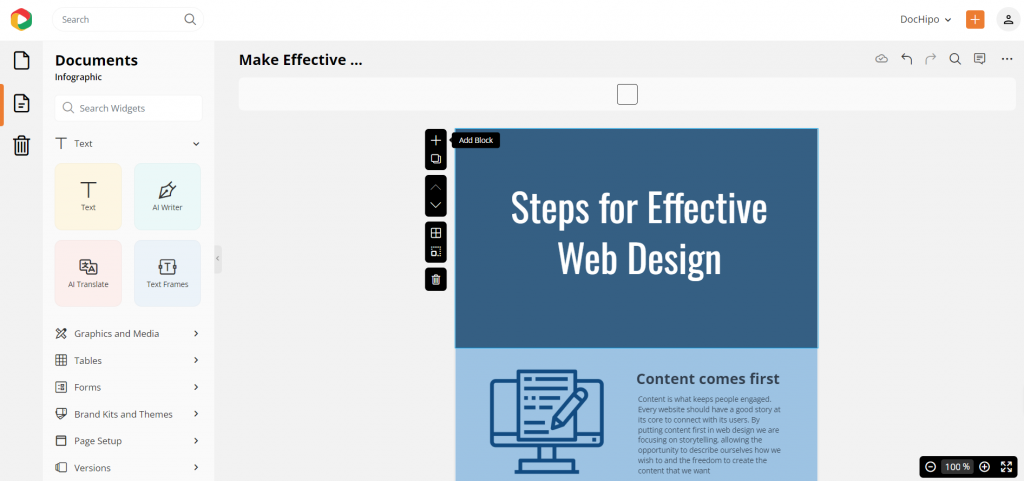
Also, you can clone the same design or layout for a quick and convenient design experience.
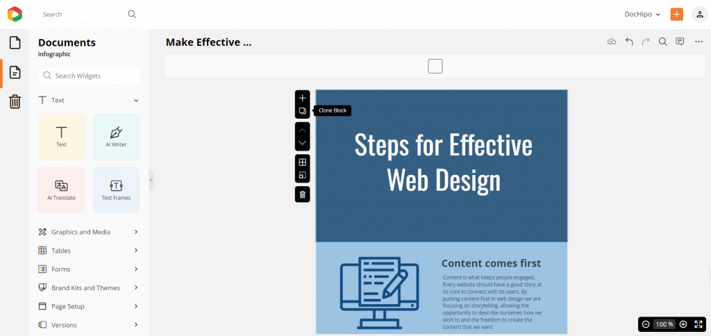
Moreover, if you find a design block unnecessary, simply click the delete button to remove it from your process infographic design.

Also, if you have trouble adjusting all the design elements in one block, resize it to make more room in the design, accurate for informative and text-heavy content formats.

B. Apply Brand Fonts
After altering the texts, change the default font to your branded font style.
Let’s kick things off with a super easy and advanced customization trick to give your designs that branded flair—customizing templates using your brand kit! You won’t need to adjust every single design element anymore manually. It stores your logo, brand colors, fonts, and visuals all in one handy spot.

Click the “Brand Kit and Themes” option from the left panel to update your font style. Then, simply use the dropdown to choose your brand kit and instantly customize your design with your brand’s assets. Head over to the fonts section to apply your branded fonts and maintain your usual typography.
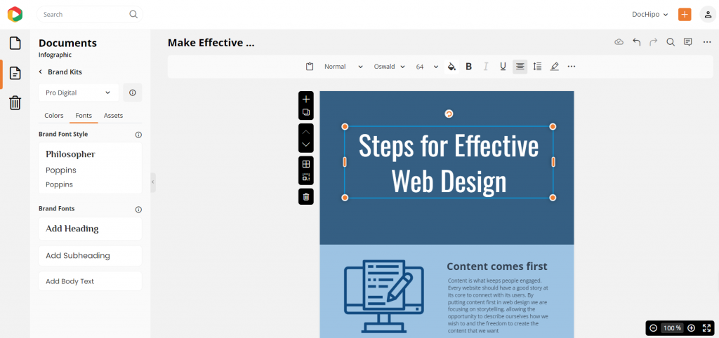
You can easily upload custom fonts to use them seamlessly in your designs.
Watch this video to upload custom fonts.
C. Apply Brand Colors
You can upload your brand colors in the DocHipo Brand Kit. You can also upload other brand assets like logos, images, and videos to keep things handy while designing your case study.
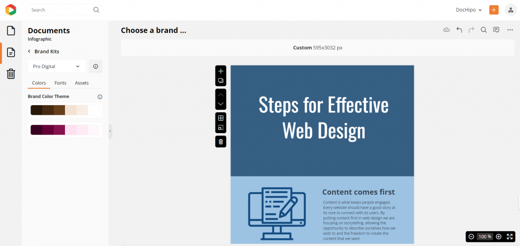
Apply the brand colors to customize your process infographic design blocks.
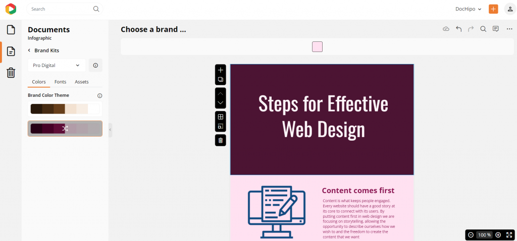
D. Incorporate and Customize Process Graphics
Add relevant icons, illustrations, and stickers to highlight key points in your process infographic with steps.
Go to the “Graphics and Media” option to explore the astonishing library of design assets that enhance your design and catch the eyes without any hassle.
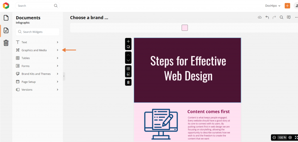
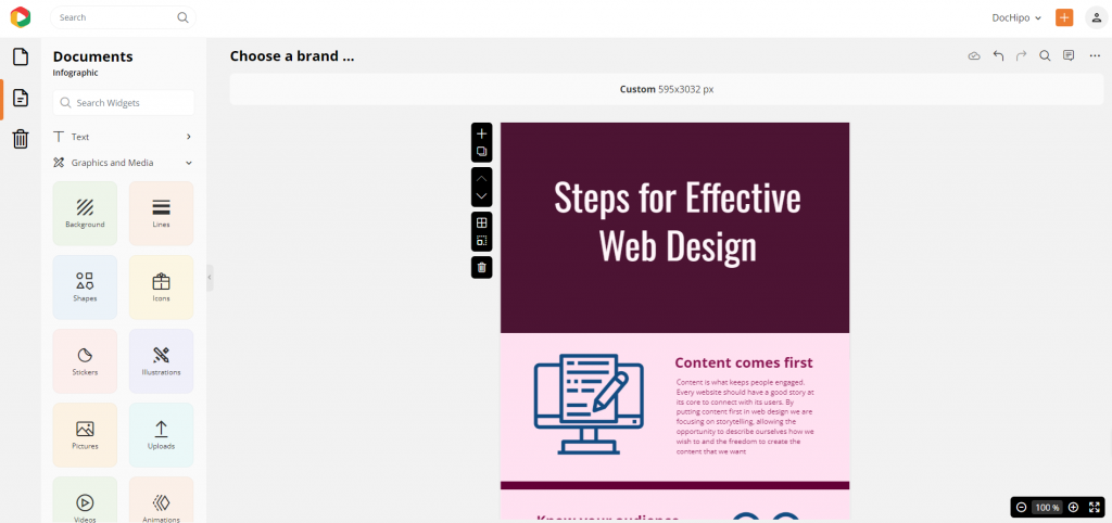
Let’s explore some icons to customize this default design block.
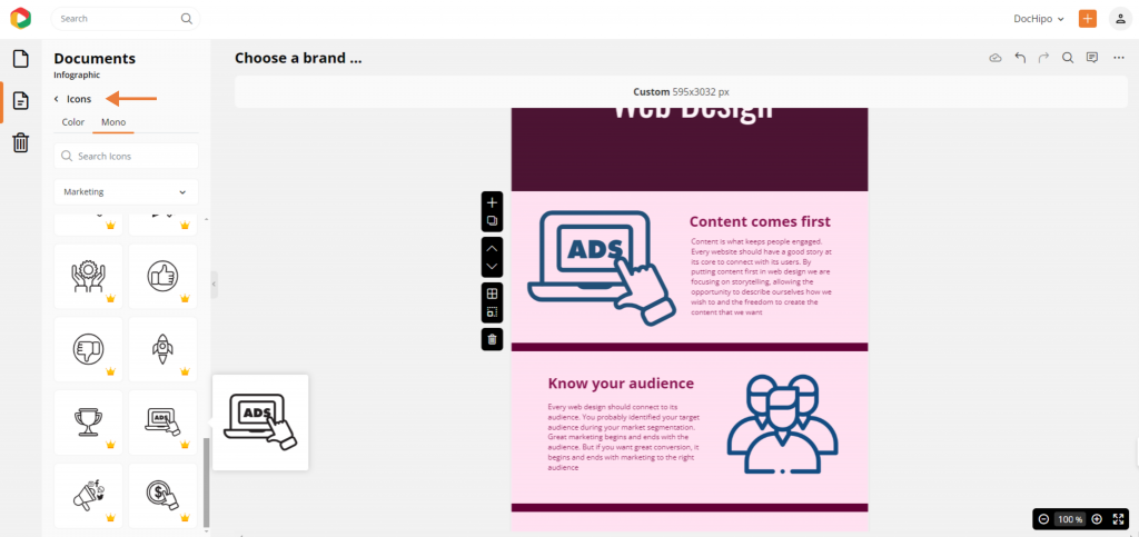
There are many icon categories, such as notification, marketing, education, and more, to decorate the infographic design with appropriate elements and thematic aesthetics. Moreover, you can customize every part of these design assets, from color themes and size to opacity, to make them visually appealing.
Watch this short video to use icons in any design.
Step 3: Download Your Design
Click on the three dots at the top right corner and put the cursor on the “download” option.
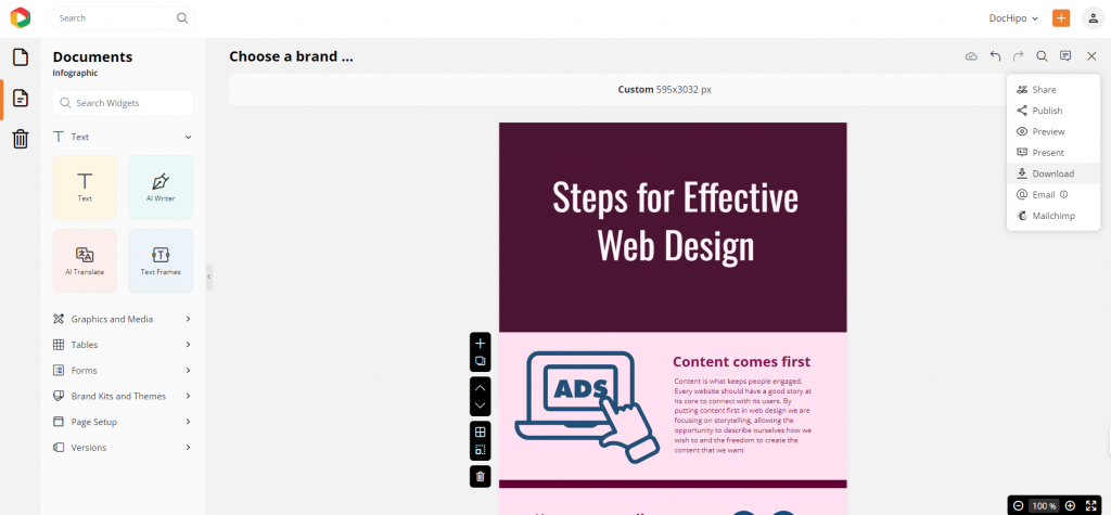
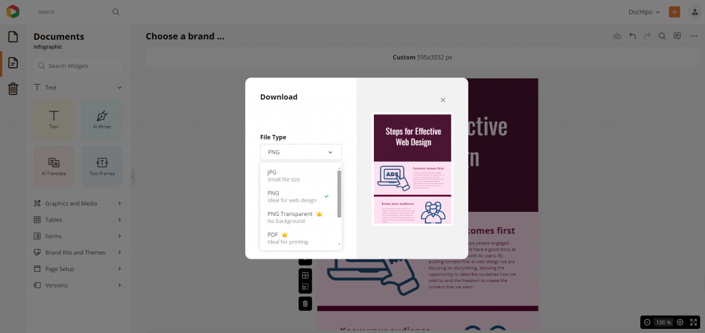
You can also choose the file format, such as a high-quality PDF, JPEG, or PNG. Preferably, choose the PNG format because it is easy to share.
Moreover, if you wish to use the same design for the other process infographics as a template for your company, you can try Dochipo’s company template feature!
Watch the video to create a company template for your branded content.
I’ve put together the final design for you, making sure it strikes the perfect balance and contrast.

Conclusion
In conclusion, when designing professional infographics, keep the basics in mind—stick to core design principles and a clear, step-by-step format in a compact style. For a quick and seamless infographic creation process, sign up for DocHipo and unlock access to exclusive templates and top-notch design assets, making customization a breeze!
FAQS
What is a process infographic?
A process infographic visually breaks down steps or stages of a procedure or concept, making complex processes easier to understand and follow.
How to you create a process graphic?
To create a process infographic, map out the steps, choose a clear layout like a flowchart or timeline, and use icons, colors, and arrows to guide the viewer through each step.
What is a process explanation infographic?
A process explanation infographic details the steps of a workflow, visually guiding the audience through each phase to ensure clarity and comprehension.
How to explain a process visually?
Use diagrams, icons, color-coded steps in a structured layout (like flowcharts or timelines), relevant illustrations, and stickers to break down and simplify complex processes for easy understanding.
How should you create a process flowchart?
Start by outlining each process step, then organize them sequentially with arrows and shapes to show direction. Keep it simple with clear labels and minimal clutter for readability.


