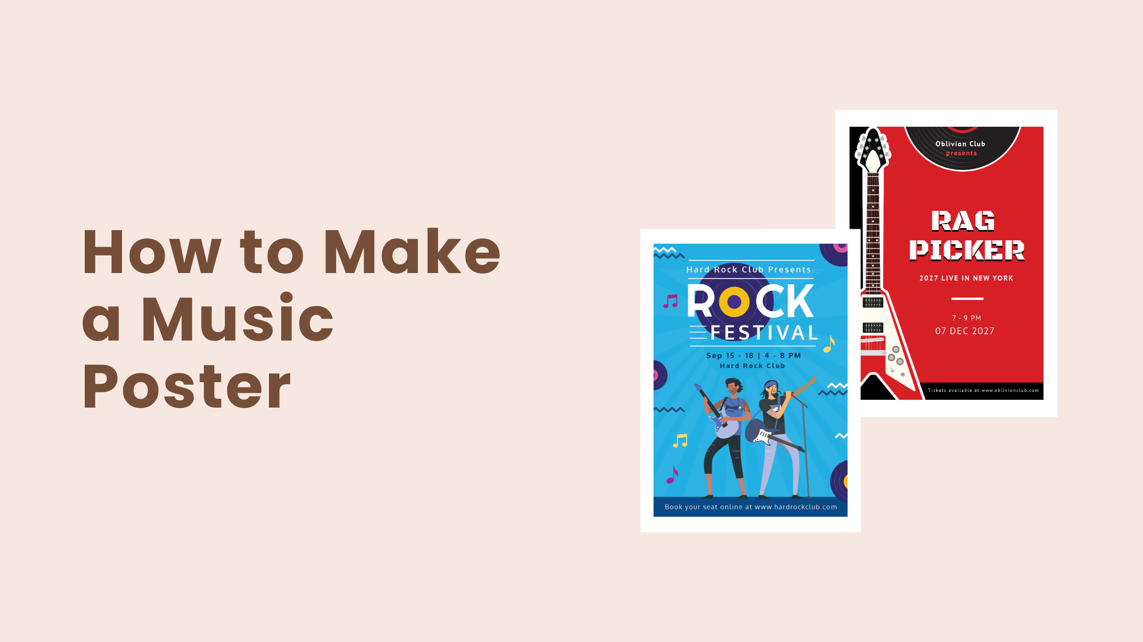
Music Poster: How to Make a Music Poster with Ease

The promotion of musical concerts through music poster is not something that started with the advancement in graphic design. It’s a trend that has been around us for decades now. Nevertheless, promoting a musical concert or event is hefty work, and a large chunk of it is getting the aesthetic right.
Statistics show that since 2011, more than 50 million people have been attending concerts each year. Furthermore, in 2024 the industry is expected to generate $31.05 billion in revenue. So, to generate more revenue and spread the message across the world through music, your band needs to be unique. The unique identity of every band significantly depends on its own distinct look.
How to Make a Music Poster
- Choose A Template Aligning Your Band’s Style: This will depend on the music style your band plays, such as jazz, rock, pop, etc.
- Use a Darker Shade for the Background: A dark background makes the design clean and sleek and sets the mood for a vast audience.
- Reflect Your Band Theme: Take inspiration from the atmosphere and setting of the fest.
- Use Legible Fonts: Use two to three complementary fonts that are easy to read.
- Select Eye-Catching and Contrasting Colors: Choose colors that align the background and other design elements to make the design easier to grab people’s attention.
- Select Images Carefully: Use images of your past few concerts or a large image when the image itself is the primary focus.
- Include Complete Information: Include Band name, Date & Time, Venue, Contact Info, Name of the musicians, and Ticket pricing in your music poster.
- Include Social Media Information: Include links to the Facebook page, Instagram handles, and website for purchasing tickets.
Finding the uniqueness in your band’s appearance is not an easy task, but not impossible. You can find that look easily with the combination of DocHipo Poster Maker and your band’s theme.
Continue reading to learn how to make a music poster with ease.
Table of Contents
What Is A Music Poster?
A poster is a temporary promotion of an idea, service, product, thought, or any event put up in a public place for mass consumption. Thus, making it a great marketing tool. Posters are designed to be both appealing and informative. Hence, they are also a great tool to communicate a message.
When posters are designed to communicate a message or promote an event and festival by musicians, it is called a music poster. Though the posters were first designed in the late 18th century, the modern poster that we know today dates back to somewhere between the 1840s and 1850s.
Music Poster Design Tips
We understand the complexities that non-designers face while designing anything. This is what motivated us to create DocHipo that can help non-designers design stunning graphics like professionals.
Hence, to make it easier for you to design your music poster, we have developed some effective music poster design tips along with some example templates.
Choose A Template That’s In Line With Your Band’s Style
Due to the variations in music genres, there are different styles of bands in the music industry. Hence, a Rock band will surely not be of the same style as a Jazz band. Choose your template according to your band style.
For example, the music poster design for a pop band should be fresh and sleek. You can add different design elements such as smooth lines, dots, shapes, and many others. Moreover, other design elements such as music notations, lines, and shapes will create an environment your audience will love.
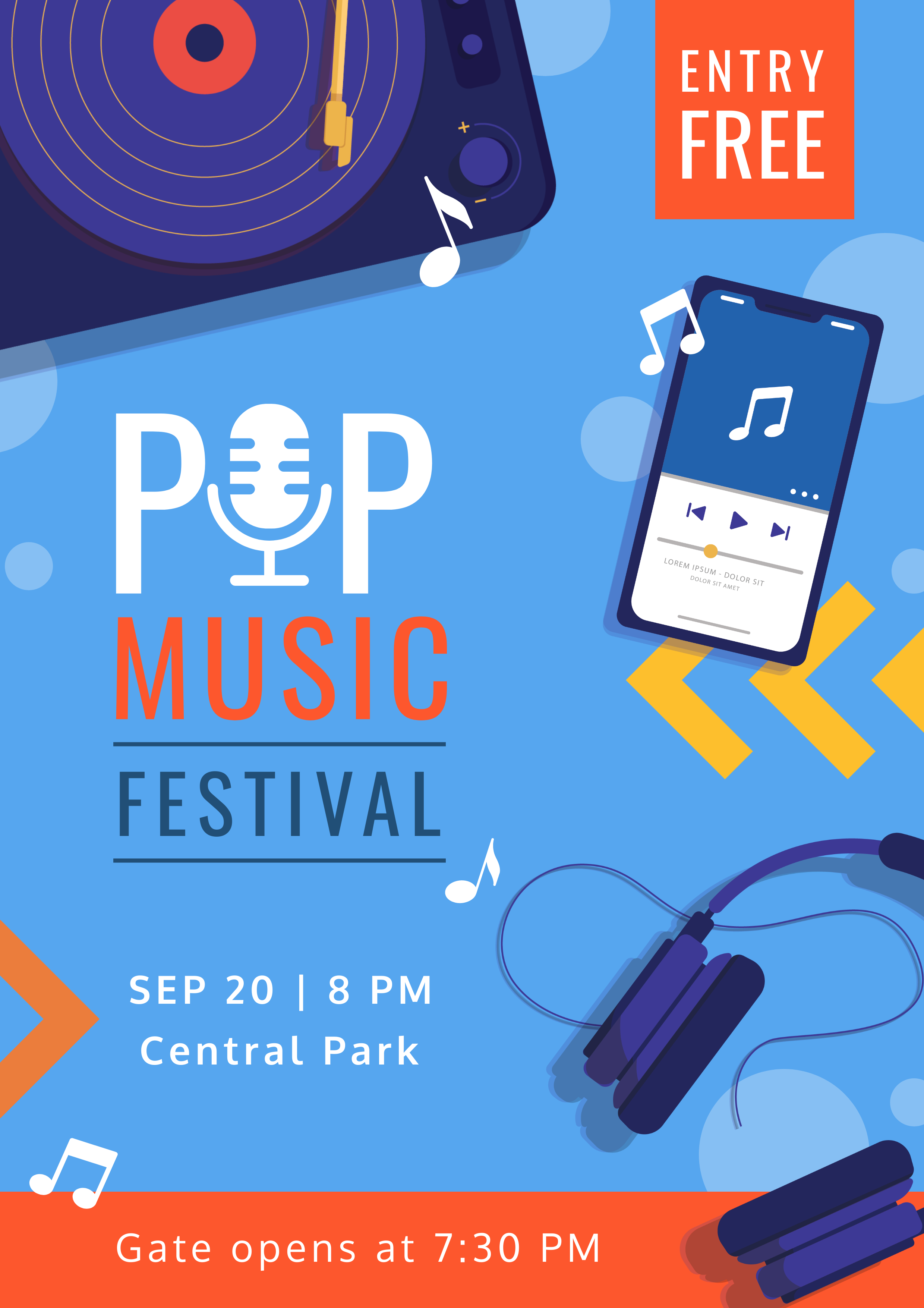
Get This Template and More
Alternatively, for a Rock band, the design should be grungy. The use of energetic red colors and shady backgrounds are the perfect fit for a rock band music poster.

Get This Template and More
Use A Darker Shade For The Background
Bright backgrounds can grab people’s attention quickly. But when it comes to music poster design, a dark background makes the design clean, sleek, and professional. All the live concerts that take place worldwide mostly have dark backgrounds, especially when setting up a vast audience’s mood.
Get This Template and More
Additionally, consider watching this video to learn how you can create stunning backgrounds in DocHipo.
Reflect Your Band Theme
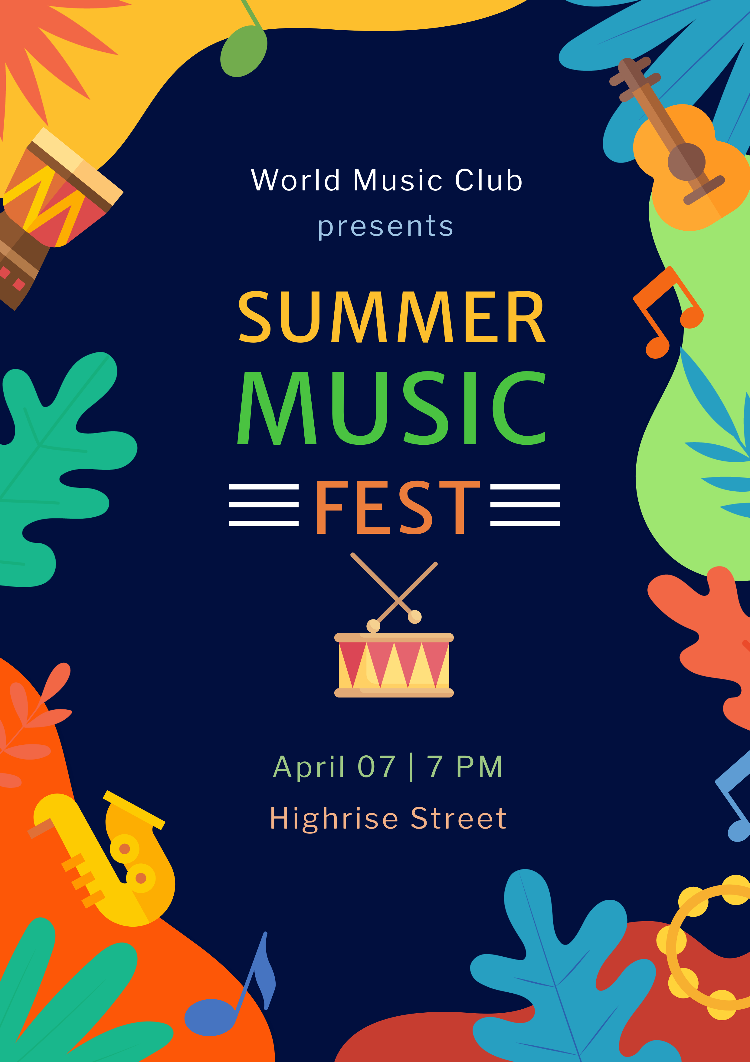
Think about those huge concerts. How do they set up their stage for a concert? A black background setting, bright lights, prominent flashy wording, and some concept graphics to bring the audience’s mind into the stage. It seems that their poster was designed to create the atmosphere before the concert or festival takes place. So, it would be best if you designed your music poster keeping in mind your band’s theme.

Get This Template and More
Use Legible Fonts
Typography is another critical design element that brings life to your poster. Especially when it comes to music posters. Your music poster should be easy to read. We recommend that you don’t mix too many different font styles. Use two to three fonts that complement each other.
For critical information like the Band name, venue, date, time, and others, use a bold and stylish font. And for the body text like legal aspects or ticket pricing, use a thin font.
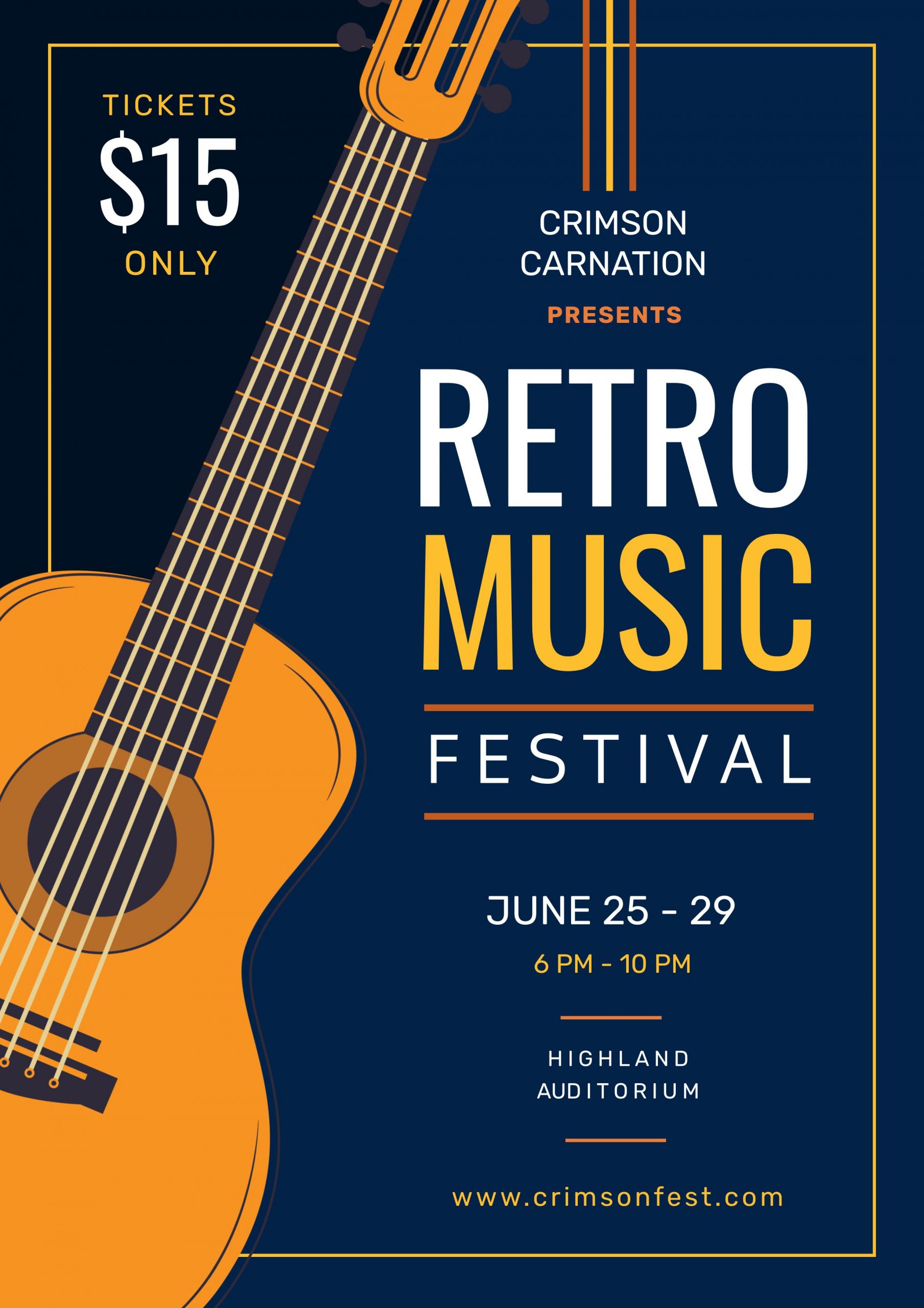
Get This Template and More
Learn more about typefaces from here.
Select Eye-Catching and Contrasting Colors
Color is another crucial aspect that you should be very careful of while designing a music poster. Choose your colors carefully and use them appropriately. You can look for a combination between the background and other design elements to make the design easier to grab people’s attention.
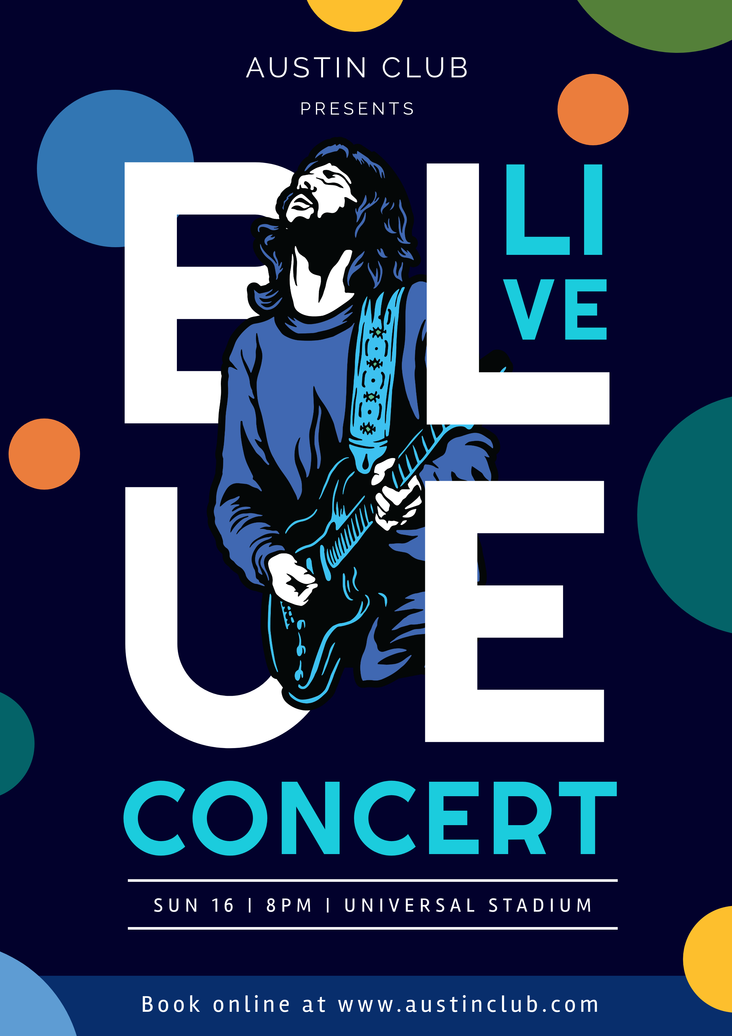
For example, look at the music poster template below. The Oxford blue in the background and the white fonts make the template super stylish. Additionally, the other design elements with different and complementary colors add an extra layer of design.
Get This Template and More
Alternatively, you can use your band colors, such as the colors in your logo, your instruments, and many others. However, if you are having trouble selecting the colors for your music poster design, click here to get the best color combinations.
Select Images Carefully
Image selection for your design can make or break your music poster. While designing a music poster, your goal should be to make it uncluttered. You can do this by selecting single images for your music poster.
Select either a large image when the image itself is the primary focus or a small one surrounded by ample white space that makes the audience curious. DocHipo allows you to upload your pictures and enhance them using the free online Photo Editor.

Get This Template and More
You can either use images of your past few concerts or click pictures of the musicians in your band or the lead singer. Use DocHipo filters to make your band’s images more exciting and charm your audience. Here’s how to do that:
Include Complete Information
An ideal music poster must have complete information about the concert or event. Therefore, you need to include some critical information like Band name, Date & Time, Venue, Contact Info, Name of the musicians, and Ticket pricing in your music poster. You can jot down this information separately to include in your poster template later.
However, don’t be tempted to make the ticket pricing so noticeable that it overwhelms the music poster design. We recommend that you make it a little smaller than the other texts in your poster and put it at the bottom of the poster.
Include Social Media Information
Don’t forget to include your band’s social media information, as this is your most significant opportunity to interlink your music poster with your online presence. And if you don’t have any social media accounts for your band, create one today. Otherwise, you will be missing out on something huge.
Design social media graphics for your channel like Facebook Event Cover, Facebook Post, Instagram Post, and many others using DocHipo. Additionally, you can share your music poster on your social media pages. It will ensure that your target audience sees your poster not only on the walls in public places but also on their social media.
How To Make A Music Poster In DocHipo
Now that you have understood the concept of music poster design theoretically, why not give it a try. You will show you how to make a music poster using DocHipo in just 3 simple steps. Sign-up to DocHipo if you haven’t already and get started for free.
Step 1: Select A Template
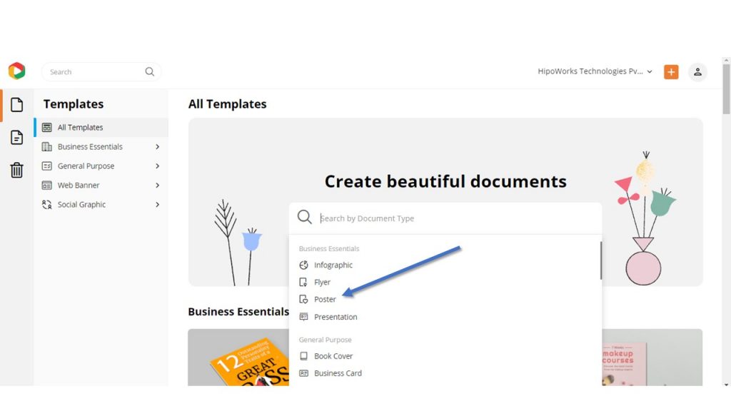
We hook you up with a wide variety of professionally designed templates, so you are never starting from scratch with the blank templates. Once you land inside the DocHipo application, you will find an ocean of templates under different categories. Since you are looking for music posters, click on the search bar, and some suggestions will appear. The third document type is the poster. Click on it.
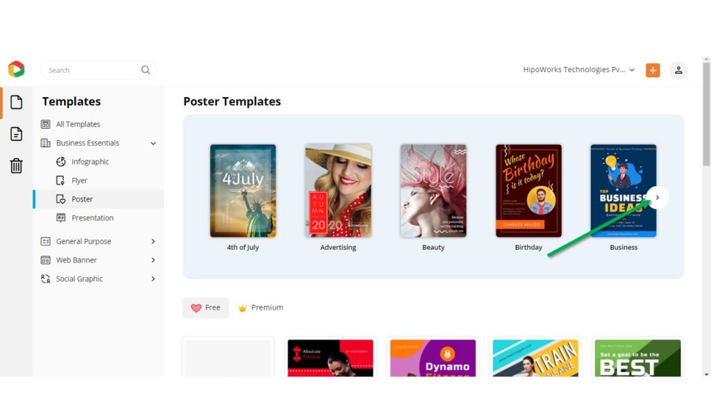
Then click on the right arrow to skip to the Music category. Click on the Music template category, and you will find many free and premium templates to choose from.
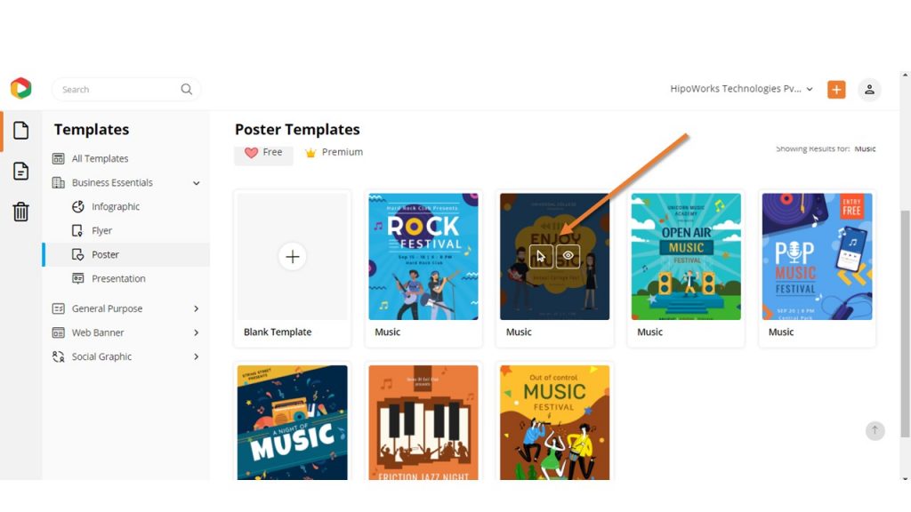
Once you find a template to start from, click on it to either preview or open it in the editor.
Step 2: Customize the Template
There are many ways you can personalize your music poster template. Replace the text with your concert or festival information that you have jotted down as we have recommended before. Change the fonts and color scheme accordingly. Upload your photo, browse from the thousands of free illustrations and icons available right in DocHipo and use them properly.
Alternatively, you can go for stock images from Freepik, Pexels, Pixabay, Shutterstock, and many others. Click Here to learn how to use stock images in your design.
Do whatever you want and spend as little or as much time as you want to customize the template until you are satisfied. Click Here to learn how you can utilize the DocHipo editor.
Step 3: Download or Publish the Poster
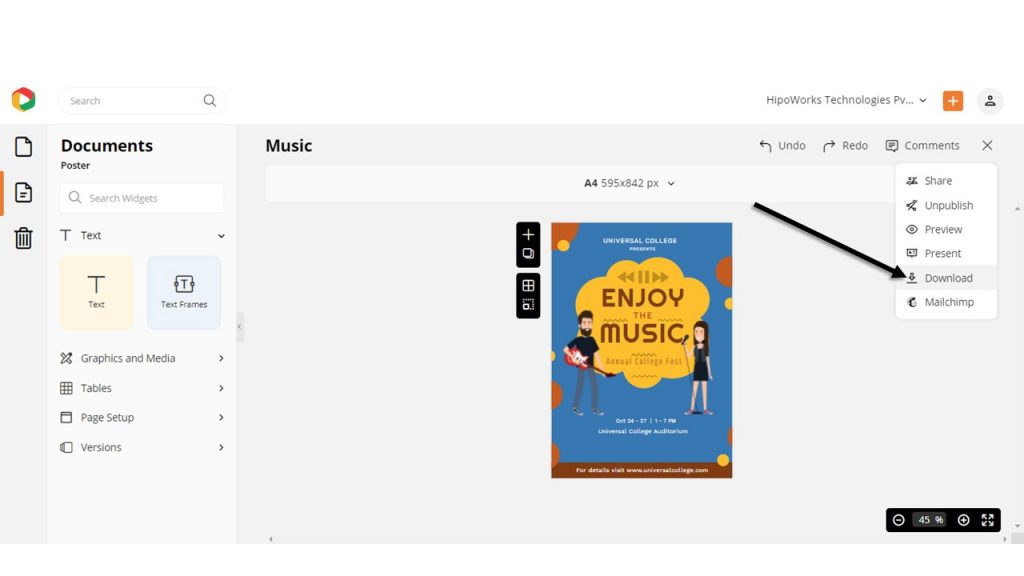
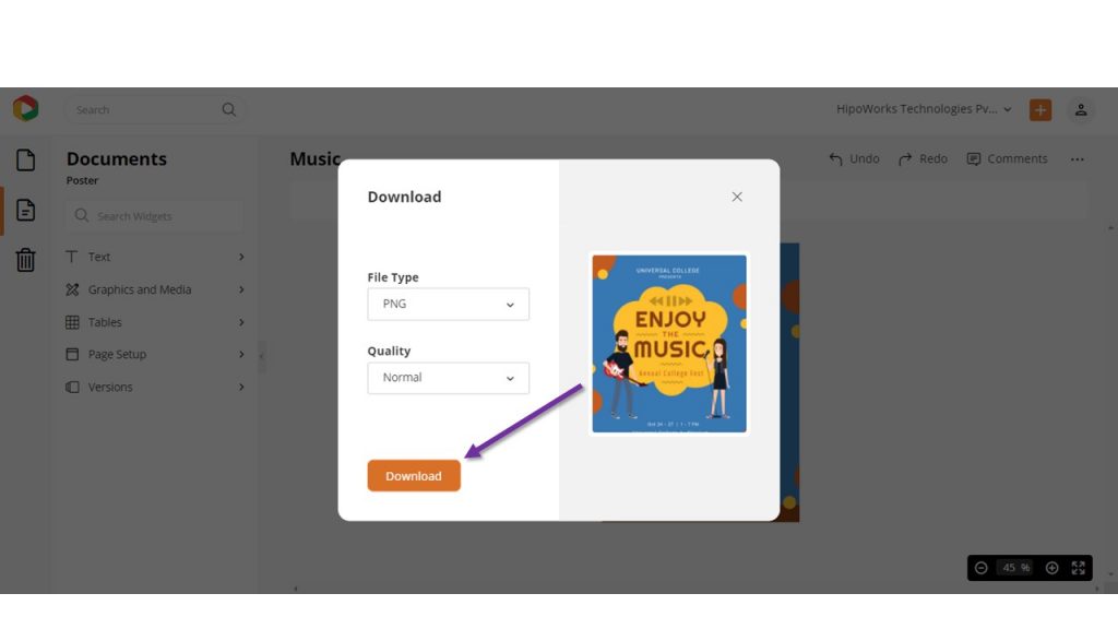
DocHipo lets you download the files in three different qualities: Normal, Medium, and High. Furthermore, the file types that DocHipo offers are PNG and PDF. Once you have completed the design, click on the three dots from the upper right corner of your screen.
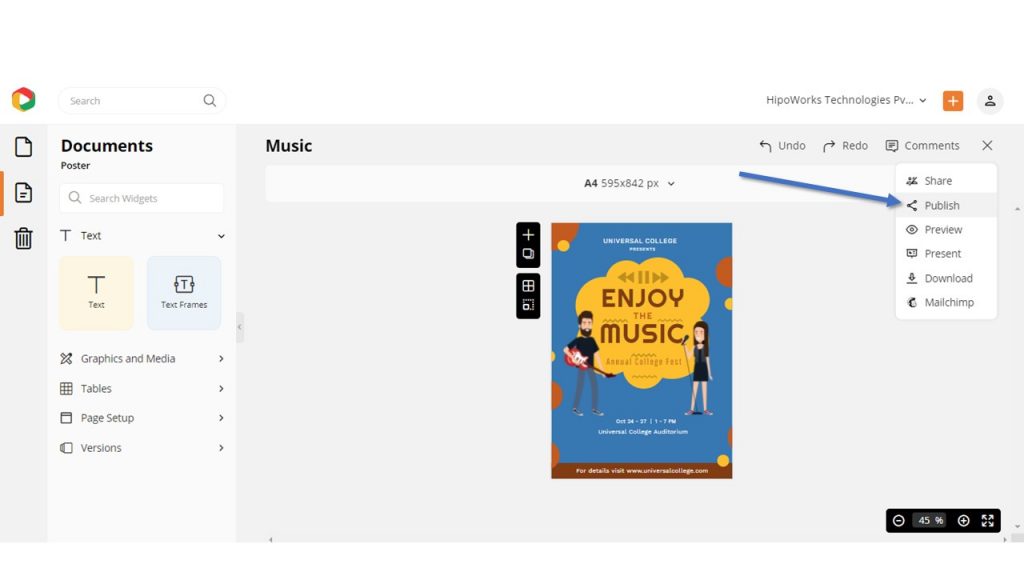
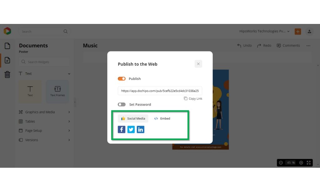
Hit the publish button to publish the music poster design on different social media platforms.
To download the poster design, click on the Download button from the drop-down menu.
Now hit the download button and wait. Your design will be automatically downloaded to your system.
Click Here to learn more about how to make a music poster or watch this video.
Final Thoughts…
Hopefully, the music poster design tips and the steps mentioned above helped you understand how to make a music poster with ease in DocHipo. Hone your creativity with the power of DocHipo. Explore the professionally crafted templates to get your wheels spinning. Personalize the music poster templates using icons, illustrations, fonts, and other design elements to make them visually appealing.
So, what are you waiting for? Sign-up today and explore the magical world of DocHipo.


