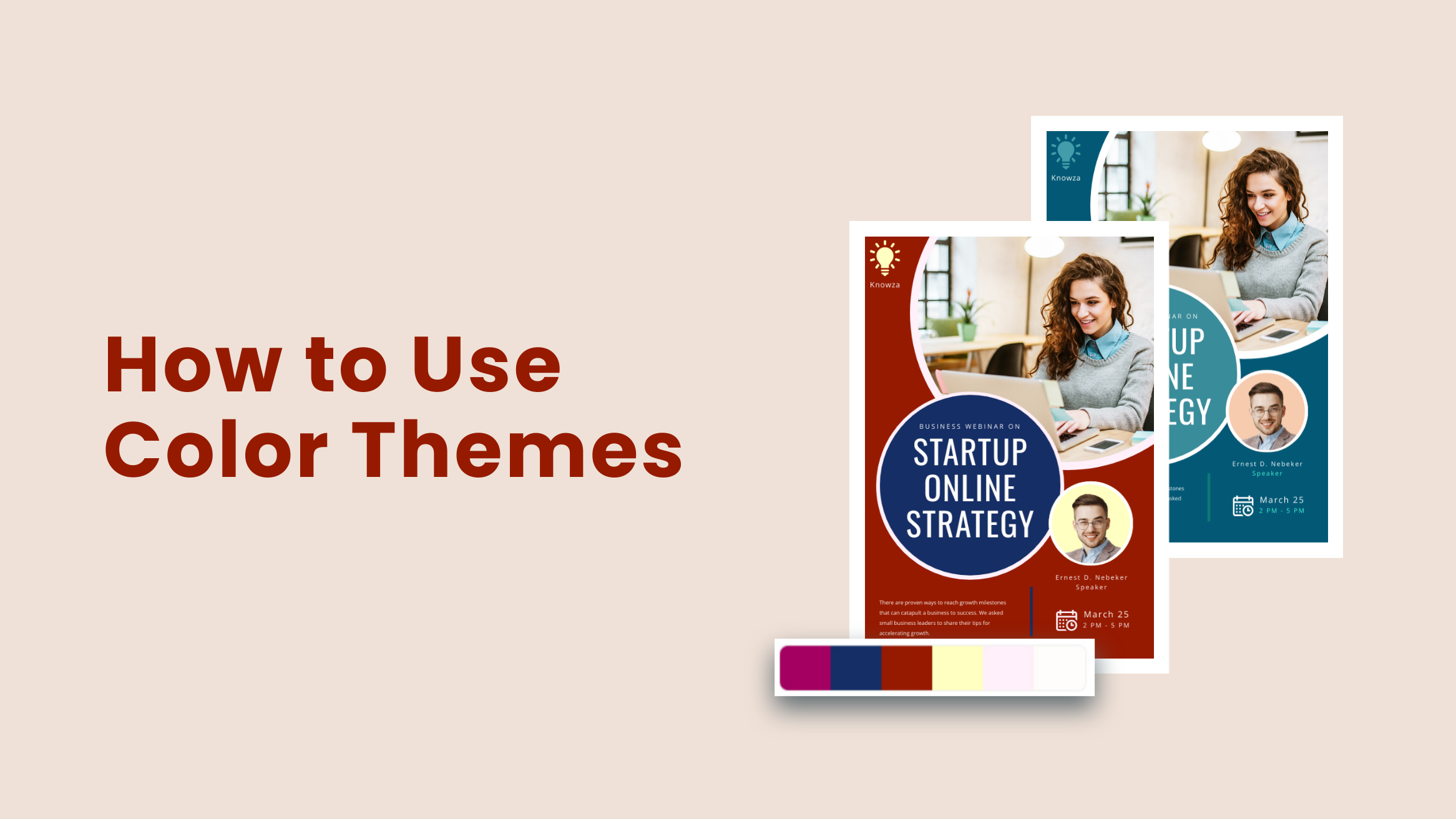
How to Use Color Themes in DocHipo for Quick On-Brand Designs

Get ready to unlock a unique feature in DocHipo – Color Themes! Imagine effortlessly creating on-brand designs or revamping existing content with stunning, eye-catching color palettes – all in seconds. Gone are the days of spending hours hunting for the perfect colors to match your brand persona; with Color Themes, you can transform your visuals aligned with your special campaign goals with a single click!
How to Use Color Themes
- Select the Template: Choose a design template that fits your campaign.
- Edit the Text: Customize text to match your message.
- Select Themes Option: Click “Brand Kits and Themes” to access color schemes.
- Choose a Preset or Branded Color Theme: Pick a preset or upload branded colors for consistency.
- Shuffle Colors for Best Fit: Adjust color combinations until the design feels perfect.
- Download or Publish: Save in a preferred format or share directly on social media.
These steps make it easy to create on-brand, eye-catching designs with minimal effort!
In this blog, we’ll dive into why color themes are crucial for brand consistency, how to use color themes in DocHipo, and how this feature makes branding a breeze for any content creator, designer, or marketer.
Table of Contents
What Are Color Themes in DocHipo
Color themes in DocHipo are pre-set color palettes designed to help you effortlessly create visually cohesive and on-brand designs. Whether starting from scratch or customizing existing content, DocHipo’s color themes allow you to apply a polished, professional look with just a click.
These themes save time by instantly harmonizing colors to match your brand’s style, making your content more engaging and consistent. Whether it’s a black Friday sale or a winter collection announcement, find the best color combinations from the preset color themes in DocHipo to apply to your designs directly!
Top 5 Reasons to Use Built-in Color Themes for Improved Brand Campaigns
Now that we’ve introduced you to the ultra-convenient feature that enables you to create thematic content, let’s understand the role of DocHipo’s color themes in graphic design beyond its flexible nature.
1. Wide Range of Color Themes to Match Every Campaign Need
You will find a variety of color theme categories denoted by different base colors, moods, occasions, classic styles, natural essences, weather, seasons, etc. This color theme list is appropriate for any industry, festival, or visual advertisement.
Each built-in color theme reflects the purpose of a particular campaign or occasion. By selecting themes that capture the mood and essence – like festive colors for Christmas or calming shades for nature-inspired content—your designs become more impactful and resonate with the intended audience.
2. Various Sub-Categories for Niche Projects
These color themes allow you to explore diverse sub-categories within the primary theme filters for seasonal campaigns or emotion-driven visual marketing. These options will enable you to create tailored designs that capture the essence of your campaign, whether it’s festive, inspiring, or nostalgic. Each theme offers shuffleable color palettes, giving you even more creative freedom to craft exclusive content that resonates with your audience.
3. Effortless Color Changes with Automatic Application
One of the standout features of DocHipo’s color themes is the effortless, single-click transformation of your entire design’s color scheme. With this tool, you can instantly update colors across multipage documents – like brochures, presentations, and case studies – saving you from the tedious process of changing each page individually to maintain color harmony. It means what used to take hours can now be done in seconds, giving you consistent, vibrant, on-brand designs with minimal effort!
4. Ideal for Quick Turnarounds and Tight Deadlines
Built-in color themes are perfect for working under tight deadlines or with last-minute project needs. Since themes are readily available and can be applied instantly, DocHipo makes creating polished, professional designs easy, even when time is limited.
5. A Time-Saving Solution for Repeated Branding Needs Across Platforms
Sometimes, you need to create a design for a particular sale or festive campaign in every media channel. These themes help you create cohesive designs across all marketing materials. Whether it’s a Twitter header, Instagram post, or blog banner, the inbuilt color schemes ensure that your brand’s visual story remains unified, regardless of the platform. These color themes simplify the creation of such content for recurring campaigns.
How to Use Color Themes in DocHipo
Are you excited to see how you can use these default and on-brand themes for your mega campaigns with a long-lasting spellbound effect on your audiences? Let’s explore the simple steps to apply theme colors quickly with DocHipo.
A. Select the Template
Before anything else, it has a massive collection of free and premium templates to make classy designs for any marketing channel.
Start by signing up for DocHipo and finding an adequate template to customize the design with color themes.
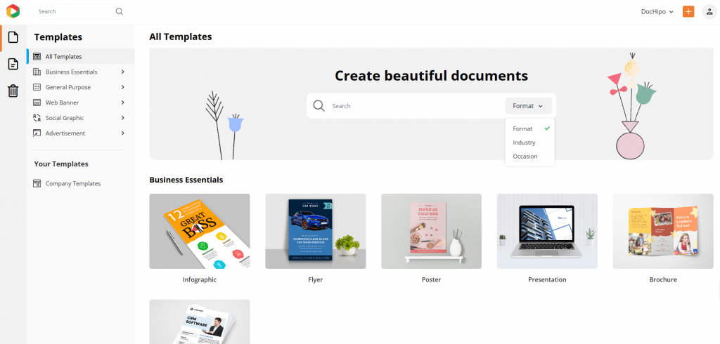
Watch this video to find the template you want to use in DocHipo easily.
We will use a fabulous fashion magazine cover template to showcase all the steps for applying a stunning color theme.
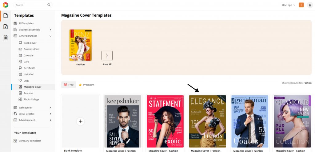
B. Edit with DocHipo Color Themes
How do you select and apply theme colors? Once you choose the preferred template, you can customize it in the following quick steps.
1. Edit the Text for a Specific Purpose
Once you open it in the DocHipo Editor, glance at the design elements to see if they require any changes. For instance, we’ll edit the texts in the template according to our needs.
Select the text you want to edit and write within the box.
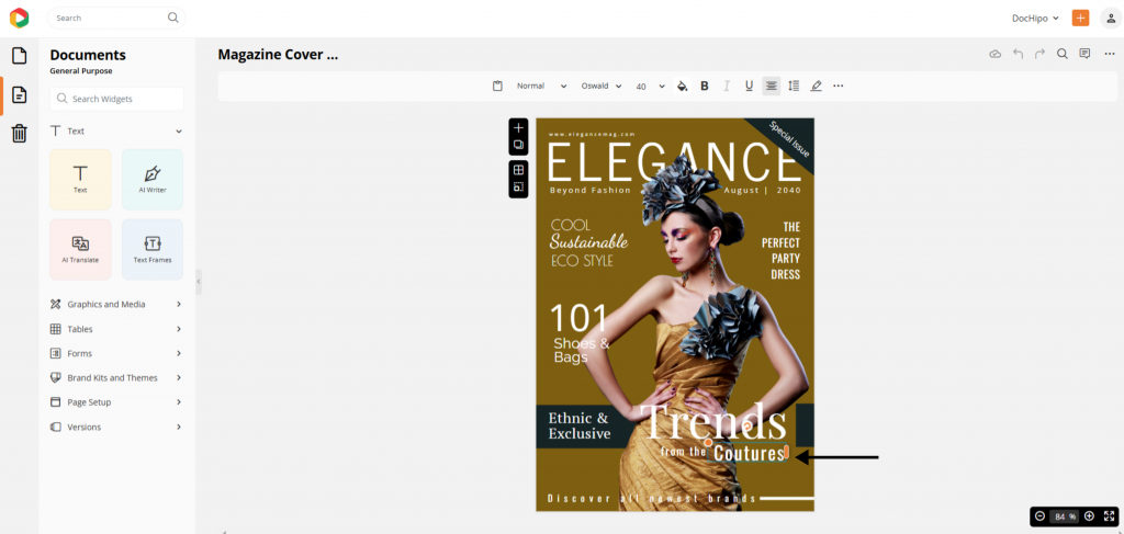
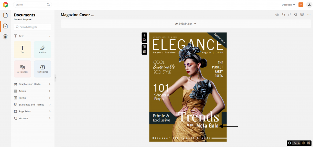
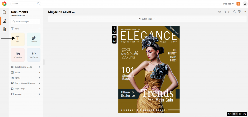
You can add more text with the text-editing widget on the left panel.

Watch this video to edit texts in the editor.
2. Select Themes Option
Now, click on the “Brand Kits and Themes” option to find a suitable color scheme for this design.
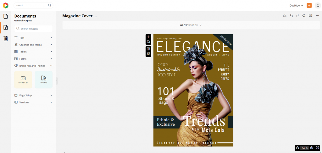
Go to the “Themes” tool to explore myriads of beautiful color combinations.
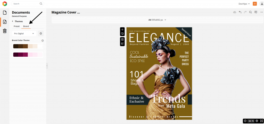
3. Choose an Appropriate Preset Color Theme or Use Your Branded Theme
Next, choose the “Preset” color themes to use the pre-existing theme collections in the design. There are many theme categories, and you can easily select from the search filter.

Since it’s a fashion magazine cover design with inspirational trends from one of the world’s mega fashion events, we chose the “Party” color palettes from the “Occasion” color theme category.
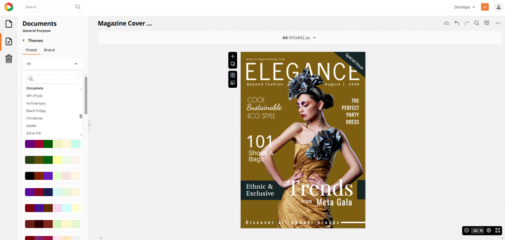

Before you shuffle the exciting color combinations from the “Party” color theme, try your branded color schemes from the “Brand” options. It’s a must-have feature when you want to make consistent and recognizable on-brand content for every occasion. For that, you need to upload or create branded color palettes to access them in the DocHipo Themes tool anytime you want.
4. Shuffle the Colors for the Perfect Color Scheme
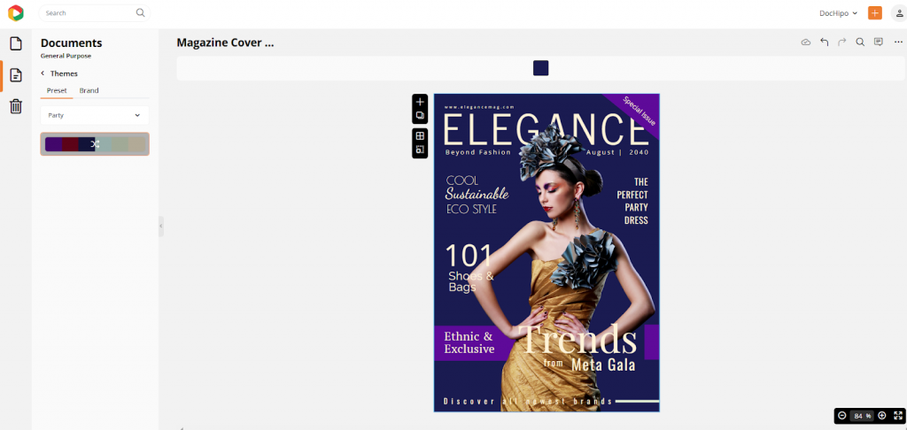
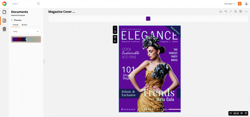
Now, let’s shuffle to choose the best theme color for the magazine cover we mentioned. You can click on the color palette and change the combination of colors as many times as you want. Here’s a sneak peek of color shuffling to find the best color combinations to tune with your design.

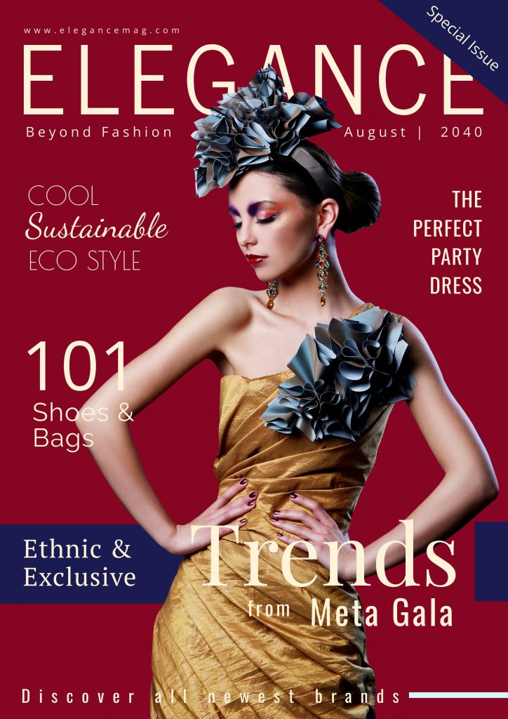
Finally, we love the sleek cherry-red background, light beige fonts, and royal blue strokes, creating a glamorous and stylish design.
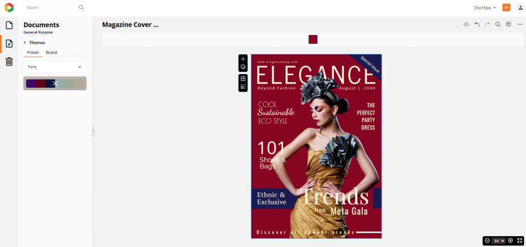
This is the final design after customization.
C. Download or Publish Directly
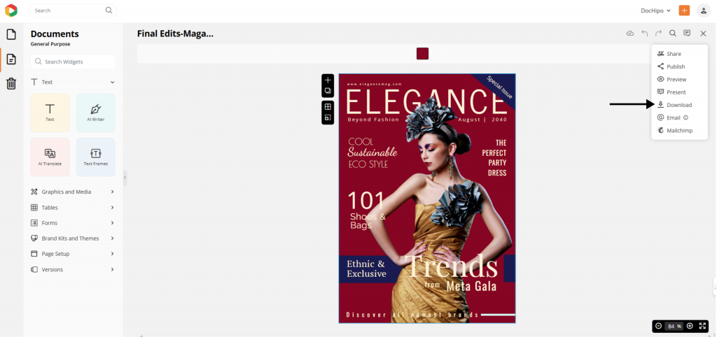
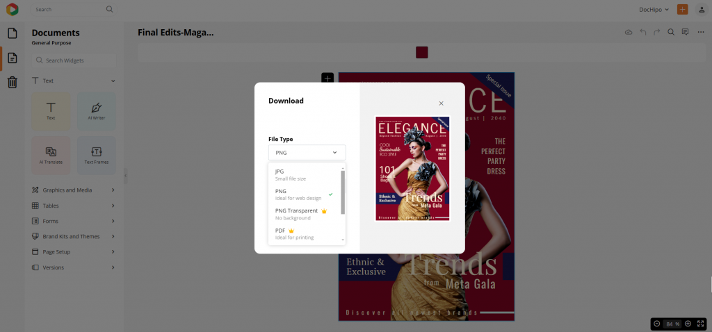
Now, it’s time to execute your new campaign design. To do so, click on the three dots on the right side, select the download option, and choose a high-quality file format suitable for inbound marketing.
Also, DocHipo has a seamless sharing option that lets you directly upload your design on various social media platforms.
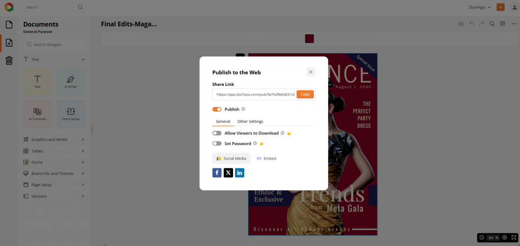
Moreover, you have complete control over the access of how your audience will interact with your shared content.
Watch the short video to use this feature in DocHipo.
For a quick recap, check out the following video on how to use color themes.
7 Ways DocHipo’s Color Themes Help You to Transform Your Brand Content
As you discovered the simple steps about how to use color themes in your design, it’s time to understand how these themes have an impact on your branding.
1. Choose Dominating Color Schemes to Reflect Branding
Dominating color themes helps brands establish a strong visual identity. For instance, bold colors like red or black can make a powerful statement demanding attention, while softer shades like beige create a calm, professional look. These themes are ideal for campaigns where a consistent, impactful color is crucial.
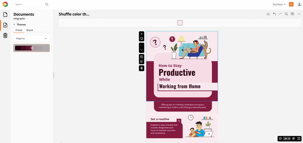
We will show you how a dominating color theme can change the look and feel of the following infographic design.
To change the template’s color scheme, choose any dominant palette from the “Color” category, such as the “Magenta” color theme. It reflects your brand’s energetic personality and tells a story that catches your eye!

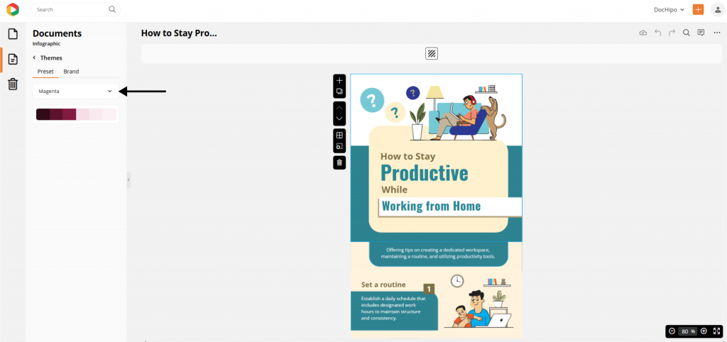
Then, shuffle it to find the matched color combination, as shown above.
Before

Get This Template and More
After Customization

2. Color Themes for Every Mood to Evoke Emotions in Your Audience
Colors stimulate different kinds of emotions in the human brain. Brands know the science behind this; hence, they use certain colors to subtly evoke emotions through their visual storytelling. For instance, warm yellow tones create subtle joy and happiness in your mind. Meanwhile, red symbolizes passion and energy that demands everyone’s instant attention.
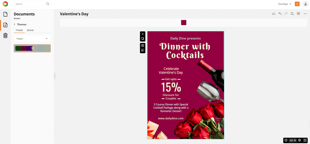
Here is a beautiful Valentine’s Day poster for a restaurant. Since it’s a special day to express affection to your loved ones, we’ve changed its color themes according to the vibrant “Happy” color palettes from the “Mood” filter. They include passionate maroon and beige streaks to reflect their prominent contrast.

You can shuffle as usual to find the perfect color combination.
Before

Get This Template and More
After Customization

3. Nature-Based Color Themes for Sustainable Campaigns
If you have an organic brand or want to start a campaign for eco-sustainability, then a nature-centric color theme will grab a lot of attention and positive remarks.
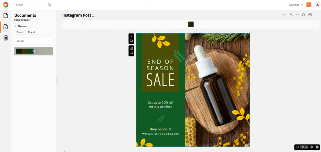
Dive into the earthy allure of the Instagram beauty post below! We’re looking to enhance this eye-catching design with subtler, nature-inspired tones to truly capture the herbal magic behind the product.
To create such a lush natural vibe, you need to explore fresh color palettes based on nature, such as forest, ocean, rainbow, and sunset.

Embrace a fresh, meadow-inspired vibe with the enchanting “Forest” filter.
Before

Get This Template and More
After Customization

4. Choose Your Color Themes for Specific Occasions
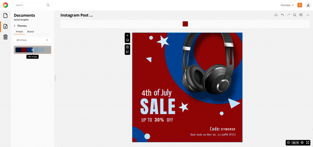
We all know that certain occasions come with themes people instantly connect with. Take, for example, the following regular Instagram post transformed with a color palette that every American recognizes—the 4th of July theme. With just a click, this theme instantly gives a Cyber Monday sale post a fresh, patriotic vibe, capturing attention in no time.
First, you need to customize the text according to your new campaign strategy. Then, you can add the appropriate color theme to enhance the design.
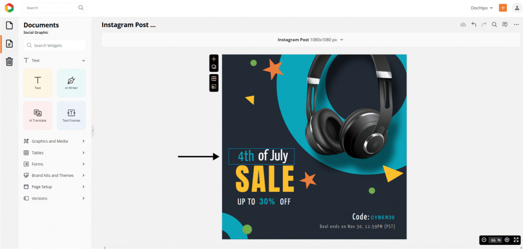
How to select and apply this theme? Simply choose the occasion color theme and go for the “4th of July” color palette. Shuffle various combinations to see which one you like the most.
Before

Get This Template and More
After Customization

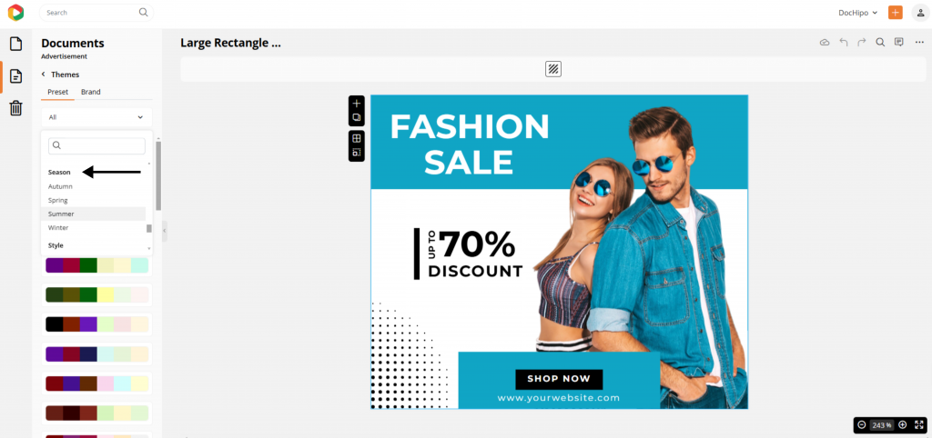
5. Color Themes Based on Seasons for Seasonal Marketing Campaigns
DocHipo’s season-based color themes—like autumn, spring, winter, and summer color palettes—are invaluable for brands looking to make an impact with seasonal marketing. These palettes enable your brand to effortlessly align your visuals with the current season, making your content feel timely, relevant, and more engaging for audiences.
For example, warm, earthy tones in autumn evoke coziness and nostalgia, while bright, floral hues in spring can convey freshness and renewal.
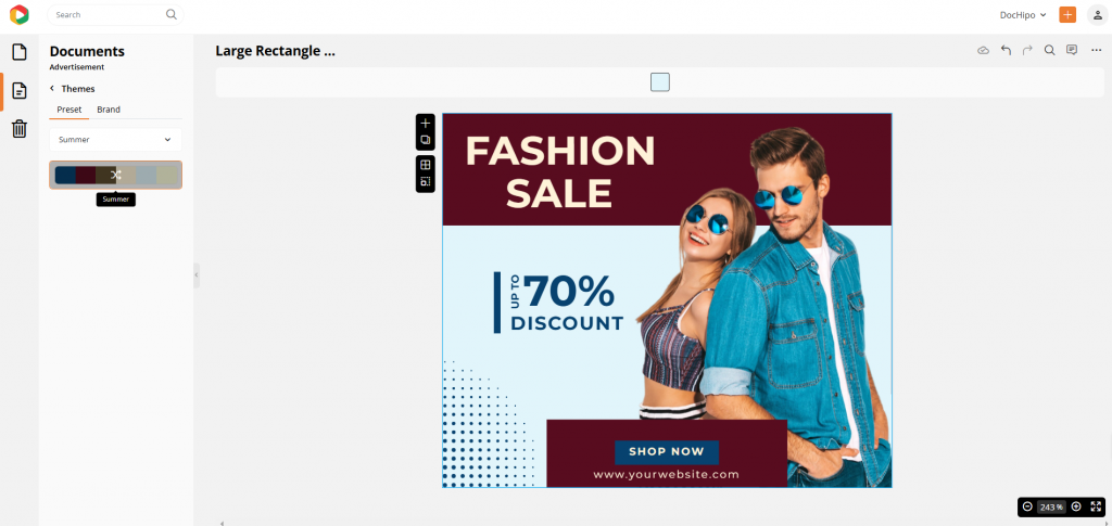
Similarly, we’ve changed a fashion large rectangle ad into a summer campaign with our “Season” color themes. Simply pick your favorite seasonal tones—like we did with the vibrant summer palette—to infuse this design with warmth and brightness.
Before

Get This Template and More
After Customization

6. Themes with Different Styles of the Classic Era to Stand Out from the Rest
Inspired by the 70s, 80s, and retro aesthetics, the new style themes can add a nostalgic flair to branding and special campaigns. These color themes bring a unique, vintage vibe that can make your brand different, especially in today’s modern, minimalistic design landscape. Perfect for brands targeting audiences who appreciate classic eras, retro color themes work well for lifestyle, fashion, music, entertainment, and arts-based brands.
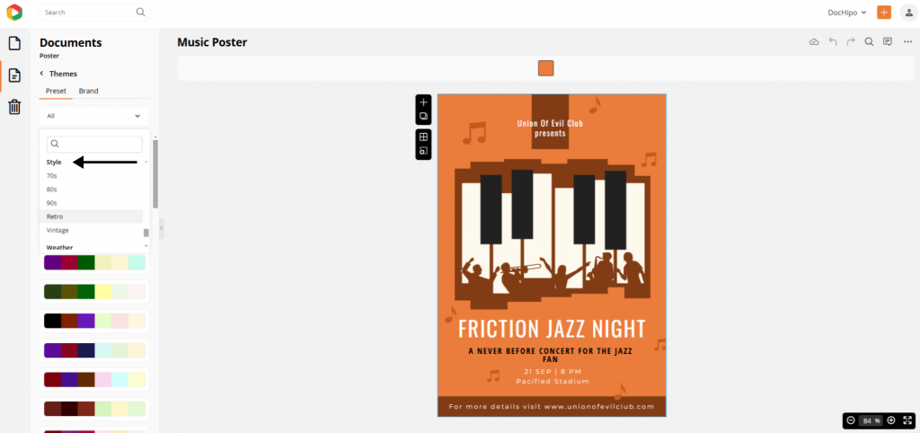
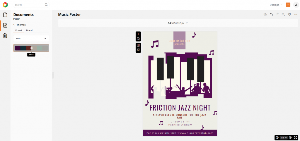
We have a classic music poster design that we’ll revive with a retro vibe using the exclusive “Style” color theme categories.
To get this look, choose the “Retro” theme filter and shuffle to explore color schemes that depict a vintage saga of your visual advertisement.
Before

Get This Template and More
After Customization

7. Color Schemes in Various Weather Themes for Emotional Marketing
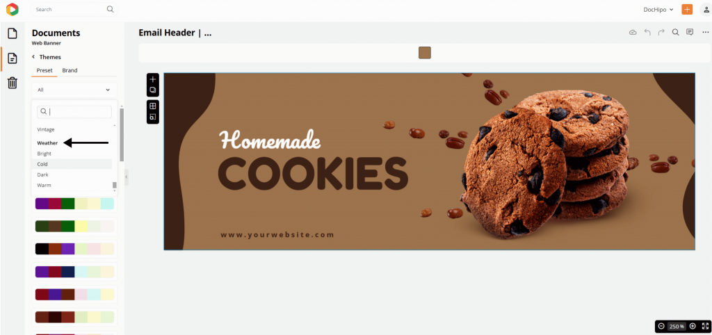
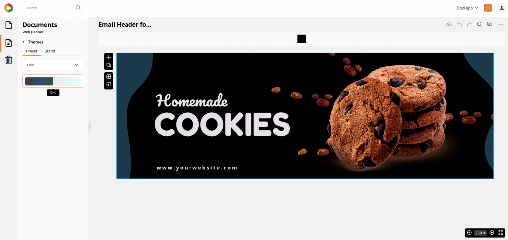
If you are a food and beverage brand like Starbucks or manage food logistics, you know how quickly food preferences change, like the weather. For those unplanned and instant digital marketing campaigns, you can use DocHipo’s weather color themes, such as cold, dark, warm, and bright.
In one click, you can turn the warm, fuzzy email header with the caramelly coffee essence into the perfect snack solution for darm and cold winter days with the Weather color themes.
Try the “Cold” color theme filter to apply to the design.
Before

Get This Template and More
After Customization

See how effortlessly you can switch between color themes crafted for every mood, occasion, season, weather, and whatnot? No need to stress over last-minute or unexpected marketing materials—DocHipo’s exclusive color themes let you transform your design’s look in seconds. Give your brand the perfect vibe instantly!
How to Pick a Color Scheme
Choosing the perfect color themes to captivate your audience and make them fall in love with your brand can be tricky. But fear not! We’ve highlighted essential factors to guide you in selecting the ideal color schemes that truly resonate with your brand message. With these insights, you’ll be ready to pick colors that not only look stunning but also create an emotional connection, drawing your audience in and leaving a lasting impression.
1. Understand Your Brand Identity
Think about your brand’s values, mission, and how you want your audience to perceive your brand image. Are you fun, professional, eco-friendly, or luxurious? Each personality suggests different color choices (e.g., playful brands might use bright and color themes, while luxury brands often lean towards cold or dark color palettes).
2. Know What Your Brand’s Audience Wants
Research your target audience’s preferences and cultural associations with colors. Specific colors can have different meanings across cultures and demographics. For instance, white symbolizes purity in Western cultures, while in some Eastern cultures, it may signify mourning. Therefore, you should be careful about the color themes you want to use to represent the same meaning, keeping harmony with other brand assets.
3. Pick a Color Theme That Reflects Your Campaign Goal
Different campaigns may need different color themes. A holiday campaign might feature festive color schemes with red, pink, yellow, and blue, while a product launch may focus on brand colors to build recognition.
4. Follow the Color Psychology
Understanding color psychology is key to creating visuals that connect! Each color brings its own vibe: red sparks insatiable passion and urgency, blue builds trust and serenity, green channels growth and nature, and yellow radiates optimism and creativity. Use the color wheel to pick a combination that matches your message and creates the exact mood you want to set.
5. Check Competitor’s Color Themes
It is always better to observe your enemies before they lay their eyes on you! Hence, analyze your competitors’ color schemes to determine their position. While you don’t want to copy, you can find ways to stand out by choosing distinct yet complementary color palette ideas to your industry norms.
6. Experiment with Versatility and Gather Feedback for Making Impactful Content Designs
The last tip for picking the perfect color theme for your design is to be versatile. Ensure your color theme looks good on various materials and platforms, from social media posts to printed materials. Run A/B tests to see which color theme examples your audience responds best. You can use analytics from social media or your website to determine which color themes perform well.
By following these steps, you can use a color theme that aligns with your brand identity and appeals to your audience to enhance the effectiveness of your campaigns.
Conclusion
In a nutshell, DocHipo’s color themes make it easy to create stunning, on-brand designs in no time. With a vast range of themes tailored for every mood, occasion, and season, you can effortlessly switch up your visuals to suit any campaign. So, next time you’re working on a project, skip the hassle of manual adjustments and let DocHipo’s color themes bring your designs to life instantly and professionally!
Also, sign up for free and try unique template designs and the latest editing features that can transform your brand identity.
FAQ
How to change theme colors?
To change theme colors in DocHipo, select your template and click on the color theme option. Browse through categories like seasons, moods, or occasions, and pick the one that suits your design. Your template will automatically update, saving you time and ensuring consistency.
How Do I Find My Color Theme?
In DocHipo, explore options organized by categories like nature, holidays, and moods in the color themes section. Use filters to narrow down themes based on your campaign’s vibe and preview how each theme fits your design. Choose the one that feels most on-brand!
Which color theme is best?
The best color theme depends on your design goals! For a festive look, choose bright and exciting themes. Pick themes with earthy tones if you’re going for a calm or nature-inspired vibe. Ultimately, the best theme complements your message and brand identity.
What is the best color theme for a presentation?
For presentations, opt for professional themes with balanced colors that enhance readability, like neutral tones with one accent color. Themes categorized under neutral colors or natural tones are ideal for keeping your slides clean and engaging without overwhelming viewers.


