How to Make a LinkedIn Carousel Post: A Guide with Templates

Are you looking to boost engagement and expand your reach on LinkedIn? LinkedIn carousel post is a powerful way to captivate your audience with striking visuals and engaging content. If you want to know how to make a LinkedIn carousel post, this blog will tell you all about it.
Designing a LinkedIn carousel from scratch can be daunting for a beginner. You might have all the information about your niche industry, but presenting it so that you stop those scrolling fingers would require strategy and creativity. Let’s be honest; most of us are not design wizards. Nonetheless, we aim to captivate your audience with a compelling LinkedIn slideshow post.
How to Make a LinkedIn Carousel Post
- Select a graphic design tool like DocHipo
- Choose a LinkedIn carousel post template and customize it
- Download the design in PDF format
- Login to your LinkedIn profile
- Start a new post on LinkedIn
- Select the ‘Add a document’ option
- Upload your document
- Schedule or post your LinkedIn carousels
This blog explores creating an effective LinkedIn carousel post, from creating compelling copy to best practices for designing to ideal size specifications with ideal template examples. To amplify the effect of your posts, we have also shared tips to boost your carousel engagement. Lastly, this blog provides a step-by-step guide for uploading a carousel post to LinkedIn.
Table of Contents
- What Makes a Good LinkedIn Carousel
- LinkedIn Carousel Sizes
- How to Write a LinkedIn Carousel Post
- Best Practices for Designing LinkedIn Carousel Posts
- How to Boost Engagement for LinkedIn Carousel Posts
- How to Make a LinkedIn Carousel Post Using DocHipo
- How to Create a LinkedIn Carousel with AI
- How to Create a Carousel Post on LinkedIn
- FAQs
What Makes a Good LinkedIn Carousel
LinkedIn carousel posts can skyrocket your engagement, but only if crafted to be irresistible! A good carousel post features multiple slides packed with valuable content that keeps your audience swiping for more. So next time you’re scrolling through your feed, take a moment to notice what grabs your attention—that’s the secret sauce for a compelling carousel.
For example, here is a LinkedIn carousel post with significant engagement. You can notice the buzz it generates—look at the number of reactions, reposts, and comments. That’s the impact we should aim for with every LinkedIn carousel!
Most importantly, we are interested in users’ reactions after posting a carousel on LinkedIn. The real magic happens after you hit “post.” High-performing carousels spark reactions, ignite conversations, and are widely shared, giving you better visibility and engagement.
LinkedIn Carousel Sizes
If you want your carousels to shine without getting blurred or pixelated, you must follow the carousel size requirements. Let’s dive into the ideal LinkedIn carousel post size before creating one.
- File type: PPT, PPTX, DOC, DOCX, and PDF.
- Maximum File size: 100 MB
- Maximum number of pages: 300
- Recommended page size: A4 or US landscape orientation
Follow these LinkedIn carousel size to ensure better visibility of your posts. In the upcoming section, we will cover everything about ‘How to make a carousel post on LinkedIn’
How to Write a LinkedIn Carousel Post
Writing the content for your carousel post is one of the most crucial steps. Indeed, it includes vital information, but how you present it matters the most on digital platforms. Therefore, you must organize your content to capture attention, deliver value, and boost engagement.
When planning content, the first question that often arises is, “How do you structure a carousel post?” or “How to make slides on LinkedIn.” In this section, we will answer everything about building the foundation of your carousel post. Follow these guidelines to write an effective carousel post on LinkedIn.
Plan Your Content Based on the Objective and Audience
Depending on your objective, you can offer insights or showcase multiple products. To get a better idea, observe carousels that are related to your interests. Further, research all the facts and data you may include in the post.
Now, think about a topic that would help your audience or holds importance in your industry. Your LinkedIn profile should be around the niche for consistency, be it a banner, profile picture, or post. To ramp up your LinkedIn profile, explore LinkedIn banner ideas to get inspired. Once you have decided on the topics for each page, write all the information in one place.
Create an Impactful Hook as the Title
Your first page is like the cover for the carousel. It should inform about the topic and immediately hook your audience. Use intriguing questions, insightful stats, exciting topics, and bold statements to arrest your audience’s attention immediately.
Ensure that the cover aligns with the overall value you will be offering to your audience. For inspiration, here is the cover page of a vibrant carousel template from Marketing LinkedIn Carousel Templates that will hook your audience in a second!

Get This Template and More
Craft a Clear and Captivating Introduction
After creating the title, add an introduction to your post. Think of the introduction as an overview of the content within the carousel. You can briefly describe or create the build-up for the story in the upcoming slides in the introduction.
You can add the introduction on the second page of the carousel post or use the cover page to give the necessary information. To illustrate, here is the cover page of one of the Finance LinkedIn Carousel Post Templates with a title and an introduction underneath.

Get This Template and More
Divide the Content Into Easily Digestible Sections
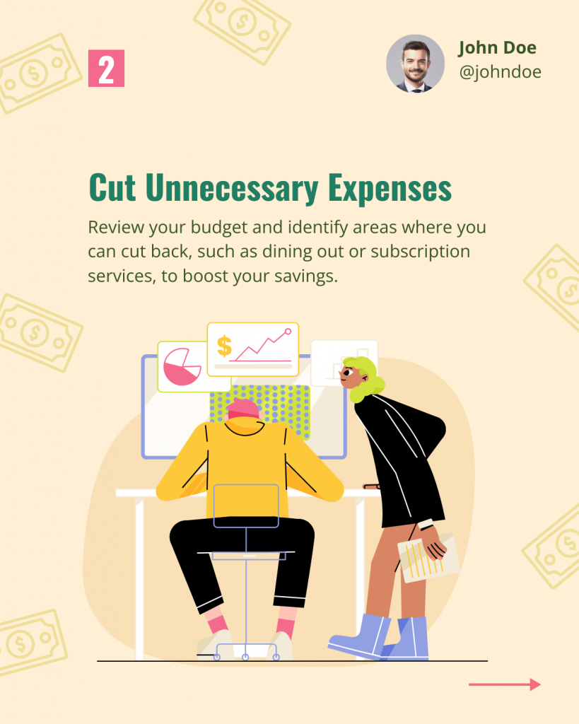
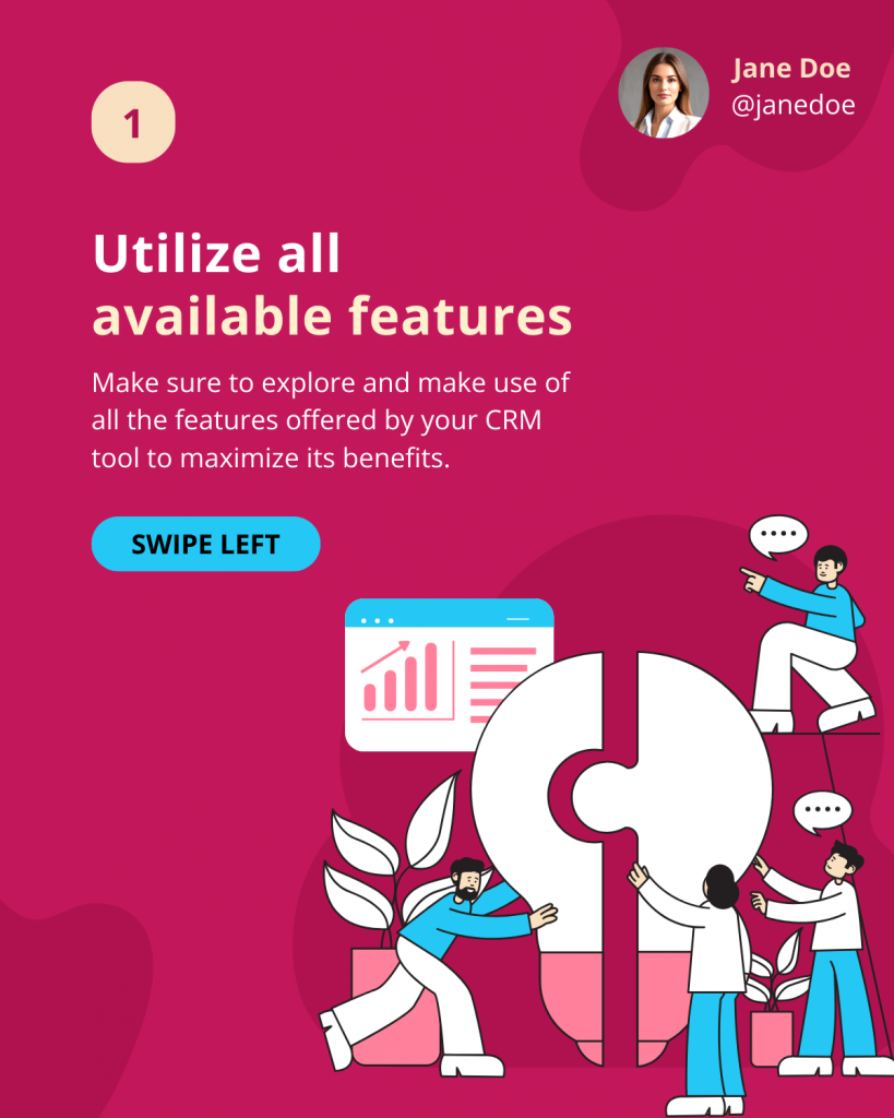
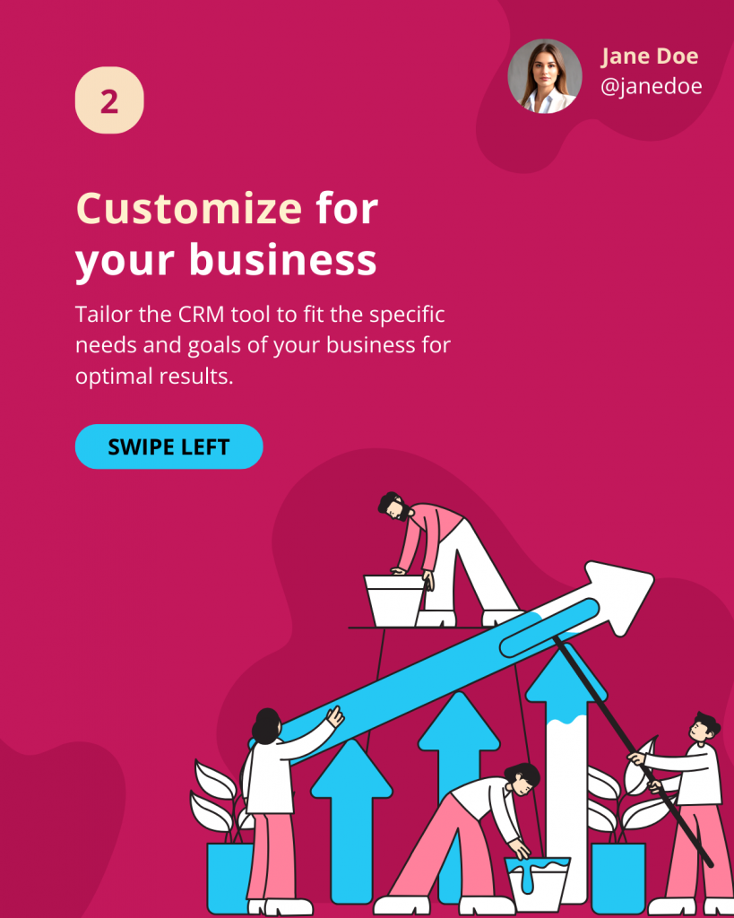
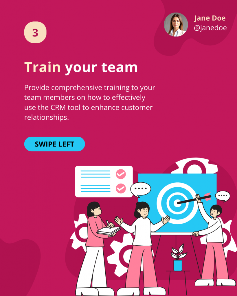
After designing the introductory slides, let’s move to the other sections. First, break your information into different sections or points. For convenience, create a draft with separate points for every slide. Remember to discuss one idea per page to ensure everything is clear. Use 2-3 sentences for each section to avoid clutter, like this template example.
Use Easy and Action-oriented Language
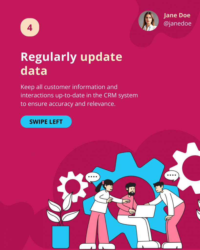
Remember to use direct language while keeping a conversational tone to connect with the audience. Frame short sentences without indulging in too much detail. Also, focus on the action-oriented words that clearly state the necessary steps. Highlight critical takeaways in bold or with different text to drive more engagement, like this design from Sales LinkedIn Carousel Post Templates.
Create a Meaningful Narrative
Plan your content in a logical flow of information. If you stack information without a cohesive flow, the reader may feel clueless about the information. Use transition words to interconnect the sentences for a smoother flow while reading the content.
Also, arrange the slides’ sequence to have a proper beginning, middle, and end with appropriate LinkedIn carousel pdf dimensions. To illustrate, look at this example from Finance LinkedIn Carousel Templates, which demonstrates a guide to investing in stocks.
Wrap Up with the Main Value and CTAs in the Final Card
If you tell a story, build up the content until the last page to encourage your audience to swipe through the entire carousel post. Remember to add a call to action, like, comment, or share, and keep up with social media rituals like this Marketing LinkedIn Carousel Templates!

Get This Template and More
Best Practices for Designing LinkedIn Carousel Posts
Carousel posts can work wonders for you, only if done correctly. When we ask ‘How to create a LinkedIn carousel”, we are concerned about the eye-catching carousel post layouts that grab attention. Getting started with carousels can seem daunting, but fret not. Look at these tips for designing a compelling carousel post on LinkedIn.
Leverage Color Psychology to Make Carousel Posts Stand Out
Colors can influence up to 90% of the initial impressions, so you might notice a post because of its rich color. We associate different colors with different emotions, such as red for passion, blue for reliability, or yellow for optimism. If you have a specific brand color, it’s best to add it as a background.
You can also use various color combinations to enhance your designs. However, choosing complementary colors can be challenging. One way to master the skill of using eye-pleasing colors is to explore the color wheel theory. However, you can take a shortcut and select preset colors using the Themes option in DocHipo.
Use Clean Fonts and Typography
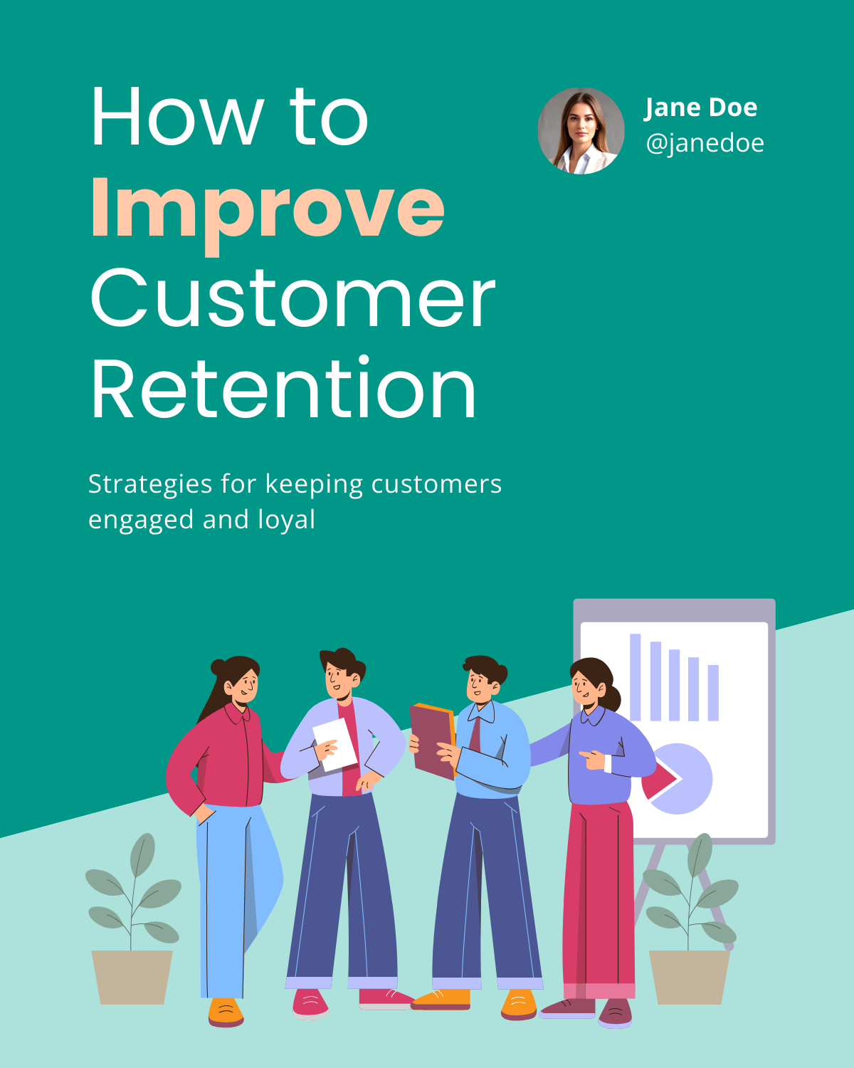
Adding too much aesthetics to the fonts in the post can interfere with the clarity of the text. Since professionals usually use LinkedIn, you should choose sans serif font pairings for a clutter-free appeal. Likewise, typography hierarchy plays a vital role in designing an organized layout. Check out this carousel template cover and observe the play of typography.
Get This Template and More
Enhance Your Carousel Pages with On-theme Visuals
To increase the appeal of your carousels, you should use visual storytelling. Graphic design elements like icons, illustrations, or stickers help your designs grab attention and inform about the post instantly by creating a visual story. It is one of the best ways of engaging the audience.
Don’t know where to search for exciting visuals that align with your industry or business? Find on-theme design assets in DocHipo and customize the size, color, and alignment without compromising the quality.
Maintain Visual Harmony with Ample White Space
LinkedIn carousels require a clean and organized layout. After all, you don’t want your message to get lost in the clutter. White space plays the most crucial role in achieving harmony in design. By aligning the space between these elements, white space helps balance typography and visuals. In the same context, utilizing the empty character instead of white space can also help maintain the design’s visual balance. Look at this design from Business LinkedIn Carousel Templates and notice how white space works for all the elements.

Get This Template and More
Add Branding to Your Carousels
Add brand elements to make your carousels iconic. You can choose brand colors for layouts and incorporate logos into your document. Further, you can use fonts and brand symbols that you often use so that your viewers can recognize your brand instantly.
Look at the logo and branding at the top of the page in this carousel design from HR LinkedIn Carousel Templates.

Get This Template and More
You can leverage DocHipo’s brand kit to easily access all your brand assets and save brand colors, fonts, logos, images, etc.
Leverage Existing Content Using 3-5 Cards
Getting started can feel overwhelming; therefore, we suggest you start small. If you have existing content, organize it or deconstruct a more significant piece into carousel cards. You can start with 3-5 cards in your carousel and test by adding more cards.
Use Carousel Templates to Speed Up Your Carousel Creation
Designing visually pleasing content from scratch can be time-consuming. Enticingly aligning text and visuals can be challenging for many of us. After all, carousels are all about creating an organic flow of content.
Switch to DocHipo to avoid the hassle of creating everything from scratch. In DocHipo, you can create carousels for various topics, such as business, finance, marketing, sales, etc., with professional layouts and top-notch carousel graphics.
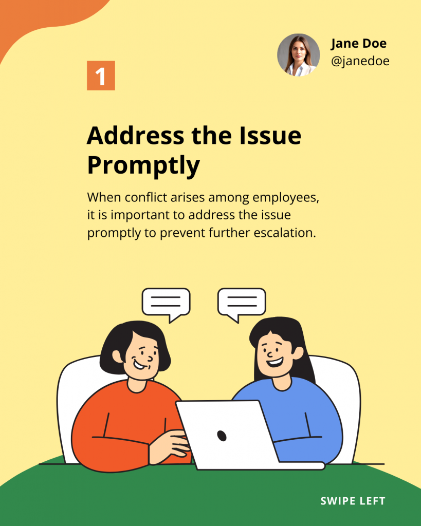
You can find the perfect designs and save unnecessary effort by trying DocHipo’s Free LinkedIn Carousel Maker, which allows you to create stunning carousels in minutes. For example, look at this eye-catching HR LinkedIn Carousel Templates guide on handling employee conflict.
Learn to enhance documents with DocHipo’s LinkedIn Carousel Post templates.
How to Boost Engagement for LinkedIn Carousel Posts
You may design an exquisite carousel post on LinkedIn, but you must wonder, ‘How can I increase engagement with LinkedIn carousel posts? Accessible and to-the-point information makes your LinkedIn posts reach more people. All you have to do is to fine-tune your carousels to suit your viewer’s preferences. Here are a few tips to boost your engagement for carousel posts.
Choose a LinkedIn Carousel Post Objective
In the first place, gain clarity about your LinkedIn presence. Ask yourself a few questions like:
- Why do you want to create a carousel post?
- Is it for your brand or business?
- Do you want to engage an audience and promote your products?
These questions will give you a direction for your efforts and help you plan the carousel better.
Understand Your Target Audience
You already know that LinkedIn users have a keen interest in valuable tips and the latest news related to their industry. Therefore, it’s essential to identify your niche audience. You can pick an industry where you already have some experience and share your valuable insights.
You should get a better idea about a few things like:
- Who is your target audience?
- What type of jobs they are looking for?
- What are they interested in?
- What are their pain points?
- How can you help them?
Look at this template design from HR LinkedIn Carousel Templates, which offers crucial tips that would help HRs handle day-to-day tasks

Get This Template and More
Here is another example from Marketing LinkedIn Carousel Templates that would help marketers and businesses improve their content marketing strategies.

Get This Template and More
Schedule Your Content According to Your Niche Audience
After gaining insights into the objectives and niche audience, it’s time to post a carousel on LinkedIn. Study your audience’s engagement times, schedule your posts accordingly, and gain greater visibility.
Keep It Short and Simple
Although LinkedIn allows you to post up to 300 pages, people don’t prefer to read lengthy posts. Lengthy slideshow carousels can only hold your viewers for a short time. Also, keeping the content to the point will help your audience to retain information instantly. Therefore, keep your carousel pages up to 30 slides with simple sentences.
Align Carousels for Mobile Users
Around 60% of the traffic comes from the LinkedIn mobile app. But ‘How do I optimize LinkedIn carousel posts for mobile? Always download a resolution PDF file to avoid pixelation on the small screen. However, keep the file size below 100 MB for smooth downloading.
We have also noticed a lot of square carousels on LinkedIn. Now, you would ask, ‘Does LinkedIn carousel have to be square?’
That is not necessarily the case, but square or portrait posts look better on mobile devices. Ensure that you upload high-resolution PDFs to avoid blurred graphics. Also, keep visible font sizes for your text fonts in small paragraphs.
Optimizing Text, Hashtags and Captions
Optimize your text in the post description to elaborate on your carousel. You can use buzzwords in the caption to create hype about the content. Relevant hashtags will help you to connect with people in your industry. Thus, use popular and niche hashtags to reach the targeted audience. Remember to use the first three as the most critical hashtags, as LinkedIn does not index beyond those.
Tag Accounts and Share Your Carousel in Groups
Once you have posted the carousel, remember to share it with relevant groups for maximum visibility. If you have a co-creator, tag the post to their account. You can add the post in the Featured section or repost the same content.
How to Make a LinkedIn Carousel Post Using DocHipo
In this section, you will find a step-by-step guide on ‘How to Create a LinkedIn Carousel Post.’ Creating a LinkedIn carousel takes more than stacking slides together. You must craft a visual story that grabs attention and leaves a lasting impression. Therefore, we have devised the most convenient way to use DocHipo templates. Our professionals have already done the heavy lifting to create stunning design layouts. Sign up and make a carousel post using three simple steps.
1. Choose Your Carousel Template
You will land on the DocHipo homepage as soon as you sign up. Search for the LinkedIn carousels to get started.
Watch this video to find templates in DocHipo easily.
Next, you will come across a variety of different templates. Choose the one that closely matches your industry, niche, or expertise for as little customization as possible.
2. Customize Your Template
After selecting the template, it’s time to customize your carousel design within the editor. Here, you will get a vast library of design widgets with hundreds of icons, stickers, stock images, illustrations, etc.
Watch this video to find widgets easily in DocHipo.
Customize Text in the Carousel Design
Select the text block and replace the default text with your own. Now, you can customize the text size, font, or color.
Now, customize the font with the help of the editing bar at the top of the canvas.
You can further modify the text size or applying different typefaces and text formatting such as bold, italics, or underlined.
Watch this video to learn more about customizing text in DocHipo.
Further, you can also add your own custom and brand fonts to personalize your design.
Learn more about applying custom fonts to your designs with this video.
Customize the Color of the Layout
After changing your text, let’s change the color of the design. To do this, select the background color at the editor’s top and choose any color, gradient, or pattern from the left panel.
Or, there is another way to do this. With Themes, you can also change the color theme of the entire carousel post at once. First, select the Themes option.
You will now see various preset color options. Try different themes and settle for the one that best suits your design.
Next, click the ‘Apply to All Pages’ option, and you have changed the background theme color with a single click.
Learn more about Themes in DocHipo with this video.
Personalize with Profile Image or Logo
If you want to personalize your LinkedIn carousel, add your photo or logo to promote your brand and make it memorable. Let’s start by selecting the upload widget option and uploading your image.
Choose the file option from your device and select open to upload your file.
Once you have uploaded your photo, drag and drop the picture to the desired place.
Next, choose the Crop to Shape option from the editor to adjust the picture.
Here, you can select any shape to crop your picture. Once satisfied with the customization, apply the changes.
Learn to upload images in DocHipo.
Select the Brand Kit option within the editor to add your logo to your LinkedIn carousel design.
Here, you can save all the brand assets for easy access. Select the logo and customize the size to place it on the canvas.
Explore the DocHipo brand kit with this video tutorial.
Enhance Your Designs with On-theme Graphic Assets
You can enhance your carousel posts with many design assets for different industries. Let’s customize illustrations in your design.
Search for the category for which you want to add an illustration.
Now, choose the one that suits your design best and replace the existing one.
Customize the finance illustration’s size and color to complement the overall layout.
Learn more about DocHipo’s illustrations with this video.
3. Download the Carousel Design
Once you are impressed with the design, click on the three dots at the upper right corner of the editor and select the Download option.
Select the PDF file format and file quality, and click on Download. And you are ready to upload your LinkedIn carousel post.
Explore the page-wise download option in DocHipo.
Before Customization
After Customization
How to Create a LinkedIn Carousel with AI
Creating a LinkedIn carousel can be easier using AI tools. Now, you don’t need to struggle to write the perfect copy or search through several images to get the right one. DocHipo offers generative AI power, helping you enhance your carousels like a pro. Let’s explore how you can do it.
Create a Catchy Copy with AI Writer
Choose the AI writer in DocHipo and give a suitable text prompt, as shown below. You can also describe the topic and number of characters in the prompt.
Select the text’s tone from various options, such as casual, confident, friendly, professional, dramatic, or excited, and click ‘Generate Content.’ You have generated an eye-catching copy within seconds!
Learn more about AI writing in DocHipo with this video.
Generate On-theme Graphics with AI Images
DocHipo’s AI Images helps you generate high-quality images with text prompts. To do so, choose the Pictures widget in the editor and select the AI images option, as shown below.
Now, describe the picture you wish to generate as the text prompt.
You can also select from various image styles, such as anime, cartoon, illustration, pencil sketch, oil painting, fantasy, cinematic, and realistic. Here, let’s choose the illustration style.
Click on Generate Images, and your images will appear within seconds. Resize and align the selected image according to your LinkedIn carousel layout.
Watch this video tutorial to learn more about AI images.
Create a Seamless Look with Background Remover
After creating your AI images, you can achieve a seamless look by removing the background of the selected photo. To do this, select the Remove Background option from the editing bar.
With a single click, you can obtain the picture without the background using a built-in background remover.
Learn more about the background remover tool in DocHipo.
How to Create a Carousel Post on LinkedIn
We have created a stunning carousel post and are ready to take the next step. After making a PDF document, one would ask, “How to upload carousel in LinkedIn?” or “How to create a slide post on LinkedIn?” So, look at this step-by-step guide to upload your carousel post on LinkedIn.
1. Start a New Post on LinkedIn
At the top of your feed, you will come across an option to start a new post. Click to continue posting your carousels.
You will see a dialogue box asking you to post your feed. Now, select the More option at the bottom of the box.
Next, select the Add a Document option to upload your carousel PDF.
2. Upload Your Document
Now, choose a carousel PDF file from your desktop and add it to your post.
Now, add a title that describes your LinkedIn slideshow post. This will help the platform easily find your post. Select Done at the bottom of the post.
Within the indicated space, add a little description for your audience. You can briefly describe what they can expect within the carousels or add a hook to make your post more engaging.
3. Schedule or Post Your LinkedIn Carousel
You can schedule the post for later or post it right away. Let’s explore both options.
First, select the Schedule option for later options.
Select the date and time to schedule your post and click Next. You have scheduled the post in advance.
Or, post a carousel on LinkedIn immediately without much ado.
You have uploaded a stunning carousel to your LinkedIn profile!
Wrapping Up
You have all the information about creating and uploading a LinkedIn carousel post. We have discussed writing your post, creating a top-notch design, and boosting carousels for engagement. With these tips and tricks, you can post a LinkedIn slideshow to amplify your brand’s presence.
But before you hit that publish button, research, carefully draft your content, and design your post with stunning visuals. For a seamless design experience, try using professional templates from DocHipo. Sign up today and start crafting eye-catching documents in just minutes!
FAQs
How do I make a carousel post on LinkedIn?
You can easily create a carousel post on LinkedIn.
- Create a PDF document
- Start a new post on LinkedIn
- Upload your document
- Schedule or post your LinkedIn carousels
How to design a LinkedIn carousel post?
Here are a few tips to design your LinkedIn carousel post:
- Leverage Color Psychology to Make Carousel Posts Stand Out
- Use Clean Fonts and Typography
- Enhance Your Carousel Pages with On-theme Visuals
- Maintain Visual Harmony with Ample White Space
- Add Branding to Your Carousels
- Leverage Existing Content Using 3-5 Cards
- Use Carousel Templates to Speed Up Your Carousel Creation
How do I post a carousel on LinkedIn 2024?
You can easily create a carousel post on LinkedIn.
- Create a PDF document
- Start a new post on LinkedIn
- Select the ‘More’ option followed by ‘Add the document.’
- Upload your document
- Add the title and text description
- Schedule or post your LinkedIn carousels
What is the best format for LinkedIn carousel?
The best format for LinkedIn carousels is PDF format, but the platform also accepts PPT, PPTX, DOC, and DOCX.
How many pages can you post on the LinkedIn carousel?
You can upload up to 300 pages on the carousel post on LinkedIn.
Can you add a link to a LinkedIn carousel?
No, you cannot put links within the carousel pages of LinkedIn. However, you can add one in the text description.
What is the best practice for LinkedIn carousels?
Best practices for LinkedIn carousel posts:
- Choose a LinkedIn Carousel Post Objective
- Understand Your Target Audience
- Plan Your Content Based on the Objective
- Use Carousel Templates to Incorporate Visual Storytelling
- Create an Impact with the First Slide
- Leverage Existing Content Using 3-5 Cards
- Wrap Up with the Main Value and CTAs in the Final Card
What are the rules for carousel posts on LinkedIn?
To post a LinkedIn carousel, you need to follow the LinkedIn carousel post specs:
- File type: PPT, PPTX, DOC, DOCX, and PDF.
- Maximum File size: 100 MB
- Maximum number of pages: 300
- Recommended page size: A4 or US landscape orientation
Why is my LinkedIn carousel blurry?
LinkedIn carousel gets blurry if you have yet to follow the recommended specifications. For best results, follow these requirements:
- File format: PDF
- File size: less than 100 MB
- Optimize PDF resolution
- Use vector graphics
- Avoid aggressive compression
How do I boost my carousel post on LinkedIn?
Here are some tips to boost your carousel post on LinkedIn:
- Add value to your content
- Use a clean and organized layout.
- Use eye-catching graphics
- Keep it short and simple
- Engage with visual storytelling
- Include strong CTA


