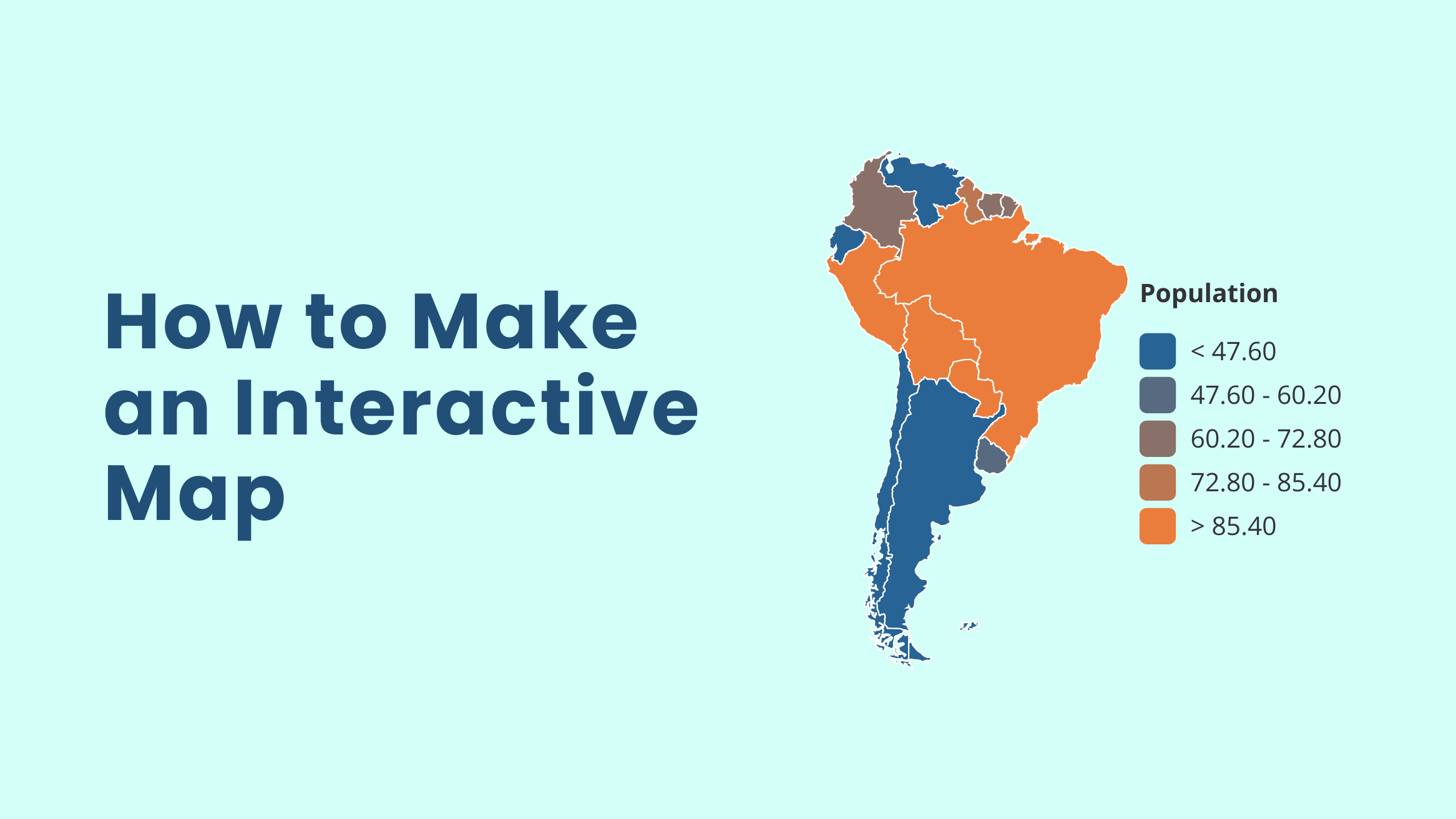
How to Make an Interactive Map in Minutes to Enhance Data Visualization

In the fast-paced world of marketing, you’re constantly trying to make sense of complex geographic data and present it in a way that keeps your audience hooked. Imagine preparing for a high-stakes presentation where you need to show sales data by region, but static maps just don’t cut it.
Here’s where the challenge kicks in: You need something dynamic that tells a story visually – an interactive map. Thankfully, DocHipo’s interactive map widget swoops in to save the day, helping you create captivating, data-driven maps in a snap.
How to Make an Interactive Map in Minutes
- Insert a Map: Use the map widget to open an interactive map.
- Customize the Map: Select a region or country, edit data, adjust colors, add captions, and create a legend to make your map interactive and visually engaging.
- Embed & Share: Easily embed your interactive map into websites, presentations, or social media.
This blog will walk you through everything you need to know about how to make an interactive map – what it is, its key features, and when to use it. Plus, I’ll show you how to create one effortlessly within DocHipo without the hassle of switching between different tools. By the time you’re done, you’ll know how to whip up stunning interactive maps and present them with other design elements – all under one roof. Stay tuned!
Table of Contents
What is an Interactive Map
An interactive map is a powerful tool that lets your users actively engage with the content on the map. So, what makes a map dynamic or interactive? When the map offers features like clickable markers, pop-ups, legends, and overlays, data visualization becomes more dynamic.
Whether you’re displaying geographic data, providing directions, or creating immersive website experiences, interactive maps bring your content to life.
Check out the SolSmart Map uploaded on its website.
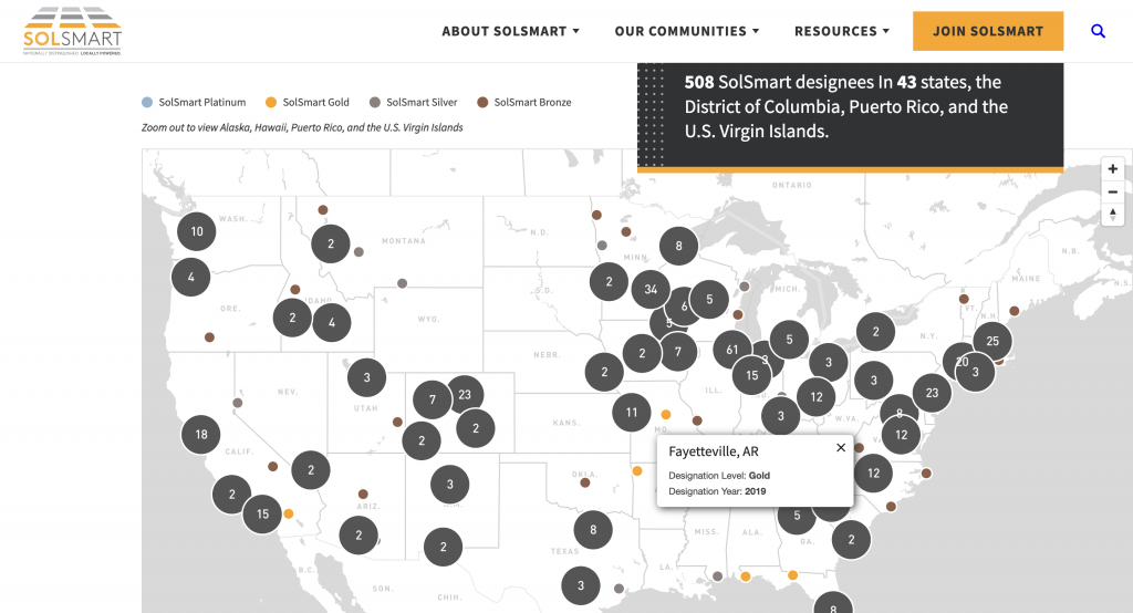
Next, I’ll show you how to make the most of these maps in your marketing designs.
What Can You Do with Interactive Maps in Design
According to the Content Marketing Institute, 81% of marketers say interactive content grabs attention better than static content. So, the real question is, “How do interactive maps work?” It gets people clicking, scrolling, and interacting, which keeps them engaged longer.
If you are a beginner, you might have one question. What does the interactive map show? For a start, you can use interactive maps as follows:
- Demographic maps (e.g., population or crime stats)
- Comparative global maps (e.g., happiest countries)
- Regional sales growth maps (e.g., highest and lowest growth in states or countries)
- Market expansion maps (e.g., regional market penetration rates)
- Highlight revenue data by country or city
- Showcase election results visually and clearly
In addition, you can use interactive maps to display climate data, tourism growth, and transportation routes, making complex geographic data visual and engaging!
Now, you’re thinking about how to build interactive map designs without any premium map-making software or extensions! Well, surprise! You can use any interactive map maker free, like DocHipo, to create such stunning experiences.
Before you find out how easy it is to make interactive maps with the advanced graphic design tool, you should know about some of the features and advantages of using interactive maps for visual-worthy attention!
Advantages of Using an Interactive Map Design
What is the use of interactive map? From data visualization to data comprehension, from its visual appeal to the longer attention span, you can achieve everything with a good interactive map! Let’s explore this in detail.
The following features show how an interactive map helps you build brand recognition. Let’s understand what makes a map interactive and how that makes your business profitable!
1. Effortless Data Visualization
I’m often hit with the one question, “How do I make an interactive map accessible?” Accessibility is one of its coolest features! Interactive maps take complex data and turn it into visually engaging experiences.
2. Engaging User Experience
Your audience will love the fully interactive features of such maps. Users can easily zoom in and out, click on specific regions or markers for detailed information, and explore the data in a way that feels intuitive and captivating.
3. Intuitive Customization
You can use extensive customization to build an interactive map. Whether you want to adjust color palettes or create custom popups, you can tailor your map to fit your needs while keeping your company’s branding front and center.
4. Seamless Embedding
Integrate interactive maps effortlessly into any digital platform. Whether it’s a website, presentation, or report, such maps can be embedded anywhere, making your data accessible and engaging across various mediums.
5. Real-Time Data Updates
Updating data in these maps is a snap. You can easily make changes and see them reflected on your map. This feature is perfect for tracking sales figures, population statistics, or real-time events, ensuring your map remains current and relevant.
5 Best Map Design Ideas You Can Try for Creative Visualization
Let’s take a look at some cool designs that can turn into an interactive map world to show essential aspects like regional product availability and store locators so that your clients can find you easily.
1. Add Coffee Charm to Your Maps
If you’re considering using interactive maps online for your coffee business, you’ll fall in love with this map style, which features a metallic bronze background, charming coffee illustration art, and cute coffee bean icons.
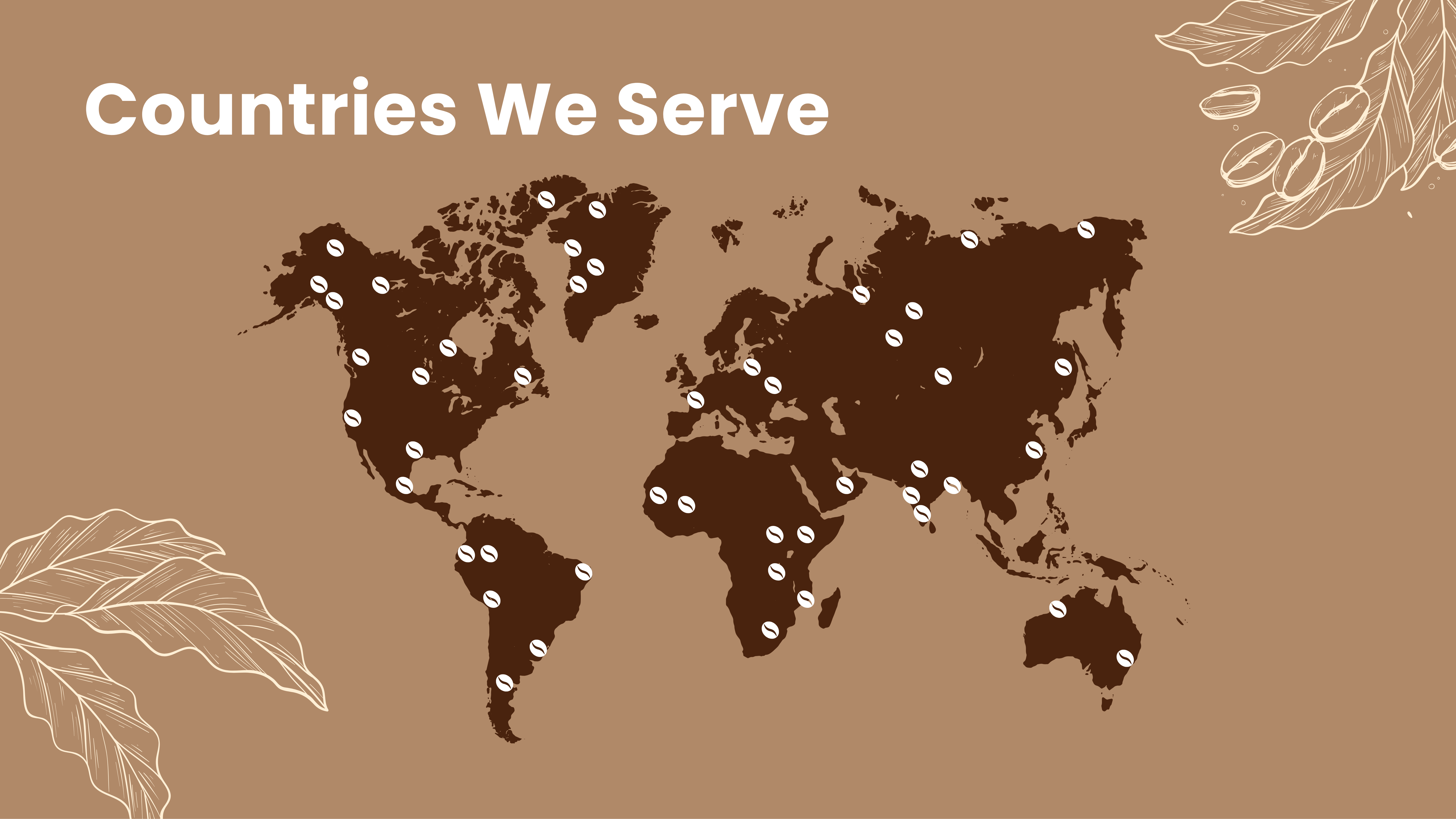
Customize Maps with This and Other Documents
By editing it with advanced interactive features like pop-up information, you can easily showcase the countries where your products are available.
2. Subtle Overlay for Perfect Contrast
Contrasts make everything easily visible. Therefore, try this map design, emphasizing geographical interactive data by using dark colors to denote the map areas and a subtle background overlay with a light and cool tone.
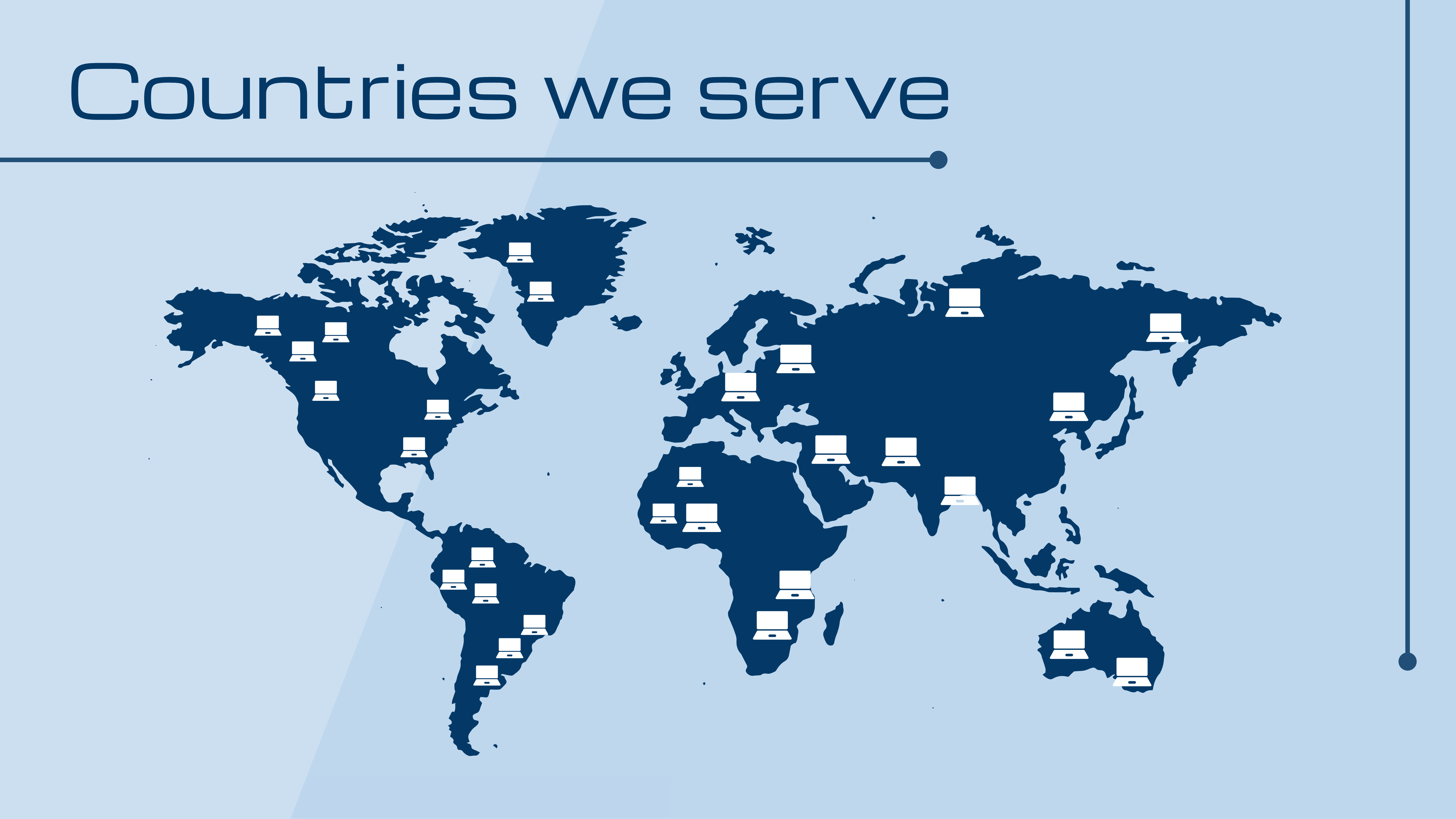
Customize Maps with This and Other Documents
3. Icons That Highlight the Places of Your Savory Delights
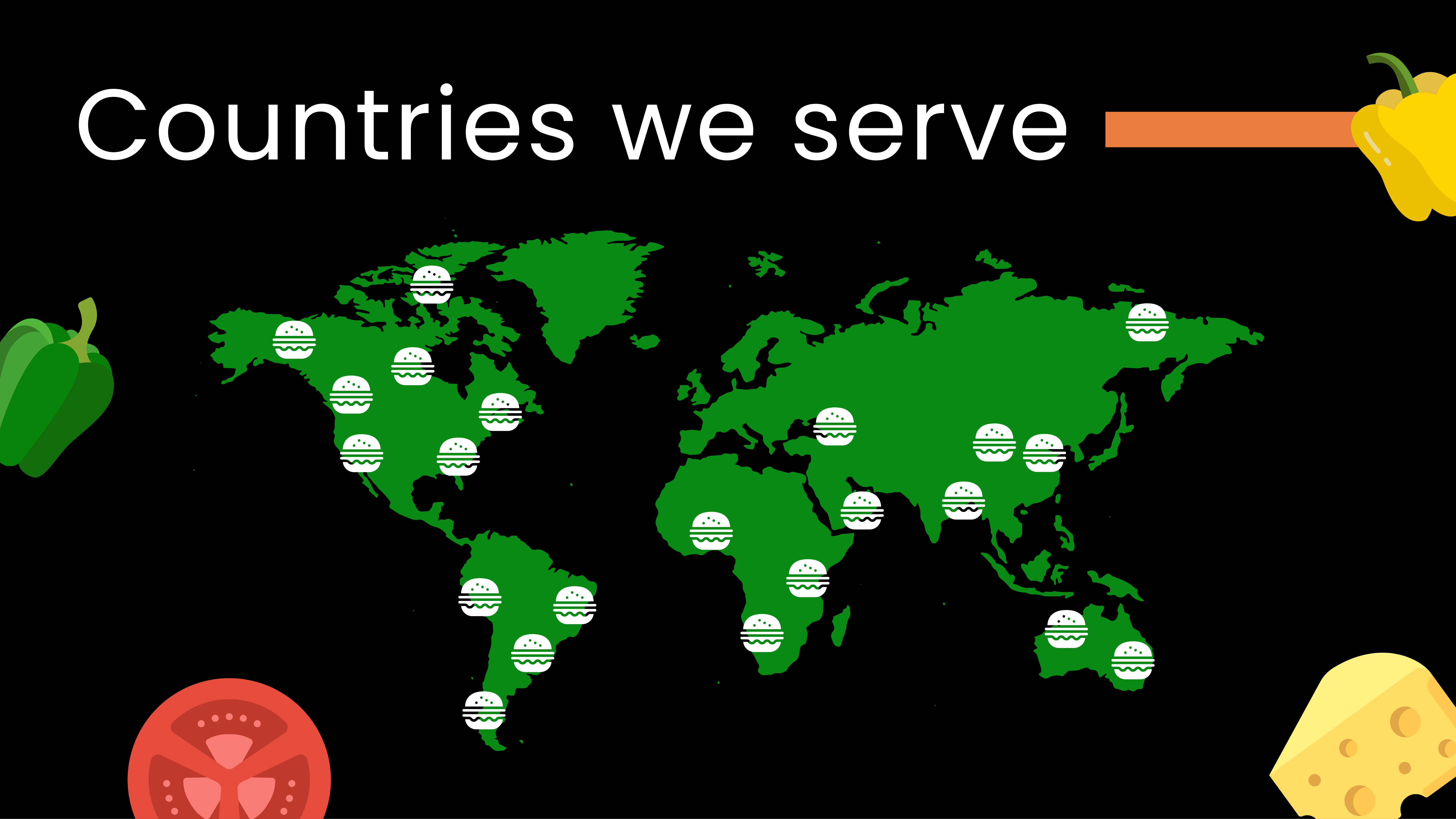
If you want to show the latest fast-food chain’s market penetrations in various countries, adding interactive map features with clickable and more accessible data can create an extraordinary customer experience. The following map design style is perfect for such customization with DocHipo’s interactive map maker.
Customize Maps with This and Other Documents
Moreover, jazz it up with mouthwatering food icons to design it and highlight the countries with juicy burger icons to show what your unique products are all about!
4. Bold Contrast for Gripping Visual Attention
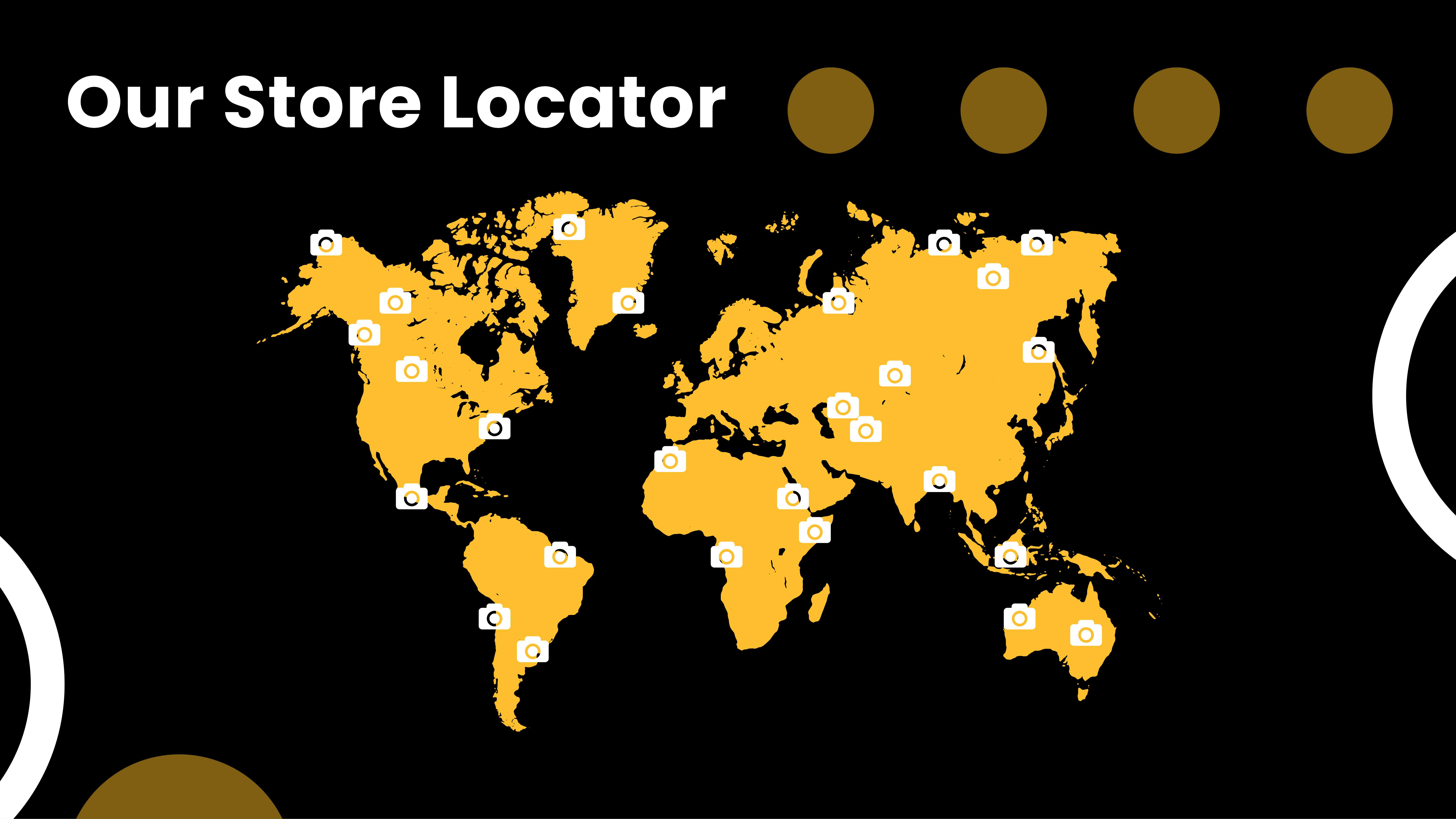
Warm yellow shades create a vibrant contrast on a black background because of its high brightness and color difference. Yellow is one of the lightest, most intense colors on the spectrum, while black is the darkest. This stark color combination allows interactive maps for websites to stand out sharply, making them highly visible and attention-grabbing.
Customize Maps with This and Other Documents
You can also add store addresses in a region so your audience can easily find you in other shareable documents.
5. Decorate Your Map Presentation with Organic Mono Icons
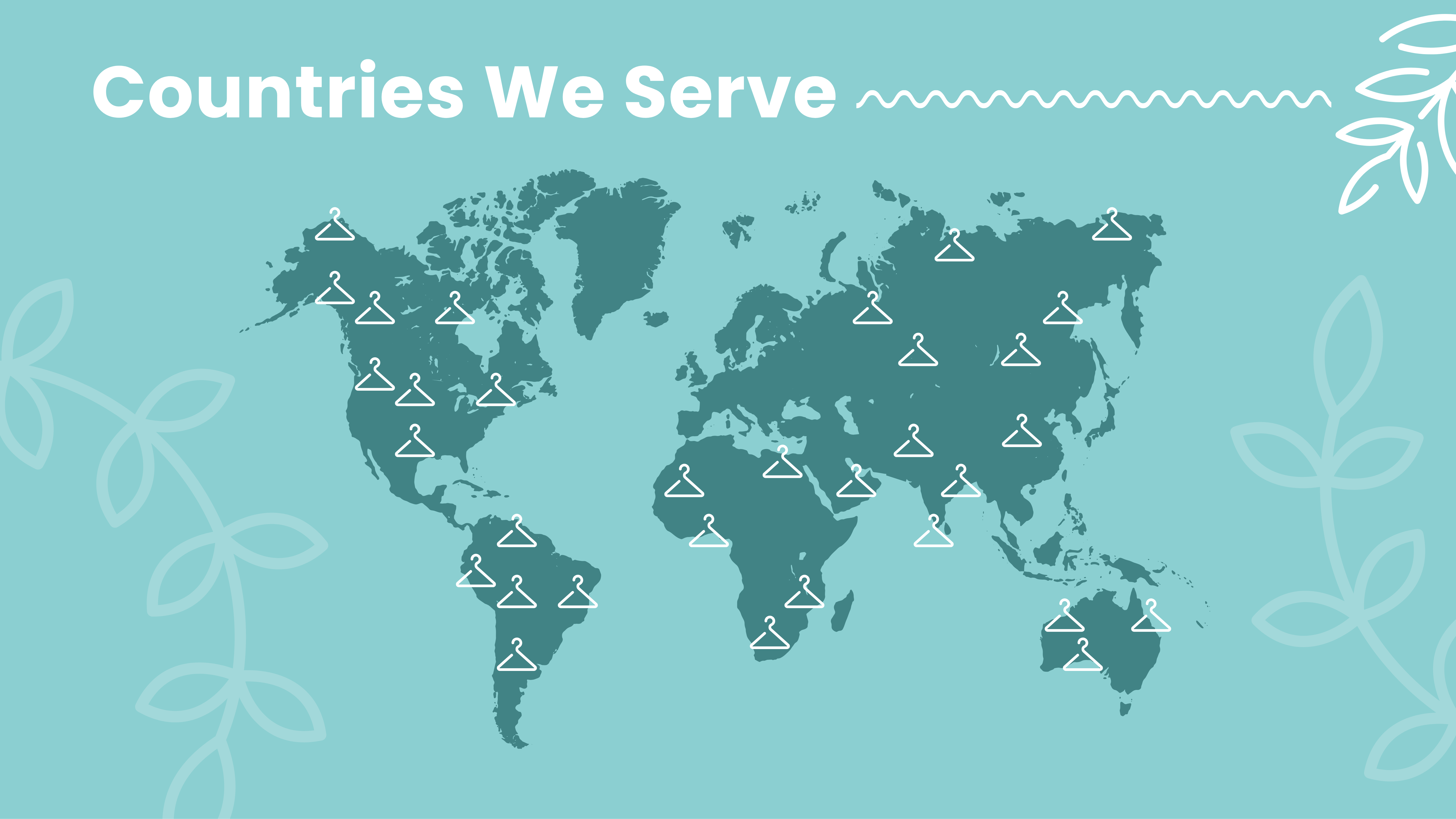
Nothing can beat Mono Icons’ minimalism and chic style, which includes a floral touch and leavy curves. If you’re in the fast fashion business, you need to grab your audience’s attention even faster.
Customize Maps with This and Other Documents
This map design shows how the reflection of the brand aesthetic also plays a role in pleasant visual appeal.
I’m sure you have fallen in love with the chic design ideas for making interactive maps. Are you wondering, “Where can I create an interactive map?” Try DocHipo for free interactive maps!
Now, let’s have a look at how to create interactive map designs using DocHipo, an advanced, all-in-one document design tool.
How to Make an Interactive Map Design with DocHipo
Let’s get started with DocHipo’s easy-to-use interactive maps. Editing a template or creating a design from scratch is super easy in DocHipo; meanwhile, customizing any template with a map widget seems unbelievably effortless!
To add an interactive map to your marketing collaterals, first, sign up and select a template in DocHipo.
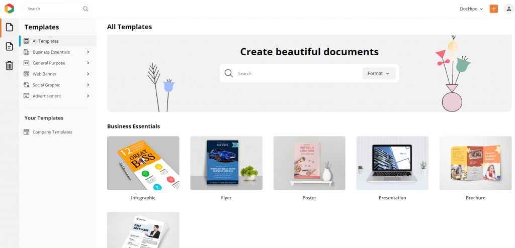
From infographics and presentations to social media posts and case studies, find any design template at your fingertips.
Watch the video to find your desired template in DocHipo.
Imagine presenting a business report to your client. You want it to be data-driven and easy to follow. After discussing the problem and solution, adding an interactive map to showcase sales performance could make your presentation more compelling and visually engaging.
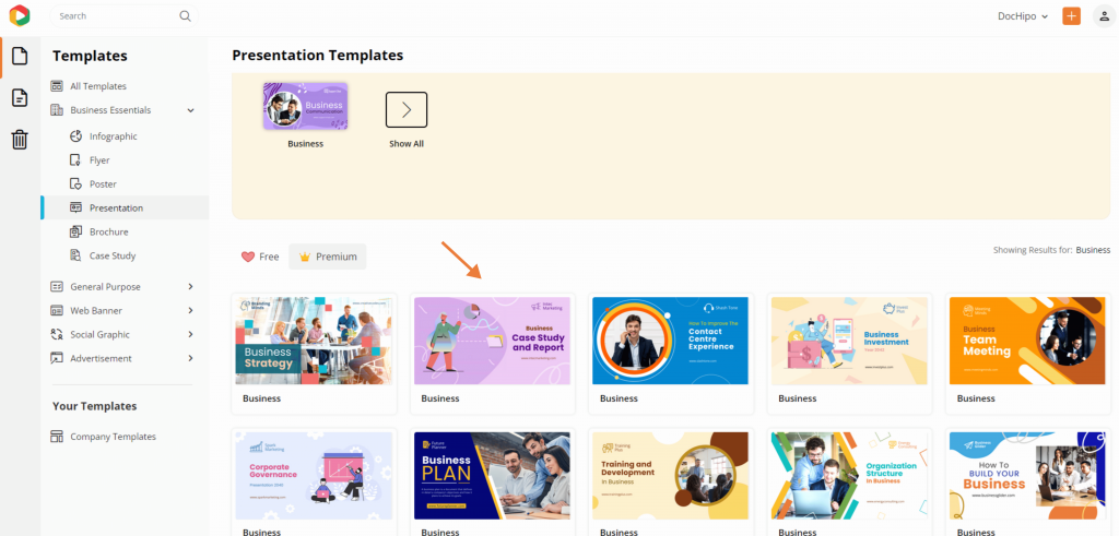
Let’s do this with DocHipo’s wide range of business presentation templates! I’ve selected the beautiful business case study and report template to demonstrate the customization steps for an interactive map.
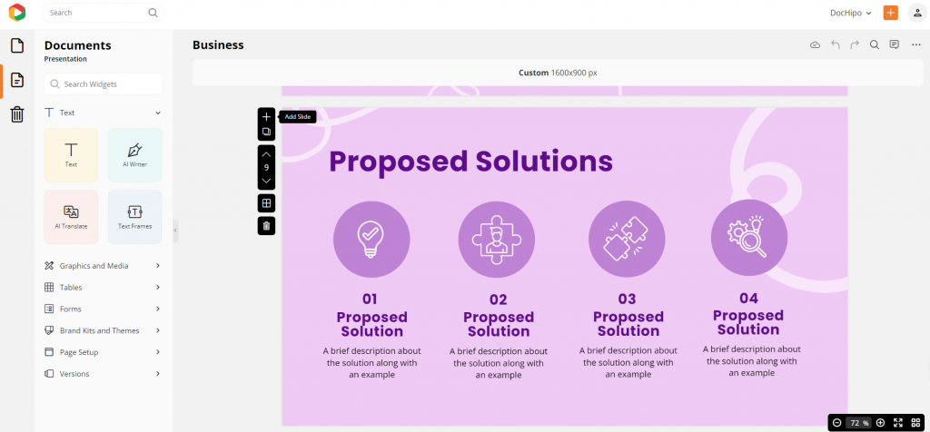
Now, click on the “+” icon to add a new page with interactive maps to showcase the growth in the sales report.
Let’s see how to make an interactive map with DocHipo in just three easy steps.
1. Select the Map Widget
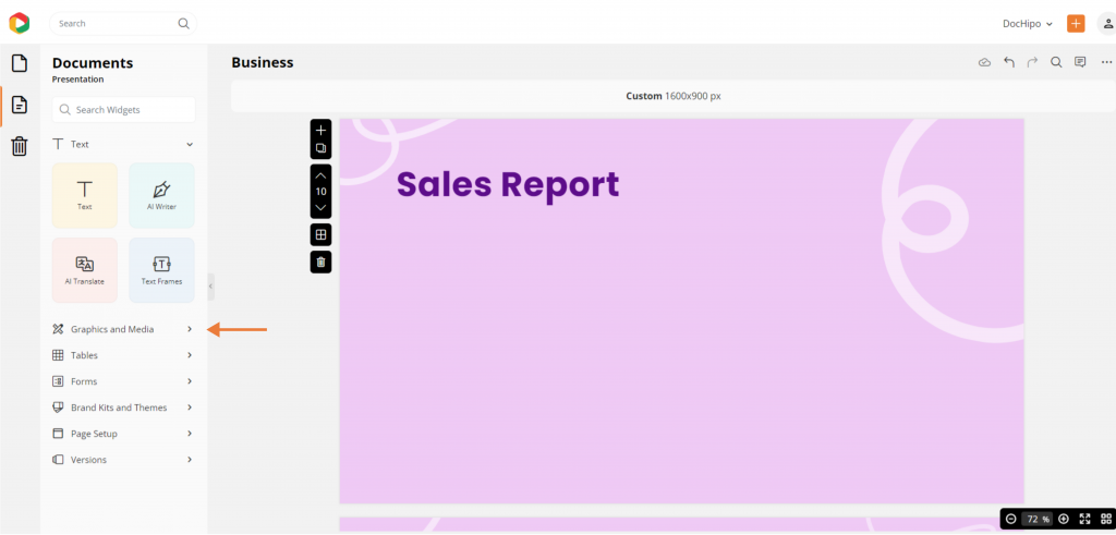
Go to the “Graphics and Media” option from the left panel to select the map widget.
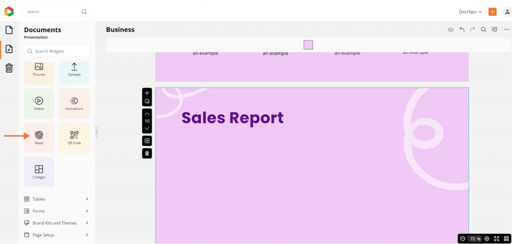
Then, click “Maps” from the widget library in DocHipo to create an interactive map to add to the design.
2. Edit Your Map Data and Settings
You can edit this tab to customize your map and add interactive features. Click the edit button with the pen icon at the top-right corner to input your data.
A. Select Location by Region or Country
Choose a country or region you want to highlight.
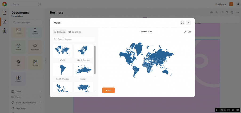
You can display your data on any of the seven continents, from the interactive map of the world to the interactive map of Asia, Europe, or Africa.
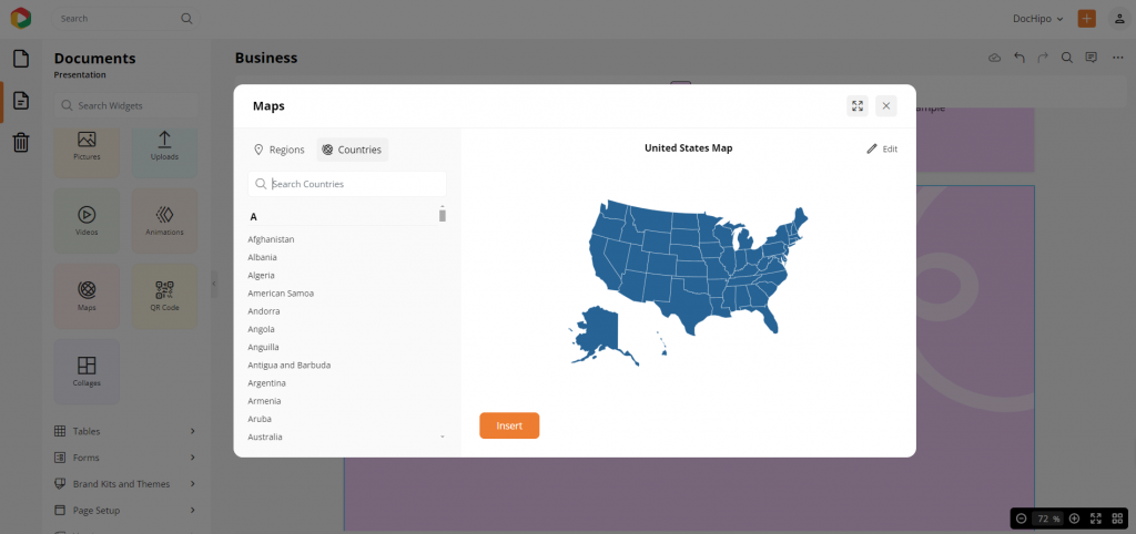
If you wish to choose a particular country, you can switch from region to country to pick your choice of country from 200+ options. You can use the search bar to find your country name easily. I want to use the interactive map USA from the map widget to make the sales report.
B. Input Your Data
Now, it’s time to add your map data from the data tab. Whether you’re showcasing population stats, sales numbers, market expansion, or growth trends, you can input any data you want. You can also turn the display on or off with a click.
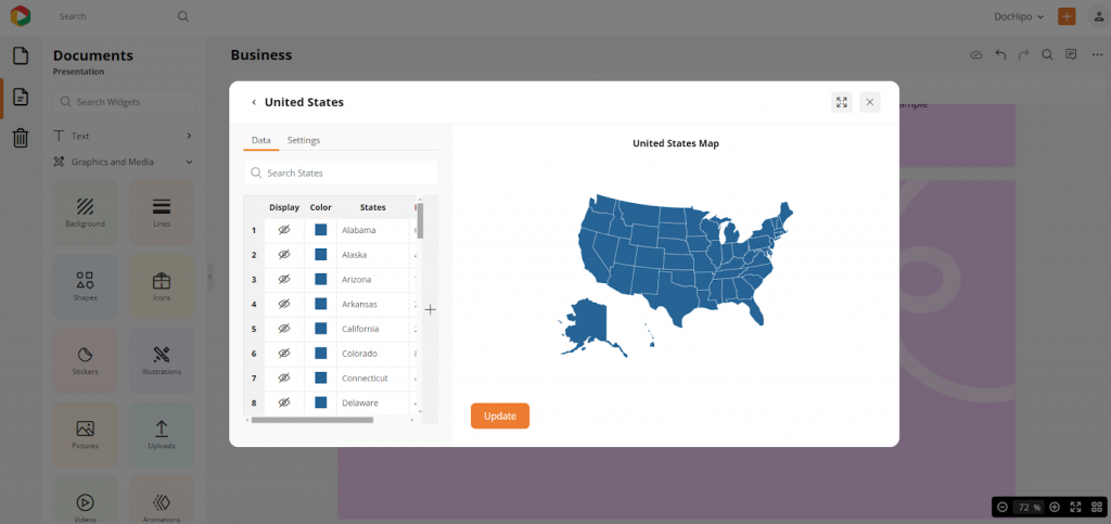
As shown below, the map automatically displays the name of each state, country, or province with a default label for the data, but you can easily update it with your own information to suit your needs.
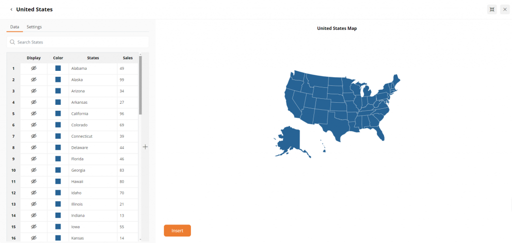
Double-tap on the cells and type to give each column a clear heading and add your own data. Click on the “+” icon to create as many columns as you need.

C. Color Code Your Map and Border Areas
Now, it’s time to color-code your data to make it easily distinctive among different data points for more clarity! In the Map Data tab, you can choose different colors for various areas on your map. You can change the colors according to your data and information.
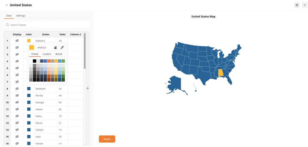
DocHipo has many preset color shades; add custom colors using hex codes. Moreover, you can use brand colors with DocHipo’s brand kits.
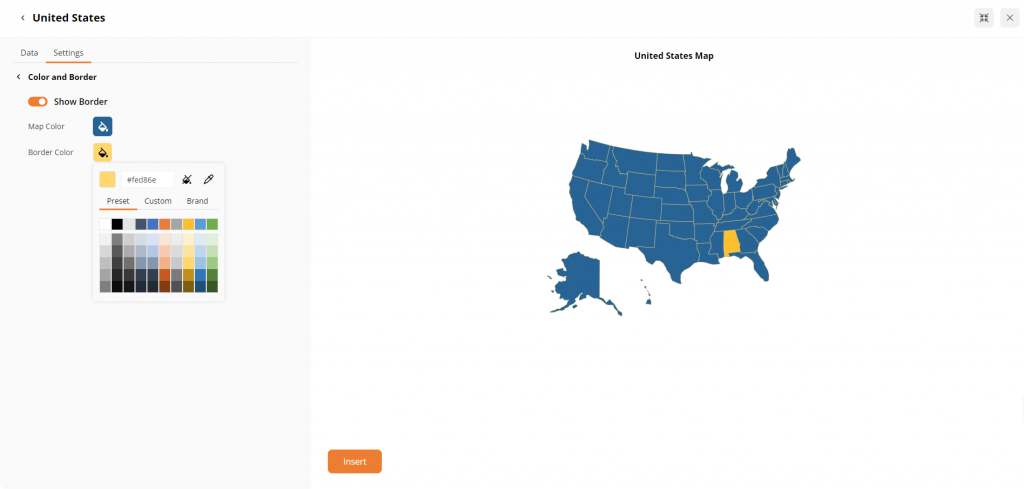
Moreover, you can easily display state or provincial borders on your map and customize them with distinct colors from the “Settings” tab. Select the borders to make them visible, then choose the color that best suits your design or data. This feature helps highlight specific regions or draw attention to key areas, making the map more engaging and easier to understand.
D. Add Interactivity
DocHipo lets you add cool interactive features to your map.
1. Modify Caption
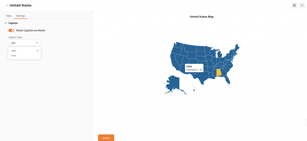
Include elements, such as captions, from the Setting tab to provide your information with stunning visual appeal.

You can enable the “Show Caption on Hover” option so that when you move your cursor over any state, the data from the previous step pops up. To make it stand out against the map, choose a caption color that contrasts with the background – either light or dark, depending on the map’s tone. It helps keep the information clear and easy to read while interacting with the map.
2. Customize Area Value Map and Legends
Next, you can easily showcase the data you added under the “Map Data” tab by enabling the “Area Value Map” setting. If you’re working with numbers, you can represent the values visually through color gradients. Pick a Start and End color in the “Area Value Map” setting, and the map will automatically shade each data point accordingly.
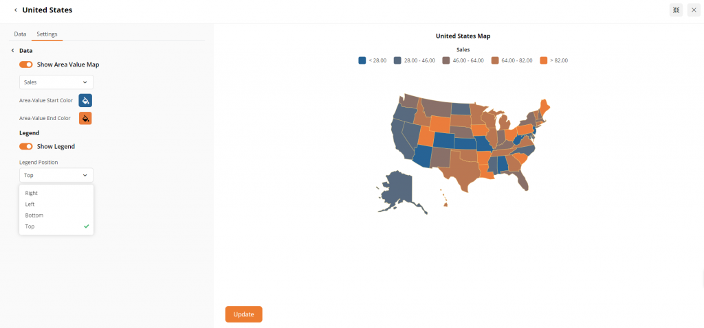
You can also turn on the “Show Legend” option to explain each color’s meaning, adjusting its position and text color to fit your design.
3. Insert Your Interactive Map into Your Document
Click on the insert button to add the map. You can resize and reposition it with a drag. Simply update the interactive map design and download the design in watermark-free high-quality file formats like PNG, transparent PNG, JPEG, or PDF.
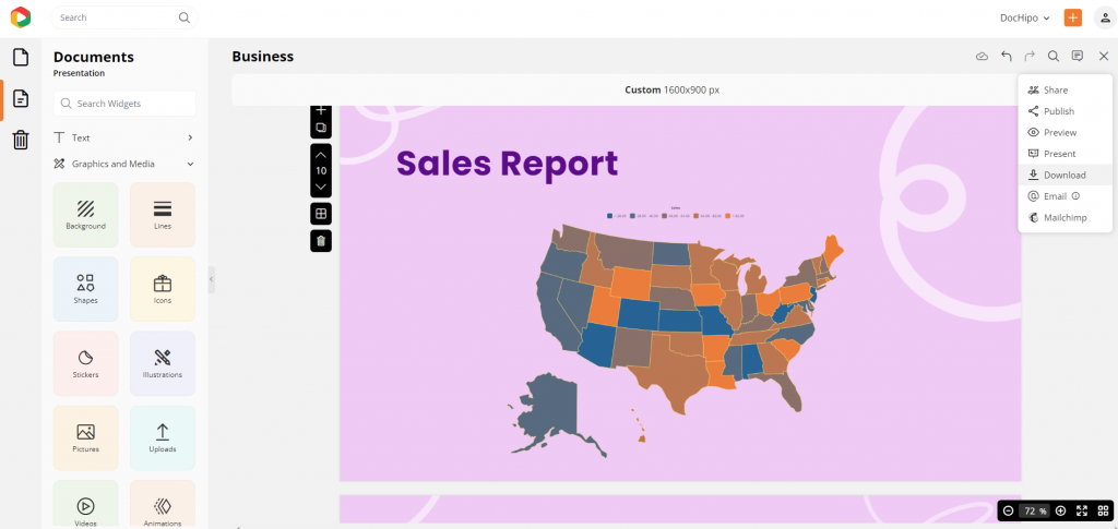
You can also present the design directly or share it on social media with controlled access.
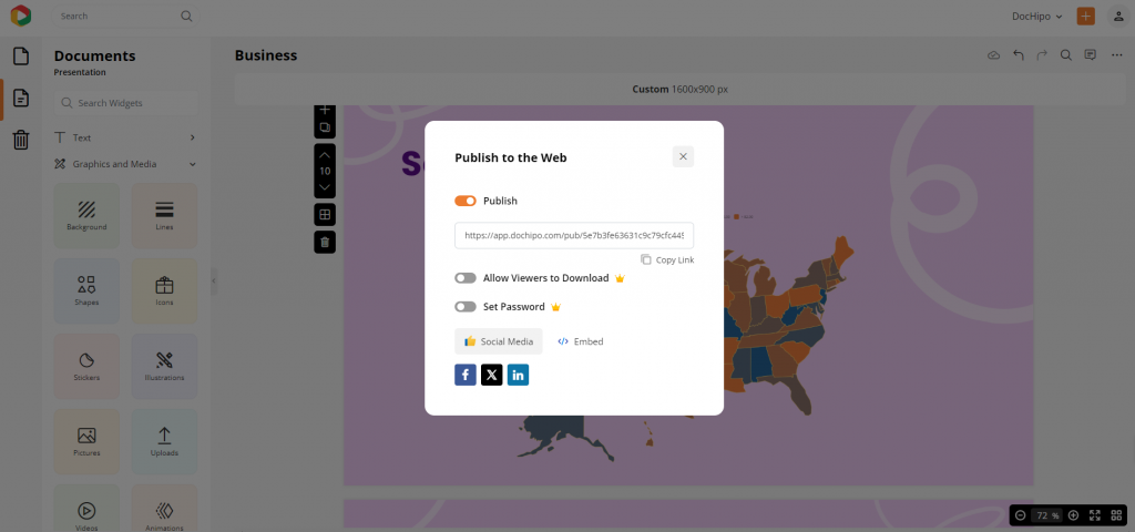
What if you want to add this to your webpage? If you are asking, “How do I embed my maps on my website?” We’ve got you covered. To embed any document on your website, use DocHipo. You need to use the publish button to get the option to embed your design. Simply copy the code and paste it on your communication channel, i.e., your website. Now, you can easily update your document in DocHipo, and the real-time changes will be reflected on your web pages.
Watch this video to embed it to your websites.
Isn’t it too easy to make interactive maps in DocHipo? Watch the video below for the customization steps again before making interactive map designs.
In a Nutshell
The importance of interactive maps is constantly on the rise. From LinkedIn posts to Facebook ads and case studies to pitch decks, using engaging and clickable maps is a surefire way to keep your audience hooked.
In conclusion, if you’re excited about how to make an interactive map with DocHipo, this guide has surely sparked fresh ideas and insights for your projects. Remember, crafting engaging maps doesn’t have to be a daunting task—it’s all about exploring your visualization power. Stay connected with us through the accessible resources, and sign up today to create interactive maps without any effort. Let’s effortlessly turn your mapping vision into a reality!
FAQ
How to Make an Interactive Map?
With DocHipo’s maps widget, you can easily add interactive maps to your designs. Select the maps widget, then edit the map to customize the regions and add relevant data by adding columns or visualize it with interactive features like hovering captions, legends, and borders to make it engaging and informative.
How to make an interactive map free?
DocHipo is a free tool for creating interactive maps. You can use the map widget in any free design template, customize it with new data, color codes, and interactive features like legends and hovering captions, and insert your interactive map in your designs without any cost.
What is an interactive map maker?
An interactive map maker is a tool that lets you create dynamic maps where users can zoom, click, and explore different areas, adding a layer of engagement and detailed information to your designs. DocHipo is one of the best free graphic design tools to build interactive maps.
How can I create my own interactive map?
In DocHipo, you can easily create and share your own interactive map by choosing a template, using the map widget, and customizing it with your preferred regions, colors, and data.
What is a static map and an interactive map?
A static map is a fixed image, while an interactive map allows users to zoom, click, and interact with different regions, offering a more engaging and informative experience. Make interactive maps easily with the DocHipo design tool.
How do I create a custom map?
DocHipo allows you to create custom maps by selecting specific regions, customizing colors, and adding labels that match your design needs.
How do I add an interactive map to my website?
You can use the DocHipo design tool to embed all your designs on your website. You can also update those document in DocHipo and that will directly reflect the change on the website in real time.
How to make an animated map for a video free?
DocHipo’s maps widget lets you create maps that can be exported into videos. You can also animate map elements to create engaging animated maps for your video projects for free.


