How to Make a Restaurant Flyer in Minutes [Step-by-Step Guide + Templates]

Do you struggle coming up with your Restaurant flyers over and over again?
As a restaurant owner, you might already know that a flyer is cost-effective to grab the existing customer’s attention and address new ones. You can think of it as a communication vehicle for your restaurant business.
The difficult part of excelling at creating an eye-catching and effective Restaurant Flyer is the design. It needs to have the right format, choice of colors, fonts, illustrations, etc. Otherwise, the whole purpose of the flyer will become meaningless if it doesn’t attract eyeballs and read the message. So, pay attention to the design part.
How to Make a Restaurant Flyer
- Choose a Restaurant Flyer Template: Speed up and fail-proof your design.
- Customize the Text: Add a catchy headline, restaurant name, crisp descriptions of your menu items, price, and contact details.
- High-resolution Food Images: Highlight your bestselling and chef’s special dishes with mouth-watering pictures to appeal to the senses.
- Choose Appropriate Fonts: Choose legible fonts that reflect your food business’s personality and style.
- Experiment with Vibrant and Contrasting Colors: Experiment with more oranges and yellows that stimulate the appetite.
- Experiment with Typography: Use visually attractive typography to convey the mood or tone of your message and evoke hunger.
- Take Care of the Visual Hierarchy: Highlight the first thing your target customers should know about your restaurant.
- Incorporate Graphic Elements: Relevant and appealing stickers, icons, and shapes to add visual interest.
- Download Your Restaurant Flyer Design: Download in a high-quality, watermark-free PDF file.
If you struggle with designing or don’t have much time, this post will help you with a step-by-step walkthrough on using DocHipo to create your Restaurant Flyer Design in minutes. The post also includes a few flyer design best practices with DocHipo Templates as examples to get you started.
Table of Contents
Restaurant Flyer Design Ideas with Examples
Follow these best practices to make a flyer for a restaurant that entices people to take steps and ultimately grows your business.
Appeal to Senses Using High-resolution Food Images
The visual appeal of the food you offer is undeniable as it draws your target customer’s attention, making a fantastic first impression. You may highlight your bestselling dishes, chef’s special dishes, or most profitable ones. Always use your high-quality and mouth-watering food pictures that sharpen one’s desire for food and trigger visual hunger.
Incorporating such with striking images in your Flyer Design will:
- build trust and credibility
- add to your customer’s emotions
- increase sales
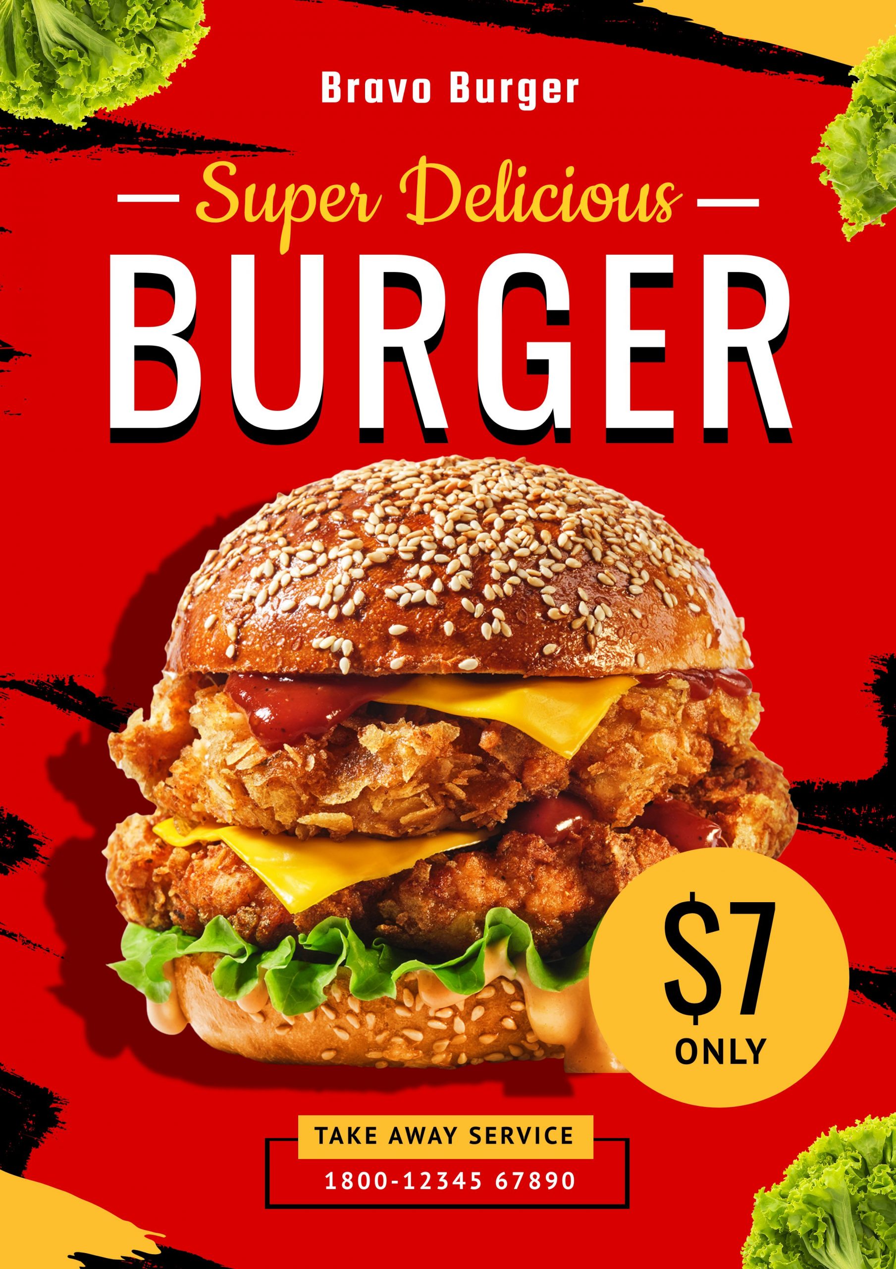
The tempting Restaurant Flyer Design has a perfectly-shaped, juicy burger below.
Get This Template and More
Get This Template and More
Get This Template and More
Experiment with Vibrant and Contrasting Colors
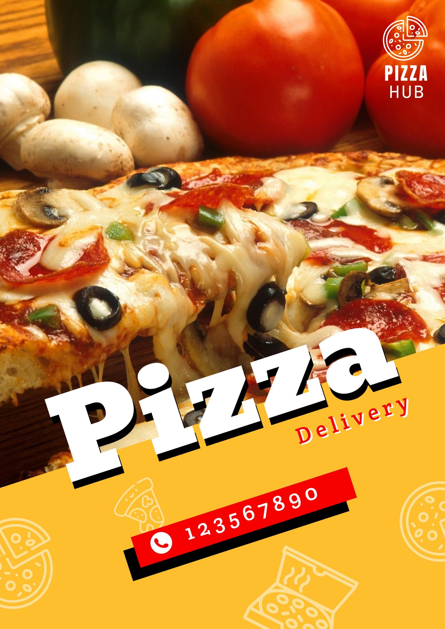
Colors can make your restaurant’s key message stand out to the right people and direct their eyes toward them. It will also create and improve your brand awareness and recognition. The colors and textures you use should make your target people feel intrigued and hungry. You may experiment with more oranges and yellows that stimulate the appetite.
For instance, the Restaurant Flyer Design with a fresh and hot pizza slice used a vibrant color scheme.
Get This Template and More
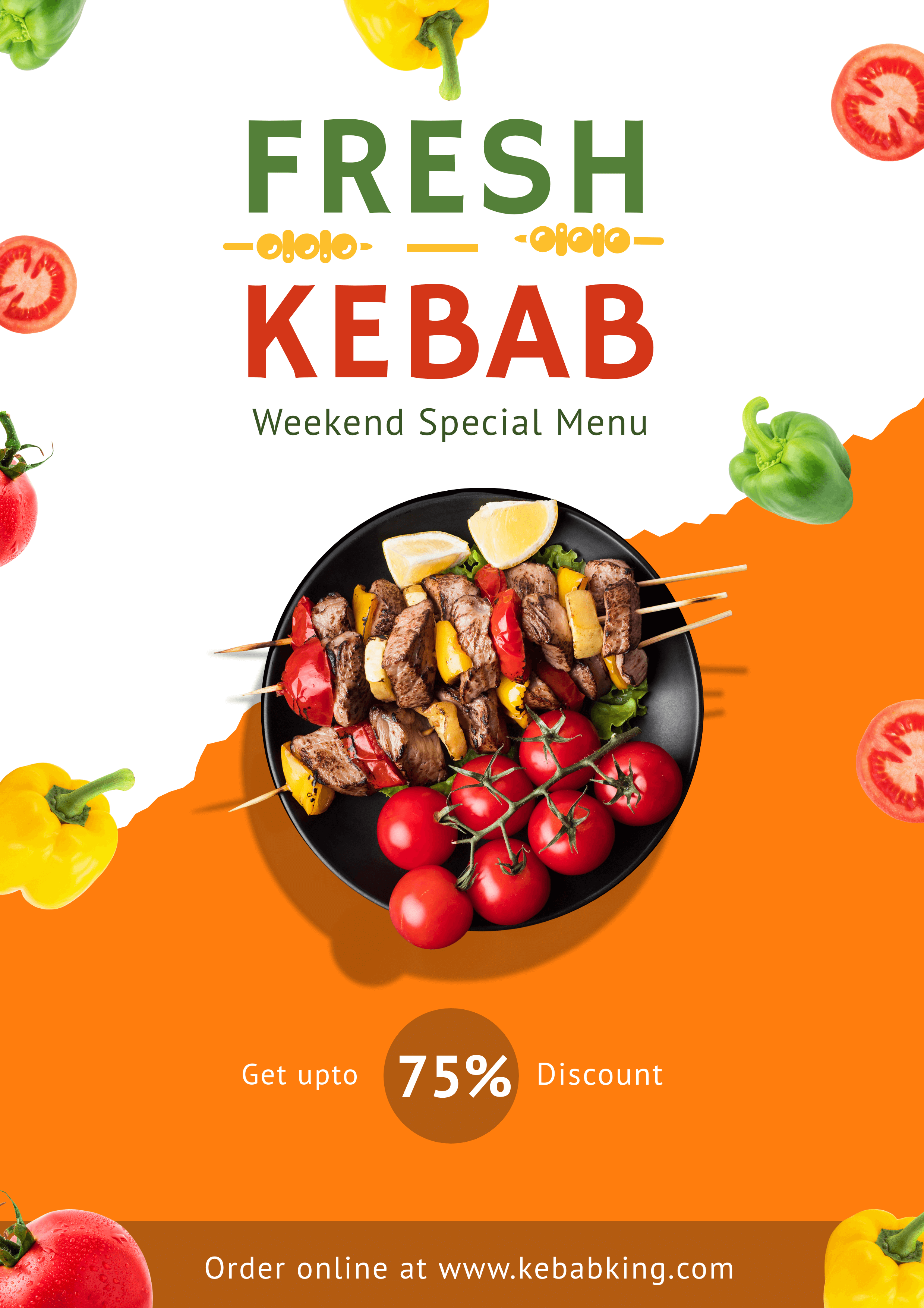
Get This Template and More
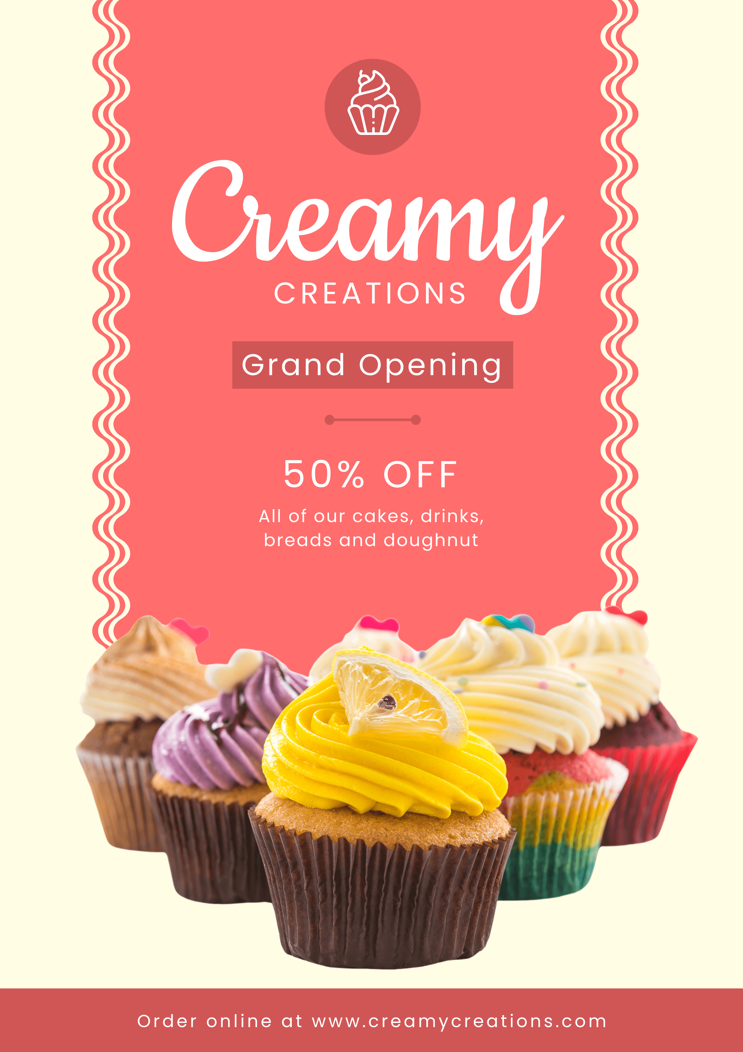
Get This Template and More
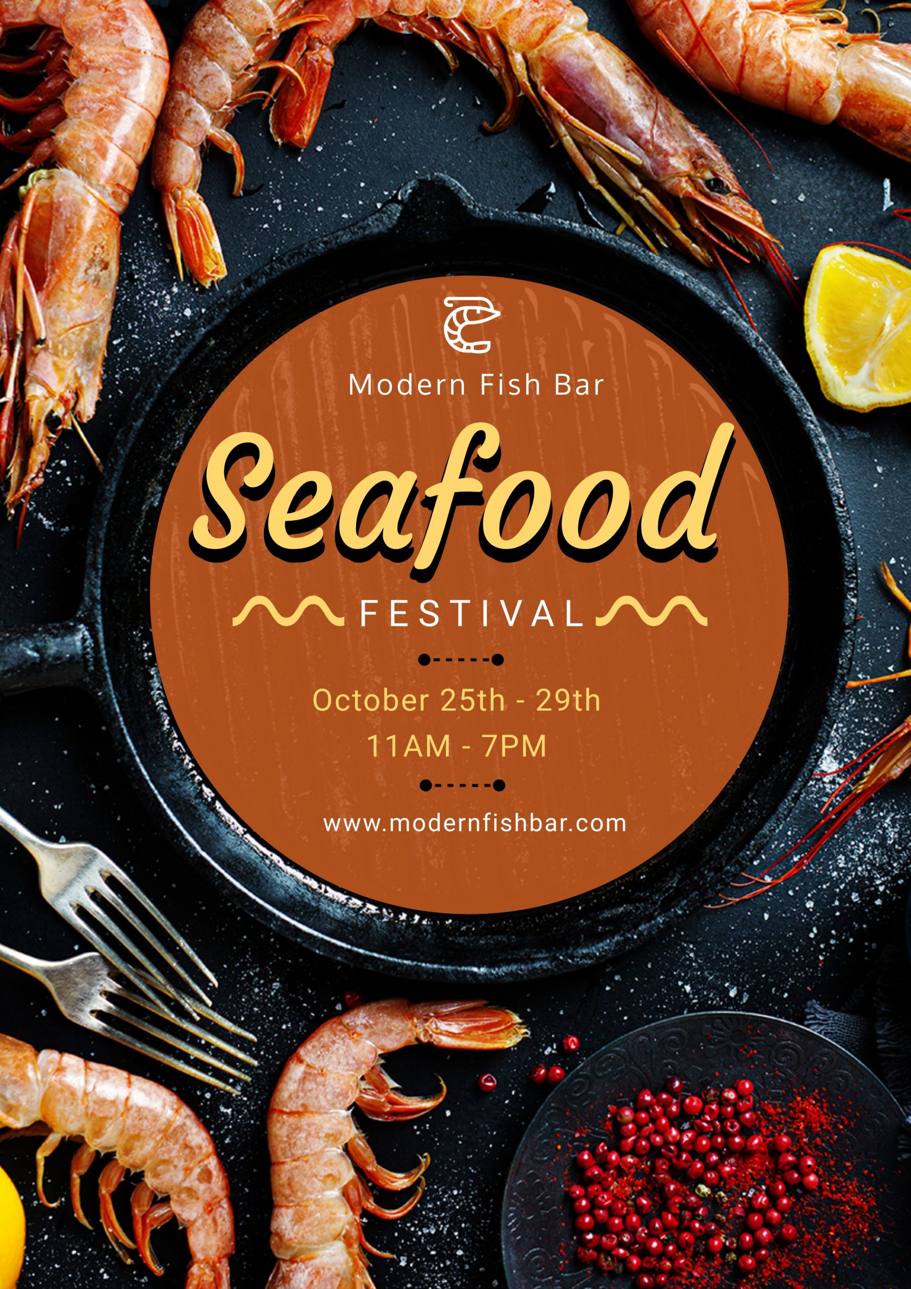
Choose Fonts Appropriate to the Design
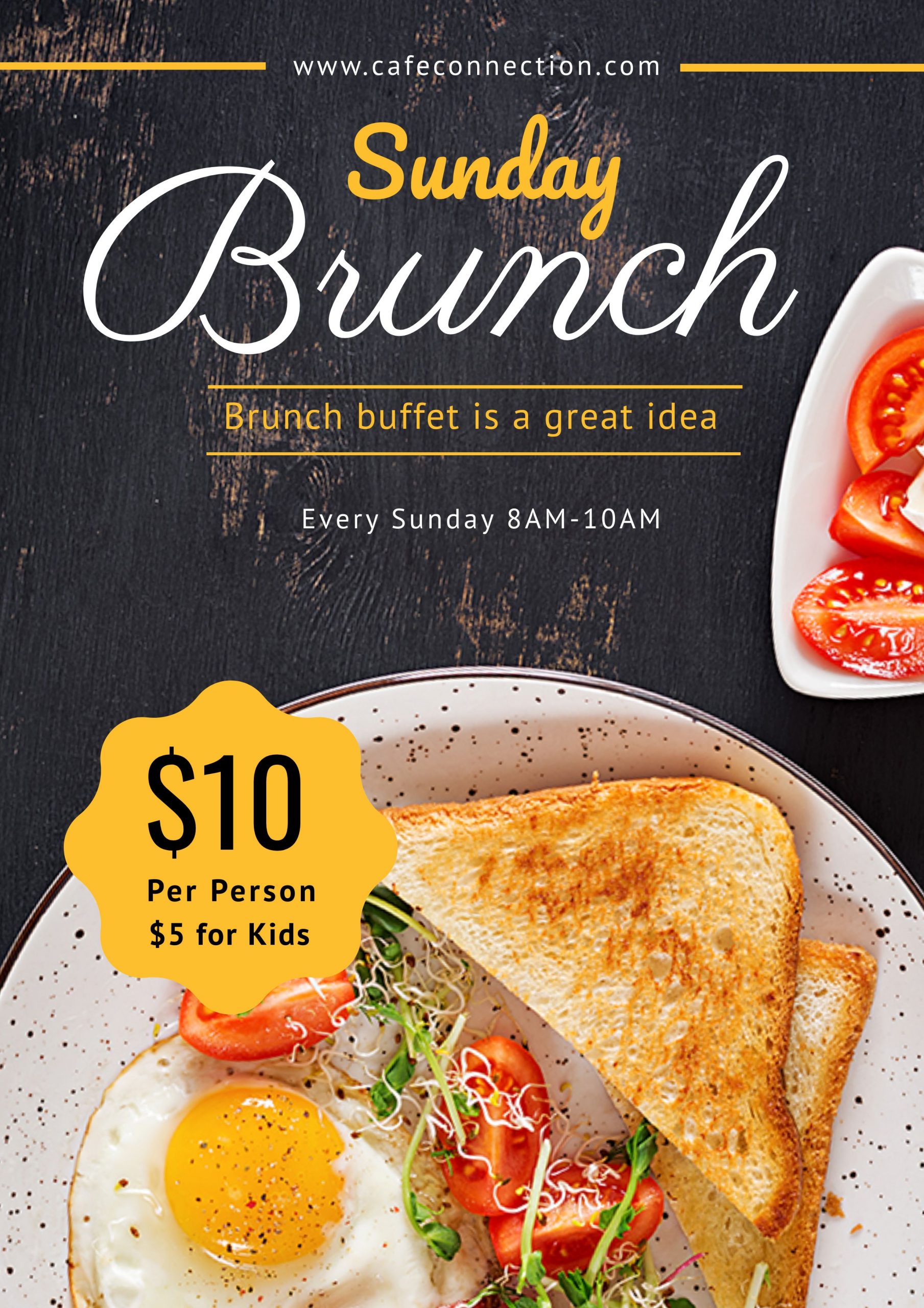
Whether you have a luxurious restaurant, fast food joint, or run a homemade food business, choosing the right fonts for your flyers is crucial. Alongside legibility, the fonts must communicate the range of dishes you offer. It should also reflect your food business’s personality and style.
If you serve a range of foods and feel that a single font isn’t enough to bring in the flavor of the dishes, try two to three fonts.
For example, observe the beautiful font choices in the two DocHipo Restaurant Flyer Templates below.
Get This Template and More
Get This Template and More
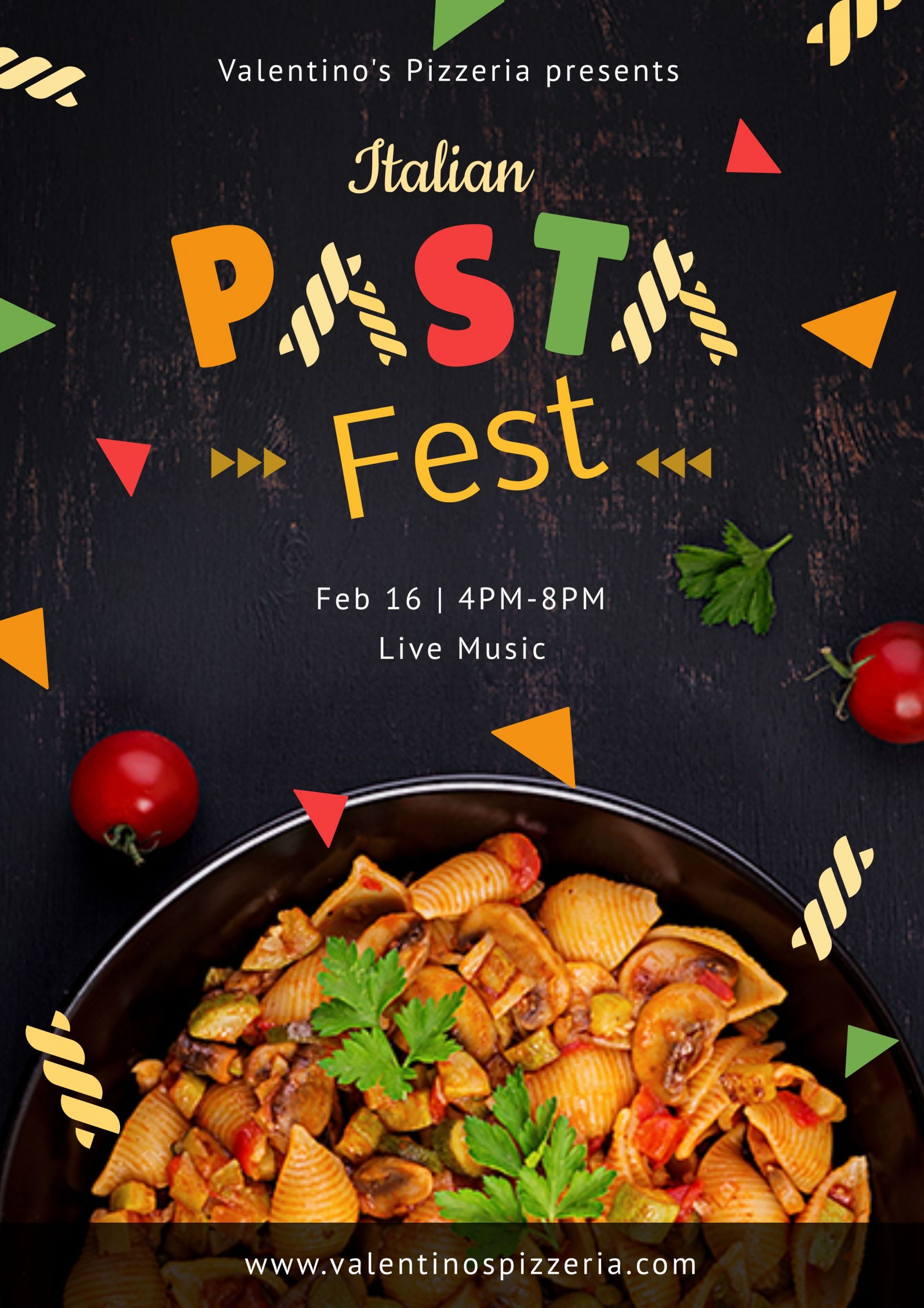
Experiment with the Typography
Typography is another integral element in your Flyer Design of using text as a visual. Convey the mood or tone of your message and evoke their hunger with a visually attractive typography design. It should be easy and fun to look at.
Play around with different design elements to give unique shapes to your text. Arrange the letters so that they become worth remembering for your viewers.
For instance, look at the Restaurant Flyer Templates below. They’re adding freshness to the design.
Get This Template and More

Get This Template and More

Get This Template and More
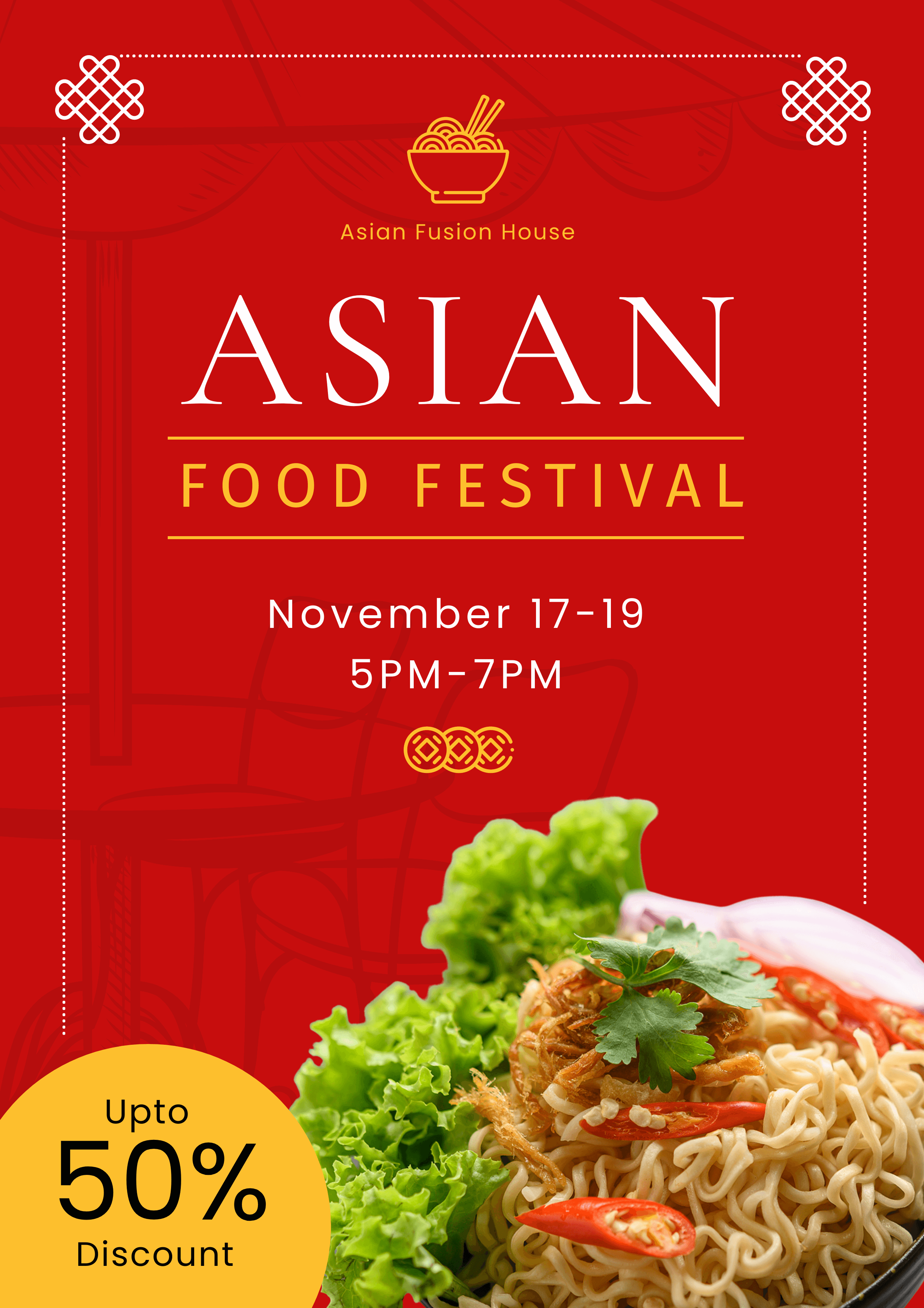
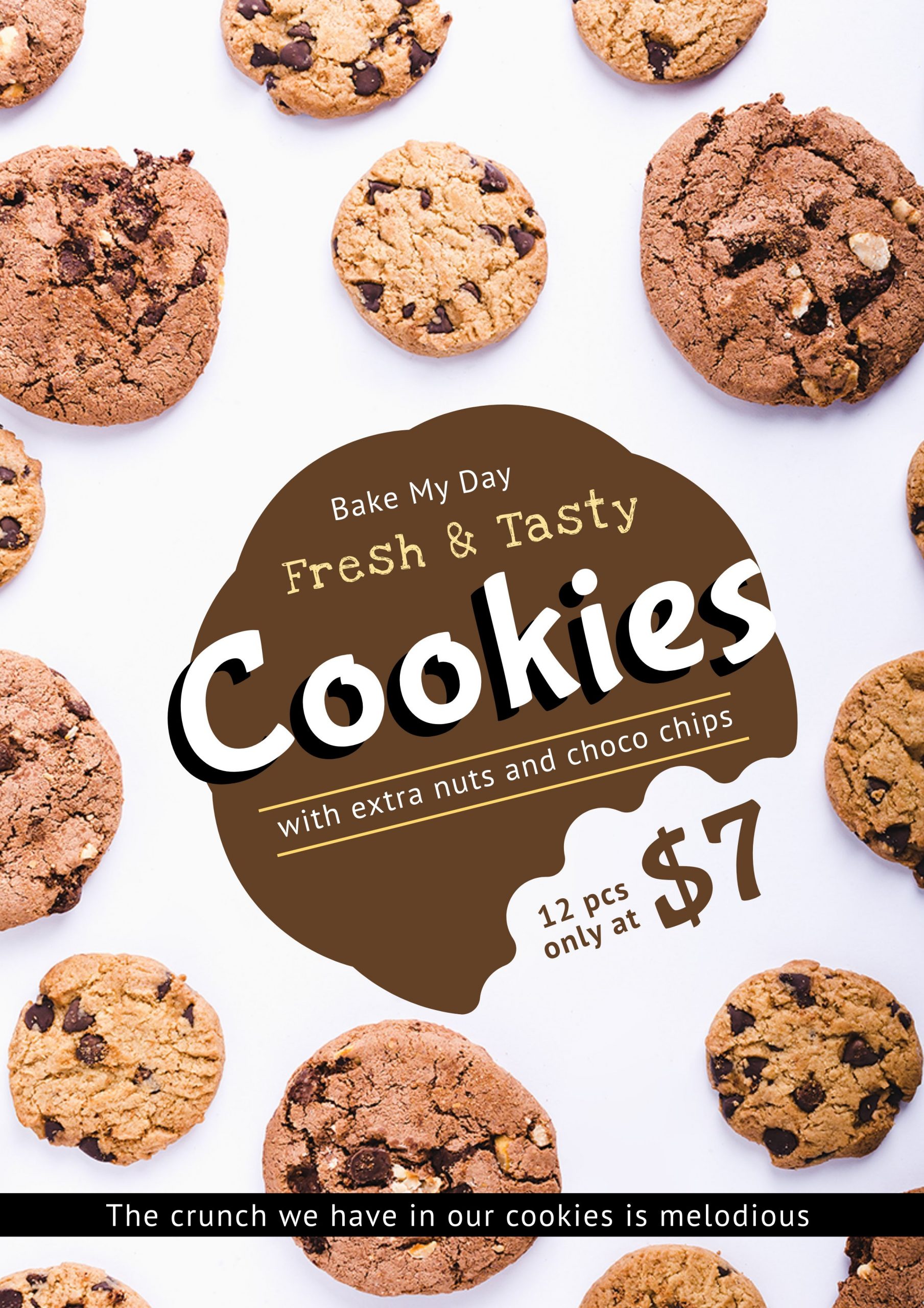
Take Care of the Visual Hierarchy
Figure out the first thing you want your target customers to know about your restaurant. After that, use a Visual hierarchy to highlight it. Your potential customers should know what you are talking about right away.
Keep the main message or name of the event in a large and easy-to-read font.
Then use the same or any other pairable font(s) in a smaller size for details like the nature of the event (say, food festival, the opening of a restaurant, etc.), location and date, your restaurant’s menu, and so on.
For example, you’ll understand the above points from the following DocHipo Restaurant Flyer Design Templates.
Get This Template and More
Get This Template and More
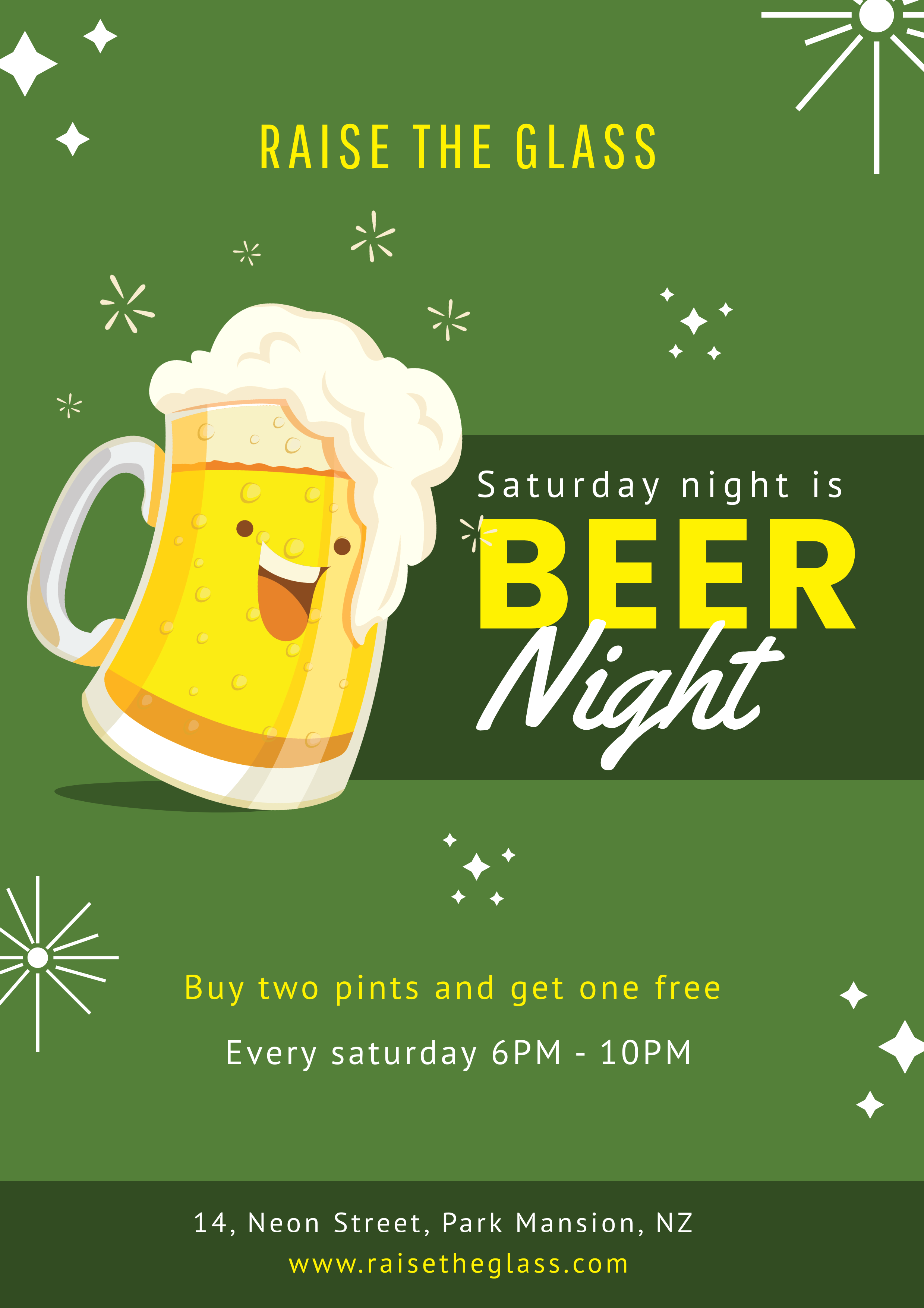
Illustrated Restaurant Flyer Design
Depending on the nature of your business, you can use illustrations to represent the food menus you offer. Make sure you communicate the mood or emotions associated with what you offer.
For example, you’ll understand the above point when you’ll have a look at the below Restaurant Flyer Template.
Get This Template and More
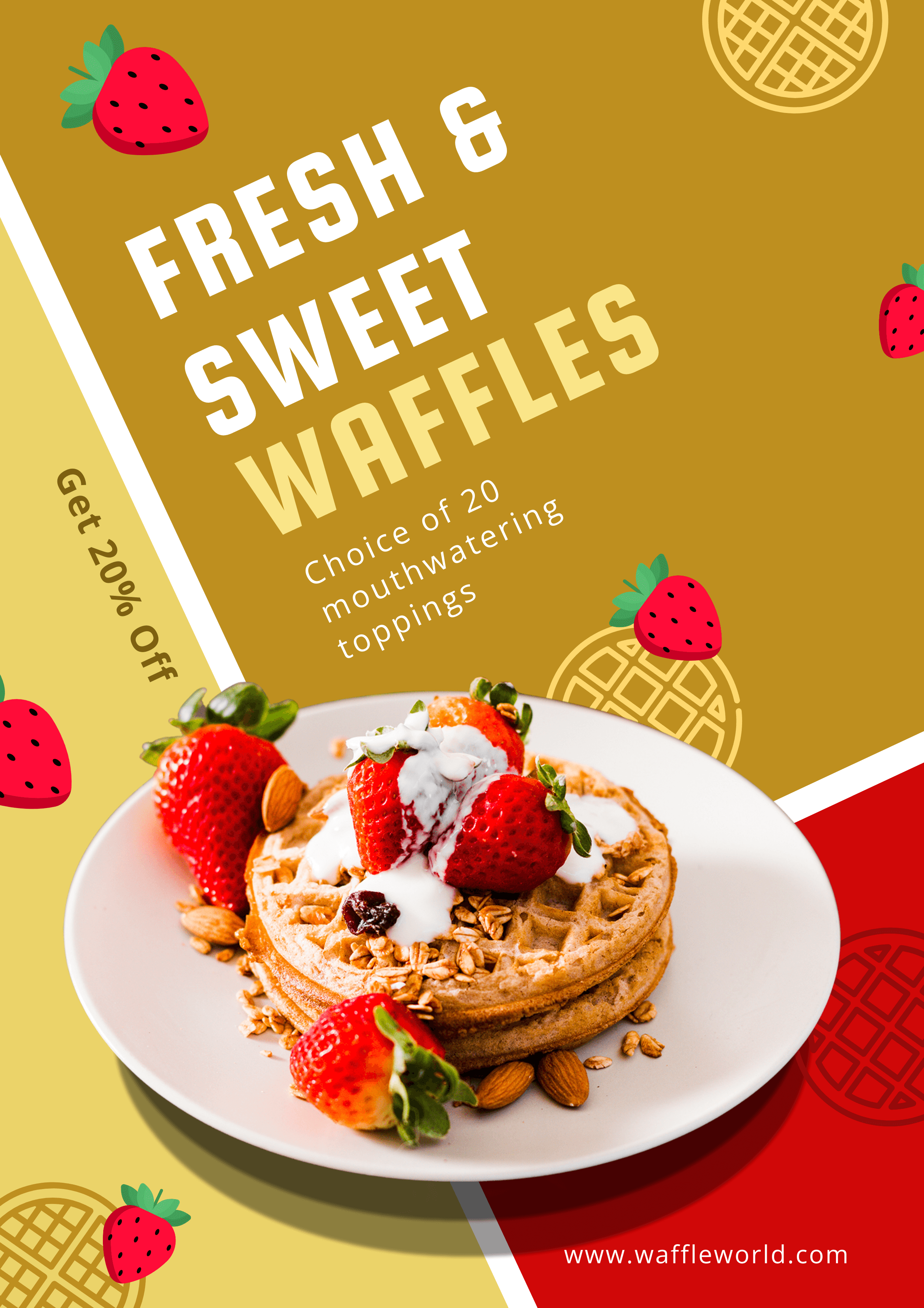
Incorporate Relevant and Appealing Stickers and Icons
Use captivating stickers and icons that add to the meaning of your Restaurant Flyer Design.
For example, observe how adorable the strawberries look in the below Restaurant Flyer Template.
Get This Template and More
How to Make a Restaurant Flyer Design with DocHipo’s Online Flyer Maker?
If you are new to DocHipo, you need to sign up to DocHipo for free with your email address and password. Then refer to the following three-step simple process to create your Restaurant Flyer Design for your business.
STEP 1: Choose a Restaurant Flyer Template
After logging into your DocHipo account, you’ll be on the ‘All Templates’ page. Type ‘Flyer’ in the search bar and click on the result.
The Flyer templates in DocHipo are presently available in different categories such as Corporate, Education, Real Estate, Car wash, Restaurant, and photography. In this case, we’ll select the Restaurant Flyer Template category.
If you are already ready with your design layout or want to experiment from scratch, a blank template is your option.
If you want to save your designing time and produce great results at the same time, go for the professionally designed high-quality Flyer Design Templates by DocHipo.
So, hover over any Flyer Design Templates you love to preview or select it.
Now, add a name and a short description to the document you will design and click on ‘Next.’
STEP 2: Customize the Restaurant Flyer Template
The stunning and effective Flyer Design Templates by DocHipo will set the foundation for you. Then, you can customize your chosen template just the way you want with the design widgets.
Pictures
You can find the ‘Pictures’ widget under the ‘Graphics and Media’ tab on the left sidebar.
The pictures are available in various themes. Select the one you need. We’ll select the ‘Food And Drink’ category in this case.
Explore the high-resolution pictures and choose the one that best represents your brand or business.
Simply drag the picture and drop it over the existing one to replace it.
After that, resize and reposition the picture using the drag and drop tool.
Now the Flyer Design looks like the following:
Since the picture in your Flyer Design will grab viewers’ attention first, watch the video below to enhance it with DocHipo filters.
Watch this video if you want to add a glow effect to your picture.
Background
The ‘Background’ widget is also available under the ‘Graphics And Media’ tab. Alternatively, select it and click on the color icon in the editing panel adobe to edit the background.
The theme colors will appear.
To explore more colors, click on the little color palette icon for custom colors to show up.
In addition, you can type the hex code in the box provided and then click on the color shown beside, and you can see the changes in your Flyer Design.
Now the Flyer Design looks like this:
For more guidance on creating stunning background in DocHipo, watch the video below.
Text
To edit an existing text, double-click on it and replace it with your own text that communicates your brand or business offerings or messages.
Once you replace the text, you can explore the text editing options from the above panel.
The editing panel allows you to change the text font type, size, color, alignment, etc. Click on the three horizontal dots on the editing panel for more options.
Moreover, to add any new text, select the ‘Text’ widget from the left sidebar and choose any of the three formats – headings, subheadings, and body text.
Refer to the YouTube video for adding, editing, and deleting text in DocHipo.
Icons
The next graphic element icon is also available under the ‘Graphics and Media’ tab on the left sidebar.
You can either search for your desired icon or select a related icon theme from the drop-down menu.
DocHipo has a huge collection of appealing icons under various themes in color and mono categories.
Since I’m creating a Restaurant Flyer Design, I choose the ‘Food And Drinks’ theme.
First, let’s delete the unnecessary elements and select our chosen icon to add to the design.
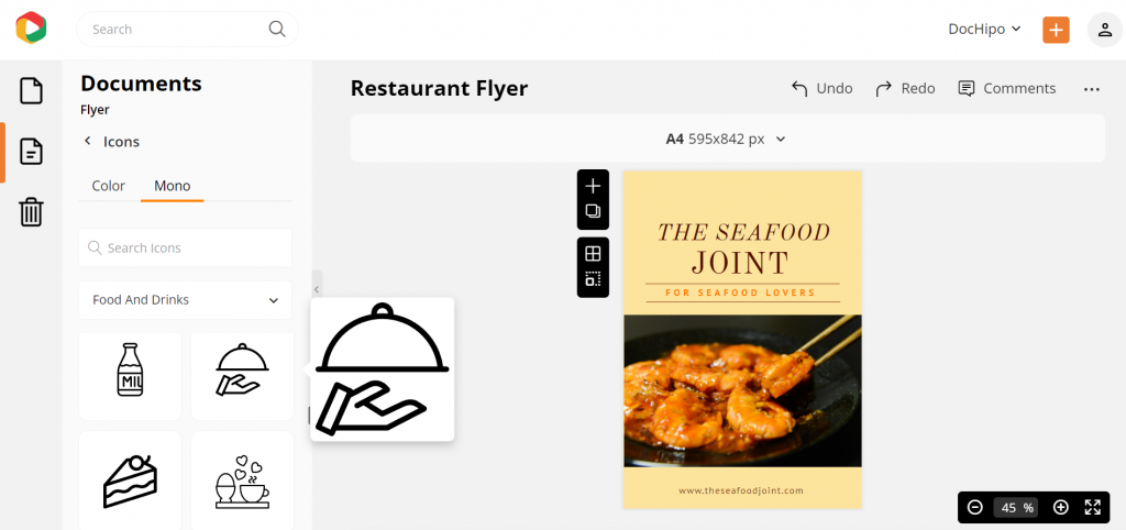
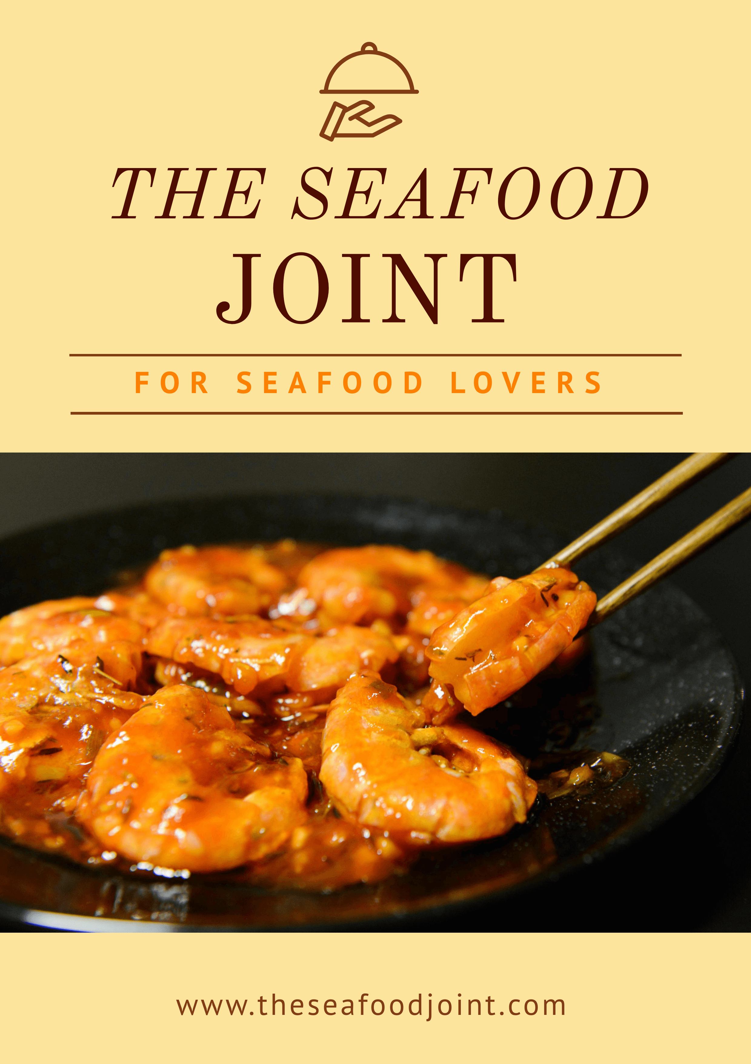
After resizing, repositioning, and changing the color of the icon, the Flyer Design looks like the following:
Watch the YouTube video below to learn more about using icons in DocHipo.
The other design widgets that you can use to make your Flyer Design or any document are illustrations, stickers, shapes, lines, etc.
Watch the video below and have fun with stickers in DocHipo.
I highly recommend checking out The Ultimate Guide to Using the DocHipo Editor to Design Your Documents.
STEP 3: Download Your Restaurant Flyer Design
Once your customization is complete, and you are happy with the outcome, preview it, and then you may download, share with your team, save it to MailChimp, etc. all these options are available to you once you click the three horizontal dots.
The downloadable formats are PNG, PNG Transparent, JPG, PDF, MP4, and GIF.
After choosing your preferred file type and quality, click on the download button.
Here’s a video you can refer to while downloading documents in DocHipo.
Before Customization:
After Customization:
Wrapping Up
I hope the above step-by-step customization process made you realize how easily you can tweak Flyer Template Design to make your own. So sign up to DocHipo, explore all the Restaurant Flyer Design Templates and work with the design widgets and create a flyer that drives more sales.


