How to Make a Presentation: A Step-by-Step Guide with Engaging Templates

Do you want to crack a deal for your business and learn how to make a presentation strategically for the same?
Or are you a content creator who has established a personal brand and wishes to share your learnings and experiences with your audience through a live session?
You may want to give the best content ever to your audience. Writing all the points so that you don’t miss an important one, finding the perfect visuals to convey your message that make your audience understand the topic with complete clarity, choosing a simple yet meaningful design, and appropriate fonts – a lot of work is involved in the process.
Also, have you been an audience to a boring presentation? You’ll never want your audience to feel the same about your presentation that you’ve worked so hard for.
So how to make a presentation attractive?
How to Make a Presentation
- Know Your Audience: Understand your audience’s background, age group, level of knowledge, expectations, queries, or points of concern regarding your topic, etc.
- Clarify Your Presentation’s Purpose: It will guide content structure, subject matter, tone, and design choices.
- Brainstorm Your Presentation Topic: Consider your target audience’s perspective and potential questions, and address them in your slides using relevant facts, stories, analogies, or real-life scenarios.
- Research Main Ideas and Note Key Points: Break the big chunk of data into bulleted key points.
- Collect Essential Data and Statistics: Include crucial facts and figures from credible sources and ideate how you’ll showcase necessary data in different visual formats.
- Draft Your Content: One single key concept per slide in simple and crisp sentences.
- Use Stunning Presentation Template: Choose one that closely aligns with your industry and theme and edit the content.
- Use Appropriate Fonts: Use a maximum of two to three easily readable fonts per slide and keep these consistent throughout all your slides.
- Incorporate High-quality Visuals: Use pictures, videos, graphics, charts, etc., as your supporting elements and to break the monotony.
- Customize the Color: Use brand colors or those complementing your presentation theme.
- Add a Suitable Transition: Choose one that looks professional.
In this post, you’ll learn how to make a presentation skillfully that grabs your audience’s attention at first glance and hooks them till the end.
Table of Contents
Planning a Presentation
Planning a presentation streamlines your whole process and eliminates the overwhelm later. Follow the steps below before you start to create a presentation.
Take Your Audience into Account
You can best serve your target audience only if you know and understand them well. Research to understand your audience’s queries or points of concern regarding the topic you are presenting. Understanding your audience’s background, age group, level of knowledge, expectations, etc., will give you a direction to approach your topic strategically. You can cover them smartly in your slides. Researching your target audience will help you choose the most appropriate visual elements to explain and support your points.
DocHipo offers you stunning presentation templates for different target audiences.

Get This Template and More

Get This Template and More

Get This Template and More
Be Clear about Your Presentation’s Purpose
You can create a presentation for various purposes across industries. Whether discussing a company profile, business idea, thorough business plan, demonstrating products or services, and so on – a presentation is an all-rounder document type. We can group all these different contexts into the ultimate presentation goals of informing, inspiring, or persuading your target audience. Clarifying your presentation’s purpose guides its content structure, subject matter, tone, and design choices. Eventually, it helps you create a presentation that effectively accomplishes its goals.

Get This Template and More

Get This Template and More

Get This Template and More
Brainstorm Your Presentation Topic
Before creating your presentation, clearly define your key message. Think from your target audience’s perspective and brainstorm their potential questions. Address them through your presentation to earn credibility and make it value-packed. You can think of a relevant story, analogy, or real-life scenario to make an idea or concept relatable to your audience. Note down all the significant points you want to discuss, draft whatever you’re thinking to offer your audience through this presentation, what action you want them to take right after it ends, and so on. After brainstorming, create a structure or outline for your content and consider the slides.
Gathering and Writing Your Presentation Content
Follow the steps to create a presentation that compels the audience to have a lot of key takeaways from it.
Research Main Ideas and Write Key Points
Research and gather the information you brainstormed in the previous step. Break the big chunk of data into bulleted key points, each supporting your presentation’s purpose.
Collect Essential Data and Statistics
Support your points with data and statistics from credible sources to build trust with your audience. You can also ideate the type of visual element you want to include in your presentation.
Draft Your Content in Simple and Concise Sentences
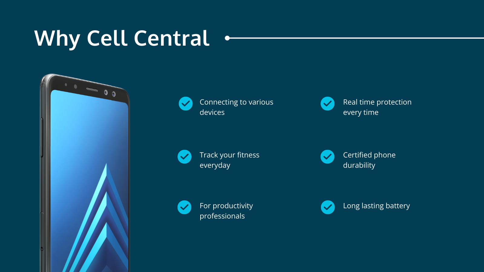
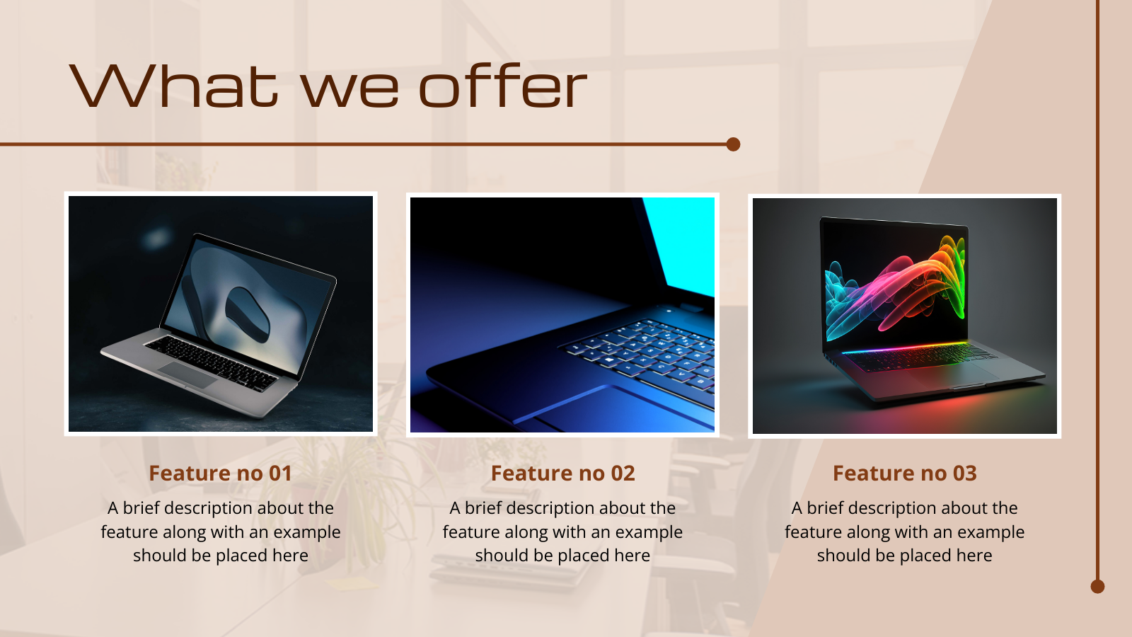
While writing your presentation content, focus on one single key concept per slide. Ensure that your content flows logically from one slide to the next. Concisely write your content in bullet points in simple language for your audience to read quickly. Keep your points clear and focused and avoid information overload. Writing too much text in a slide may distract the audience from the value you’re offering.
Get This Template and More

Get This Template and More
Get This Template and More
Designing an Effective Presentation
In this section, we’ll cover the design aspects of making a presentation:
Use Appropriate Fonts
Choose easily readable fonts that remain clear even when viewed from a distance. You can use two to three fonts per slide at maximum and keep these consistent throughout all your presentation slides. Otherwise, it’ll be visual clutter. Avoid making the font sizes too large or too small; make it easy to read for your audience. The minimum font size for each of your slides should be 24 points. Also, think of your branding and design style while choosing fonts.
Some of the best fonts for your presentation slides include Lato, Roboto, Open Sans, Helvetica, Futura, Verdana, Montserrat, Georgia, etc.
One unfailing way of choosing fonts that complement each other is to use DocHipo’s ready-made presentation templates.

Get This Template and More

Get This Template and More
Incorporate High-quality Images and Graphics
The visuals are your supporting elements to refer to while explaining a complex topic and for your audience to make their visualization easy and quick. So, they help your audience to enhance their understanding of the topic because visualization is paramount to clarify an idea or concept.

Get This Template and More

Get This Template and More
Also, it breaks the monotony of continuous verbal messages and makes the presentation interesting and engaging.

Get This Template and More
The images you use should complement or reinforce the message you’re trying to convey and add value to your presentation. So don’t add images to fill spaces; use them only where necessary.
Never use pixelated, blurry, or any poor-quality images or graphics. It’ll make your audience have a terrible impression of your brand or business. So why take the risk?
If you crack this part with the right choice of visuals, your audience will enjoy and appreciate your efforts. DocHipo’s integration with stock photo libraries lets you access and use high-quality stock images from its editor. It also has your back with an exclusive and rich design assets library comprising appealing illustrations, icons, animations, and so on.
DocHipo ensures you always use high-quality pictures and graphics for your presentation or any document you design.

Get This Template and More

Get This Template and More

Get This Template and More
Here’s how to use illustrations in your design to make it more appealing and memorable.

Get This Template and More
Here’s how to use icons in your designs to make them stand apart.
You can also add tables, infographics, graphs, charts, etc to your presentation.

Get This Template and More
Here’s how to insert tables in DocHipo.
Be Consistent with the Design Elements throughout Your Presentation
You must be consistent with the design elements throughout your presentation as it reflects professionalism. It creates a visual harmony, making the presentation design look appealing and easy on the eyes. This little yet impactful attention to detail helps you leave a positive lasting impression on your audience.
To maintain consistency in your design throughout the presentation with elements like font, colors, and so on, choose a close-match template and then tweak it according to your needs.
How to Make a Presentation in DocHipo
Once you’ve gathered your relevant data and content, let’s see how to make a presentation within minutes with DocHipo. If you are a new user of DocHipo, sign up for free with your email ID and password.
STEP 1: Choose a Presentation Template
Once you sign up or log in to DocHipo, you can see various document types categorized as Business Essentials, General Purpose, Web Banner, Social Graphics, and Advertisement on the left panel. To create a presentation, search for the document type ‘Presentation’ through the search bar and then click on the desired result.
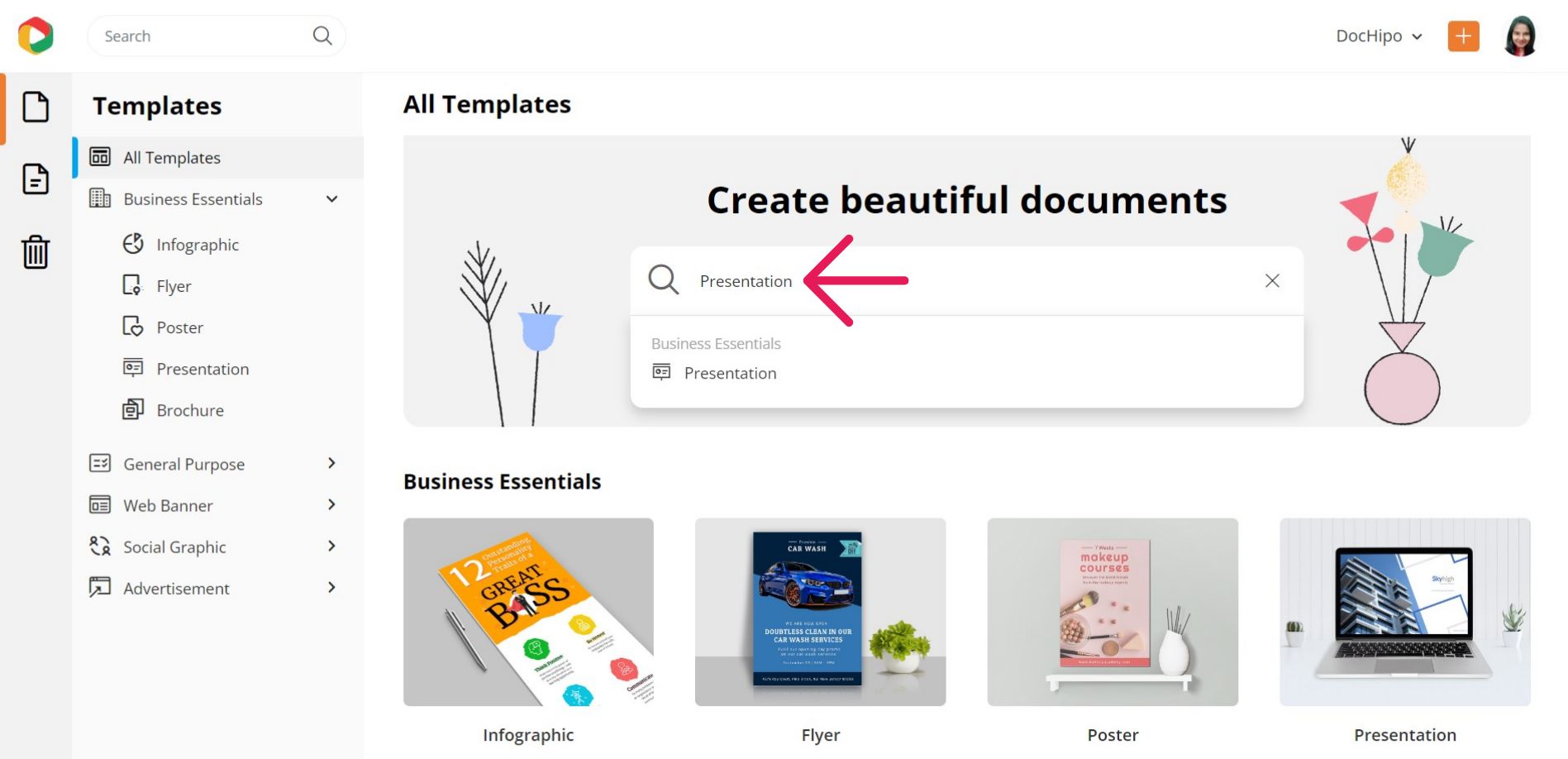
Otherwise, find it under the ‘Business Essentials’ category.
DocHipo provides beautiful presentation templates in various categories like architecture, business, marketing, pitch deck, product, and sales. And the library is ever-growing!
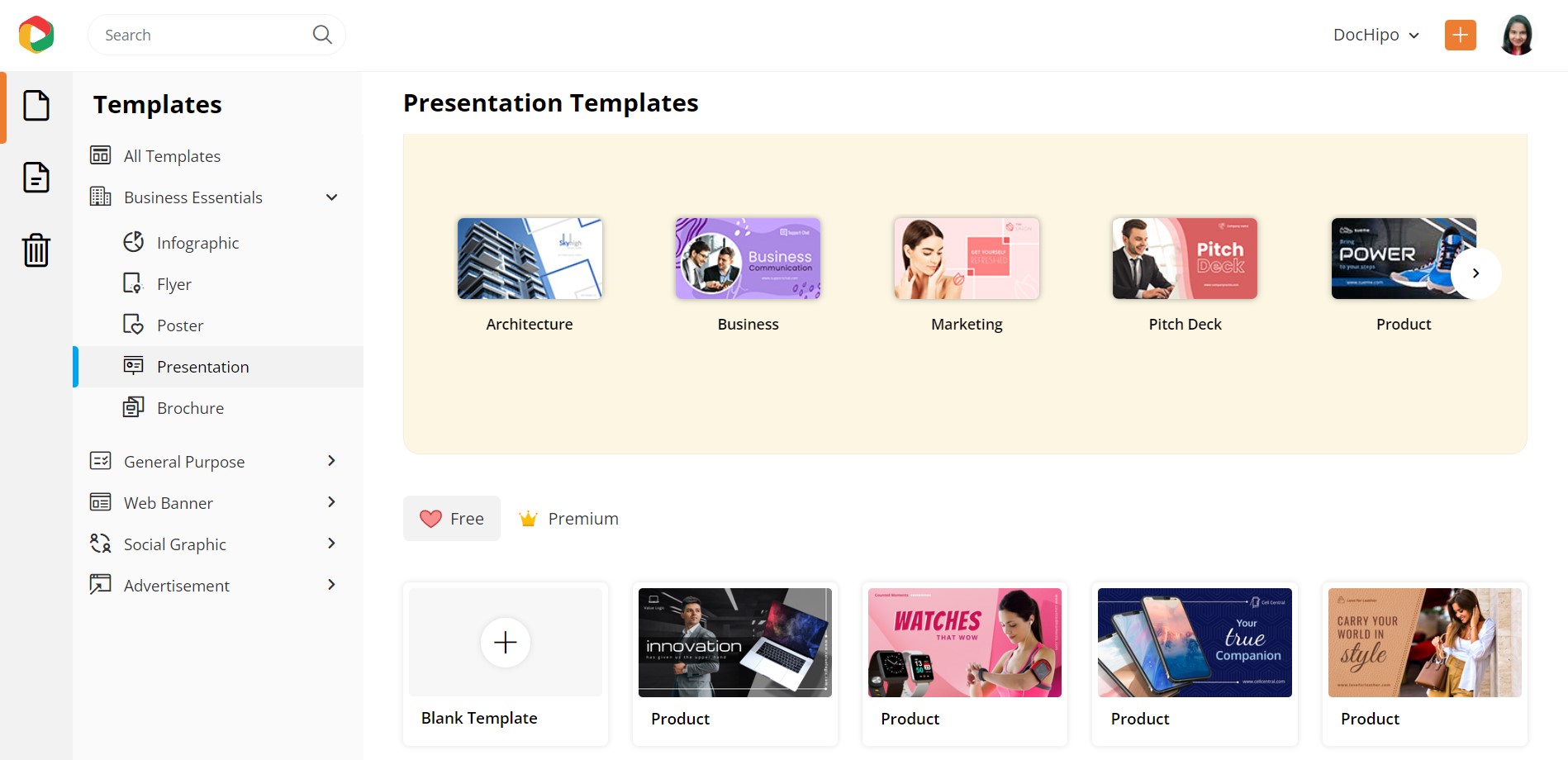
Though you can create presentations from a blank template, starting with a template is better to make your process super-fast. To either preview or select a presentation template, hover your mouse pointer over the one you love that aligns with your business requirements.
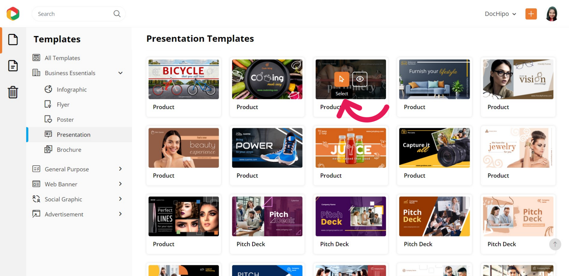
I selected a product presentation template to demonstrate how to make presentations in DocHipo in three super-simple steps.
After selecting the presentation template, add a name and a brief description for you to refer to later, and then click on ‘Next.’
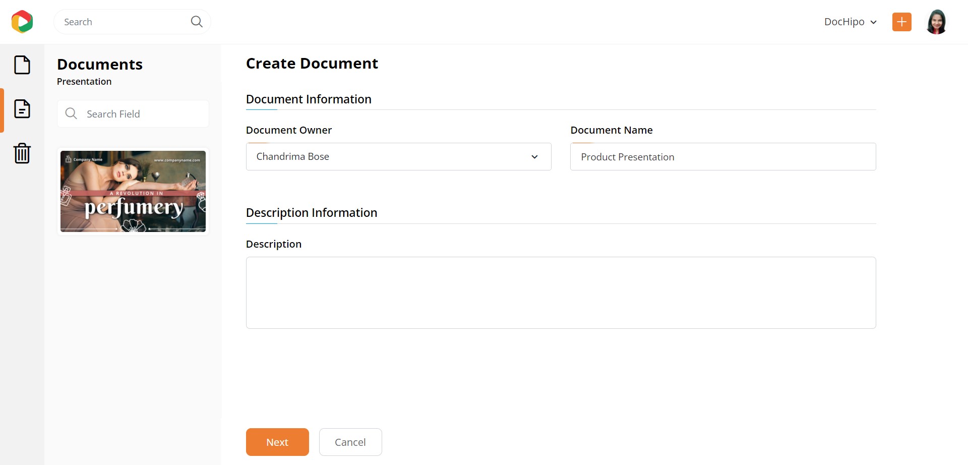
STEP 2: Customize Your Chosen Presentation Template
Now comes the exciting part of designing your presentation. On the left-hand side, you’ll find a variety of design widgets to equip you for customization. Let’s cover them one by one.
Change the Picture
Most probably, you already have professionally shot photos of your offered products. So, in the introductory presentation slide, you must use a picture catering to your purpose, theme, and target audience. Select the ‘Uploads’ widget under the ‘Graphics and Media’ tab on the left sidebar to upload a picture from your device.
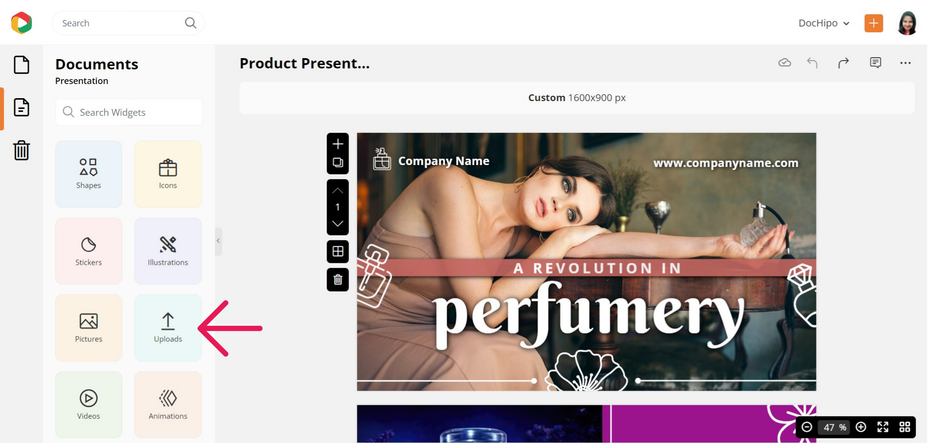
You can upload images in JPG, PNG, GIF, and SVG formats with a maximum file size of 5 MB. Now drag your uploaded image and drop it into the existing one on the canvas.
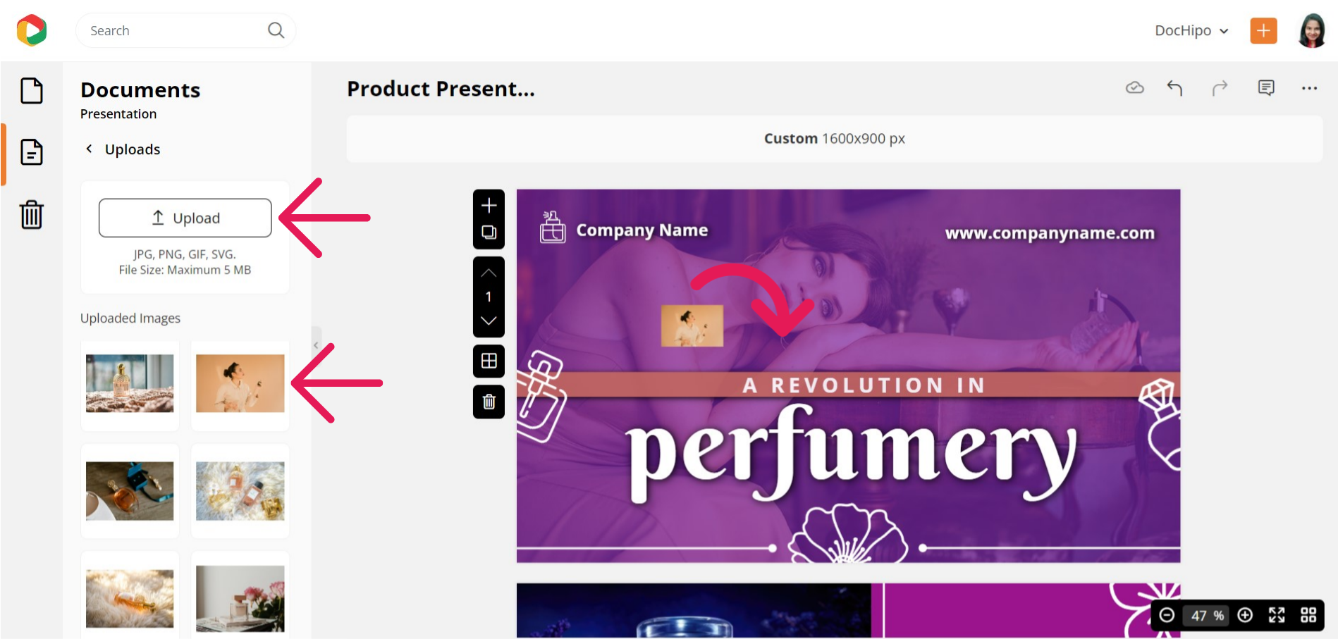
You can resize and reposition the picture with the drag-and-drop tool.
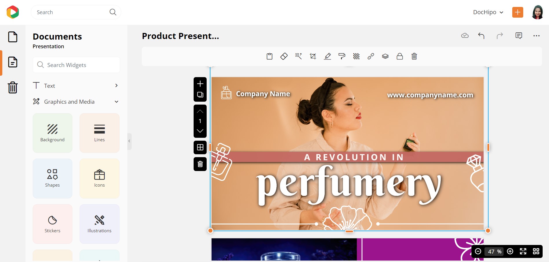
Refer to the video below while unloading images in DocHipo.
Don’t worry if you don’t have your professionally-shot high-quality image yet. DocHipo’s integration with stock photo libraries is your best bet! Choose a relevant picture that closely reflects your presentation theme.
Edit Text
Select it and double-click on it to replace an existing text to add your content. If you want help writing the presentation copy to persuade your audience, AI Writer is your savior! Select the ‘AI Writer’ under the ‘Text’ widget from the left sidebar.
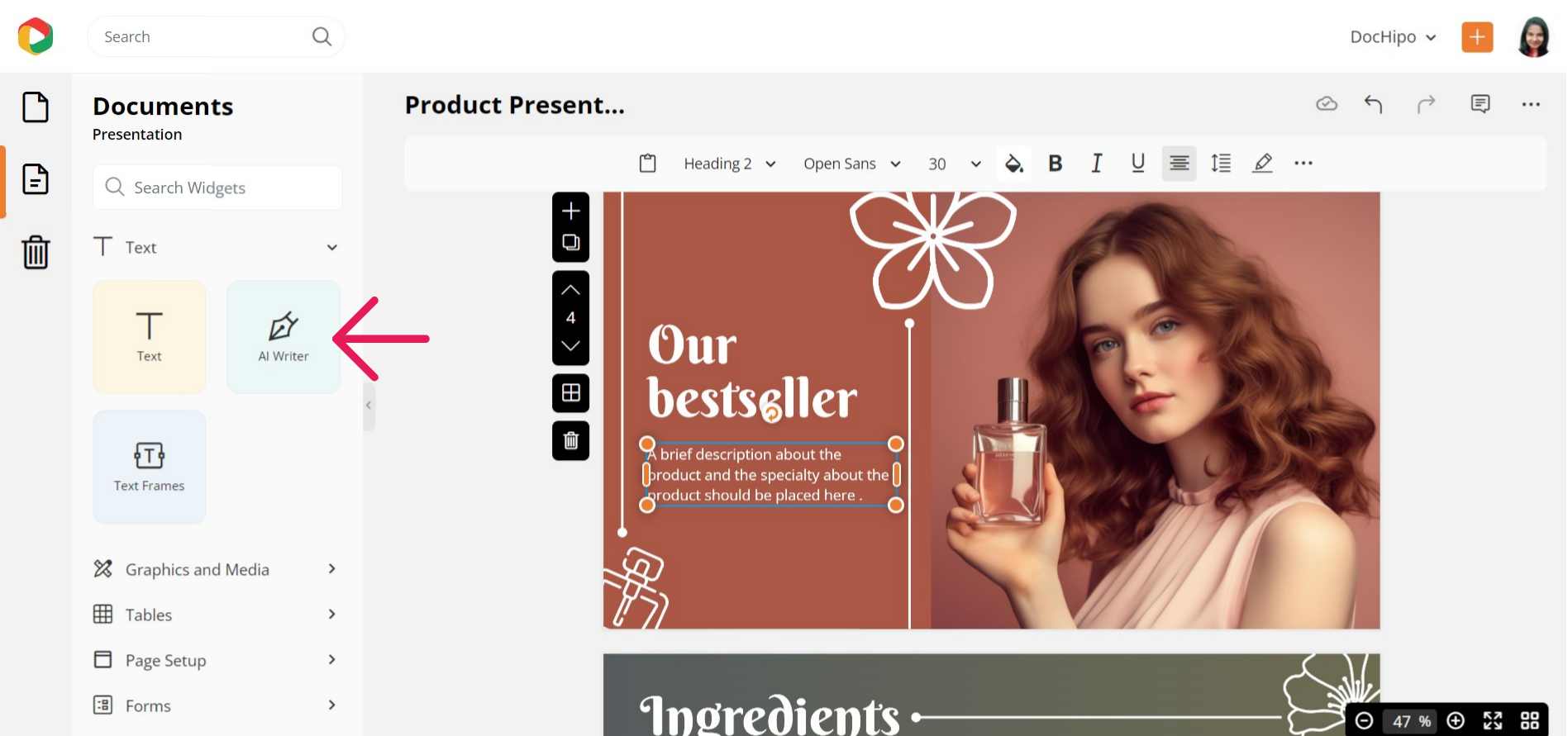
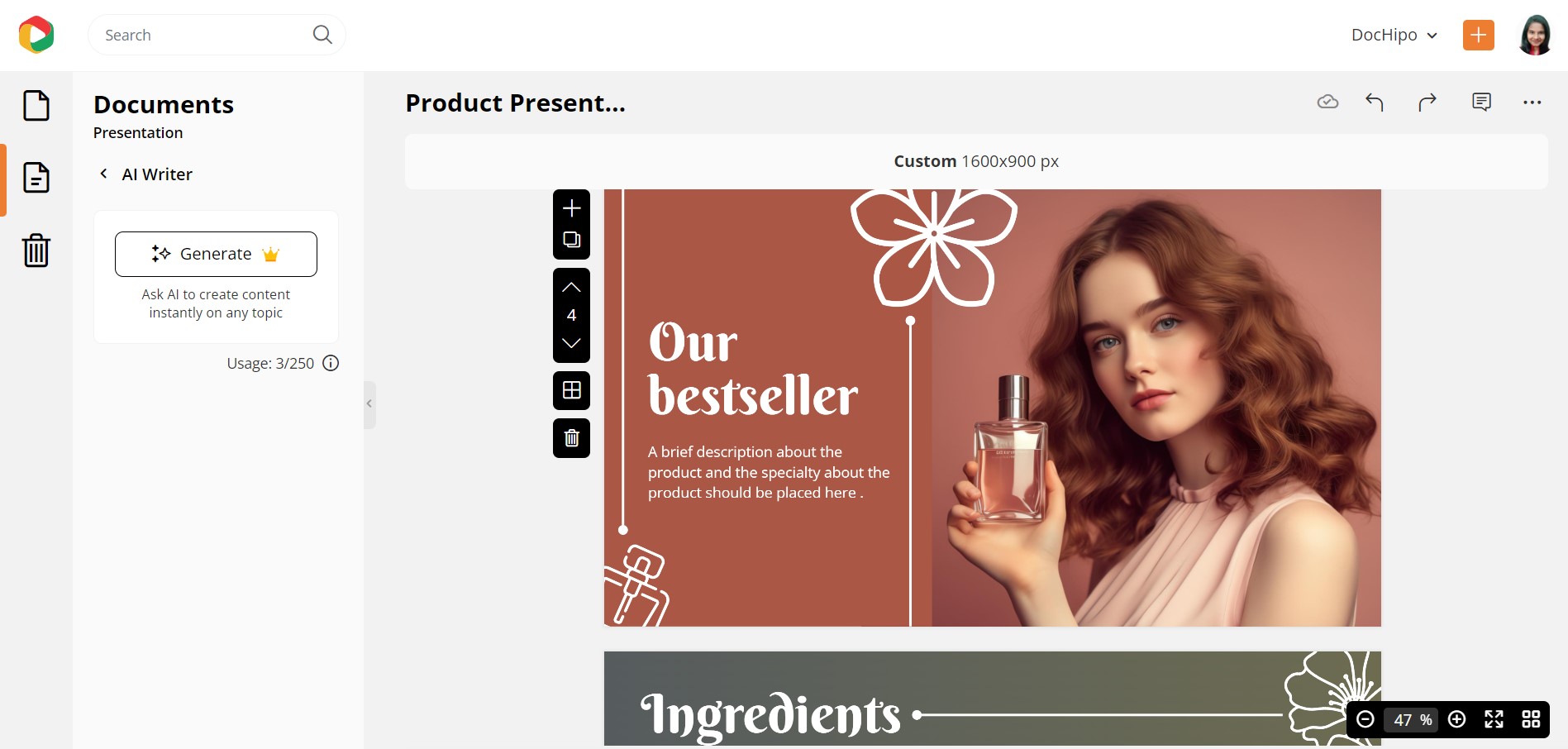
Click on the ‘Generate’ button to proceed further.
Give a specific prompt for the content you wish the AI to generate and set your desired tone. You’ll get various options, such as casual, confident, dramatic, excited, friendly, funny, and professional.
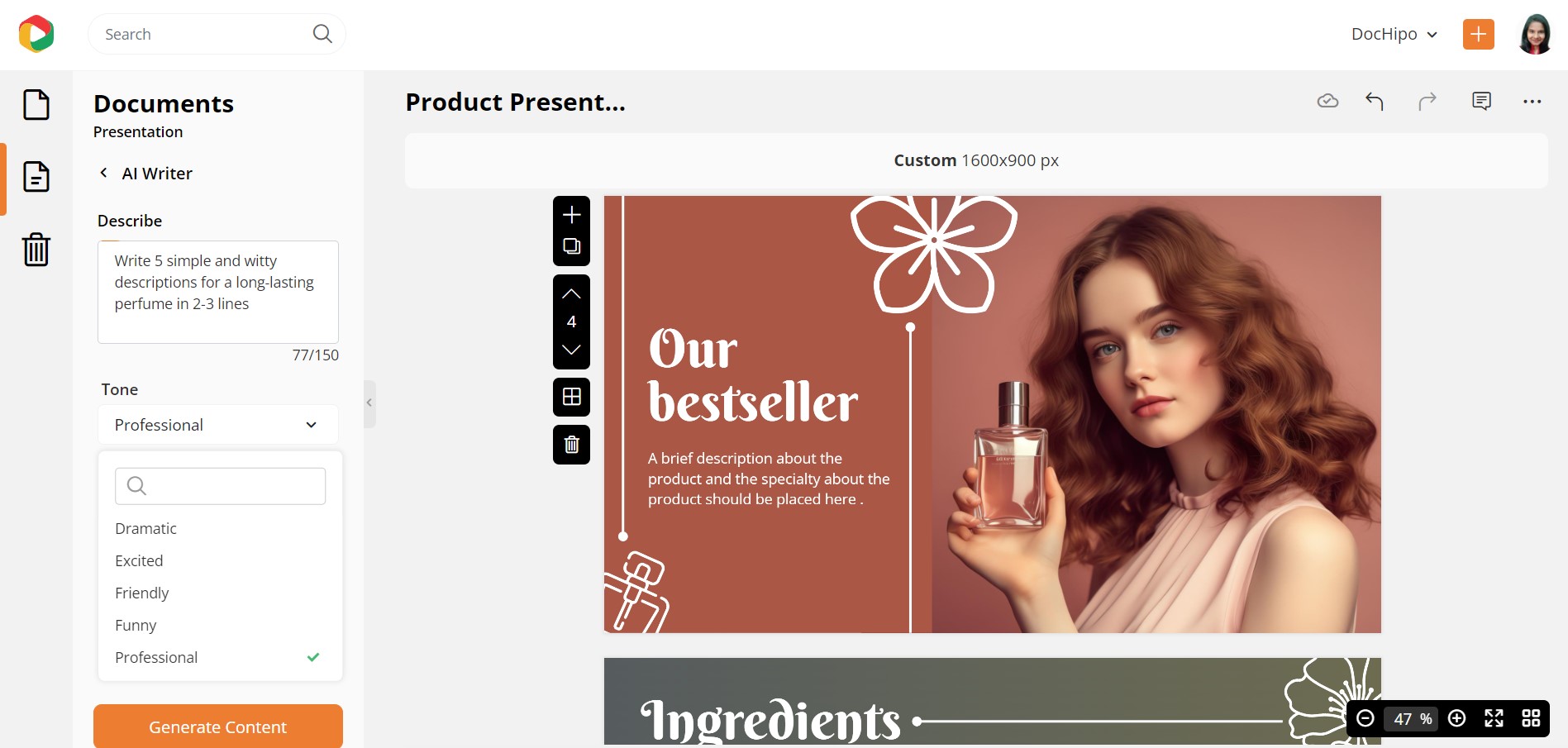
Click on the ‘Generate Content’ button. Tadaa! You saved so much time and energy coming out with the perfect copy! This way, you can generate multiple outputs for a single prompt.
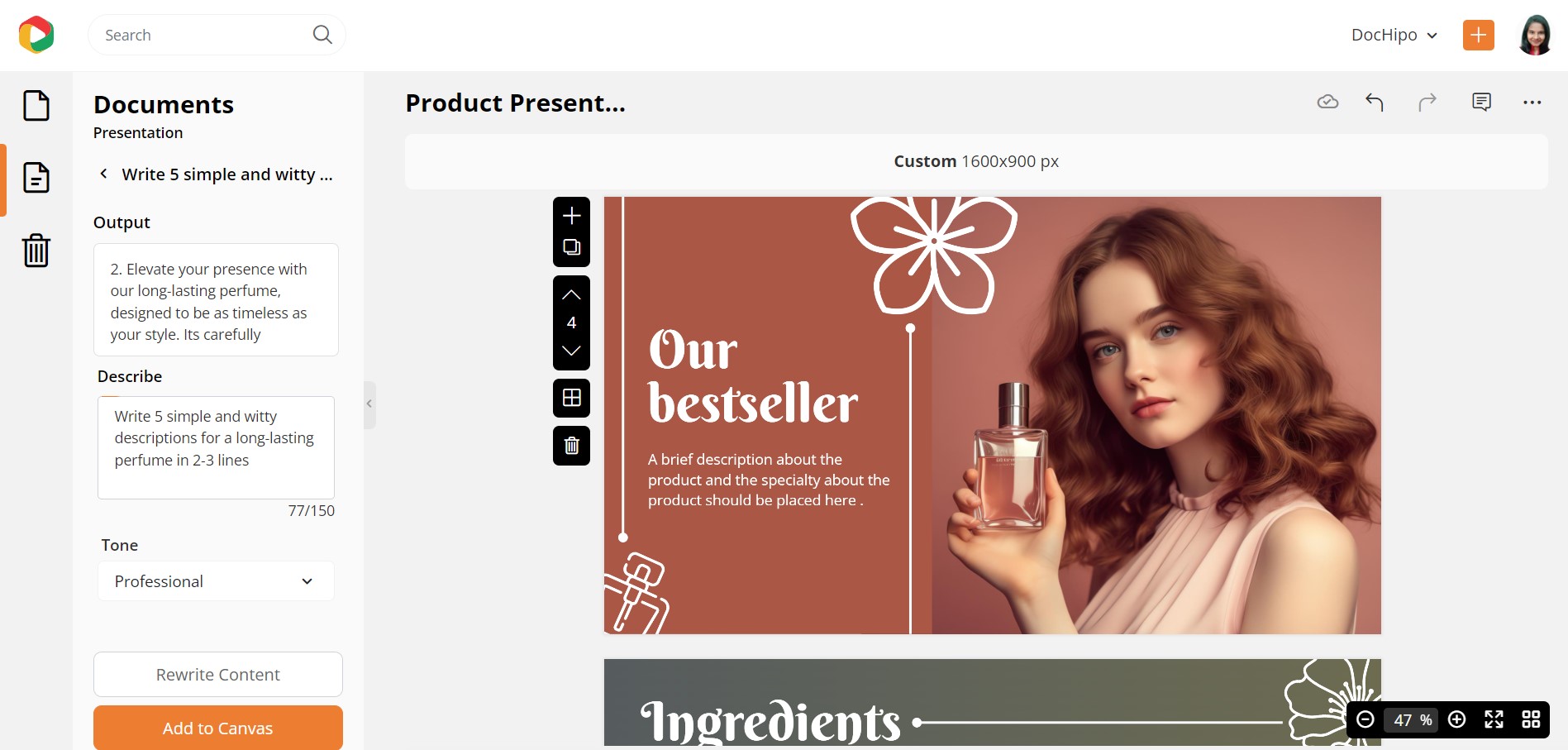
What if you’re not satisfied with the output? Click the ‘Rewrite Content’ button until you find an output that aligns with your brand voice.
If you want to work on it further, click on the three horizontal dots on the editing panel above the canvas.
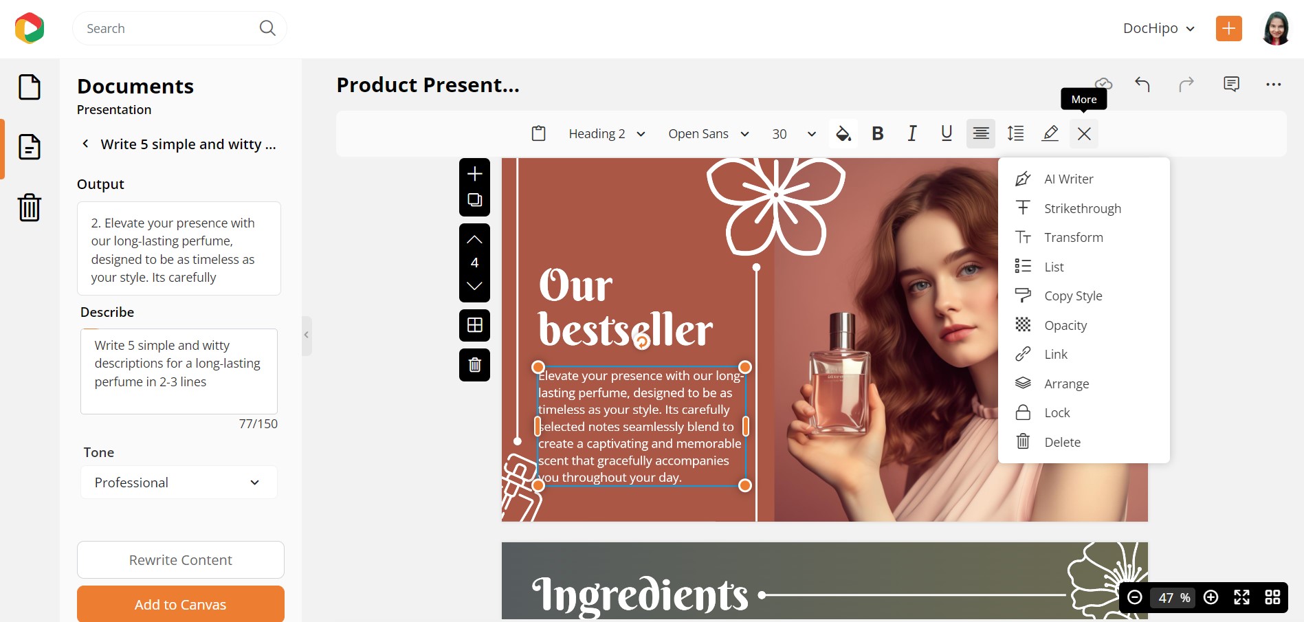
Select ‘AI Writer’ and choose to rewrite, summarize, or expand your copy from the drop-down menu.
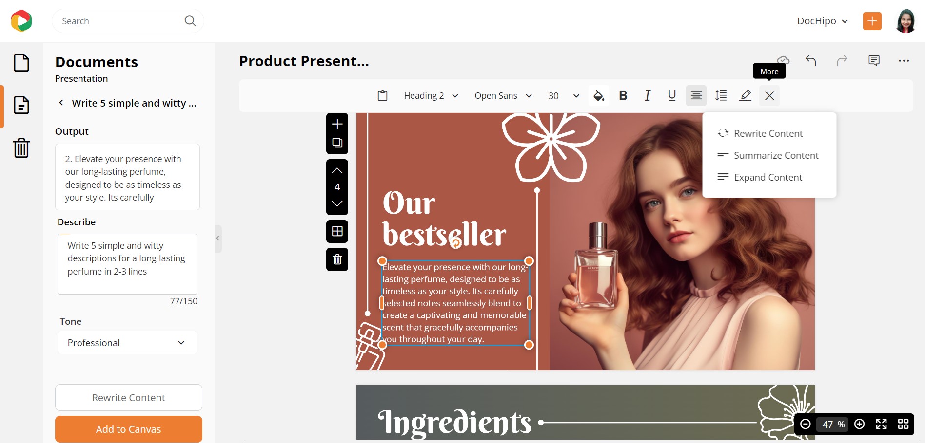
Once you finalize the text, use the drag-and-drop tool to adjust the position of your texts or other design elements.
Here’s a quick demo of using the ‘AI Writer’ in DocHipo.
To edit a text, select it first, and then you can see many editing options, like changing the font family, font size, color, alignment, letter spacing, and so much more.
Watch the video to learn more about editing texts in DocHipo.
Change the Background
The Background widget is also under the ‘Graphics and Media’ tab. Or you can select the slide and click on the background icon.
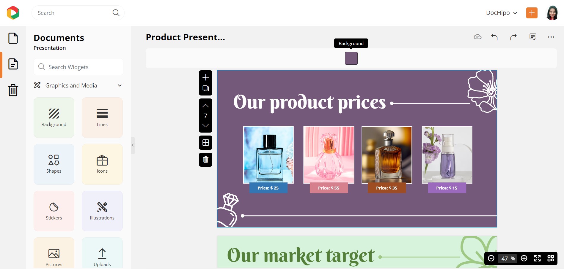
This design element is brilliantly categorized into colors, gradients, and patterns. Choose a suitable background for your presentation slides.
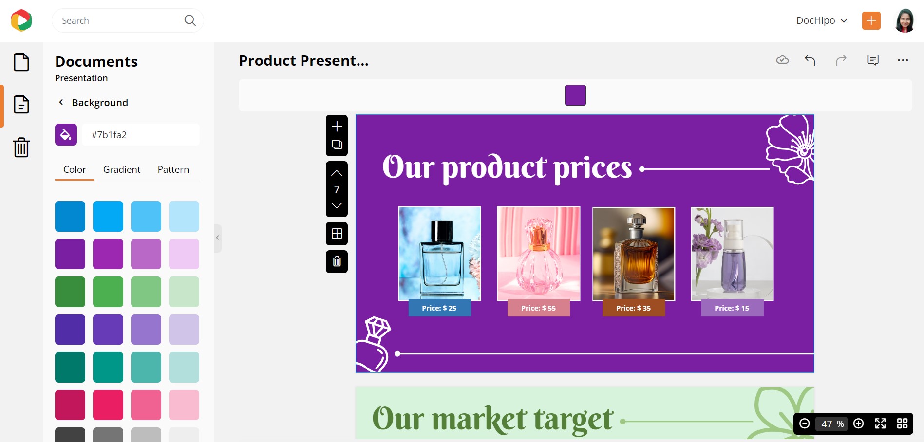
You can also click on the color palette icon to explore the custom background colors and choose the one that goes with your brand identity and the context of your presentation.
Add a Suitable Transition
Select ‘Page Transition’ under the ‘Page Setup menu on the left sidebar.
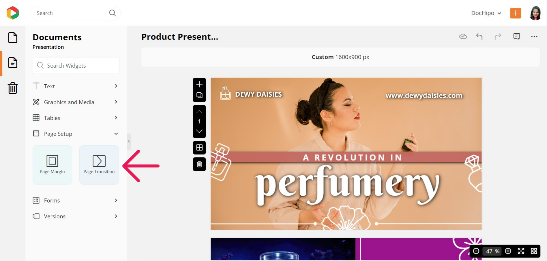
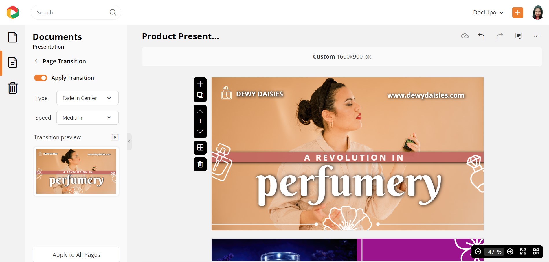
Explore the different types of transitions and stick to the one that looks the best. Also, choose a speed, preview it, and apply it to all pages.
You can read The Ultimate Guide to Using the DocHipo Editor to design an effective presentation.
STEP 3: Present, Download or Share it
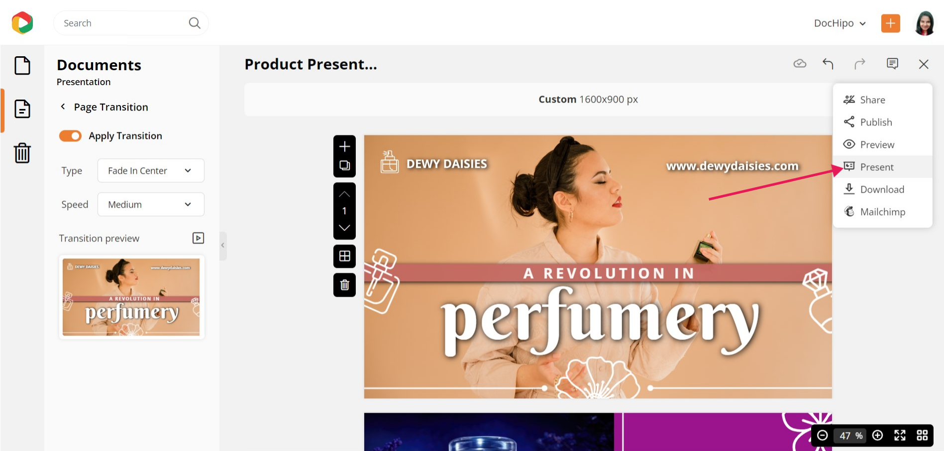
Once fully satisfied with your presentation design, you can download it, present it directly from DocHipo, or share it on various social media platforms. You will get these options by clicking on the three horizontal dots and selecting your option as needed.
If you download it, select your file type and quality, then click the ‘Download’ button.
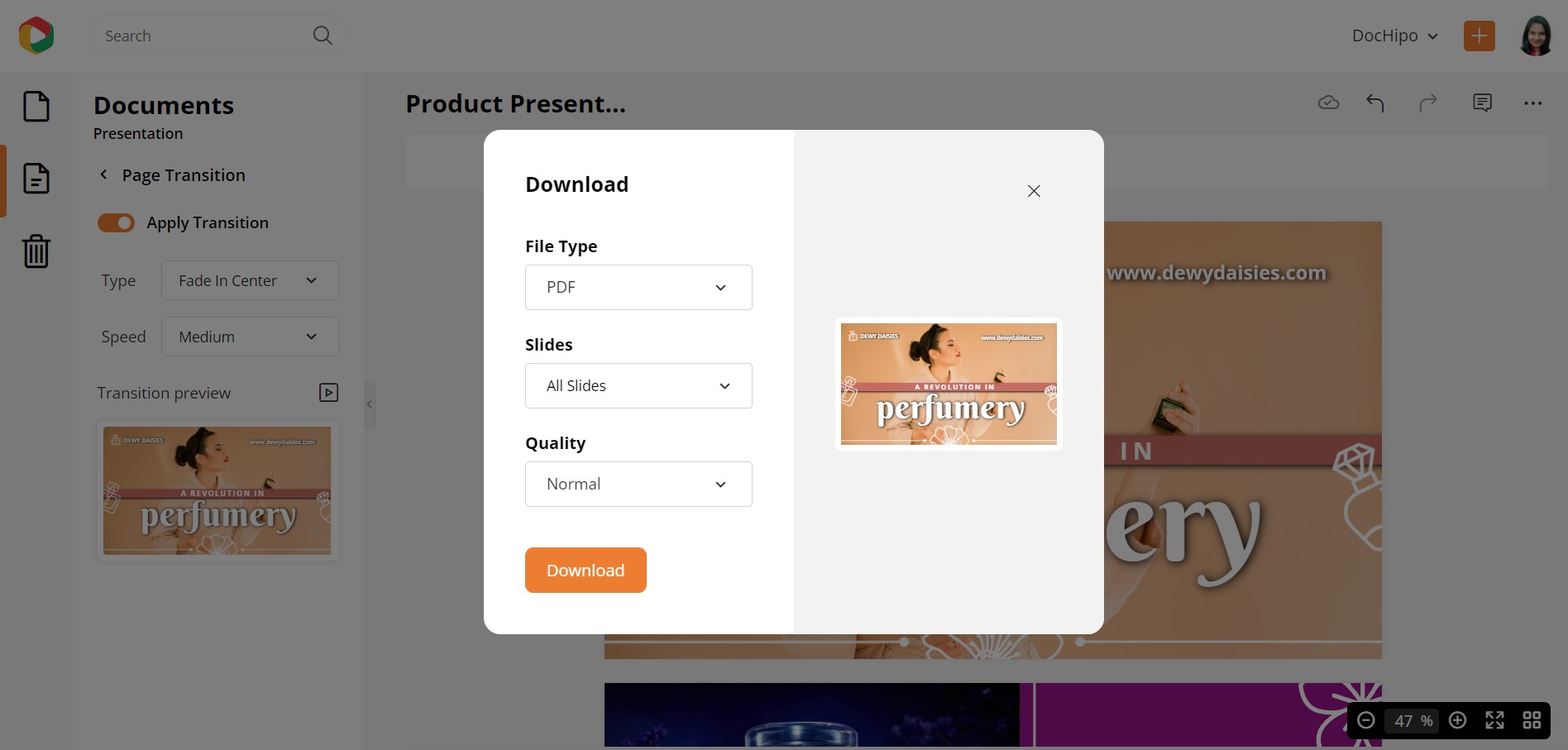
Here’s how to download a multi-page document in DocHipo.
Final Words
I hope that you have got at least some design inspiration or ideas for supporting your amazing content through your presentation. Keep the points discussed above in mind, explore our stunning presentation templates, select the one you love the most, and tweak it as needed. Nothing can stop you from rocking your presentation when your efforts meet the right tools. So sign up to DocHipo, get creative with your presentation slides, and give your best to your audience.


