How to Design a Case Study to Attract Clients

Designing a case study can feel like winding through a puzzle, especially for inbound marketers aiming to attract more reach and conversions. A case study showcases your success stories, but the real challenge lies in crafting one that resonates with your target audience and builds trust.
How to Design a Case Study
- Define the Goal: Understand the main goal of a case study.
- Structure the Content: Use a clear and engaging format with a title, overview, challenge, solution, benefits, and CTA to persuade your audience to take action.
- Select a Case Study Template: Choose a suitable case study template to customize your design.
- Boost Readability: Organize the case study with clear headings, concise paragraphs, and easy-to-read points.
- Create Visual Appeal: Use engaging color combinations, pictures, brand assets, and unique layouts.
- Build Credibility: A polished, professional design creates a positive impression of your brand.
- Drive Conversions: Include clear calls to action and well-placed contact information in your design.
- Download and Promote: Finally, download your case study design and distribute it on all channels.
So, here I am again with my secret tips and a detailed design guide. If you want to design a case study that stops the scroll, read on! Earn the crown of organic reach and, most importantly, attract more clients with your absolute state-of-the-art case study designs from DocHipo.
This blog uncovers the true purpose of case study designs and their roles. Discover the best-kept design hacks and follow a simple guide to design and promote your new case studies.
Table of Contents
What is the Main Goal of a Case Study Design
The purpose of a case study is to spotlight your success stories and show how your product or service solves real problems. Essentially, it’s about building trust and credibility with potential clients by showcasing your proven results.
A great case study design does more than tell a story; it makes the content clear and engaging. Use a well-defined structure, eye-catching visuals, and straightforward language to do this. A clear format, plain language, and engaging colors help readers quickly find and understand the key points. Plus, a neat and functional design boosts your SEO.
When search engines see a clear, structured format, they rank your content higher, driving more traffic and attracting potential clients. A half-baked case study design won’t cut it. If you want to make a strong impression and attract clients, your design has to be sleek.
Roles of a Defined Case Study Design
Let’s understand why focusing on a polished design is essential while creating a case study. Case study formats and their design may vary. However, the overall design of your case study presentation can elevate the experience for your target audience. Six visible ways a good design can impact your inbound marketing:
1. Boosts Readability
A precise design ensures your case study is easy to read. If you want to design a case study but don’t follow the basic design principles for an effortless viewer experience, then it’s a waste of time. By using clear headings, concise paragraphs, easy-to-read points, and organized sections for every design element, you make it simple for readers to grasp key information quickly.
2. Captivates the Reader
An engaging case study presentation with distinctive color combinations and unique layouts grabs attention and keeps your audiences interested.
3. Communicates Information Clearly
Effective design organizes information by its importance, making it easy for readers to follow along. You guide them smoothly through the key points, making sure they see what’s most crucial first. This approach not only helps them grasp the main ideas quickly but also keeps them engaged and focused. In short, it makes your content clear, compelling, and easy to follow.
4. Builds Credibility and Trust
A polished and professional design enhances your credibility. When your case study looks redefined and well-crafted, it reflects positively on your brand, establishing trust with potential clients and stakeholders.
5. Drives Conversions
A strategically designed case study includes clear calls to action and well-placed contact information, guiding readers toward the next step. This spontaneous focus on conversion turns interested readers into actual clients or leads.
6. Creates a Lasting Impression
Memorable case study layouts stand out because they combine striking visuals with a compelling narrative. When a layout is unique, it captures attention and engages readers on a deeper level. This could be through clever use of space or an intuitive flow of information. If you create a long-lasting impression, you slowly become their favorite brand.
Let’s dive a little deeper now with the major components of a case study.
What are the Major Components of a Case Study Design
There are six common components of a case study that you must follow; you can customize these components by adding or removing headings and information according to your needs.
- Title: Craft a compelling headline instantly revealing the case study’s focus.
- Introduction: Set the stage by outlining the fundamental problem or challenge.
- Background: Offer context and details about the client or project.
- Solution: Explain the strategies and actions that solve the problem.
- Results: Showcase the outcomes and benefits through the implementation of your solutions.
- Conclusion: Wrap it up with a summary that reinforces the main takeaways.
If you want to design a case study, focus on key components: a compelling title, clear introduction, detailed background, well-explained solution, impactful results, and a strong conclusion.
Case Study Design Tips
Throughout the blog, I’ve discussed nuances that can improve your case study. But now, let’s dive into the design basics and some insider tips. Stick with me, and you’ll be able to design a case study with ease and expertise.
1. Professional Layout
Let’s kick things off by focusing on the look and feel of your case study sample! Because it’s an important part of your inbound marketing strategy, you must design it carefully. Ensure it showcases high-quality content paired with a stellar design that aligns perfectly with your branding.
Take a look at the case study for marketing design. It grabs your attention with crisp visuals, clean lines, bold headers, and an effortless layout.
2. Break Your Case Study into Scannable Sections
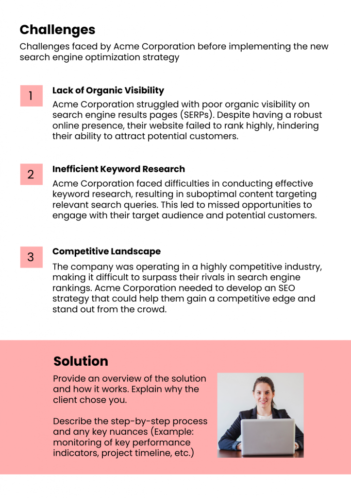
Use bold headings, short paragraphs, and distinctive rectangular boxes in subtle shades with lines and bullet points to break your case study into scannable sections. The following IT solution case study template’s clean layout makes it easy on the eyes and keeps you hooked from start to finish.

Get This Template and More
3. Engaging Visuals
Engaging visuals, such as high-quality images, graphs, and charts, don’t just break up the text—they pull your readers in, making complex data easy to digest and your story impossible to ignore.
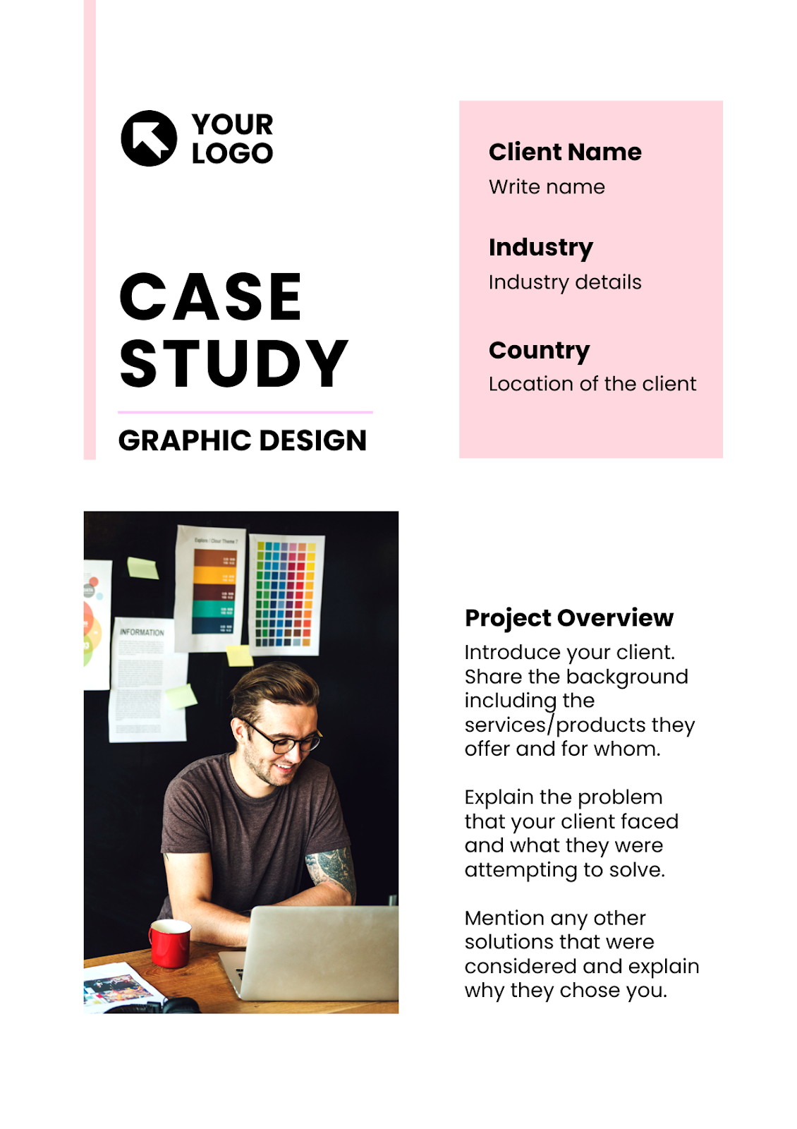
The following design case study starts with a punchy yet professional stock photo to engage the unique visitors.
Get This Template and More
Watch this video to upload your image files and customize the design.
4. Readable Typography
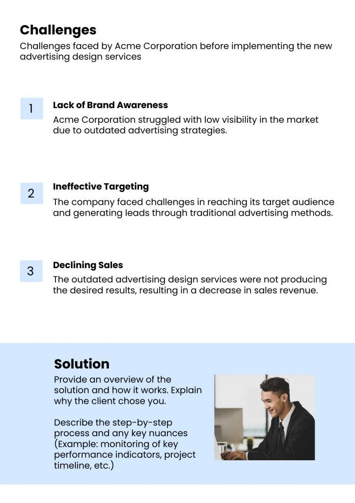
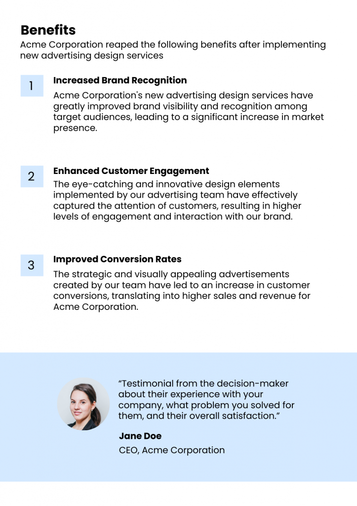
Pick a maximum of three clean, professional fonts that are easily comprehensive and attractive. Keep the size readable on any device. Use bold and italics to make information pop. This simple approach will instantly elevate your case study design. Look at the advertising design case study that utilizes readable typography to stand out.
5. Color Scheme for Clear Contrast
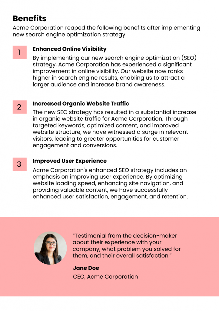
Choosing a suitable color scheme is like giving your case study its signature style. Use your brand colors to keep everything on-brand, and make sure there’s enough contrast between text and background so your content is easy to read.
Remember to add pops of color to highlight specific info – this way, your audience will find what matters quickly. The following IT consulting case study example subtly follows this color scheme rule. It clearly contrasts with the clean, white background and black, bold text.

Get This Template and More
If you want subtle background colors, try the background widget. Watch the video to apply and make your canvas with simple color contrast.
6. White Space for Balanced Composition
White space gives your content room to breathe and shine. To make balancing easier, DocHipo offers adjustable margins that you can turn on whenever you need them.
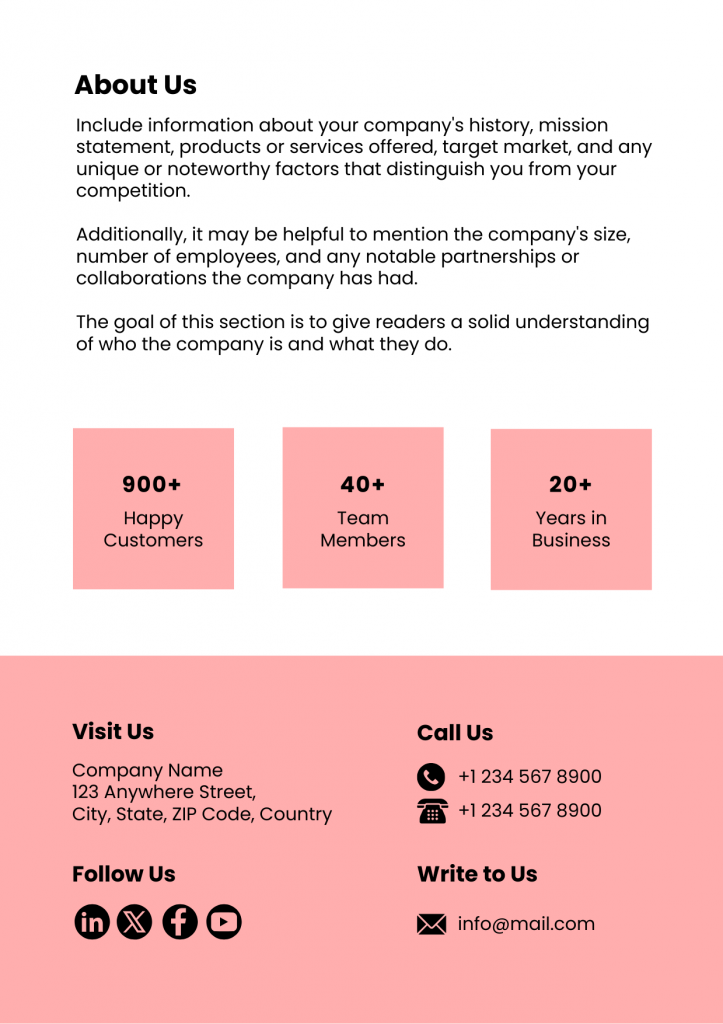
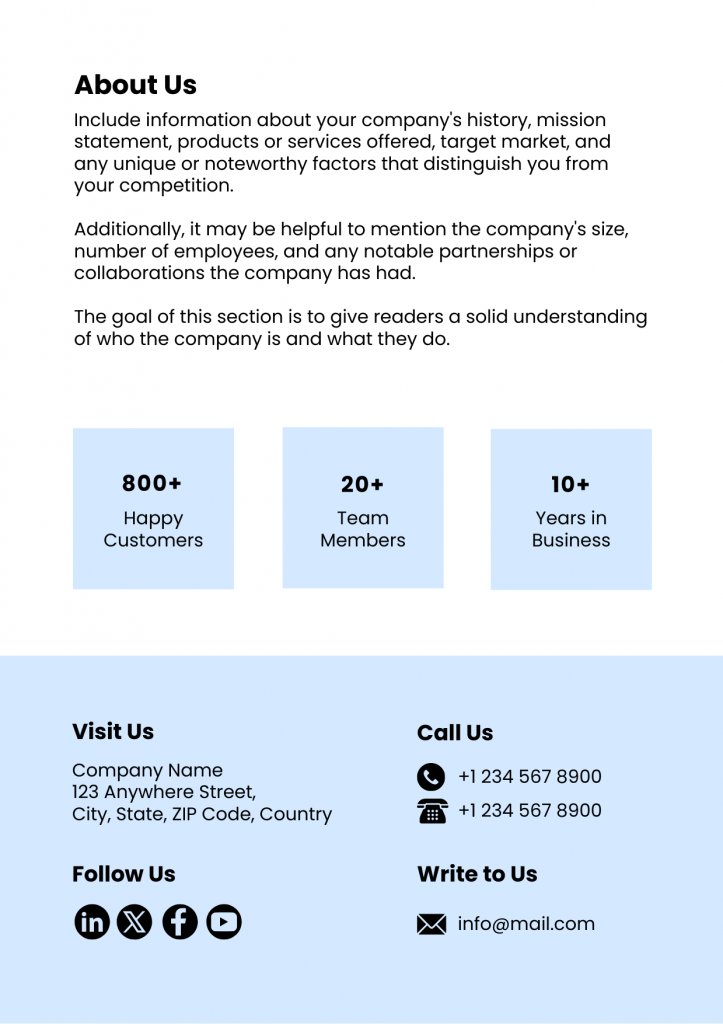
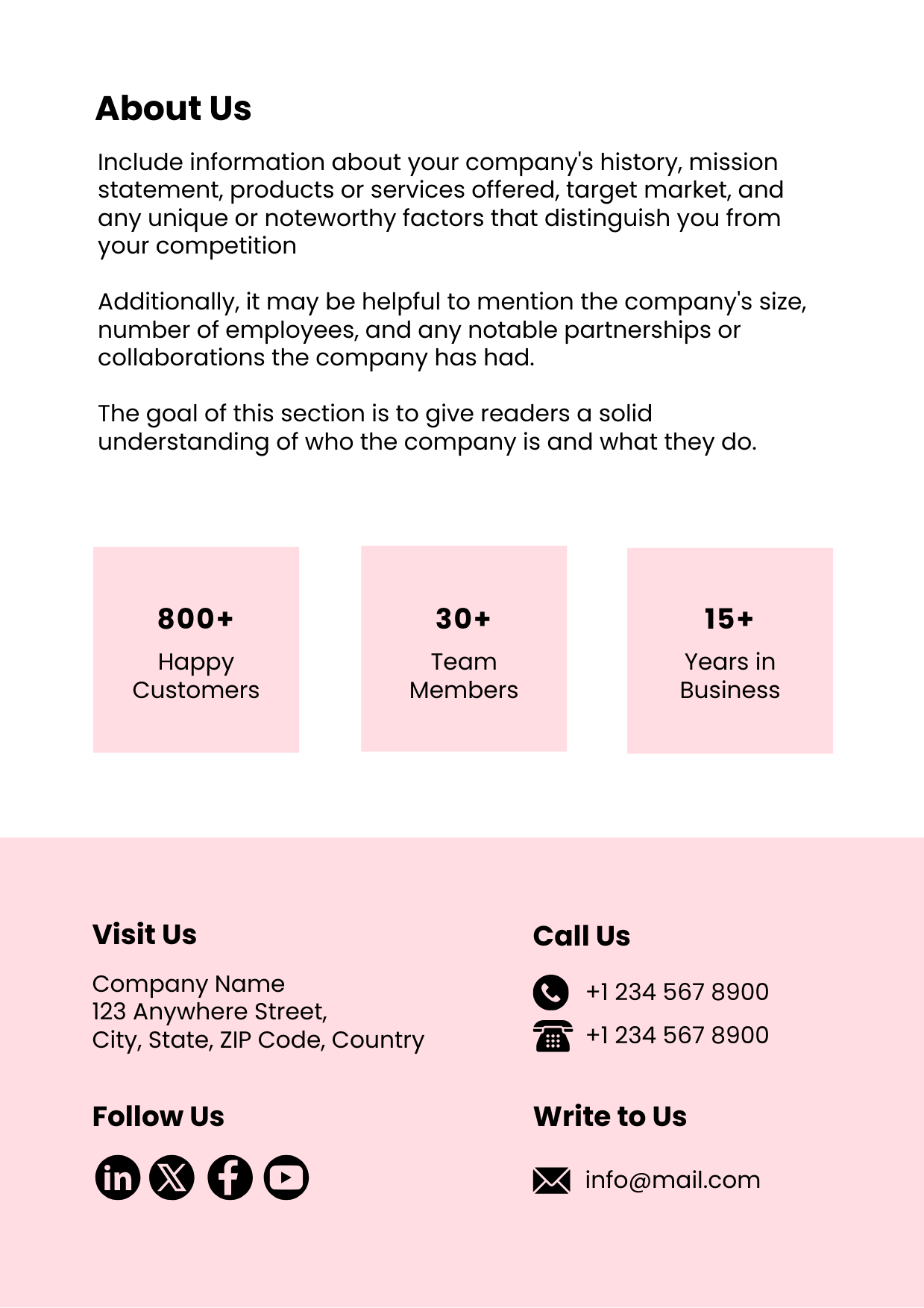
Try to use enough white space balance in your design to point out the most important information that can convert your viewers into clients. If you are trying to find more clients for social media marketing, try the following case study template. The balanced use of white space in the “About” section emphasizes the key features of your company and services.
Get This Template and More
Watch this video to learn more about this convenient feature.
7. Visual Hierarchy to Enhance Readability
Visual hierarchy is one of the most important case study principles. Use bold headings and subheadings to guide your readers, and add short lines to keep the journey smooth and easy.
Check out the webinar software case study where the Subject is bold and prominent, immediately drawing attention and establishing the topic of the case study. Key sections like “Case Study Title,” “Introduction,” and headings under “Customer Name,” “Industry,” and “Country” are clearly defined using bold fonts, enhancing their readability.

Get This Template and More
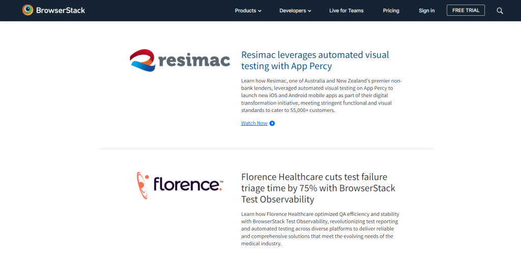
8. Client Logos and Photos
Using your client’s brand logo and photo creates a professional look and adds credibility for future prospects. Check out how BrowserStack leverages this strategy to add a personal touch that speaks volumes.
9. Interactive Elements for More Customer Involvement
Interactive elements like clickable links, video embeds, and even QR codes can drive inbound traffic while giving your clients a more engaging and enjoyable experience.
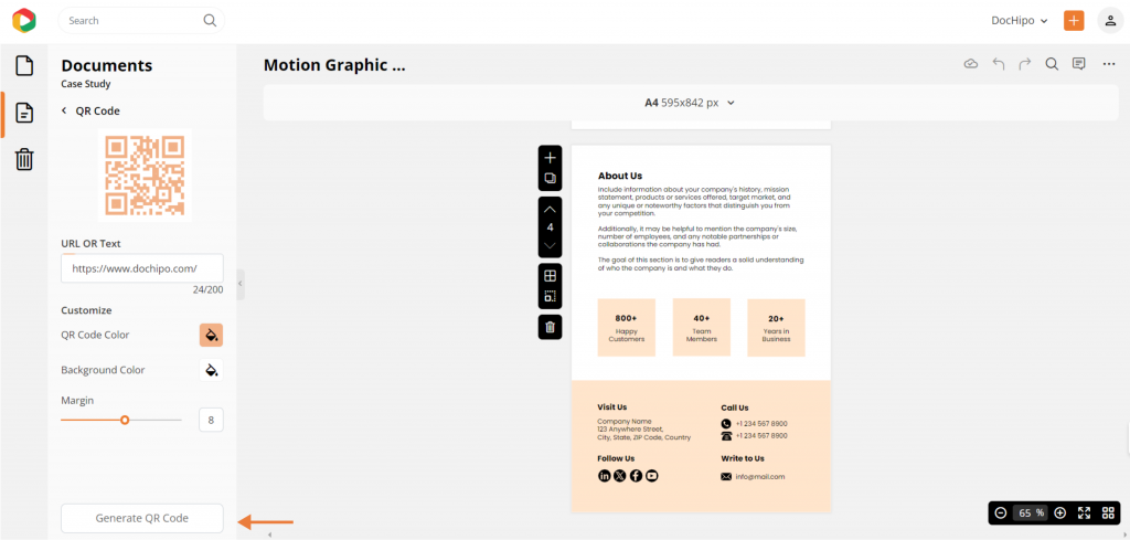
QR codes have become an essential element in marketing collaterals. You can easily create a customized QR code in DocHipo and add it to your design.
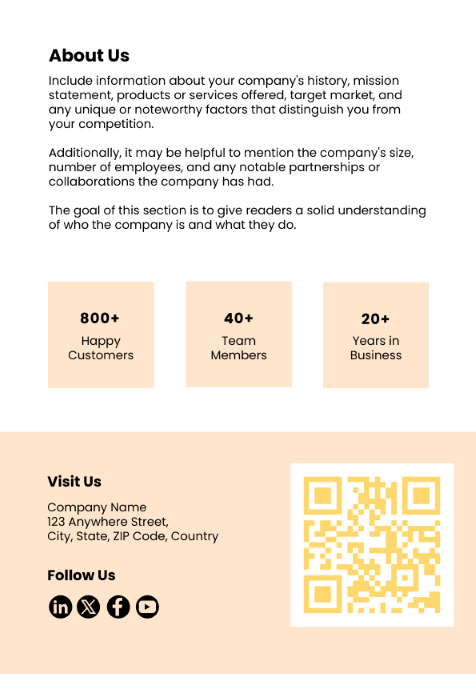
Check out the motion graphic case study design and how easily you can generate your own QR code to attach it for a better CTA. You can even choose the right color for the QR code to match your brand colors.
Watch this video to generate QR codes with AI.
Also, you can watch the video to add clickable links to any design you create.
10. Mobile-Friendly Design
Imagine your audience skimming your case study on their phone during a coffee break. A mobile-friendly design ensures they can easily read and engage with your content, no matter where they are.
11. Proofread and Test
Proofread your case study carefully—look for typos or awkward phrasing. Then, test it on different devices to ensure a seamless experience.
12. Use Templates
Using case study templates saves you time and ensures a smooth workflow between tight deadlines. They guide you step by step so you can focus on adding your unique flavor without worrying about the basics. Plus, they help you create polished, professional case studies every time.
Check out a few DocHipo case study templates you can easily customize and use for any industry.

Get This Template and More

Get This Template and More
How to Design a Case Study with DocHipo
Are you feeling overwhelmed by all these instructions? Don’t worry! It’s tempting to look up existing case studies and examples online for inspiration. But here’s the thing—why settle for someone else’s designs when you can create your own branded case study in just three simple steps? And guess what? It’ll only take you three minutes, maybe even less! So, let’s explore how you can design a case study with DocHipo templates.
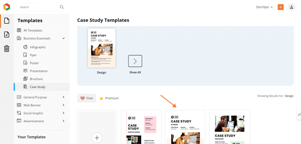
Step 1: Select Your Case Study Template
First thing, sign up for DocHipo to use its free case study maker. Once you register, you’ll see an intuitive UI with a minimalistic design that will help you easily find the case studies inside the design tool.
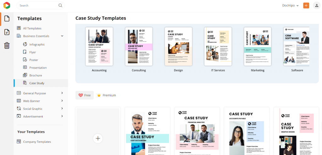
Currently, we have many broadly used categories for case study templates. From accounting to marketing, design to consulting, and IT services to software case studies, find any industry that needs case study designs to attract new clients.
You’ll also discover custom case study designs catering to every niche service in these industry-specific categories. Check out the categories below—they dive into particular services and offer exclusive, easy-to-use case study options. Perfect for busy marketers like you!
These are only a few handy Accounting case study templates that focus on niche accounting services with specific problems to tackle.
Here’s a sneak peek at important consulting case study types that you can use to meet your deadlines.
Step 2: Customize Accordingly
Customization in the case study template is essential to leave a mark on your business clients. Let’s explore how to redefine these templates with a blend of customization features and convenient drag-and-drop applications in the DocHipo editor.
I’m choosing a UI design case study template to show you the different customization steps and design a case study with personalized aesthetics.
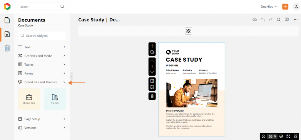
a. Select Brand Kits and Themes from the Panel
I’ll start with a simple, quick customization trick that creates a branded look: customizing templates with your brand kit. If you use the DocHipo brand kit, you don’t have to manually upload or change every design element on a template because it keeps all your brand assets, like the logo, colors, visuals, and font pairing, in one place.
Choose the “Brand Kit and Themes” option from the left-side panel. Then, use the dropdown menu to select brand kits to customize your design with brand assets.
You get to add and edit three very specific and essential components for branded case study customizations: colors, fonts, and assets.
b. Change Colors according to Your Brand Color Theme
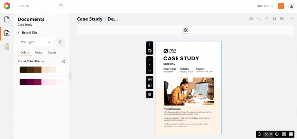
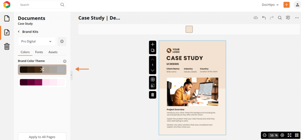
You can upload your brand colors in the DocHipo Brand Kit. Also, upload the font styles and brand assets like logos, images, and videos to keep things handy while designing your case study.
Apply the brand colors to customize your case study presentation pages.
c. Choose Your Branded Fonts
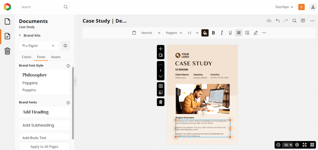
Move to fonts to apply branded fonts and create your usual typography in the design. To edit the content, you can add texts as titles, subtitles, and body paragraphs.
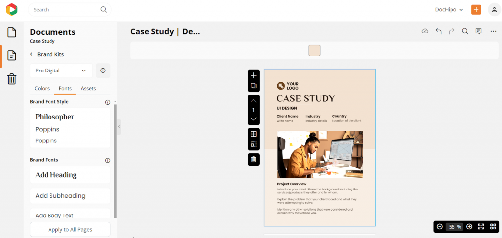
Because these templates are very niche, you can dive right in by selecting the text body and editing the content directly.
d. Add Your Brand Logo
Next, you can add your brand logo, brand pictures, and videos to apply to your design. This feature eases the process of overall brand management.
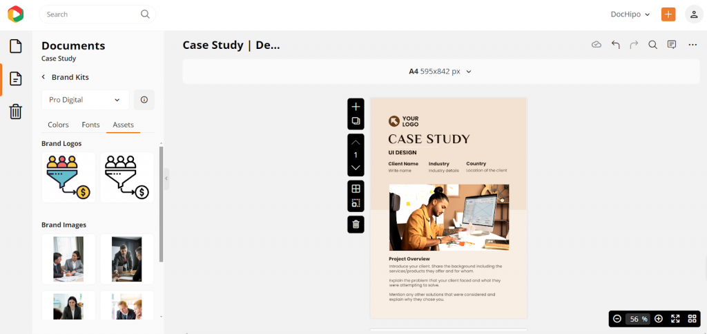
Click on the logo you want to apply to your case study. After adding the logo, it will look like this.
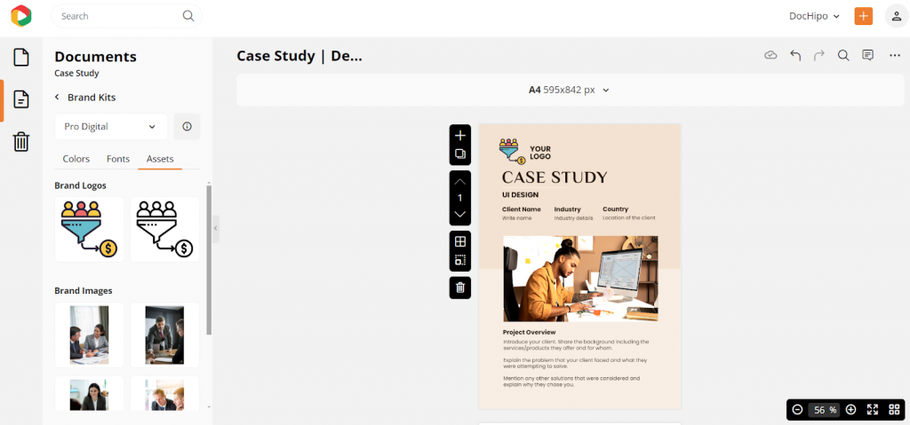
e. Add Visuals
Then, choose branded images from your uploaded asset library. To replace the default one, drag the image and drop it on the canvas. You can also resize it.
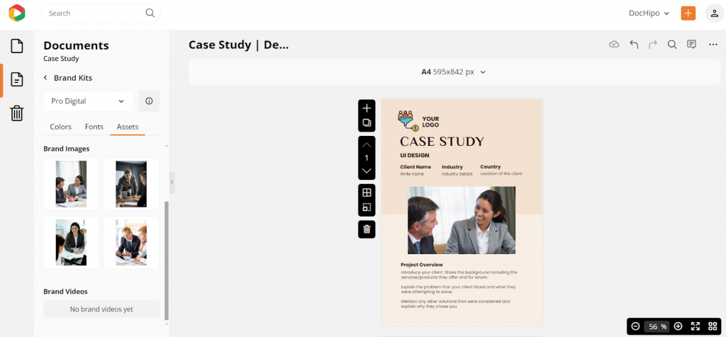
Also, you can add free stock images on the cover of your case study. With the stock image integration, you can enjoy endless high-quality stock images for free. Find this feature in the “picture” design asset from the “Graphics and Media” drop-down option.
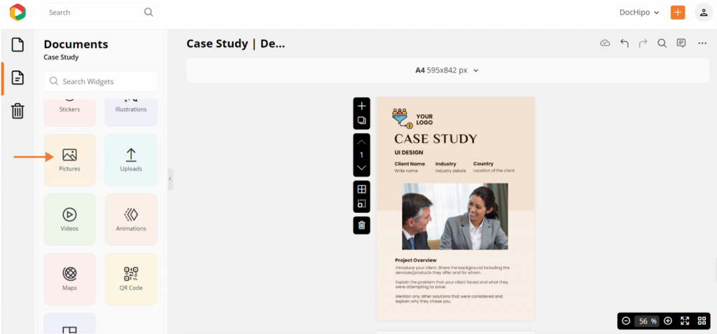
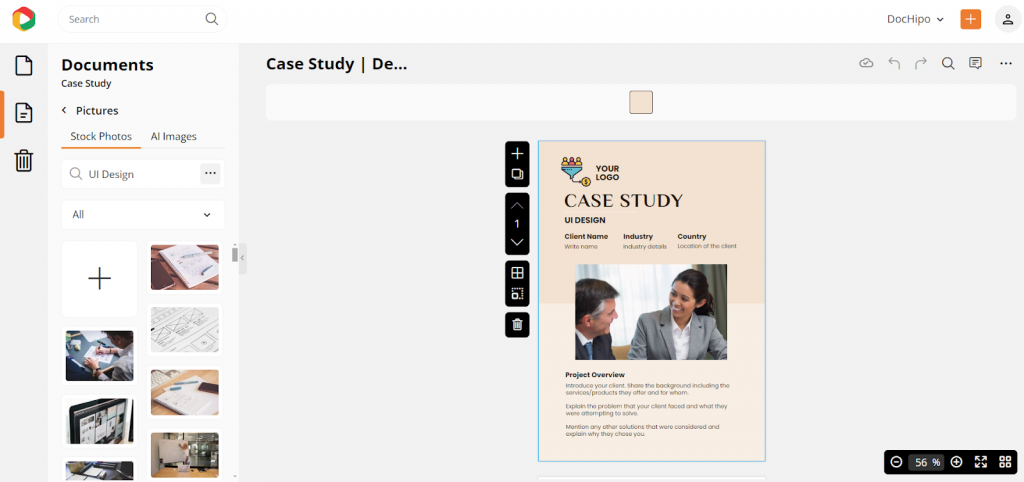
Watch this short video to learn more about using stock images in your design.
You can create or customize your case study design with these easy steps.
Watch this short tutorial video on how to use the brand kit tool in DocHipo.
Also, watch how easily you can recreate any on-brand design for your case study with the DocHipo case study maker.
Step 3: Download Your Design
Click on the three dots at the top right corner and put the cursor on the “download” option.
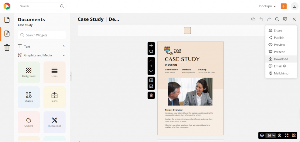
Since it’s a multi-page marketing document, you can download all or only the selected pages.
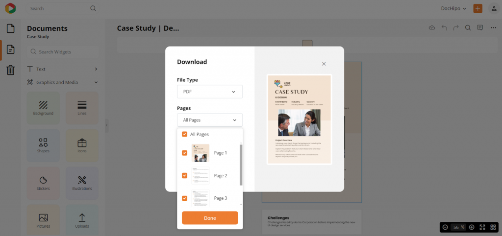
Also, you can choose the file format, such as a high-quality PDF, JPEG, or PNG. Preferably, choose the PDF format for case studies.
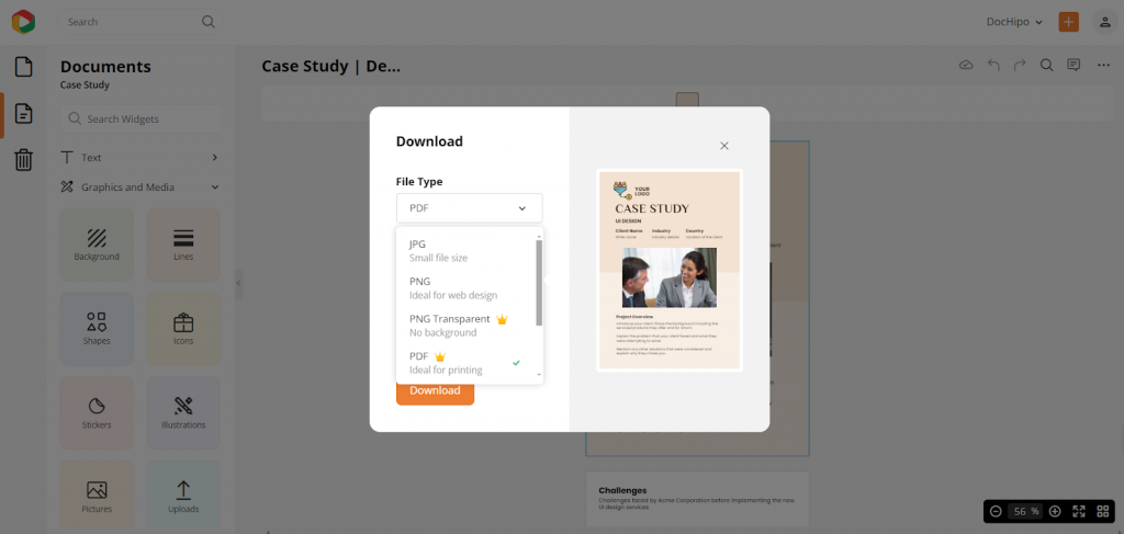
After selecting the file format, hit the download button to get it on your device instantly.
Watch the video to download your designs in DocHipo.
I crafted the final design for you, ensuring a harmonious contrast and balance.

Promote Your Case Study to Make it Easily Accessible
The customization steps help you to design a case study easily, but if you don’t know how to promote it effectively, your efforts will be in vain. Follow these steps to promote your design effortlessly.
1. Post on Your Website Directly
DocHipo lets you publish your content directly on the website. To avail of this feature, click on the right corner, and a tab like the following will appear on your screen.
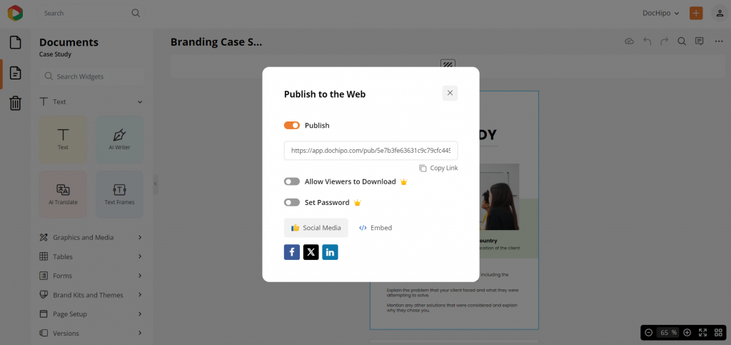
You can turn on specifications allowing viewers to download or set unique passwords for data security.
Watch the video to apply filters to control the download option for the viewers.
2. Share Across Social Media Channels
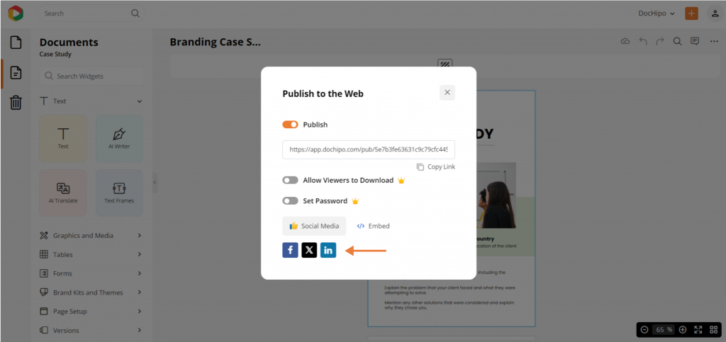
The power of social media in this digital age is evident. Imagine uploading your content directly to your social media pages without any hassle. DocHipo provides this unique feature so that you can continue to be productive in your marketing strategies.
Simply hit the “publish” button and find all the up-to-date social media options lined up at the bottom of the tab.
3. Use Email Integration to Stay Connected with the Team
You can send your case study via email to stay connected with internal teams.
Watch the video to use this feature.
Additionally, you can use DocHipo’s MailChimp integration to boost your newly designed case studies through email marketing. By sharing these case studies with your audience in weekly emails, you’ll keep your clients engaged and loyal.
Watch this video to apply this feature.
4. Incorporate into Sales Presentations and Pitches
Case studies are powerful tools for highlighting your strengths and unique selling points. Your clients crave real data showing your expertise, client base, and ability to solve real business challenges. There’s nothing more persuasive than including these marketing assets in your sales presentations and pitch decks.
5. Provide as a Downloadable Resource
Downloadable case studies can boost your visibility by making it easy for potential clients to access, share, and engage with your success stories.
Conclusion
In conclusion, when you design a case study, focus primarily on the basic design principles and the standard case study format. For quick and easy case study creation, sign up for DocHipo to access exclusive templates and fantastic design assets for effortless customization.
FAQs
How do you design a case study?
Designing a case study is the second last step in the process of creating a case study. After you create a format of the case study and gather information, it’s time to put those data into a comprehensive, readable format. To design a case study, use a template and customize it according to your needs. You can change the titles and, sub-headings, and paragraphs and add visuals and subtle color contrast to create a simple yet catchy design that demands your attention. Customize the content to recreate your design.
How to design a case study?
To design a case study, start by identifying a specific problem or question to address. Then, gather relevant data, conduct interviews if necessary, analyze the information, and organize the findings into a coherent and engaging narrative. Then, follow the basic design principles to create an attractive composition that is a tapestry of visual hierarchy, white space, color contrast, and layout.
How do I make my own case study?
You can try any free DocHipo template for case studies and customize it in three simple steps. After adding a touch of personalization, save the new design.
What makes a compelling case study?
Maintaining a central theme, adding brand assets like colors, logos, typography, arresting color contrast, and showing data in charts, graphs, or bulletins creates a stunning case study.


