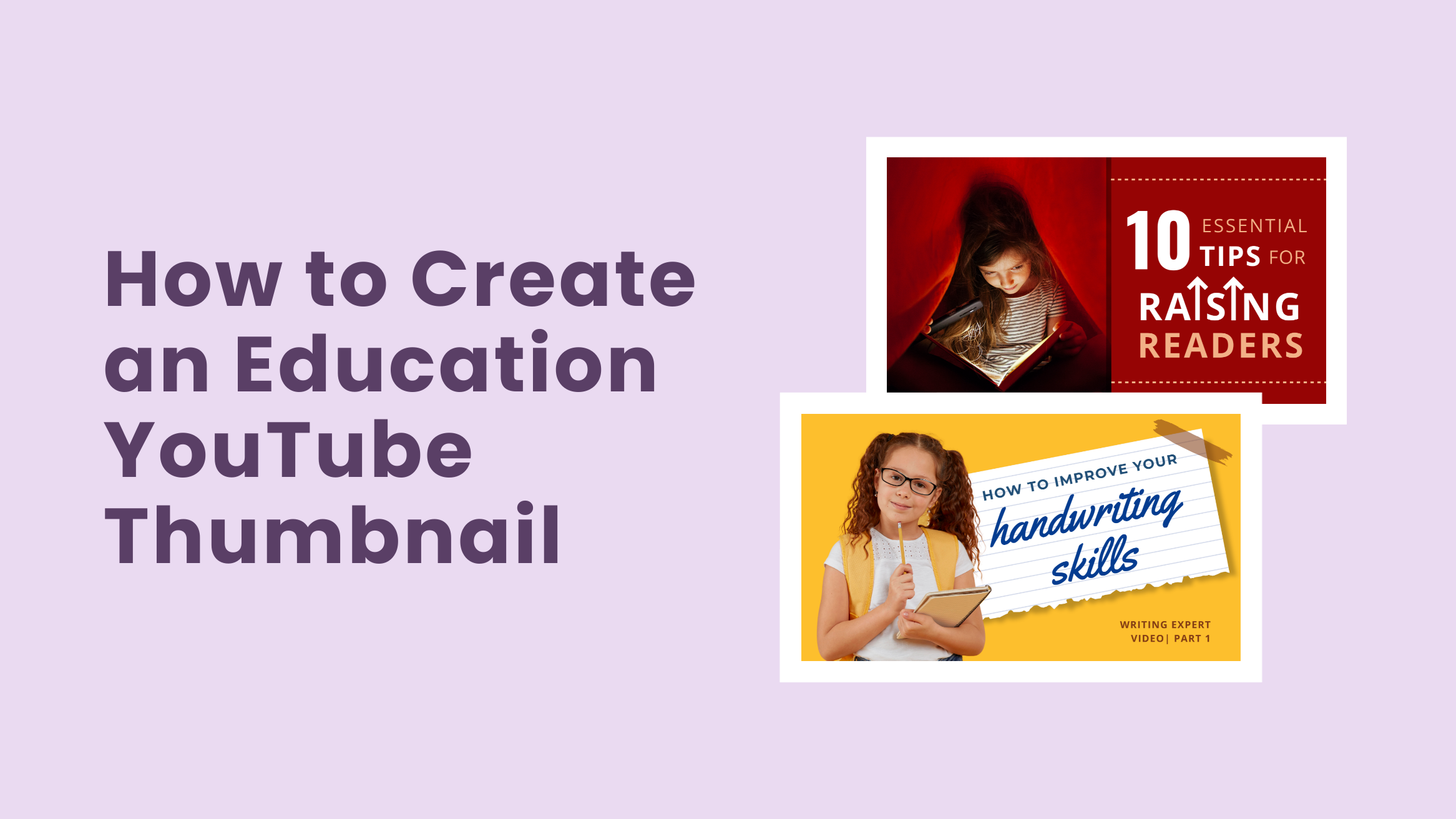
How to Create an Education YouTube Thumbnail Almost Instantly

Producing quality content for an Education YouTube Channel is not an easy task. It takes a lot of time and money to stay consistent. But all your hard work will go in vain if it isn’t reflected in the views and subscriber counts on your channel. A well-designed Education YouTube Thumbnail can make all the difference.
How to Make Education YouTube Thumbnail
- Use High-Quality Images: Engage viewers and convey emotions effectively.
- Choose Vivid Colors: Grab attention with complementary colors.
- Use Typography: Ensure readability and consistency with fonts.
- Add Extra Elements: Enhance uniqueness and message clarity.
- Utilize White Space: Improve readability and visual appeal.
- Keep It Simple: Maintain clarity, especially on mobile devices.
Thumbnails are one of the critical factors in whether someone decides to watch your YouTube videos or not. People will assume that your videos aren’t worth their time if the thumbnail is not impressive. Also, according to YouTube, 90% of the videos with custom thumbnails perform better than those without them.
But not everyone can design a good YouTube Thumbnail. Keeping that in mind, DocHipo features a YouTube Thumbnail Maker that helps you design eye-catching thumbnails in minutes.
Read the article carefully to learn how to create an education YouTube Thumbnail in DocHipo.
Table of Contents
Education YouTube Thumbnail Design Best Practices
The thumbnail of your YouTube video is like the packaging of a product. Popular brands don’t compromise on the packaging of their products. Therefore, you should not compromise the design of your Education YouTube Thumbnail.
But that doesn’t mean you need to spend thousands of dollars on designing the thumbnails. So, we have come up with some best practices for Education YouTube Thumbnail design to help you design the thumbnail without any difficulties. Go through them carefully.
Use Relevant and High-Quality Images
Most of the good YouTube thumbnails include relevant and high-quality images. This is because the images in the thumbnail give an idea of the content inside. So, you can not compromise on the quality.
Use faces and expressions to help the viewer understand what kind of emotions the video will evoke. You might have already seen that the thumbnails with a feeling of shocking facts inside always work magically. So, try to keep these facts in mind while inserting an image in your YouTube thumbnail.

Get This Template and More
Choose Colors Carefully
When placed together, specific colors can complement each other, move backward or forward in the frame, or create better harmony. Thus, learning about some of the best color combinations can come in handy while designing the thumbnail. Choosing the right color can help to create the right mood and attract the attention of your viewers.
You can choose complementary colors that will stand out against one another and grab the viewers’ attention at a glance. For example, in the template below, we have used yellow and blue for the background. So, we filled the elements with complementary colors like Orange and Red.

Get This Template and More
Alternatively, you can experiment with tints and shades of a single color to get the perfect color scheme for your Education YouTube Thumbnail.

Get This Template and More
Get The Typography Right
You are done with the images and the colors. Now, we will talk about the typography of your Education YouTube Thumbnail. A single high-quality image can not communicate everything about your video. So, you need to add text to give the thumbnail context. But a wrong selection of fonts can ruin the whole design. There should be a Typography Hierarchy in your thumbnails. Here are some points to keep in mind to do the same.
- Use not more than two to three high-quality and legible fonts.
- Prioritize the font size according to the text type: Heading, Subheading, Body.
- Pick a font color that complements the background.
- Consider other elements such as images, shapes, lines, and others while choosing the fonts.
- Make sure to use fonts that match the context.
- Always be consistent in your font use.

Get This Template and More
Incorporate Additional Elements
Additional elements such as icons, illustrations, stickers, and others make your thumbnail stand out from the rest. They add the extra layer of design to your thumbnail so that message you want to convey through it gets cleared immediately.
If your video includes auxiliary text or graphics, you can also include similar graphic elements in the thumbnail. Include some of them as appropriate. However, don’t overcrowd the thumbnail with these elements unless the design looks unprofessional.

Get This Template and More
Utilize The White Space
Whitespace is one of the most powerful tools that creators often overlook while designing their Education YouTube Thumbnails. White or negative space is the gap between all the design elements that tie the whole design together. It gives all the elements enough room to breathe by separating them from each other.
Utilize the white space in your Education YouTube Thumbnail to help your viewers’ differentiate between the text, image, and other elements. If you understand what white space is, you might notice that all the Education YouTube Thumbnail Templates inserted above include enough white space.

Get This Template and More
Keep It Simple
According to a recent study, more than 800 million monthly active users access YouTube on their mobile devices. The Education YouTube Thumbnail that you design will become smaller when viewed on mobile devices. So, it would be best to keep the thumbnail design as simple as possible while creating a visual hierarchy.
Avoid adding the entire title of the video to the image. Instead, you can use the keywords strategically to save space. Don’t use too many fonts, images, or other design elements. Otherwise, people will have difficulty understanding your YouTube Thumbnail, thus ruining all the hard work you have put into designing it.

Get This Template and More
Now, let’s put what we discussed in the best practices mentioned above by customizing an Education YouTube Thumbnail in DocHipo.
How To Create An Education YouTube Thumbnail In DocHipo
DocHipo features a wide range of Education YouTube Thumbnail templates and some awesome Design Widgets. Designing the Education YouTube Thumbnail in DocHipo is an easy process. Create an account for free and start designing your YouTube Thumbnail by following these easy steps below:
Step 1: Choose an Education YouTube Thumbnail Template
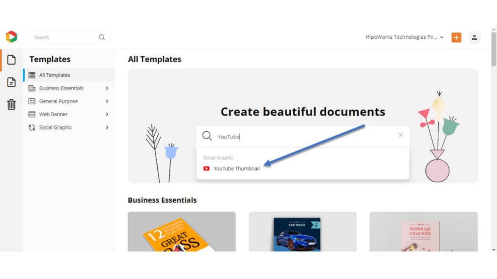
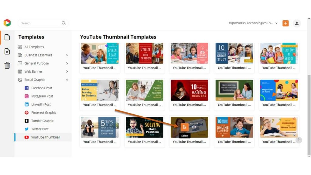
On the all templates page of DocHipo, you will find a wide collection of beautiful templates under different categories. Type “YouTube” in the search bar and click on the result.
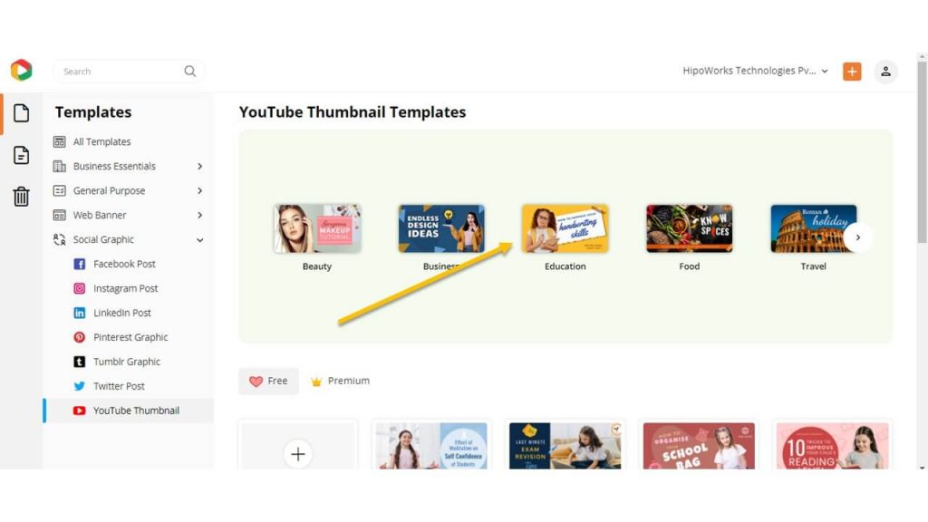
The YouTube Thumbnail Templates are divided into different categories: Beauty, Business, Education, Food, Travel, Wildlife. Filter the templates by choosing Education among the other categories.
Hover over the template you like and click “Preview” to take a look at the template before editing.
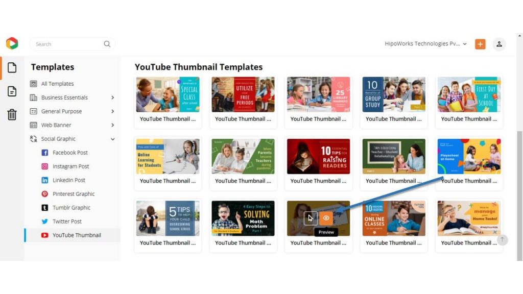
Alternatively, click “Select” to start customizing the template.
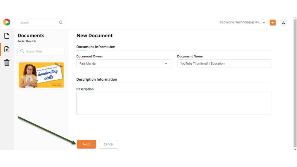
On the new page, give a name to the document so that you can find it easily after downloading. Once done, click Next to proceed further.
Step 2: Customize the Template
The DocHipo Editor lets you customize the template in many ways so that you get the perfect thumbnail for your Education YouTube Channel. Change the fonts, customize the background, replace the images, add and edit other elements, and do whatever you want.
Customize the Background
Click on the Background widget from the left sidebar under Graphics and Media.
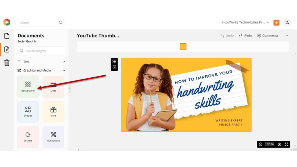
Choose a color from the presets or a custom color using the color picker tool.
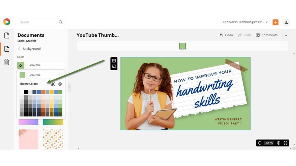
Additionally, you can add texture to the background by choosing any of the images from the list.
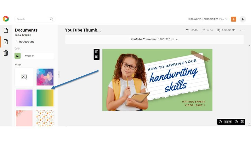
Watch the video below to create stunning backgrounds in DocHipo.
Add, Edit, and Delete Text
Click on the Text widget from the left sidebar and choose a text style: Heading, Subheading, and Body Text. Once the text object appears on the template, double click on it and type your own words.
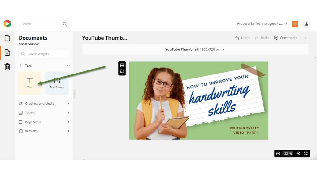
Alternatively, double-click on the preexisting text that you want to edit. Type your copy and use the edit panel on top to change the font, size, color, alignment, and even delete the text.
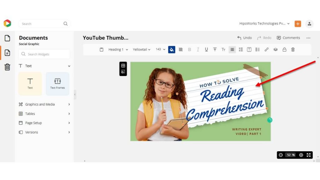
The video below will help you learn more about the same.
Replace The Image
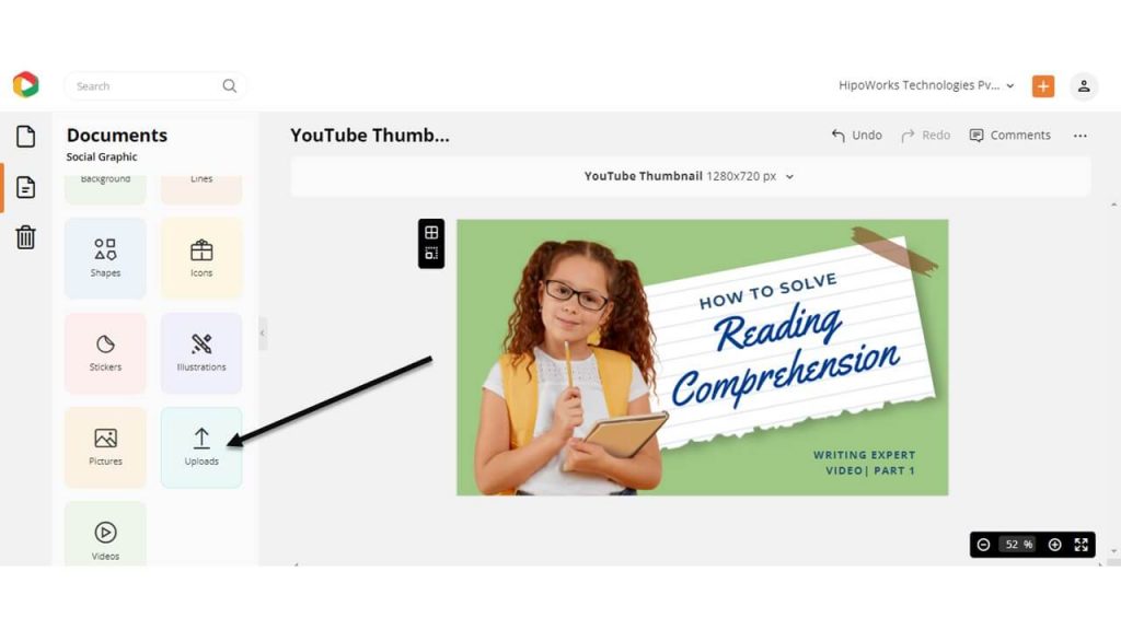
Click on the Pictures widget from the left sidebar to choose a picture from DocHipo’s Stock Photo Library.
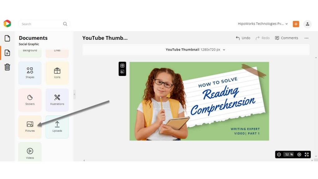
If you want to add your own images, click on the Uploads widget and upload images. Drag and drop the uploaded image on the preexisting one, and it will be automatically replaced.
Edit Other Elements
You can add other elements like icons, stickers, lines, shapes, illustrations using the widgets from the left panel. Click on any design element you want to edit and use the edit panel to change the color, opacity, arrangement, and more.
Before Customization:

After Customization:

Step 3: Download Your Education YouTube Thumbnail
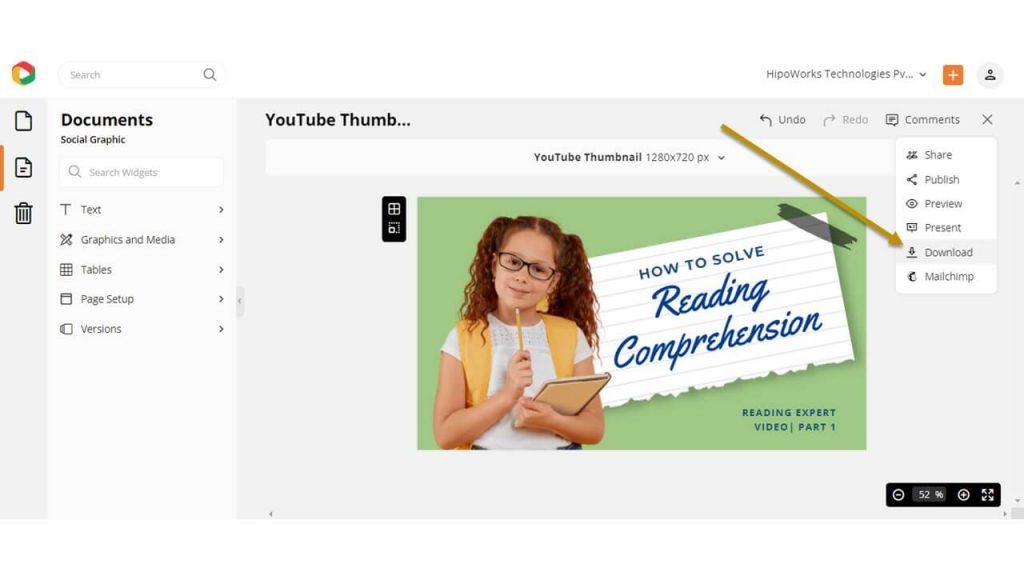
Once done with the design process, you might want to download the Education YouTube Thumbnail. In order to do that, click on the three dots in the upper right corner of the screen. Choose Download from the drop-down menu.
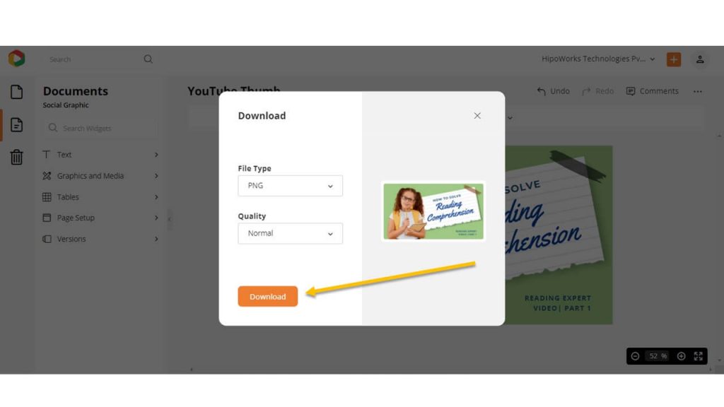
Choose your required file type and quality from the download widget and click the Download button to start the download process.
Below is a video tutorial on how to design a YouTube Thumbnail in DocHipo.
To Conclude…
Now you know how easy it is to design a catchy Education YouTube Thumbnail that helps you generate more views and subscribers on your channel. So, sign-up to DocHipo and capture the essence of your YouTube video with a stunning YouTube Thumbnail.
FAQ
What are some tips for creating an education YouTube thumbnail quickly?
You can use an online YouTube thumbnail maker for creating an education YouTube thumbnail quickly. First, select an appealing education YouTube thumbnail template that aligns with your needs. Then, change the title, picture, and other design elements wherever necessary to reflect your brand.
Should I include the title of the video on my education YouTube thumbnail?
You should include the video’s title on your education YouTube thumbnail to make it easier for users to understand what it is about and why they should watch it. Ensure your thumbnail text is in large font for users to read quickly, and don’t add misleading titles. However, if the image on your thumbnail alone can do the talking, you may not add it.
What are common mistakes for education thumbnails?
Some common mistakes for education thumbnails are their wrong size, misleading titles, poor color contrast, and inconsistent YouTube thumbnail designs. Also, stuffing the thumbnails with more than three colors, fonts, irrelevant and unnecessary graphics, or other design elements can result in lesser click-through rates.


