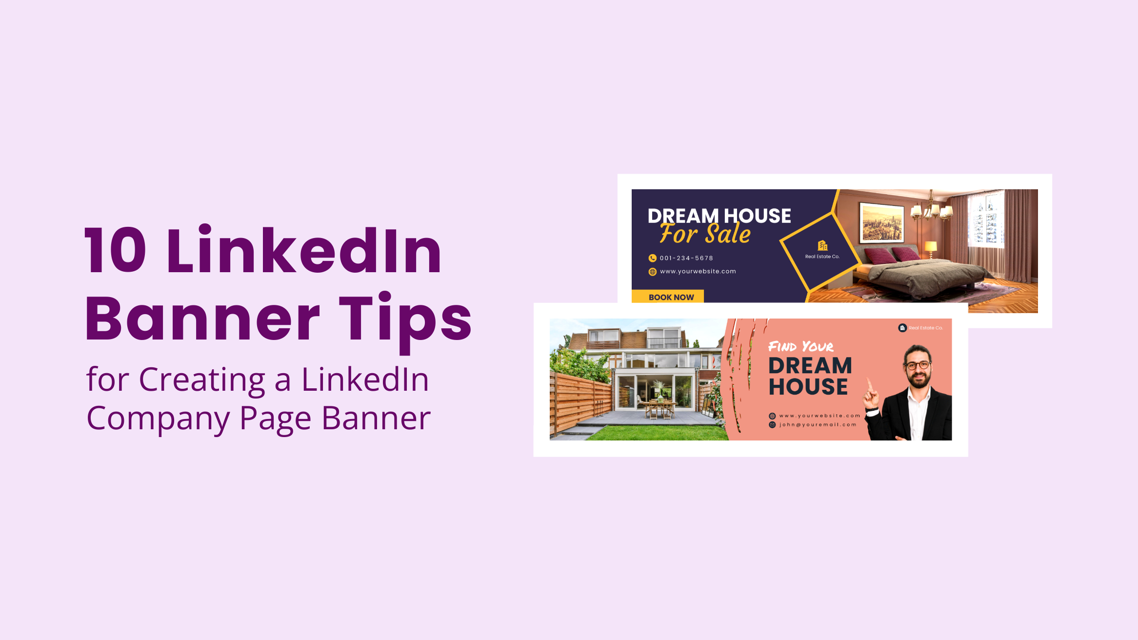
10 LinkedIn Banner Tips for Creating a LinkedIn Company Page Banner

I have seen some LinkedIn company pages leave the Cover Photo section blank, and you know what? It doesn’t look impressive. This section is on your company’s LinkedIn Page for a reason, right? The reason is to allow your company page to stand out and give a glimpse of your business in the most unique way possible. Why ignore such an opportunity for no reason? It’s best to create a customized business LinkedIn Banner for your company page that screams your brand and makes your page visitors more curious about your business.
10 LinkedIn Banner Tips
- Be Intentional: Design Your LinkedIn Banner with an Intent
- Understand target connections: Know your potential profile visitors to speak their language
- High-quality visuals: Use relevant premium-quality pictures or illustrations
- Limit your text: Write simple and crisp message to communicate your brand
- Right fonts: Choose appropriate fonts that speak for your brand
- Color scheme: Choose your brand color palette consistently
- Shapes: Experiment with shapes to add creative interest
- Visual storytelling: Tell a story visually to convey your brand message and offers
- Embrace Simplicity: Make LinkedIn banner easy and quick to understand
- Consider profile picture: Keep in mind your LinkedIn profile picture location
In this post, I will discuss ten LinkedIn Banner tips and best practices you must follow to achieve your desired results. I’ll also share templates and snapshots from DocHipo so that you can get started easily.
Table of Contents
How to Create a LinkedIn Banner with DocHipo
Haven’t you designed a LinkedIn Cover Photo before?
With DocHipo’s Free Online LinkedIn Banner Maker, you can design professional and eye-catching LinkedIn Banner for company page from fully customizable templates, even with fundamental design knowledge.
Once you sign up to DocHipo, you’ll land on the home page. Then, search for ‘LinkedIn Banner’ in the search bar and click on the result.
Alternatively, you can watch the video below to get into the customization process.
LinkedIn Banner Tips to Engage Company Page Visitors
Follow through the list of ten LinkedIn Cover Photo Design best practices. Also, you can immediately start customizing the DocHipo LinkedIn Banner Templates shown below.
1. Design Your LinkedIn Banner with an Intent
To lay a solid foundation for your LinkedIn presence, think about the goal you want to achieve through your LinkedIn header. Your LinkedIn Cover Photo could raise your brand awareness and visibility, promote a short-term marketing campaign, drive conversions, etc. So figure out your purpose and then design your LinkedIn company banner to maintain an authentic digital presence.
2. Know Your Potential Profile Visitors
You need to know your potential LinkedIn profile viewers to address them effectively.
3. Use Premium-quality Visuals
If you want to showcase your beautiful office view or the brilliant team behind it, browse your own photo library.
Refer to the video below while uploading an image in DocHipo.
Otherwise, DocHipo’s integration with popular stock photo libraries lets you access unlimited high-quality stock images from within the editor.
Look at the pictures on the left sidebar with the theme ‘People.’

Get This Template and More
Similarly, you can also use illustrations or icons to represent certain elements of your brand in your LinkedIn Header.

Get This Template and More
The Illustrations widget is under the ‘Graphics and Media’ tab on the left sidebar.
Below is the Illustrations drop-down menu covering a variety of themes.
Watch the video guide below to use icons in DocHipo.
4. Limit Your Text
Don’t make your LinkedIn Banner design cluttered by adding too much text unnecessarily. Keep it minimal.
Now the question is, what should you write in your LinkedIn Cover Photo?
Customize your business LinkedIn Banner by adding some or all of the following to it:
- Your brand or business name
- How you can help: An impactful advertising strategy is to craft a statement about how your business helps your target customers accomplish their goals
- Motto: You can state your mission statement
- Your beliefs: You can add your perspectives around the business area you serve to make your target audience feel your core values
- Call to action: ensure your target viewers know what action to take after visiting your company’s LinkedIn profile. Generate more engagement by leveraging your LinkedIn Banner
Look at the following DocHipo LinkedIn Banner Template that limited the text to their motto- “One Team-One Dream.”

Get This Template and More
Watch the YouTube video below to learn how to add, edit, or delete text in DocHipo.
5. Choose Appropriate Fonts
In your LinkedIn cover photo, it’s best to use two fonts at most. Using more fonts might look unprofessional and messy.
Take the example of the following DocHipo LinkedIn Banner Template.

Get This Template and More
6. Choose Your Color Scheme Wisely
To be memorable, incorporate elements relevant to your brand or business, like your unique brand color palette or even fonts. You may use a solid color that complements the color in your LinkedIn profile picture to make it more striking. You can also choose from various abstract textures in DocHipo and stick to the one that aligns with your business’s branding. Most importantly, your colors should look impressive together and reflect a professional LinkedIn Banner design.
Observe the fantastic application of colors in the below DocHipo LinkedIn Banner Template.

Get This Template and More
Select the area you want to change the color of, and click on the little square-shaped color icon from the editing panel.
Now, experiment with the theme or custom colors to determine the most suitable colors.
7. Experiment with Shapes
You can experiment with a wide range of standard and abstract shapes available in DocHipo.
Read Psychology of shapes in Design and choose the one that best aligns with your branding.
Look at the below DocHipo LinkedIn Banner Templates using different shapes.

Get This Template and More

Get This Template and More
The ‘Shapes’ widget in DocHipo is also available under the ‘Graphics and Media’ tab.
8. Tell a Story Visually
It will be more appealing if your LinkedIn Cover Photo tells a meaningful visual story about how your business works, its work culture, etc. Ensure you represent your brand through it as appropriately as you can.
9. Embrace Simplicity
It might be tempting to get carried away with the design elements DocHipo offers and incorporate them into your design. However, you should add only the necessary elements to keep your LinkedIn banner design simple and elegant. Simplify your design regarding the visuals, colors, text, or any element you add. Let your design breathe by keeping enough space. Give it a fresh, clean, and stunning look.
For example, have a look at the DocHipo LinkedIn Banner Template, which embraces minimalistic design and spreads a happy vibe.

Get This Template and More
10. Keep in mind Your LinkedIn Profile Picture Location
As you can see, the LinkedIn profile image takes up a little space on the LinkedIn Banner. So, it’s wise not to place any vital information or visuals in that area. I’ve seen some companies don’t pay attention to this part. Now that you know, don’t repeat their mistakes.
You can check out a new and exciting article, 10 LinkedIn Banner Ideas For Your Business.
Now that you’ve successfully designed your LinkedIn Cover Photo, you can download it immediately.
If you have designed your LinkedIn Banner using a photo, download it in JPG format.
Check out the video for downloading documents in JPG format in DocHipo.
Otherwise, if you included illustrations without any images, choose PNG.
Choose the high-quality option while downloading your custom LinkedIn Cover Photo. It will impact the way your target customers assess your brand or business.
So you are all set to use your custom LinkedIn Banner on your profile and focus on generating leads and ultimately growing your business. A good lead management software can also help effectively manage the generated leads.
Final Words
So, while wrapping up, I hope you learned at least something from the above LinkedIn Banner design best practices. Don’t miss out on the opportunity to attract your target customers and boost your LinkedIn presence with authority. This powerful section of your Company’s LinkedIn Page should also give your potential employees a warm welcome and intrigue a desire to join and contribute to your company.
Take the first step and sign up to DocHopo for free. Explore the templates, leverage the needed design elements, and get creative to design the LinkedIn Cover Photo that your brand deserves. The other resources shared in this article will help you in the process.
FAQ
What size is a LinkedIn banner?
LinkedIn recommends its banner size to be of width 1584 pixels and a height of 396 pixels. The accepted LinkedIn Banner image file formats are JPG and PNG and should be lesser than 8MB.
Does a LinkedIn Banner matter?
You must not leave your LinkedIn background banner section blank because it’s an excellent opportunity to make your brand stand out and give your viewers a glimpse of what you offer in the most appealing and unique way possible. Leverage this powerful visual section to showcase your brand and make a lasting first impression.
What makes a good LinkedIn banner?
Your LinkedIn Banner should be the answer to what you do and how your viewer will benefit by connecting with you. Convey these with a clear and concise message, eye-catching and memorable visuals (picture, illustration, etc.), appropriate colors, and fonts. Avoid using unnecessary elements to keep it neat and professional.
What words should you put in a linkedin banner?
You can put your field or industry-relevant keywords such as specific job titles, services you offer, email address, personal hashtag, and so on in a LinkedIn banner.


