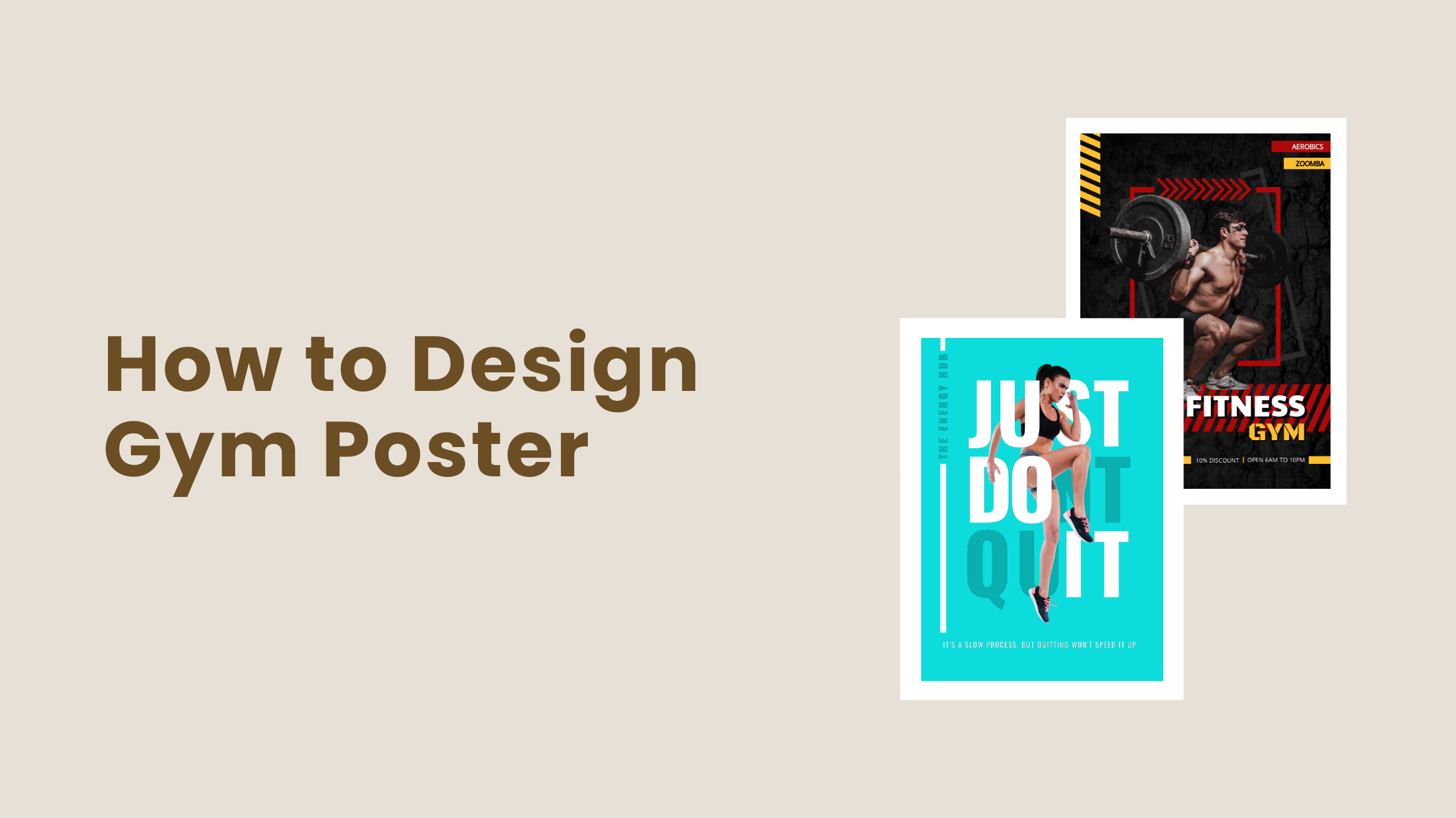
How to Design Gym Poster: Market Your Gym Effectively

Are you looking for printable marketing materials to promote your Gym? Then your search ends here. Gym poster design is one of the best ways to promote your Gym effectively. Studies have shown that the mass production of posters has been around for 220 years. They are incredibly effective at getting your message in front of a vast audience. Designing a Gym poster is much more cost-effective than other forms of marketing.
How to Create Gym Poster Design
- Catchy Title: Make the title bold and prominent to grab attention.
- Relevant Fonts: Use up to three clear fonts that reflect gym emotions.
- Vibrant Colors: Choose colors like red, green, blue, or pink that match your brand.
- Contrast: Use contrasting colors and elements to add visual interest.
- High-Quality Images: Include high-resolution images for clear printing.
- Additional Elements: Add shapes and icons to enhance the design without overcrowding.
However, designing an iconic poster is not an easy task. It takes a lot of time and effort to make the poster visually appealing to get the message across. That said, DocHipo comes with a Free Online Poster Maker for anyone willing to design posters without having any design experience.
Continue reading to learn more about Gym Poster Design using DocHipo.
Table of Contents
Gym Poster Design Best Practices
Designing a poster without having any design experience can be a daunting task. Keeping that in mind, we have come up with some practical ideas for Gym poster design. Go through them carefully so that you don’t need to stress yourself out while designing the Gym poster.
Create a Catchy Title
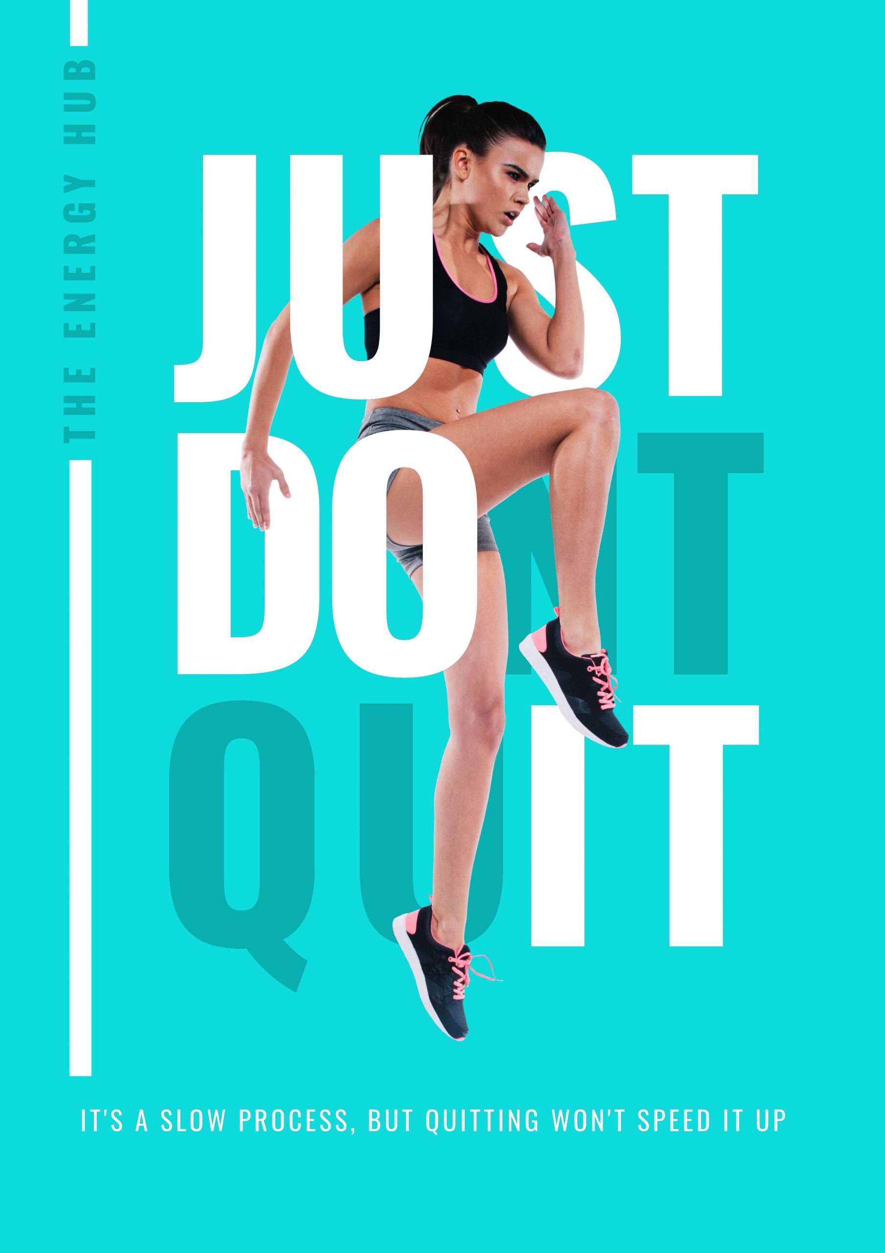
A great Gym poster design starts with a great title. The first thing your audience will notice in your poster is the title. So, it should catch their attention and get them to actually stop and read the message you are trying to convey.
To do that:
- Make sure the title is the most prominent and bolder text in the poster.
- Create enough contrast between the text and all the other elements, so the text pops.
- Whatever you do, keep legibility on top of your checklist while creating the title. This will make sure that the title is attention-grabbing and visually appealing at the same time.
Get This Template and More
Choose Relevant Fonts
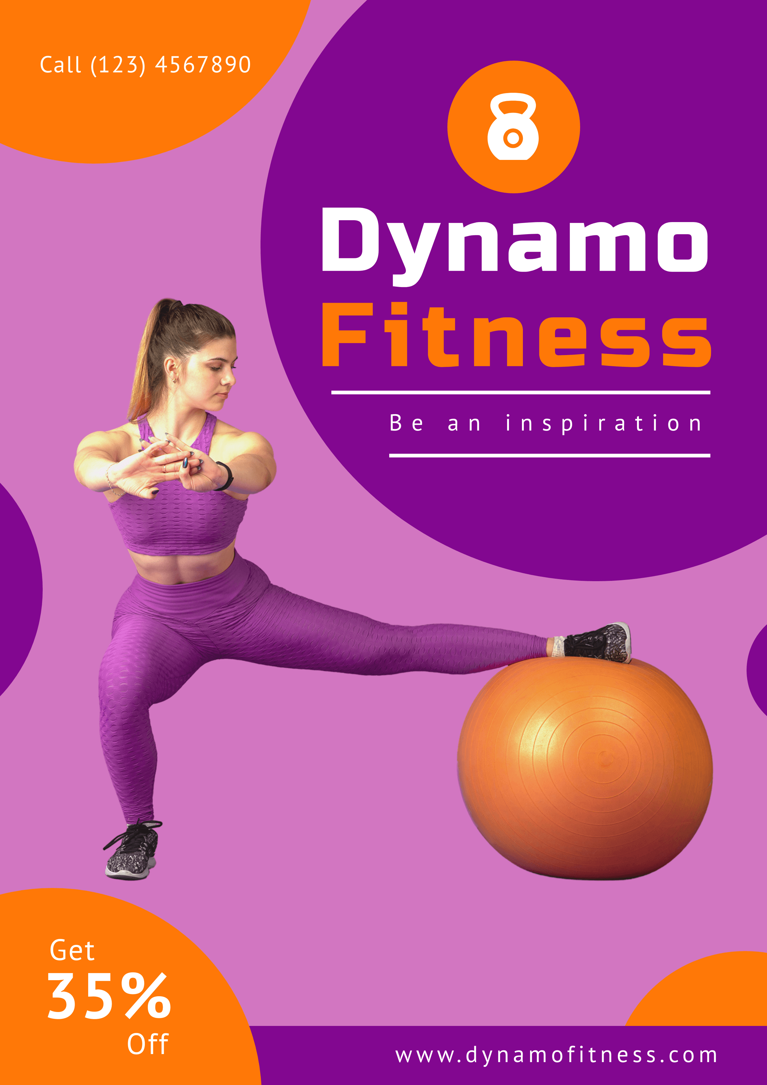
Font selection plays a crucial role in the success of your Gym Poster Design. Whether your poster includes too much text or multiple images, the message should be clear at a glance. Thus, making it crucial to choose the right fonts to reinforce your message.
While choosing fonts, make sure the text is legible and can communicate every detail through the poster. Don’t use more than three fonts in a single poster design; the more fonts you use, the more visually confusing your poster will be.
Get This Template and More
Additionally, you can use fonts according to the content you are presenting. Just because you like a font doesn’t mean it is suitable for your poster. Since you are designing the Gym poster to market your Gym, choose a set of fonts that symbolizes passion, aggression, energy, and other emotions related to Gym and fitness.

Get This Template and More
Read this article about Typography Hierarchy to learn more about choosing the right fonts for your design.
Use Colors Wisely
Different colors evoke different emotions, and they can make or break any design. While designing the Gym poster, you need to choose colors carefully. As a Gym owner, you might already know that gathering the motivation to exercise is a struggle for many people. However, you can motivate your audience through your Gym poster design.
Choose these colors for your Gym poster:
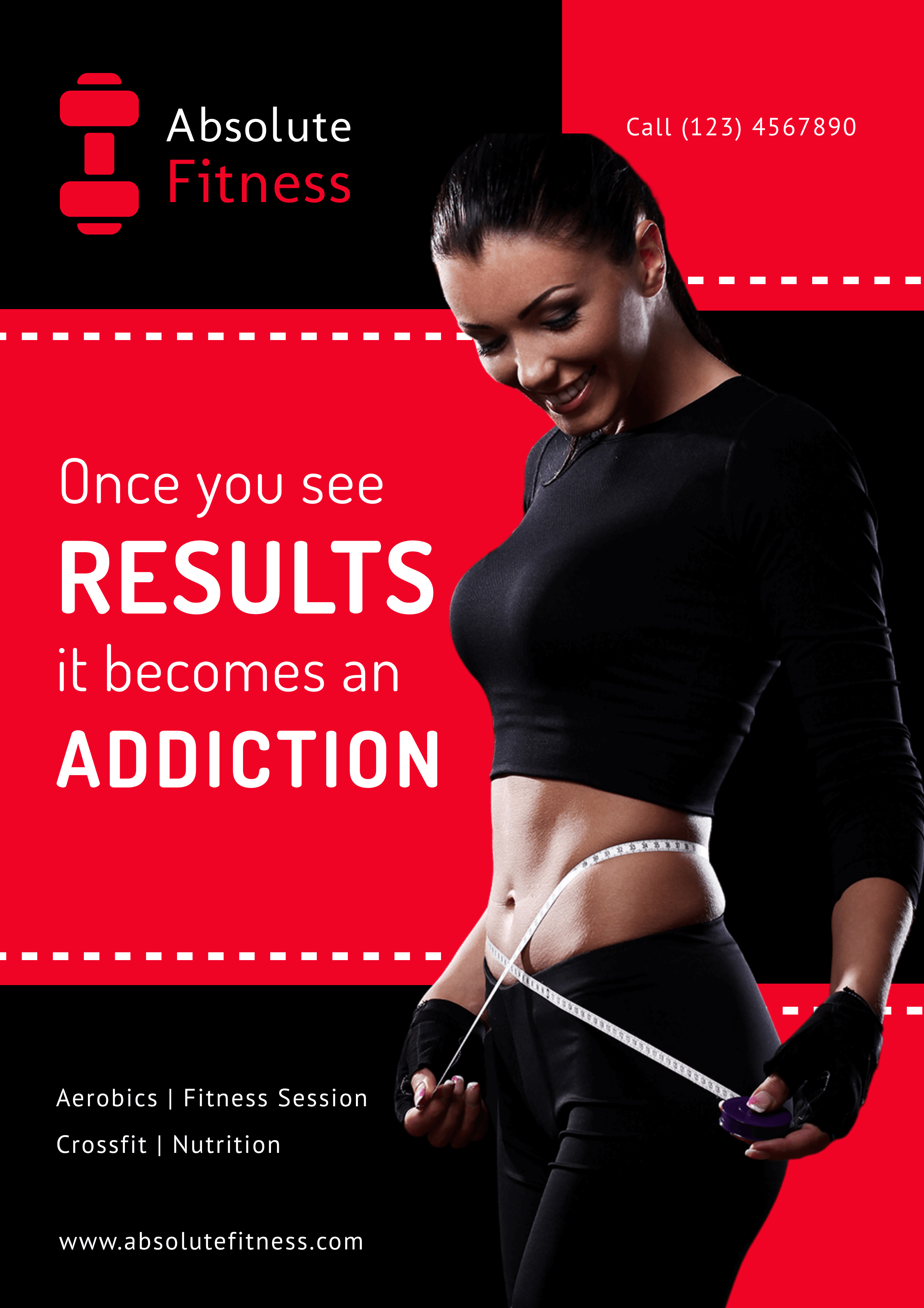
Red: Red is a color of energy and passion, and your poster with red coloring can encourage fitness enthusiasts to get attracted. Though the color can be stimulating, it increases the blood pressure in the human body. So, consider having red with whites and blacks to create harmony and contrast in your Gym poster design.
Get This Template and More
Green: To give your audience a calm feeling of the natural environment, use different shades and tints of Green. Even if the weather is not up to par, a poster with Green color will still attract an audience looking for Gym motivation.

Get This Template and More
Blue: For people who already enjoy long and steady workouts, blue is the perfect color. The calming effect in Blue helps increase productivity and concentration. Furthermore, blue has a shorter wavelength than red, making it appear less heavy and easier on the eyes. So, Blue will surely help your poster stand out and stay ahead of your competitors.

Get This Template and More
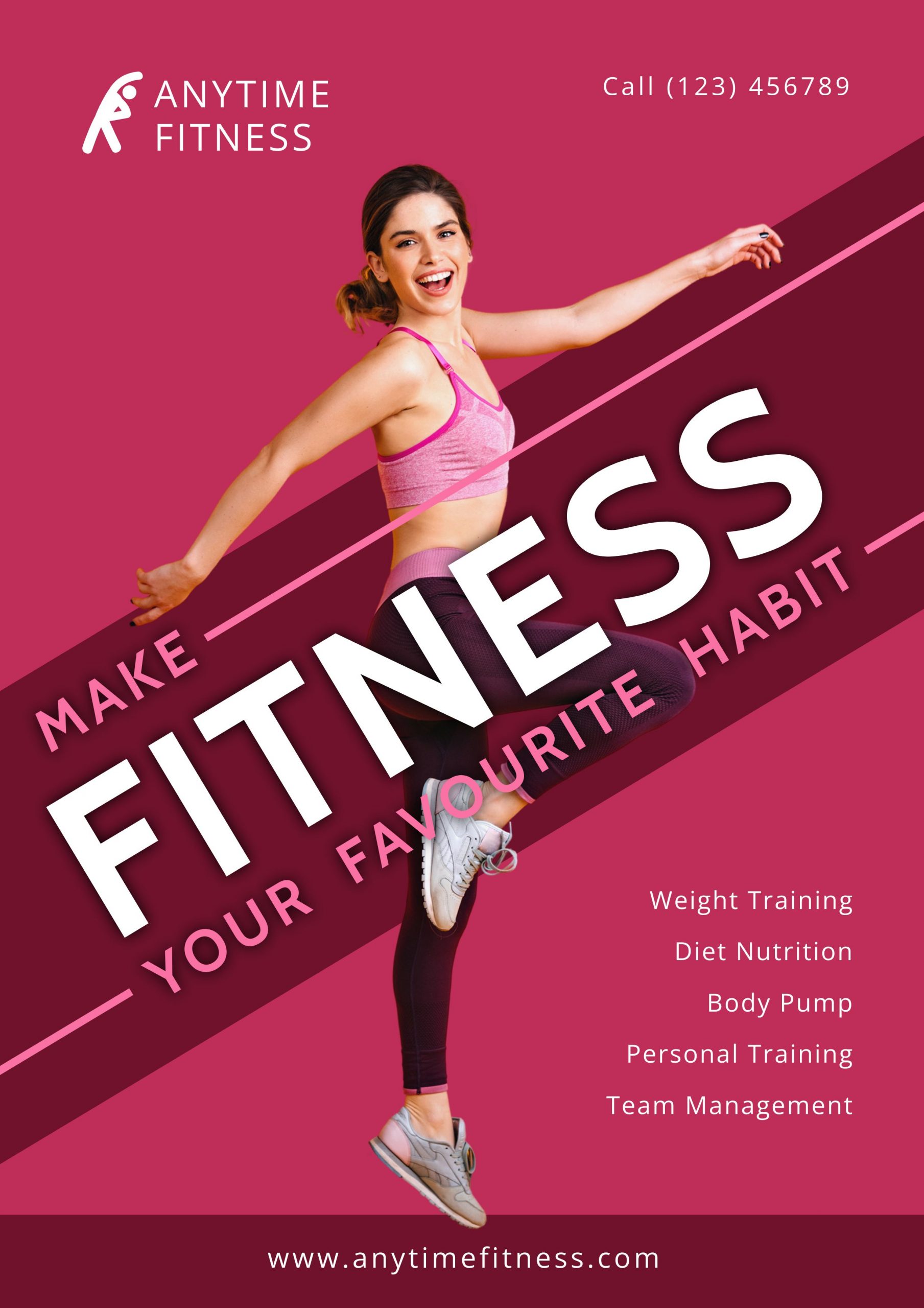
Pink: Pink is a color of relaxation. It helps muscle relaxation, anger relief, and release tension. Moreover, pink is considered a feminine color universally. So, if you have a unisex or a female Gym, consider using pink as your poster color.
Get This Template and More
Consider using your brand colors (if you have any) in the poster to create a brand identity. If you are still unsure about choosing colors for your Gym poster design, read this article on the Best Color Combinations and get inspired.
Create Enough Contrast
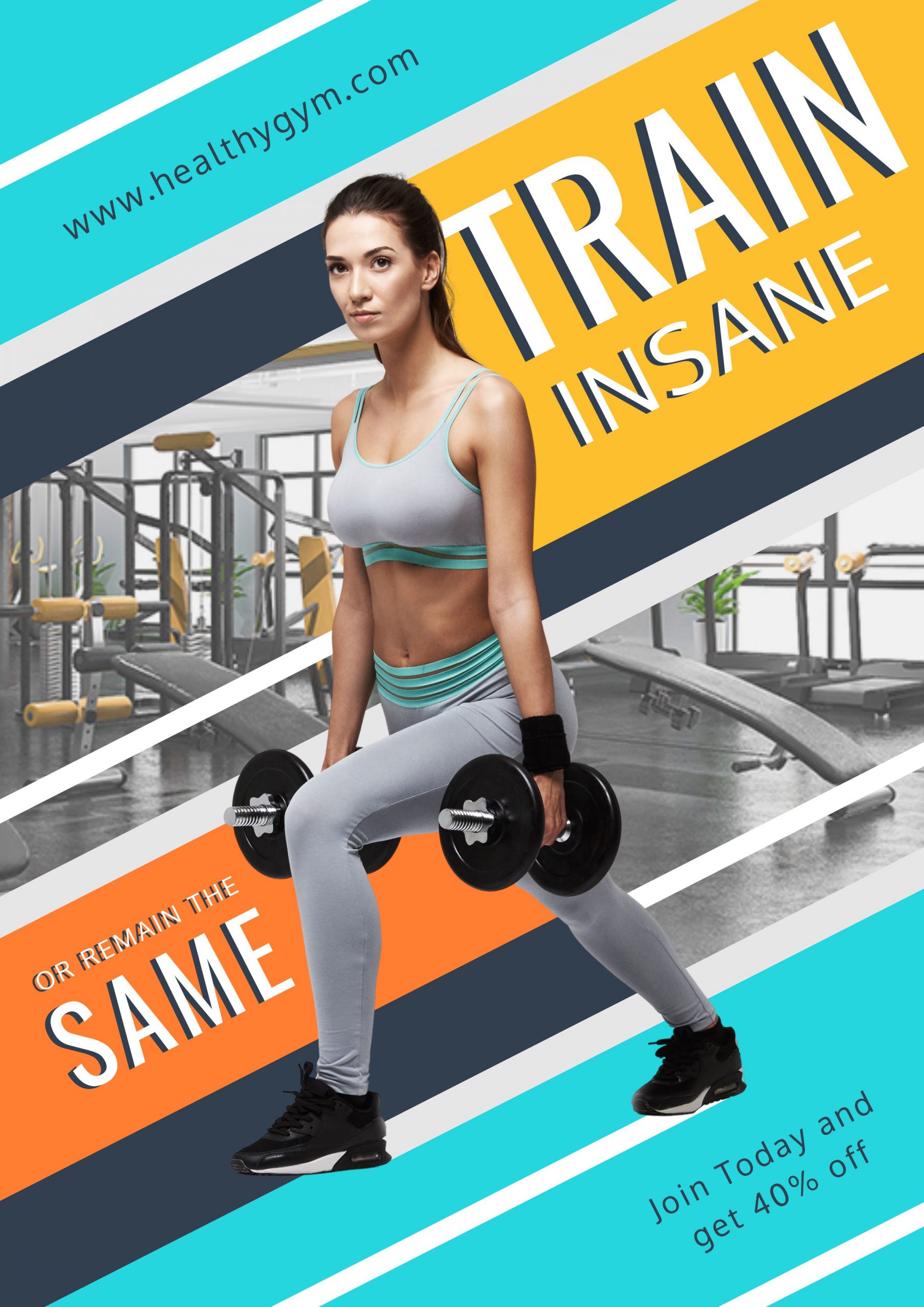
Contrast is a powerful design tool that anyone can use to add visual interest to their design. There are many ways you can create contrast in your Gym Poster design.
- Create a light color background and use dark color elements on it or vice versa.
- Don’t use more than three colors in your design – the more the color, the more confusion in your design.
- When choosing multiple colors, make sure to choose contrasting ones.
- Create contrast by selecting elements that are different from each other: Hard vs Soft, Rough vs Smooth, Flat vs Raised.
- Choose fonts from different font families – combine sans serif fonts with serifs to get the contrast you want.
Get This Template and More
Add High-Quality Images
You might come across hundreds of posters in a day. Did you notice the common thing in all those posters? They all add high-quality images. Even all the posters in this article include only high-quality photos. Since the poster is a printable document type, you need to use high-quality photos to enlarge after printing without any difficulty. A slight blurriness or pixelation can ruin the overall look of the post.

Get This Template and More
You can also go for high-quality stock images from free sources like Pexels, Pixabay, Unsplash, Freepik, and others.
Incorporate Additional Elements
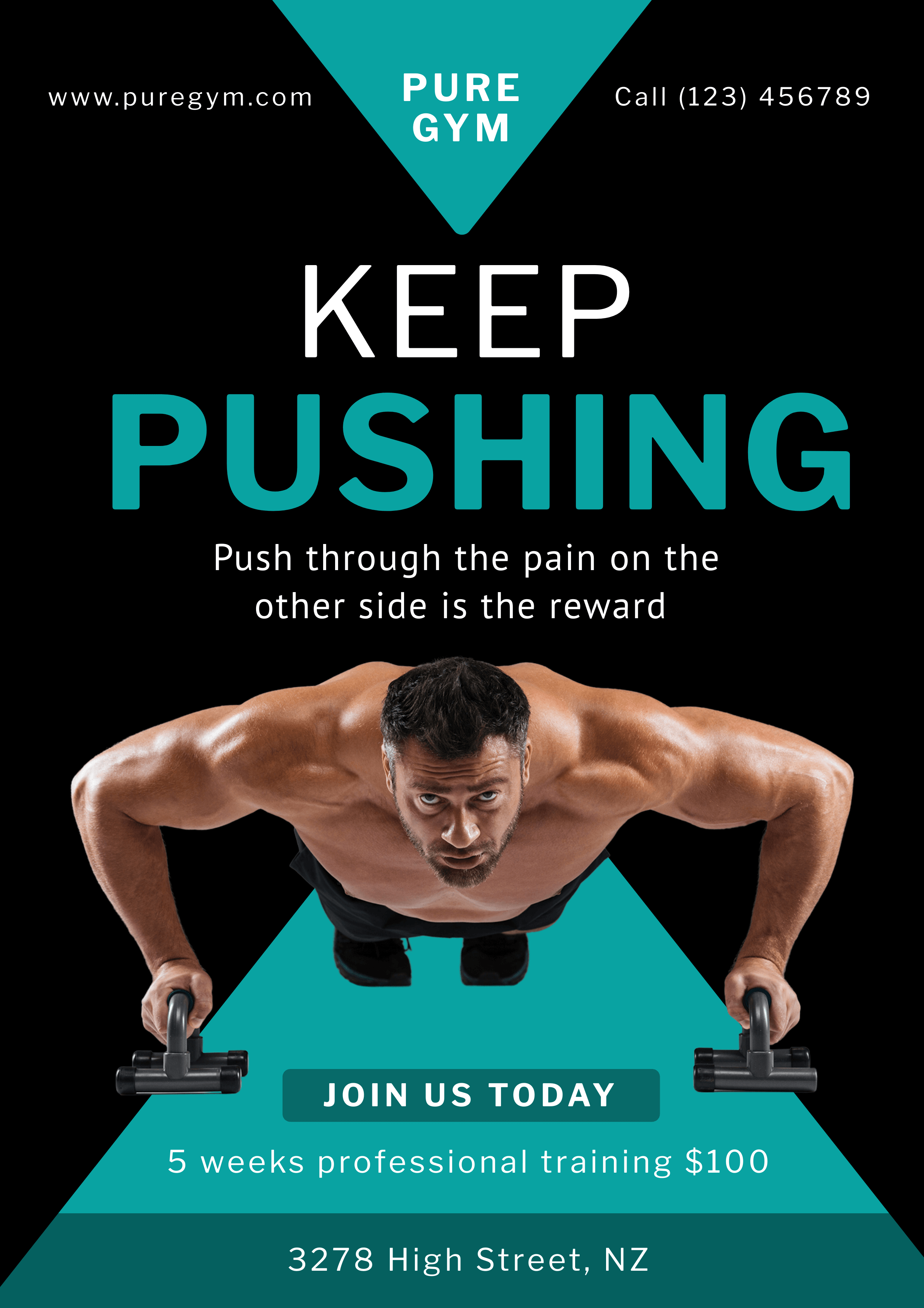
Additional elements such as shapes, lines, icons, stickers, illustrations, and others are used in posters to represent a concept. They are the perfect way to enhance your Gym Poster Design. Furthermore, they help illustrate complex ideas quickly. So, use some of the relevant design elements in your poster.
Get This Template and More
However, make sure to use the elements naturally. Don’t overcrowd your poster with elements, or it will give a wrong impression.
How To Make A Gym Poster In DocHipo
DocHipo features a wide variety of Gym poster templates and some awesome Design Widgets to help you easily design the poster. Boost your Gym membership with these eye-catching posters. Select a template you like, customize it according to your needs, and Download.
Create an account in DocHipo if you haven’t already started designing your Gym poster. Now, follow these steps below:
Step 1: Pick a Gym Poster Design Template
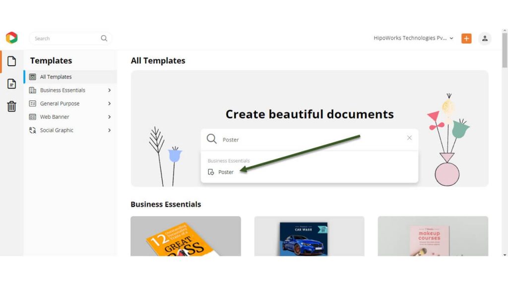
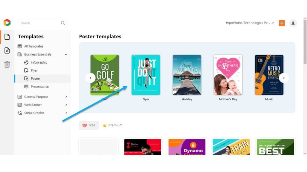
We hook you up with a wide range of professionally designed templates. Type “Poster” in the search box and click on the result to browse the poster templates.
Filter the templates by choosing the “Gym” category among the others.
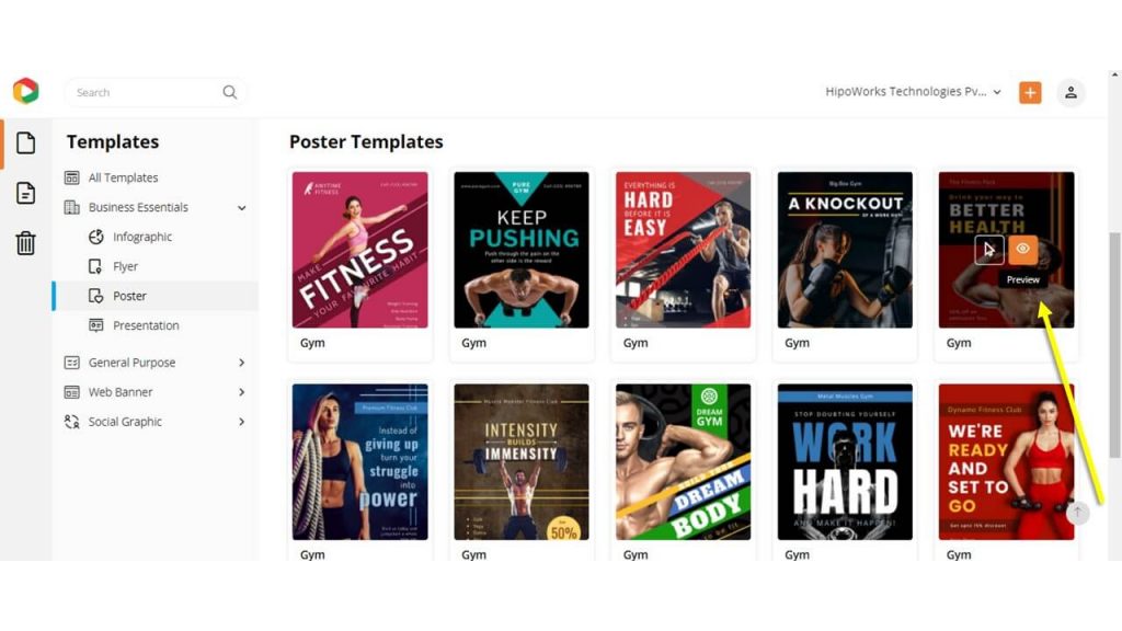
Hover your mouse over a template you like and click “Preview” to look at the template before customizing it in the DocHipo Editor.
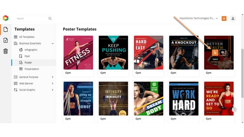
Alternatively, click “Select” if you want to edit a template.
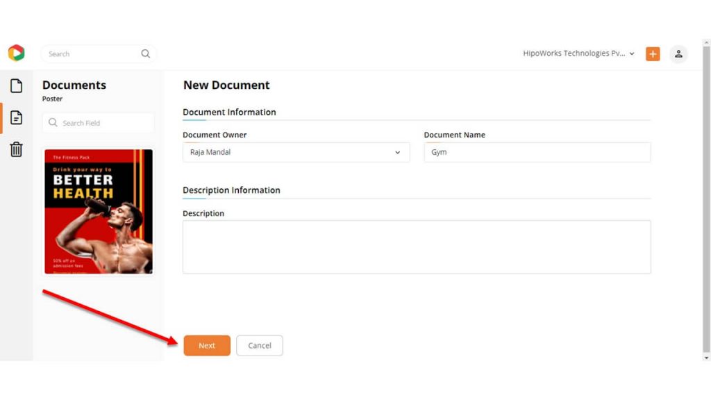
A new page will appear where you need to give a name to the document—once done, click “Next.”
Step 2: Customize the Template
DocHipo lets you customize the template in a lot of ways. Edit the text, replace the imagery, change the background, and do whatever you want. Spend as little or as much time as you want to get the perfect Gym poster. Here is how:
Change the Text
Click on the Text widget from the left sidebar and choose a text option from Heading, Subheading, and Body text. The text object will appear on the document. Double click on it and type your text.
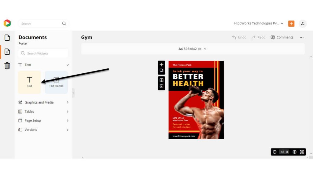
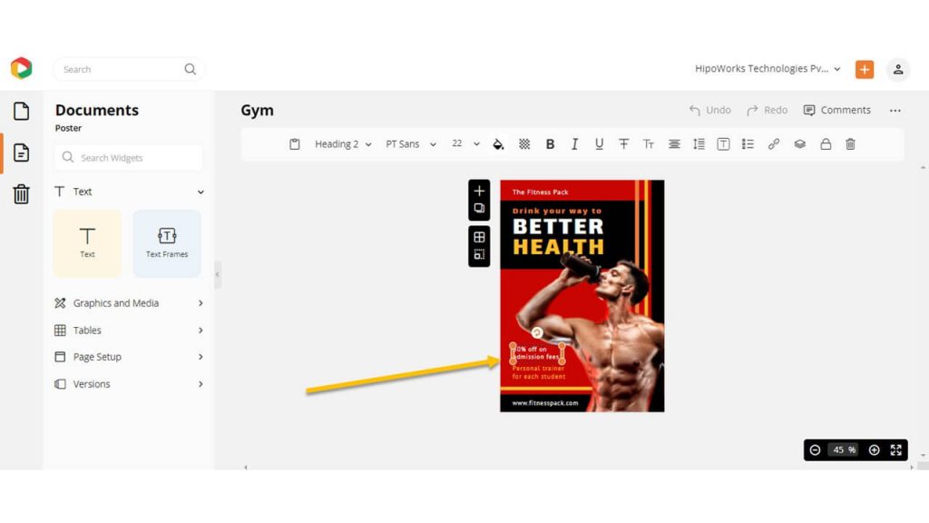
Double-click on the text to change the preexisting text, and then type your copy to replace it. Use the edit panel on top to change the font, color, size, alignment, and more.
Here is a video explaining the same.
Replace the Imagery
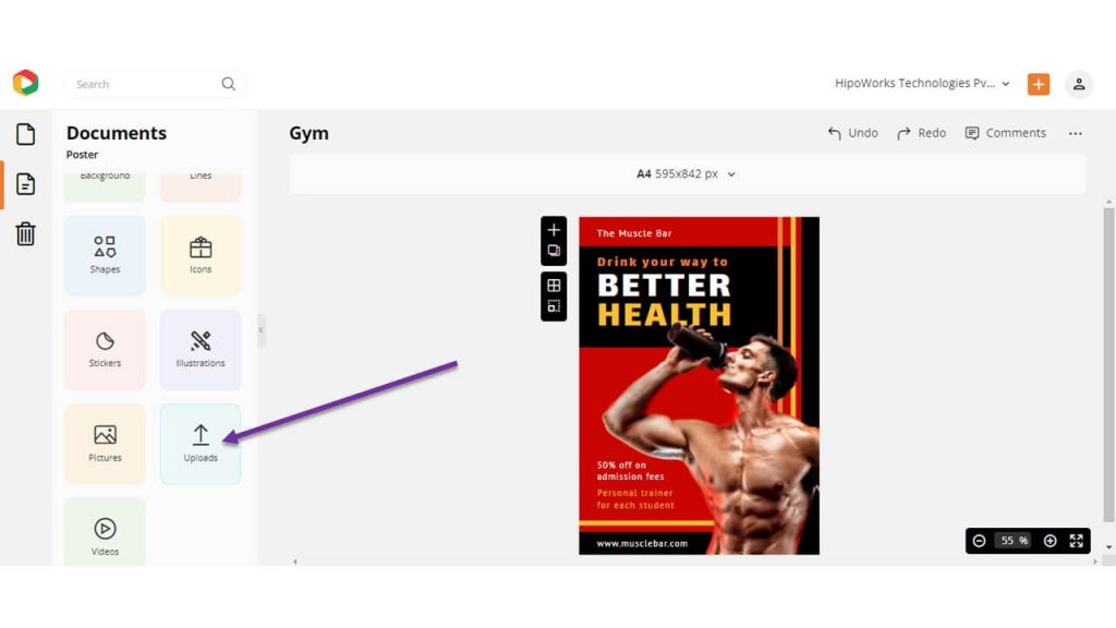
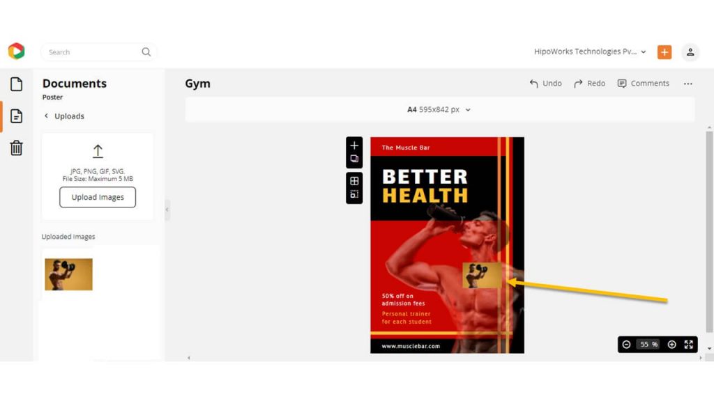
Click on the Uploads tab on the left sidebar under “Graphics and Media” to replace or add images in the template. Click Upload Images and choose files from your computer to upload them on DocHipo.
Once uploaded, drag and drop the image on the preexisting one, and it will be automatically replaced with the new one.
Remove the background of the image using Background Remover. Also, add filter, crop, and flip the image using DocHipo Photo Editor.
Customize the Background
Click the Background tab to customize the background.
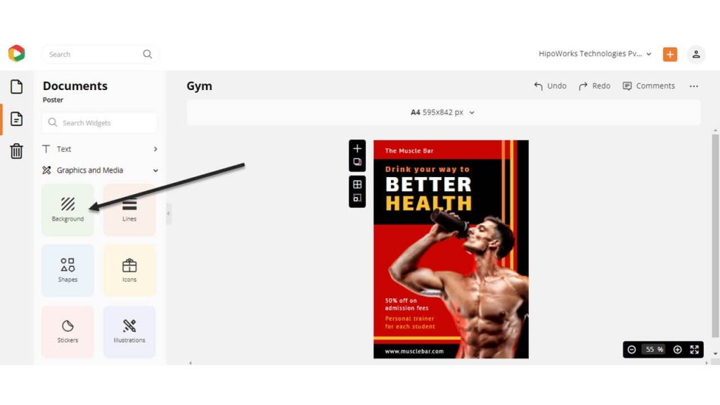
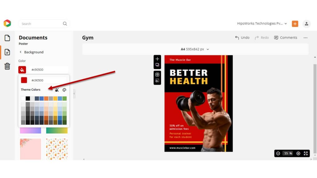
Choose any color from the presets or pick a custom color using the color picker tool to change the background color.
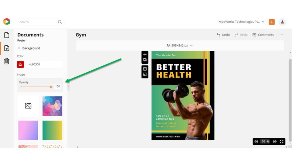
Additionally, choose any images from the list and adjust the opacity to add the texture and gradient you want in the background.
Watch the video below to learn more about the same.
Add and Edit Other Elements
Now, if you want to add some additional elements, click on the options from the left sidebar: Icons, Illustrations, Stickers, Shapes, and Lines. Also, click on any element you want to customize and use the edit panel to customize it accordingly.
Before:

After:

Step 3: Download the Gym Poster Design
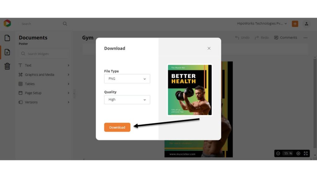
Once you are satisfied with the Gym poster design, click on the three dots from the upper right corner of your screen and choose Download from the drop-down menu to download it.
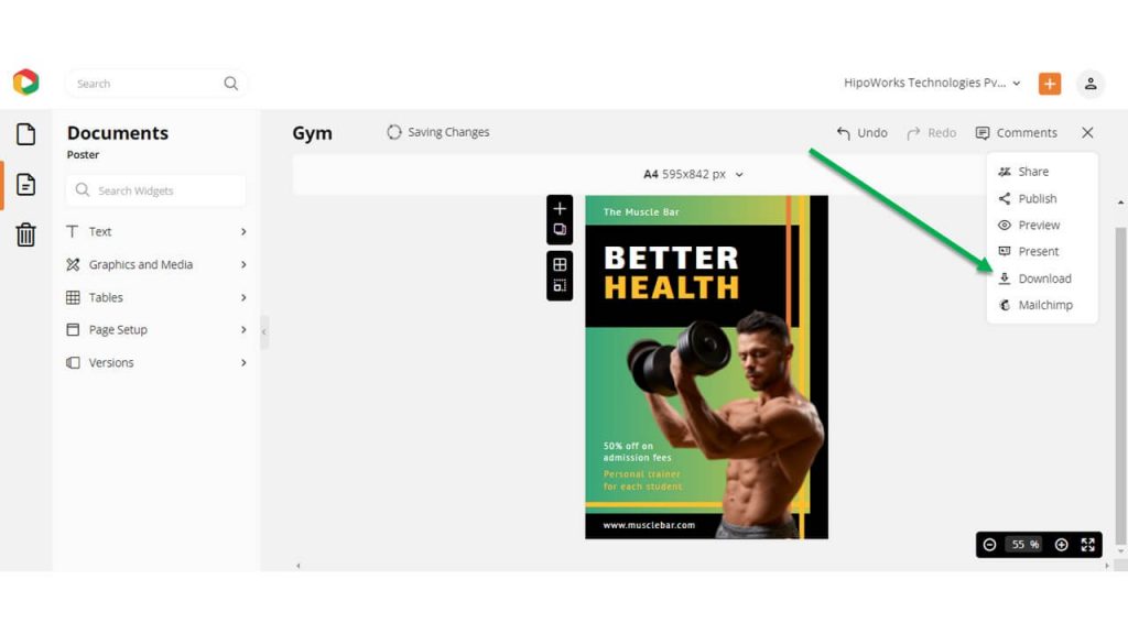
Choose your required file type and quality and click the Download button. For printable documents, we recommend high-quality downloads.
Conclusion…
Posters are one of the most effective yet underutilized marketing graphics. Most of the small and medium-sized businesses use them to deliver their message. If you haven’t included Gym poster design in your marketing plan, then you are missing out on something huge.
Use this blog post to design your Gym Poster easily, and you are all set to reach your marketing goals. Sign-up to DocHipo and get started now!
FAQ
What should be included in a gym poster?
A gym poster should include your gym name, a catchy title, services, offers, an eye-catching picture or other graphics, an intriguing call-to-action, contact details, etc.
What are some effective design tips for a gym poster?
While designing a gym poster, draft a catchy title that piques your target audience’s interest, write your services and offers in simple language and readable fonts, use high-quality intriguing pictures, and provide ample space to keep the design neat.
Can I use images of people in my gym poster?
In your gym poster, you can use high-quality and eye-catching images of people to showcase your services and pique your target audience’s interest.

