10 Graphic Design Tips for Non-Designers

Whether you’re a content creator or a business owner, excellent quality graphic design is a non-negotiable aspect. You’ll want to create appealing designs that astonish your target audience and make a lasting impression. As a business owner, you must strategically brand and market your products and services offline and online. But as a non-designer, it’s challenging to master graphic design for your content creation or manage the marketing collateral graphics. Some graphic design tips and tricks will come in handy to guide you through your journey.
10 Graphic Design Tips
- Colors: Choose a cohesive brand color scheme.
- Fonts: Select an easy-to-read typeface that matches the context and mood of your design.
- Typography: Focus on legibility, readability, and brand aesthetics.
- Imagery: Always choose high-quality relevant images and graphic elements.
- Visual hierarchy: Working on the design element’s color, contrast, typefaces with different sizes and weights, etc., to guide the viewers’ attention.
- White Space: Keep ample space to let each element in your design breathe.
- Alignment: Align the elements properly so the design looks polished, balanced, and aesthetically pleasing.
- Simplicity: Keep the design simple, neat, and uncluttered, eliminating unnecessary text or visuals.
- Ideal dimensions: optimize the design for the desired platform to prevent unwanted crops and zoom-ins.
- Functional and stunning templates: Speed up graphic design with fail-proof pre-designed templates.
This article will discuss ten practical graphic design tips for beginners and non-designers. Whether you’re designing flyers or posters to catch the attention of passers-by, consistently uploading social media posts to give tough competition to similar brands, etc., these design tips for non-designers will apply to all. I’ll also share a lot of templates from our DocHipo library for your inspiration. Let’s get started.
Table of Contents
- #1 Graphic Design Tips for Choosing Colors
- #2 Experiment with Typography
- #3 Graphic Design Tips for Choosing Fonts
- #4 Graphic Design Tips for Imagery
- #5 Graphic Design Tips to Create Visual Hierarchy
- #6 Embrace White Space
- #7 Be Intentional About Alignment
- #8 Keep It Simple
- #9 Know the Dimensions Before You Start Designing
- #10 Save Time with Templates
#1 Graphic Design Tips for Choosing Colors
While designing graphics for your brand, pick colors that will best represent or reflect the emotion you want to portray. Also, consider the following points while choosing colors:
Choose Your Brand Colors
When creating graphics for your marketing collaterals, prefer using your brand colors. The overall presence of your business, offline or online, should maintain consistency regarding colors, fonts, aesthetics, etc. This way, your audience will instantly identify your brand, thus improving brand recognition. Check out How to Pick Colors For Your Brand if you haven’t decided on it yet.
Cohesive Color Scheme
A cohesive color scheme is one where the colors are in harmony with each other and work together effectively. Such a color palette attracts attention, evokes emotions in your audience, and influences their mood. On the other hand, choosing mismatched colors will create visual chaos, and the audience will perceive your brand as unprofessional. So, strive for a color harmony that sets a tone, conveys your message, and enhances your overall graphic design. Even if you’re not from a graphic design background, you can learn the basics of color psychology and use the color wheel to create cohesive color palettes.
I love the color combinations in the Poster Template below.

Get This Template and More
Also, look at the Food Blog Banner Template. First, we picked the image and then decided on the background and text color accordingly.

Get This Template and More
Check Best Color Combinations And How To Use Them In Your Design to make your life easier.
Contrasting Colors
Contrasting colors can add life to your design and direct your viewers to focus on the vital message. You can use the “louder” colors on the text or visuals you want them to notice first to achieve that contrast.
For example, look at the Car Wash Flyer Template to understand the power of contrasting colors.

Get This Template and More
Isn’t the color contrast in the Coffee Day Square Post Template looking stunning?

Get This Template and More
Avoid Using Too Many Colors
You can go for a monochromatic look with different shades of the same color.

Get This Template and More
#2 Experiment with Typography
Typography is the art of arranging your message, focussing on legibility, readability, and aesthetics. To create great typography, consider the context and your target audience first. Communicate the message, reinforcing its meaning and sentiment that feels easy on the eyes.
Look at the typography in the Wildlife YouTube Thumbnail, Food, and Travel YouTube Thumbnail Templates, respectively, for some inspiration.

Get This Template and More

Get This Template and More

Get This Template and More
Further Reading
#3 Graphic Design Tips for Choosing Fonts
Choosing the right fonts can be powerful yet challenging. If you feel overwhelmed with the choice of fonts, you’re not the only one. Selecting mismatching fonts that don’t align with your message will convey the wrong message to your viewers.
Select a typeface or font that matches the context and mood of your design. Prioritize readability and choose easy-to-read fonts for impactful graphic design.
For example, the fonts used in the Travel X/Twitter Header Template go perfectly with the tone and mood of the design.

Get This Template and More
If you can’t read the text effortlessly against your chosen background, consider using any suitable solid shape behind the text to make it pop up.

Get This Template and More
Just like colors, don’t overload your design with too many typefaces. You can use two typefaces with three fonts at maximum.
Further Reading
#4 Graphic Design Tips for Imagery
Whether you’re designing social media post graphics or graphics for your blog, the imagery should align with the context. The visuals could be pictures, illustrations, stickers, shapes, animations, etc. Pay close attention to the quality of the visuals, no matter what document you’re designing.
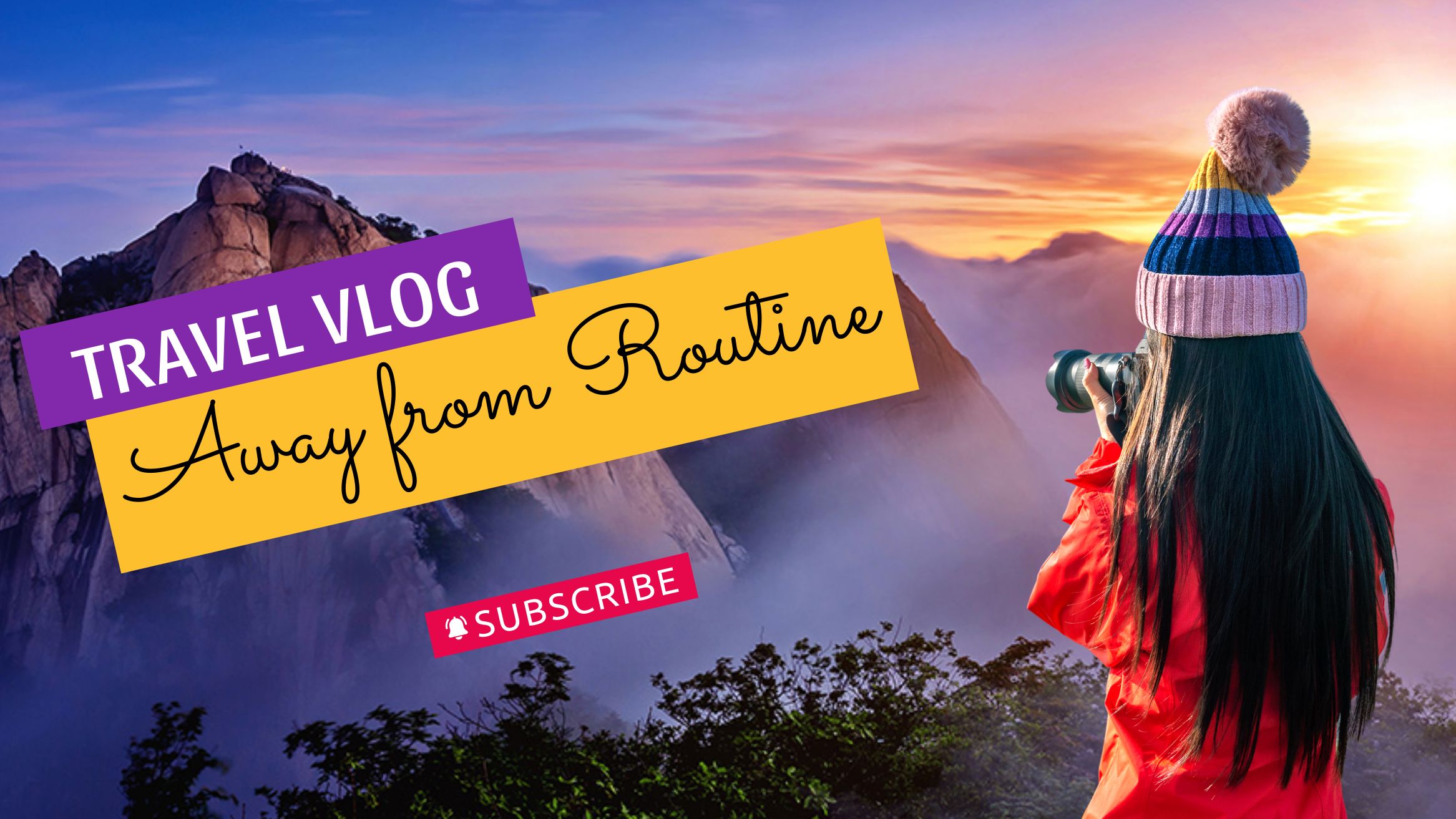
For example, the picture used in the Travel Blog Banner Template is so mesmerizing that it’ll instantly drive readers into your travel blog.
Get This Template and More
Also, look at the Food Square Post Template; the picture seems so mouth-watering and irresistible.

Get This Template and More
You can use stock images in your design from the DocHipo library or upload your own. After that, depending on the context, you can leverage our in-built photo editor feature to enhance images.
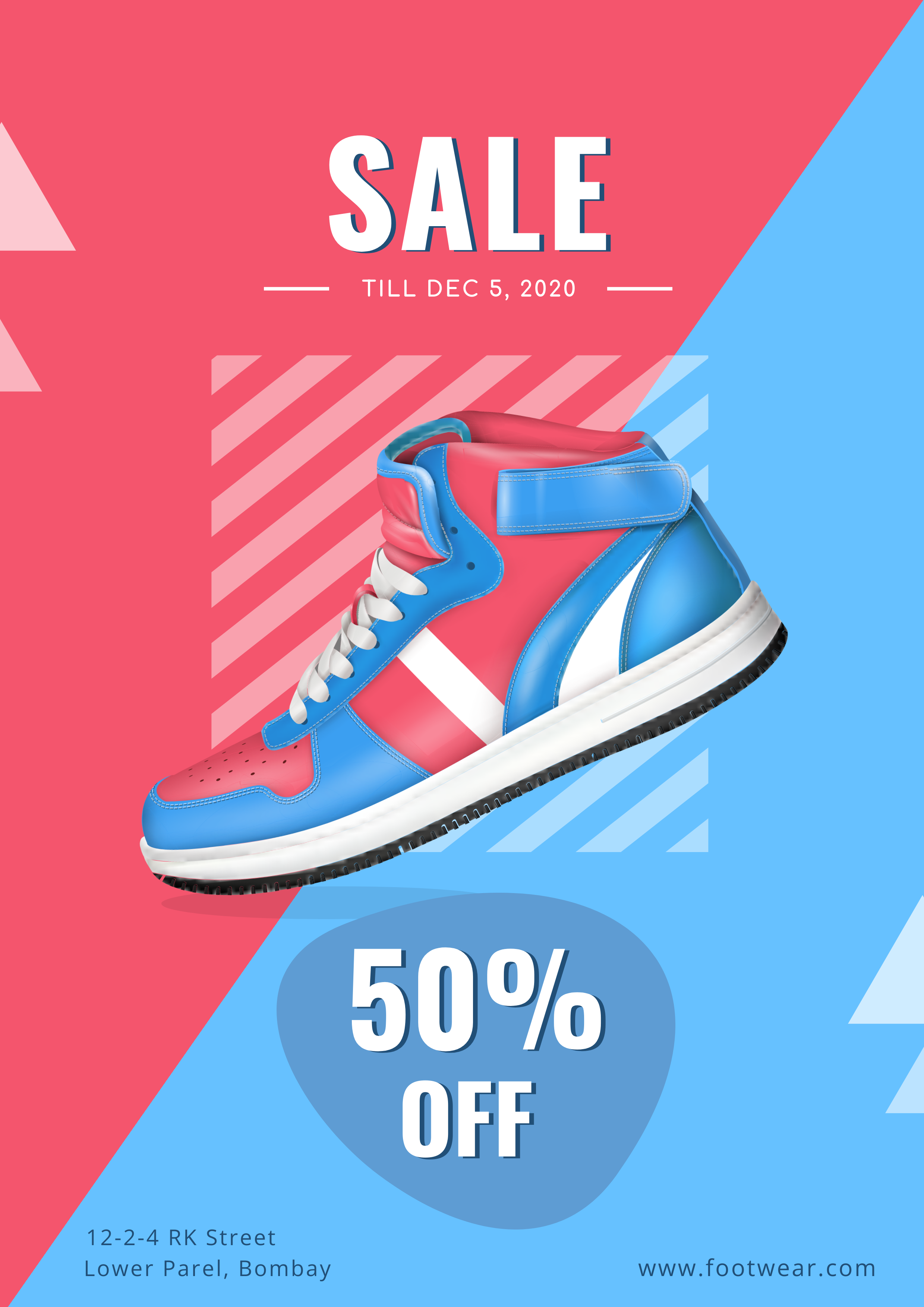
You can also use an image by removing the background for a pleasant and professional look.
Get This Template and More
DocHipo comes with a built-in one-click background remover to ease your job.
Watch our quick tutorial on the same.
#5 Graphic Design Tips to Create Visual Hierarchy
Visual hierarchy simply refers to the arrangement of design elements that guide the viewers to look at them in order of importance. Its purpose is to bring your audience’s attention to the main message and follow your desired order. You can create a visual hierarchy by working on the design element’s color, contrast, typefaces with different sizes and weights, etc. Read Typography Hierarchy to convey your message in the order you want.
Take the example of the Food Facebook Ad Template below. You read the menu first, that is, FRIED CHICKEN, then notice the discount of 70% and at last the Call to Action, “Order Now.”

Get This Template and More
#6 Embrace White Space
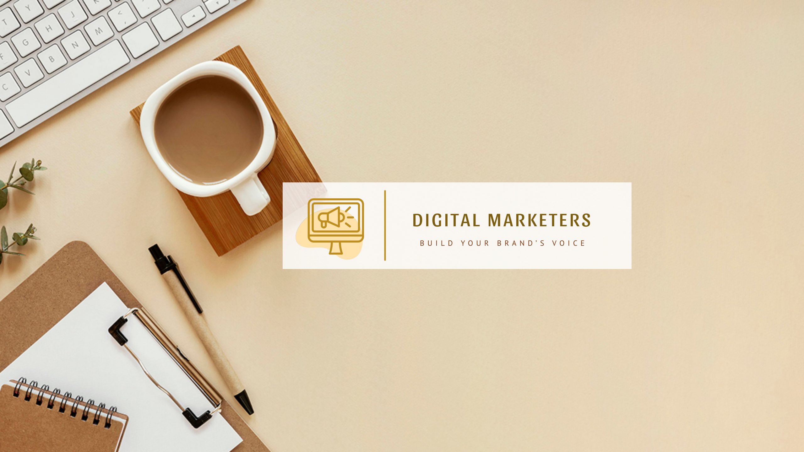
White space is a blank space where you let your design breathe. Simply put, it’s the area in your design with no text or elements. Create balanced compositions so the design doesn’t feel congested, and each element has at least some space around it.
For example, look at the Business YouTube Banner Template with a clean and professional look.
Get This Template and More
#7 Be Intentional About Alignment
Aligning the text or other graphic design elements doesn’t necessarily mean placing them perfectly centered or stacking them on top. Instead, place them so the design looks polished, balanced, and aesthetically pleasing. Also, ensure there is ample space for each element. This alignment applies to text blocks, shapes, icons, etc.
For example, observe the text alignment in line with the shape used in the Food X/Twitter Header Template.

Get This Template and More
Grids in DocHipo will help you a lot with perfecting the alignment.
#8 Keep It Simple
The key message or its meaning gets lost under the burden of chaotic graphic design, resulting in poor readability. If you overdo the design, it’ll look cluttered and lose its essence and effectiveness. The viewers will feel overwhelmed looking at it and get distracted from your key message. So, this hard work leads you to nowhere.
Don’t stuff your design with unnecessary text or graphics. Strive for a balance between text and graphics to ensure your crucial message reaches your audience without confusion.
For instance, check out how the Travel X/Twitter Header and Fashion YouTube Banner Templates are rocking it with minimalistic design.

Get This Template and More
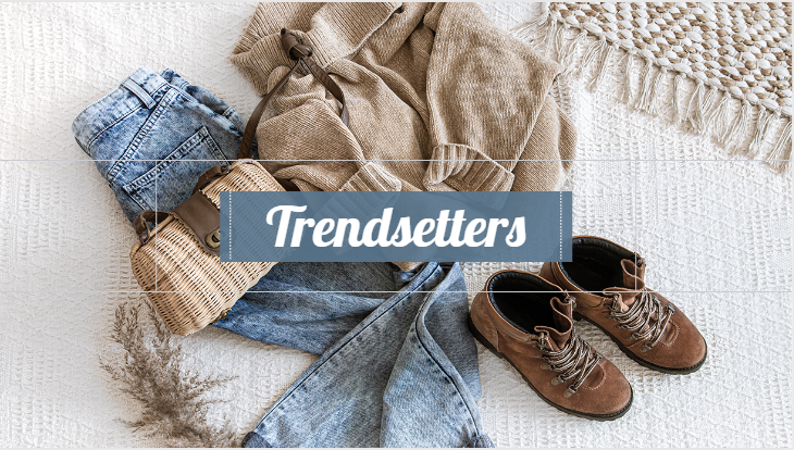
Get This Template and More
So, you can showcase your creativity even by embracing simplicity.
#9 Know the Dimensions Before You Start Designing
Different social media post graphics and web banners have different ideal sizes. Knowing the perfect dimensions (length and width in pixels and the aspect ratio) is essential to prevent unwanted crops and zoom-ins.
The great news is that DocHipo’s templates already come in pre-defined perfect sizes. Also, the smart-resize feature lets you change one document format into multiple others. So, you’re sorted for all your social media platforms.
Here’s a quick demo of the smart resize capability.
Further Reading
#10 Save Time with Templates
Pre-designed templates work as your foundation and significantly speed up the design process. It takes away the hassle of coming up with the perfect color combination, font pairings, types of visuals that work the best with the rest of the design, etc. So, even without much experimenting, you’ll know what works, and you just need to tweak it a little to serve your design needs.
DocHipo offers stunning templates for flyers, posters, logos, book covers, web banners, social media graphics, advertisement graphics, and so much more. The web banners include blog banners, email headers, Facebook covers, LinkedIn banners, X/Twitter headers, YouTube banners, etc. Hence, you never have to compromise with consistency or great quality designs while maintaining your online presence.
Watch our video to find templates by format, industry, or occasion.
Need a quick recap of the graphic design tips for non-designers? Here you go:
Start Your Graphic Design with DocHipo
You don’t necessarily need a graphic design background to create professional-looking designs. Utilize the graphic design tips for non-designers discussed above to guide your stunning creations. Hopefully, you loved the templates as examples shared above; you can customize and use them immediately. However, you can take inspiration from the templates and emulate them for your design. Explore all our templates, sign up to DocHipo, and fast-track your graphic design journey.
FAQ
How can non-designers stay updated with design trends?
Non-designers can subscribe to top design blogs, attend design-related webinars and conferences by industry experts, and follow design professionals on social media platforms like Instagram, Pinterest, X/Twitter, or LinkedIn to stay updated on design trends.
How can non-designers utilize white space in their designs?
Non-designers can utilize white space to emphasize key elements and make them stand out. They can use whitespace around text blocks, such as paragraphs and lines, or around the margins to enhance readability. Furthermore, it helps achieve balance and harmony in an overall design.
What considerations should non-designers have for using images and graphics?
Non-designers should consider the following while using images and graphics:
– Use royalty-free or properly licensed images and graphics
– Use high-quality, high-resolution pictures
– The images or graphics should align with the context and message of the design
– Use the appropriate file formats


