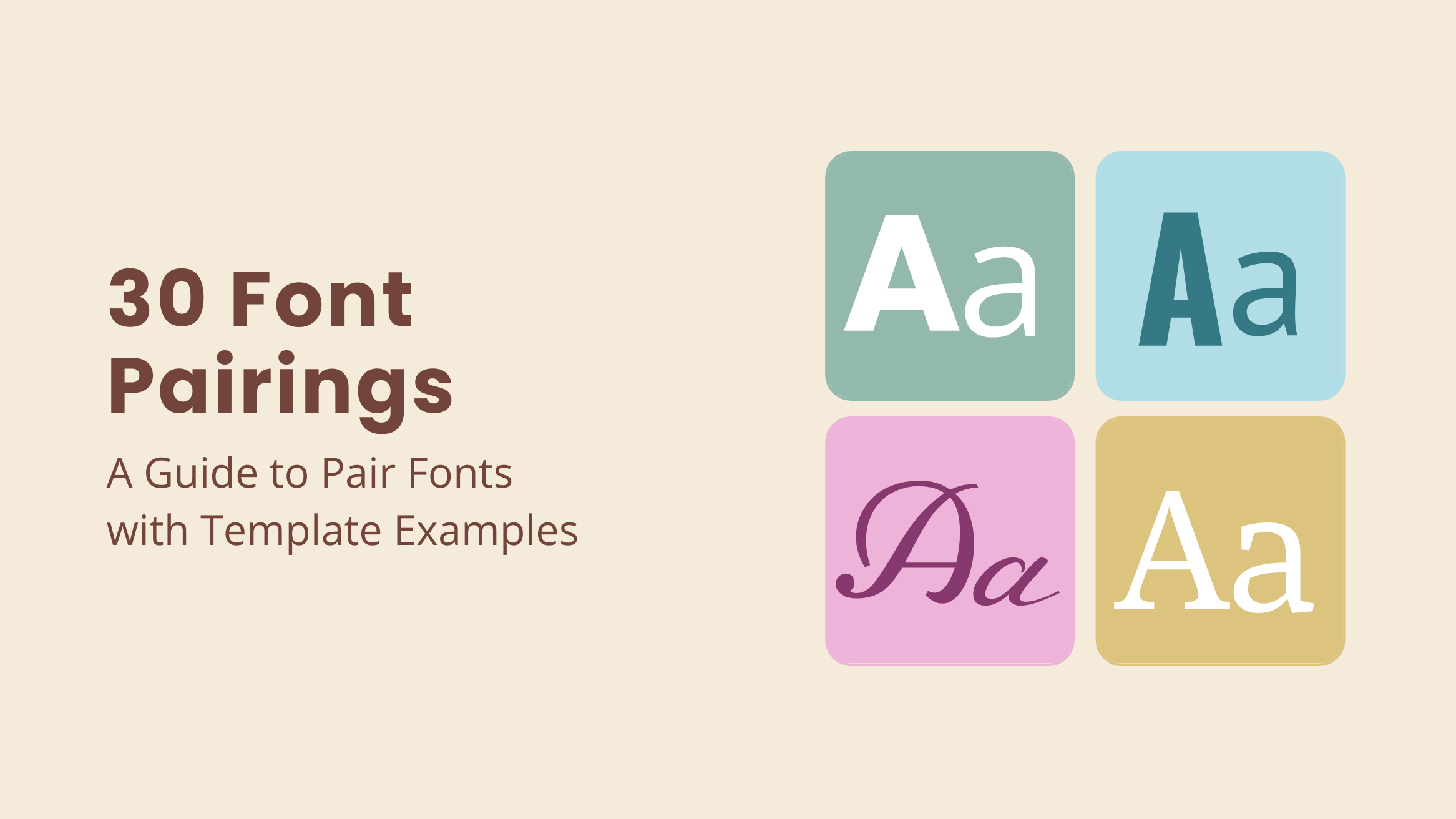
30 Font Pairings: A Guide to Pair Fonts with Template Examples

What makes a good design a great design? Even a design without an image but text can compel your audience to respond. So, what’s the secret sauce? We have often heard it’s more important how you say than what you say. That’s where font pairings create their magic.
An excellent design needs a fantastic font pair to enhance its overall appeal. However, you are likely to use two or more fonts as the headings and body of your document. The right font pairings set the desired tone of the document and hit the right chord with the audience.
Yet, selecting the best font pair can take time and effort. Some font pairs look like a match made in heaven, while other font combinations clash terribly when combined. Don’t worry; we have compiled some combo font pairs for your purpose.
Font Pairings
- Great Vibes + PT Sans: Beautiful font for Christmas.
- Fugaz One + Oswald: Bold typeface for informing about events.
- Parisienne + Molengo: Sophisticated font for wedding invitations.
- Oswald + Open Sans: Clean fonts suitable for a resume.
- Alfa Slab One + Open Sans: Bulky font for the gym and fitness industry.
- Yellowtail + Hepta Slab + Open Sans: Best design font for the travel industry.
- Bad Script + Anton + News Cycle: Ideal for restaurants and food menus.
- Poirot+Petit Formal Script+ Teko: Clean and sleek fonts for beauty brands.
- Roboto Condensed + Yanone Kaffeesatz: Elegant pair for real estate.
- Merriweather Sans + Niconne + Old Standard TT: Diverse magazine font styles.
- Julius Sans One + Fira Sans: Suitable for education brochures.
- Cinzel Decorative + Playball + Playfair Display: Ideal for elegance and luxury.
- Cabin Sketch + Qwigley + Poppins: An artistic font combination.
- Montserrat + Monte Carlo: Contrasting font pair.
- The Girl Next Door + Oswald: Handwritten typeface appeal.
Read further to explore all 30 font pairs with suitable use cases.
Explore these thirty tried-and-tested font pairings with this blog. Each font pair illustrates a use case based on events, occasions, industries, social media, and the design’s look and feel. In addition, get free template examples featuring these font combinations, saving you valuable time and effort.
Table of Contents
- Why Font Pairings Matter for Your Design
- How to Pair Fonts
- Font Pairings for Events and Occasions
- Font Pairings for Professional and Business Documents
- Font Pairings for Marketing and Advertising Collateral for Different Industries
- Font Pairings for Publishing Magazine and Book Covers
- Font Pairings for Educational Purposes
- Font Pairings for Social Media
- Font Pairings that Evoke Certain Emotions and Vibes
- FAQs
Why Font Pairings Matter for Your Design
When it comes to a design centered around text, the fonts you choose play a crucial role in how your audience connects with the text. Consider the font pairings below. Which one best expresses gratitude?
The font pairings on the right side of the image beautifully portray harmony, while the ones on the left may feel out of place. The aesthetically pleasing fonts on the right exude a soothing effect on our eyes, ideal for expressing gratitude. That’s the magic of font combos in a design.
Most importantly, you should ensure the fonts are legible and do not create chaos when combined. Fonts evoke different emotions depending on the combination and typography hierarchy. That means your heading will draw the viewer’s attention at first glance. In contrast, the body of the text should be simple and have little sophistication. Keep reading to get some crucial insights and examples of font pairing.
How to Pair Fonts
Pairing different types of fonts can be time-consuming, as it requires checking the compatibility of several fonts. To save you time and effort, here are a few things to consider while doing so.
Understand the Font Classification
Various font categories include Serif, Sans Serif, Slab Serif, Script, and Decorative. All types of font pairings in a design combine these categories. You can also create variations using different typefaces of the same font to pair them in a design.
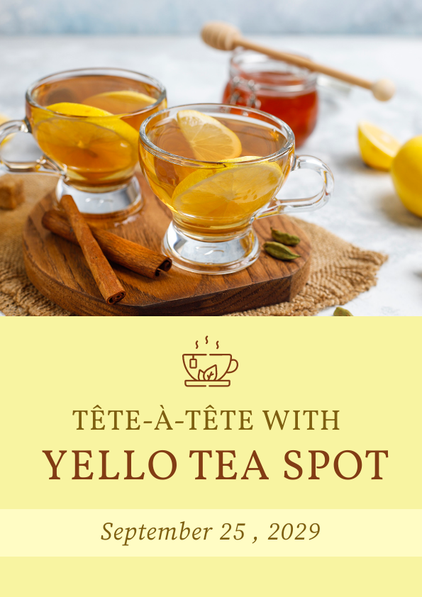
Each of the font combos has a distinct effect on the viewer. Here’s a peek at a pair of matching fonts, Vollkorn, and Source Serif Pro, from DocHipo’s Flyer templates.
Get This Template and More
Learn How to Choose Fonts for Your Design for more details about the font types.
Create Contrast between Font Types
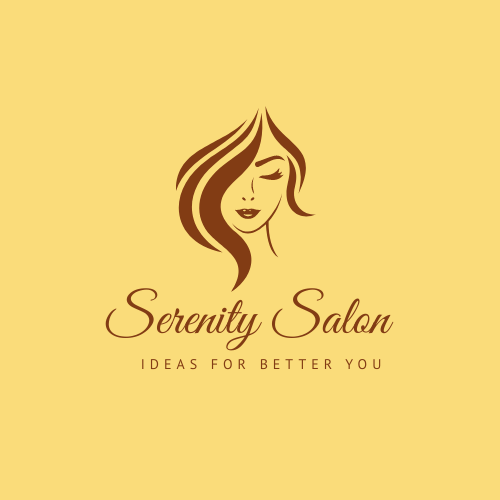
A contrast in design creates intrigue for the viewer. Contrasting fonts make a beautiful symphony of visual aesthetics. When you add a sophisticated font with a simple, bold one, our eyes trace the flow of the lines and rest on the rounded letters. For instance, look at the font combinations Great Vibes and PT Sans from one of the designs in DocHipo Logo templates.
Get This Template and More
Consider Font Size and Hierarchy
As a golden rule, remember to choose complicated fonts to draw attention and simple fonts for the body of the copy in a document. It ensures clarity and readability in a design, preventing unnecessary chaos. The harmony of the design largely depends on the typography hierarchy.
To illustrate, look at this blog banner combining Sacramento and PT Sans fonts in different hierarchies. Further, check out the extensive Blog Banner Templates from DocHipo.

Get This Template and More
If you need help deciding where to start pairing fonts for your designs, explore these font pairs suitable for various purposes. The following sections explore thirty on-point font pairs ideal for numerous occasions, industries, document types, and expressions.
Font Pairings for Events and Occasions
Designs related to events and occasions should exude a festive vibe with creative typography. These occasions can be a significant day in a person’s life. Thus, we aim to evoke excitement and enthusiasm for such documents for the occasion. Here are a few font pairs for various occasions.
1. Wedding: Parissiene + Molengo
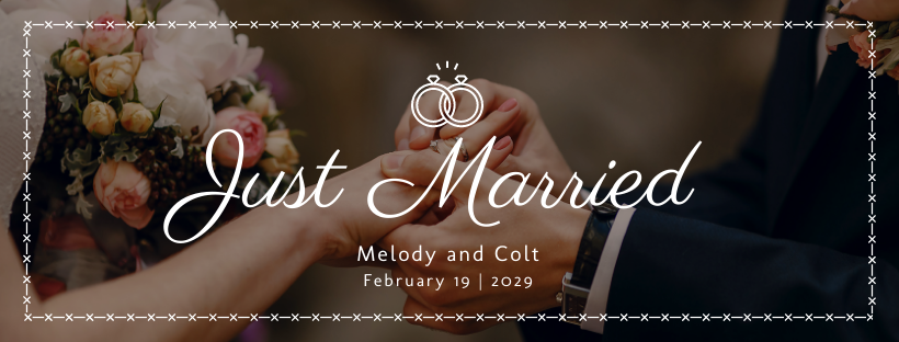
A sophisticated heading with a flair of Parissiene with cleanly spaced Molengo as the body sets the aisle for wedding bells. This is your go-to choice as wedding font combinations for social media and invitations. The high rise and smooth sliding fall create a harmonious duo with simple fonts in the Sans category.
Get This Template and More
2. Birthday: Poppins + Open Sans
Poppins have a clean and bold appeal suitable for conveying a message in the display font. In Birthday invitations, you can use Poppins to highlight the name and age along with Open Sans as the body of the design, as shown in the template design below.

Get This Template and More
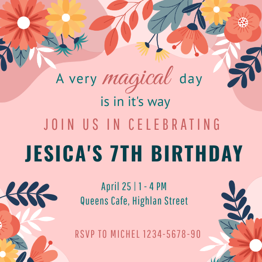
Further, if you use more than two fonts, you can choose Oswald, Pathway Gothic One, and PT Sans as heading, subheading, and body, respectively. Look at this beautiful design from DocHipo’s Birthday Invitation templates using these fonts that pair with oswald.
Get This Template and More
3. Christmas: Great Vibes + PT Sans
Great Vibes is your go-to font for creating an alluring festive vibe. Combined with PT Sans, the design gives an organized appeal while maintaining the hierarchy. It also makes a pleasing contrast, creating an eye-pleasing visual story. Here is a charming template from DocHipo’s Email Header Templates.

Get This Template and More
4. Thanksgiving: Dancing Script + Raleway
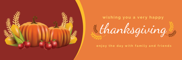
Another delightful combination of fonts for festivities is Dancing Script and Raleway. The font pairings ooze with merriment, complimenting the joyful aura of a design. Look at this Thanksgiving email header with font pair Raleway and Dancing Script as the display fonts.
Get This Template and More
5. Invitation: Russo One + Pathway Gothic One + Poppins
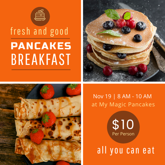
If you want to stand out with your invitation designs, Russo One with Pathway Gothic will help. The font combo’s condensed and clean form makes it the perfect choice for headings. As you can see in this invitation template, you can choose fonts like Poppins and Open Sans for the body.
Get This Template and More
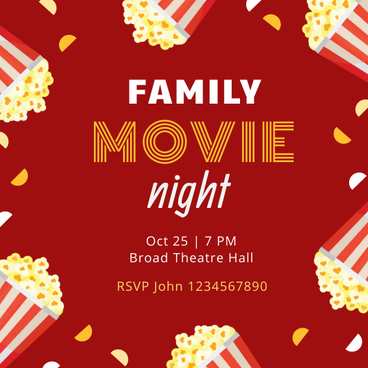
In addition, if you wish to evoke excitement around your invitation, express it more with fonts like Monton, Paytone, and Allan in the heading. Get inspired with this Movie night invitation template from DocHipo.
Get This Template and More
6. Sports Events: Fugaz One + Oswald
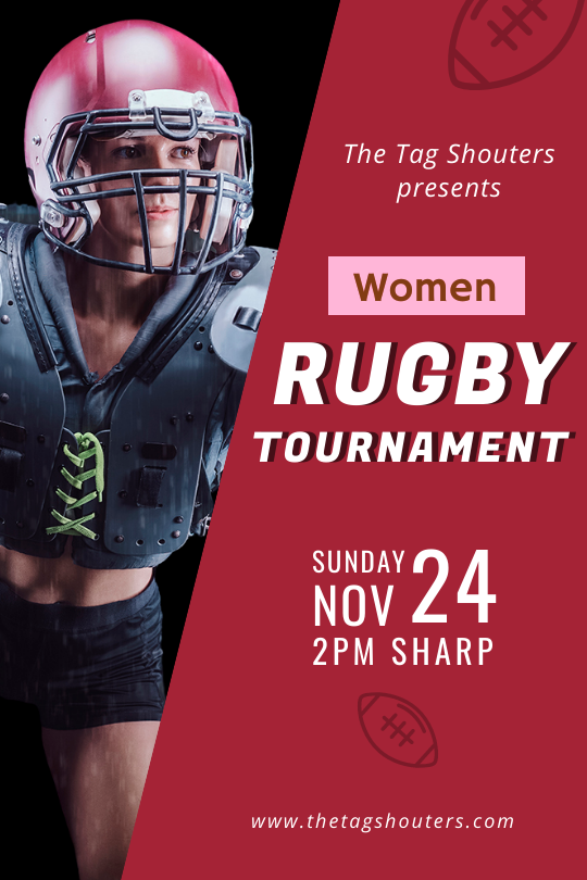
For sports events, you need a bold typeface like Fugaz One and a lightweight font like Oswald. Pairing strong fonts while balancing the heading’s bulkiness with the sleek font in the body, like one of the Tumblr Graphic templates, is an excellent technique. Here, the shadow in the text elevates the font’s appearance.
Get This Template and More
In essence, complementing the meaning of the text with the font type is the key to bringing symbolism through font pairings.
Font Pairings for Professional and Business Documents
Font pairs in business documents should be neat and minimalistic. Thus, avoid using decorative fonts that are more suitable for personal use. In the professional sphere, sleek font pairing helps you effortlessly convey information to the viewer. Here are some examples of the best formal combination of fonts for various business documents.
7. Resume: Oswald + Open Sans
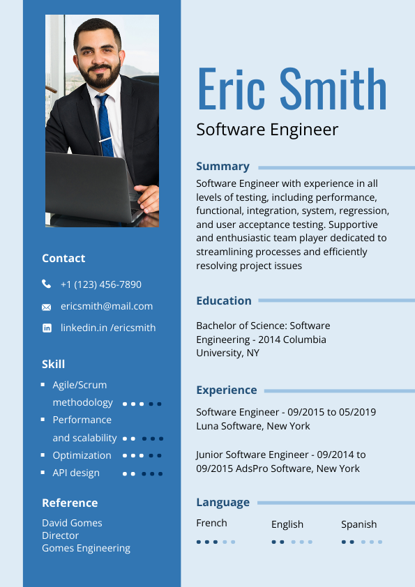
You can use Oswald and Open Sans in most text-dense documents like resumes. In these designs, you should stick to only a pair of fonts for the heading and the copy. The font combination is easy on the eyes and organized. Check out this template from DocHipo’s collection of Resume templates.
Get This Template and More
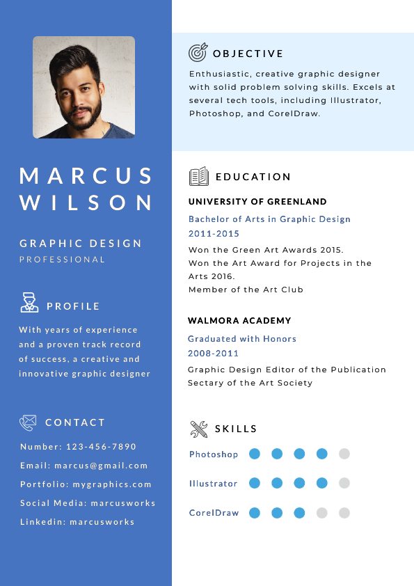
If you want to stand out with the font pair in your resume, opt for Lato and Montserrat. When combined with Montserrat, Lato brings modernity to your design. Together, they help you achieve a clean layout without boredom with the fonts.
Get This Template and More
8. Presentation: Poppins + Open Sans
Poppins is another font that pairs well with Open Sans, which you can use to sprinkle creativity into your presentations. The letters’ roundedness in Poppins eases the stiffness we often find in professional documents. Since the presentations must be eye-catching, using Poppins for headings elevates your slides.

Get This Template and More
While making presentations, you should aim to represent your industry with the fonts. For instance, this presentation template uses the font Michroma as the heading with Open Sans. Michroma makes the letters more angular, representing modern technology in the design, which is suitable for a presentation about gadgets.

Get This Template and More
9. Business Card: Asap Condensed + Poppins
A business card is significantly smaller than other business-related documents. Therefore, using clean fonts is necessary for cards to tell about your business. However, your card should make an impression on the viewer at first glance. You can pair fonts like Asap Condensed with Poppins for a minimal yet casual look. Check out this template with a similar font pairing from DocHipo’s Business Card templates.

Get This Template and More
Another way to create good font pairs in design is by combining different typefaces of the same font. To illustrate, here is a business card template with Source Sans Pro font in various forms.

Get This Template and More
Font Pairings for Marketing and Advertising Collateral for Different Industries
Designing a document for advertisement requires a compelling copy and an eye-catching font. Your brand voice depends on the industry and target audience. Further, an attractive font pairing will help you to draw attention to the most crucial details. We have aligned font pairs for various industries to simplify pairing fonts for marketing purposes.
10. Fashion: Libre Baskerville + Playball + Open Sans
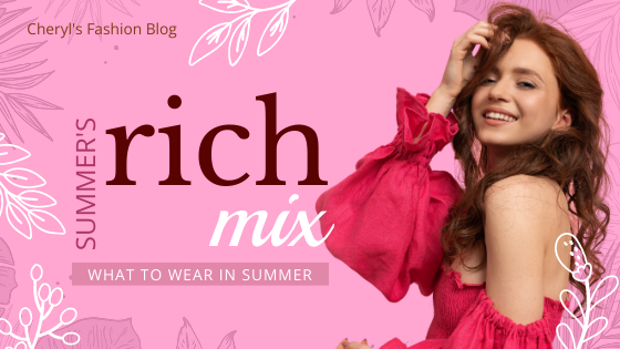
In the fashion industry, a vivacious design needs font combinations that set the right mood. Pairing Libre Baskerville with Playball in the heading makes an enchanting duo. For instance, in DocHipo’s Fashion Blog Banner template design, the font pairing creates a lovely contrast of design and colors.
Get This Template and More
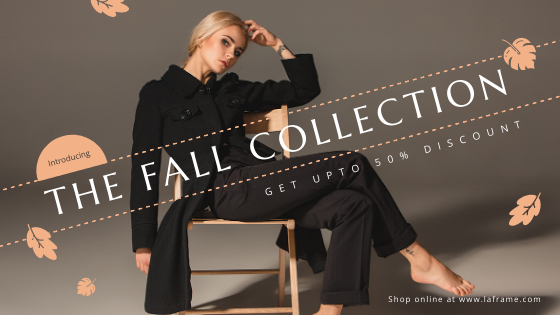
If your fashion brand uses muted and subdued tones, font pairings like Marcellus SC and Open Sans communicate the charm of minimalism.
Get This Template and More
Discover more font pairs for your fashion brand by exploring DocHipo for Fashion.
11. Gym and Fitness: Alfa Slab One + Open Sans
Alfa Slab One belongs to the Slab Serif font type, which is the best fonts for heading because of the slab-like thickness of the typography. Therefore, when coupled with an Open Sans, the Alfa slab one font pairing is ideal for gym and fitness-related designs. For example, the below one from DocHipo’s Poster templates collection exhibits the bulkiness of the weights, aligning design, and typography in the document.

Get This Template and More
12. Travel and Adventure: Mouse Memoirs + Philosopher
Mouse Memoirs is another striking, bold, yet amusing font that helps you stand out. This font is best paired with a Philosopher to contrast the design. The duo complements any design related to travel and adventure. For inspiration, take a look at this travel blog graphic template.

Get This Template and More
Moreover, other font pairings that work well for the travel industry are Yellowtail and Hepta Slab. As you can see in the template below, Yellowtail font pairing with Hepta Slab is a fun combination. Yellowtail has a fat brush script typeface as the display text, while the Hepta Slab gives the body a firm structure. Also, check out the exquisite collection from DocHipo’s Blog Graphic templates.

Get This Template and More
Explore DocHipo for Travel for more font combinations with every type of design template.
13. Restaurant: Bad Script + Anton + News Cycle
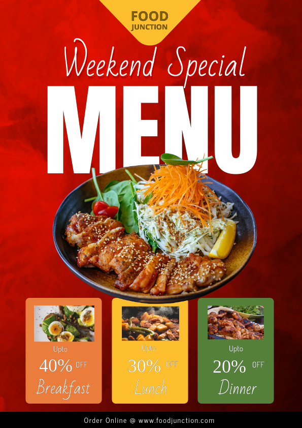
If you want fonts that pair well with Anton, choose sleek, contrasting fonts. Bad Script has a more contemporary appeal, and the Anton font pairing creates a splendid heading. While applying this duo in your food graphic design templates, be careful with the background color.
Because of the light-faced typeface of Bad Script, you should choose a bold and solid background to retain readability. Designs for restaurants, such as flyers and posters, often use bold hues of red, yellow, orange, etc, making this font pair a suitable choice for food graphic design templates.
Get This Template and More
Remember to retain playfulness in the fonts when you use font combinations for bakery and patisserie. An endearing font pair, including Luckiest Guy and Dancing Script, is suitable for heading. Further, you can use fun icons and stickers like this template example to enhance your fonts. Browse a wide range of Restaurant Flyer templates from DocHipo for more font inspiration.

Get This Template and More
14. Beauty and Skincare: Poirot + Petit Formal Script + Teko
Beauty and skincare brands want to create a calm and serene visual experience. Lightweight typefaces, like Poirot, combined with a little sophisticated Petit Formal Script, bring a feminine touch to the design. For instance, this template slide for beauty products from DocHipo’s Presentation templates combines the font pair while using Teko as the body text.

Get This Template and More
With DocHipo for Beauty, get inspired by excellent designs with high-quality graphics and eye-catching font pairings.
15. Real Estate: Roboto Condensed + Yanone Kaffeesatz
Roboto Condensed is a sans-serif font type that you can use for heading and body copy. However, to make your design attractive, you can introduce Yanone Kaffeesatz to bring the viewer’s attention to essential elements. For instance, in the real estate Instagram ad below, notice both fonts in shades of white and green in the heading.

Get This Template and More
Explore diverse template designs emphasizing their font choices with DocHipo for Real Estate.
Font Pairings for Publishing Magazine and Book Covers
The visual appeal of any design is different on a digital screen and paper. The medium size, spatial distribution, design pattern, etc, dictate the type of fonts you should use to complement the design. To better understand font pairs that work in print, let’s explore the fonts used for magazine and book covers.
16. Magazine Cover: Merriweather Sans + Niconne + Old Standard TT
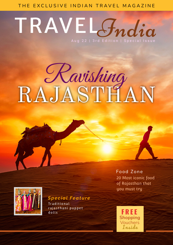
You will find many font types on a magazine cover with different hierarchies. Look at the magazine cover template and note that the variety of fonts does not clutter the design. There are two font pairings as the display heading- Merriweather Sans and Niconne at the top. At the same time, it is Old Standard TT with Great Vibes in the center. The bold uppercase typeface accompanies the elegant strokes in both cases, making a good font pair for heading magazine.
Get This Template and More
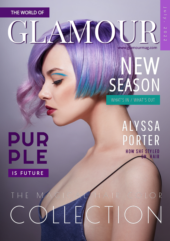
Other magazine cover examples with display fonts are Playfair Display, Poirot One, and Righteous. You can pair these fonts with Open Sans while maintaining the typography hierarchy and space between them.
Get This Template and More
Discover more dynamic font pairings for magazine covers with Magazine Cover templates.
17. Book Cover: Vollkorn + Source Sans Pro
The serif font Vollkorn is an ideal pairing with Source Sans Pro for a book cover. Take inspiration from the template design below from the DocHipo Book Cover templates library. You can notice how Vollkorn creates an impact as the display font elevates the beauty of the design.
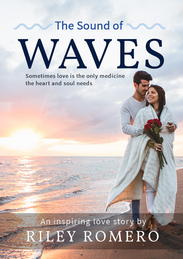
Get This Template and More
Your choice of font pairings will also depend on the book’s genre. You can use one font with various typeface variations to keep your design simple. For instance, the book cover template illustrates Dosis font in different sizes and typefaces.

Get This Template and More
Font Pairings for Educational Purposes
Educational documents like flyers and certificates have different design requirements. Let’s explore fonts for papers used for academic institutions.
18. Education Flyers: Oswald + Oxygen
Educational flyers often require bold and legible fonts. Thus, a pair of Oswald and Oxygen fonts is your go-to font for any academic document. Customize your display font in Oswald and Oxygen with this flyer template while maintaining the body text in Open Sans. Notice how colors and hierarchy blend into the education font pairs.

Get This Template and More
19. Education Brochure: Julius Sans One + Fira Sans
Julius Sans One presents a clean display font with sleek strokes that pair well with Fira Sans’s simple, bold typefaces. The document demands simplicity be retained in education brochures, as the design is text-rich. Combining these fonts in a suitable hierarchy helps convey the information effectively. To illustrate, here is one of the designs from the Education Brochure templates.

Get This Template and More
20. Certificate: Roboto Slab + Roboto Condensed
Every educational institution recognizes its students’ achievements and rewards them with a certificate. As a pro tip, remember to align the design with the context. For inspiration, explore the Certificate templates from DocHipo.
Here is one example of an academic certificate design with the font pairings Roboto Slab and Roboto condensed. The font pairings that go well together as they belong to the same font family.
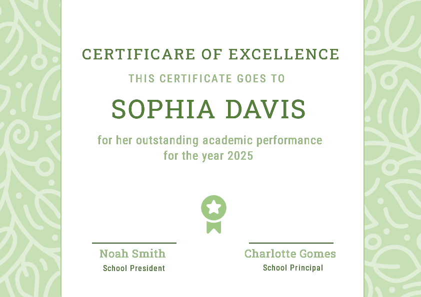
Get This Template and More
If you wish to champion the font selection for the sports certificate, take a shortcut with Paytone One, Sansita, and Archivo.
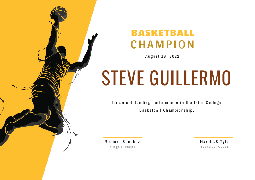
Get This Template and More
Discover the possibilities of design for your education documents with DocHipo for Education.
Font Pairings for Social Media
Your social media posts should attract attention so people engage with your posts more often. Fonts can express more than you think on digital platforms. Scroll further to learn about font pairs crucial for your posts and stories.
21. Facebook Post: Yeseva One + Montserrat
Hook your viewers with an enchanting Facebook post using Yeseva One as the display font and Montserrat as the body. This template design shows how to use this versatile font pair on a digital screen. Likewise, you can unravel your creativity by placing the text within a space in the image background. DocHipo’s Facebook templates inspire you to elevate your social media game.

Get This Template and More
22. Instagram Story: Satisfy + Roboto
Your Instagram story is the best place to connect with your followers, so don’t hold back while expressing yourself with words. For instance, look at this touching Father’s Day Story from Instagram Story templates and note how emphasizing certain words with Satisfy against Roboto conveys the intensity of emotions.

Get This Template and More
23. YouTube Thumbnail: Qwigely + Poirot One
If you’re looking for an out-of-the-box and unique font pairing for your YouTube thumbnail, Qwigely and Poirot One are your choices. Qwigely’s unique typeface, embellished with sharp strokes of disconnected letters, is perfect for a heading with fewer words. Paired with the neat font Poirot One, it creates a striking contrast. This design, a glimpse of DocHipo’s YouTube Thumbnail templates, will inspire your creativity.
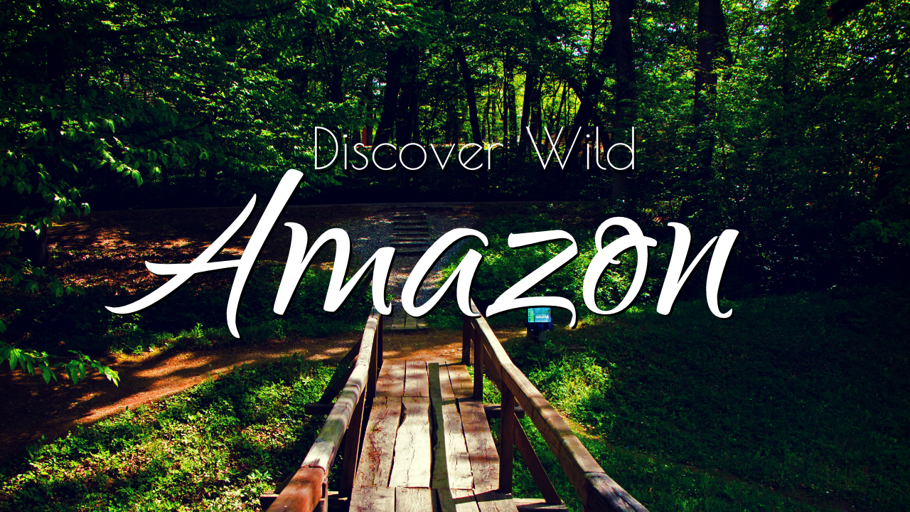
Get This Template and More
24. LinkedIn Post: Niconne + Raleway + Poppins
Unlike Facebook and Instagram, LinkedIn posts contain text-rich information. Your posts should be eye-catching yet embrace professional seriousness to retain clarity of the information. Bring the best of both worlds with Niconne, Raleway, and Poppins font pairings. Witness the effectiveness of circular font pair on LinkedIn Post templates through this design.

Get This Template and More
25. X/Twitter Post: Montserrat + Monte Carlo
This X/Twitter post template shows the elegant contrast between Montserrat and Monte Carlo font pairings. As the template design shows, you can create variations by experimenting with Montserrat’s typefaces. At the same time, the cursive waves of Monte Carlo elevate the aesthetics. Browse through X/Twitter Post templates for an eye-catching design.

Get This Template and More
Font Pairings that Evoke Certain Emotions and Vibes
We cannot emphasize enough the importance of using fonts to evoke feelings. Therefore, we have categorized a few font pairs based on the vibe they create in the design. These font combos will help you amplify the feelings you aim to express.
26. Elegant Font Pairings: Cinzel Decorative + Playball + Playfair Display
Experience luxury and royalty with font pairings Cinzel Decorative, Playball, and Playfair. The delicate strokes of the Cinzel font combination display the classical style with a regal aura. Playball and Playfair are the fonts that go well with Cizel and act as the icing on the cake with the charm of serif font styles. Here is a preview of this splendid Cinzel font pairing with Playball in one of DocHipo’s Square Post templates.

Get This Template and More
27. Artistic Font Combinations: Cabin Sketch + Qwigley + Poppins
Some fonts display the intricacies of hand-crafted fonts. The Cabin Sketch reveals the scribbling texture and pairs well with Qwigley to give a chic and casual vibe. Explore one of the designs available in the Facebook Post templates by DocHipo.

Get This Template and More
28. Fusion of Modern and Classical: Shrikhand + Qwigely + Poppins
Want to bring classical and modern charm to your design? Pair fonts like Shrikhand and Qwigely as Latin inspires the former, while Qwigely is more modern calligraphy font. In addition, Poppins font combination is suitable for the body text with Shrikhand font pairing that helps to create a balanced trio like this Black Friday Square post.

Get This Template and More
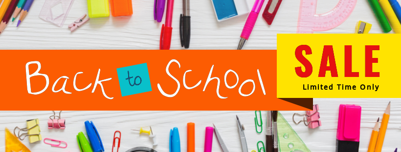
29. Playful Font Combinations: The Girl Next Door + Oswald
Bring childlike playfulness to your designs with The Girl Next Door. Our childhood handwriting inspires this unique style, probably when we were new to recognizing letters. You can use it in designs related to education or children-centric advertisements. Pair the font with Oswald to balance the appeal shown in this design from Facebook Cover templates.
Get This Template and More
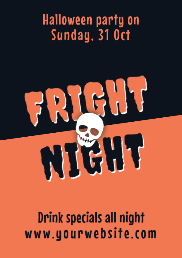
30. Spooky Font Pairings: Creepster + Sarina
Feel the chills of restless spirits and abandoned mansions with creepy fonts like Creepster and Sarina. This font pairing is perfect to set the mood for a night full of horror and darkness (of course, a fun Halloween party!). Explore more font ideas with DocHipo’s Poster templates for Creepster font generator.
Get This Template and More
Similarly, for more spooky font pairings, check out Halloween Facebook Post Templates.
When using font pairings, include other design elements, such as symbolic colors, suitable images, icons, illustrations, and stickers, to elevate the expression of your text. You can begin designing immediately with the template example for each font combination. Get professional DocHipo templates created with the most appropriate font pairs.
Pair up with Perfection!
Phew! That was a long list of font pairings. We hope that you find the perfect font pair for every purpose. Still, trying to figure out where to start? Explore DocHipo templates crafted with professional designs and suitable font combinations to convey your message in the best way possible. Sign up with DocHipo and customize your designs without any prior experience. Remember, there are no rules set in stone for pairing fonts.
FAQs
How to pick fonts that go together?
Combining fonts in a design is the art of balancing the visual weight of various fonts. Follow these steps to pick fonts that go together:
- Understand the font classification
- Create contrast between font types
- Consider font size and hierarchy.
What fonts go well together?
Some fonts that go well together are:
- Poppins font pairing with Open Sans
- Playfair Display with Raleway
- Great Vibes and PT Sans
- Lato and Archivo
- Roboto Slab
- Cinzel Decorative and Playball
What font pairs well with Montserrat?
Fonts like Sanista, Satisfy, Lato, and Yeseva One pair well with Montserrat.
What font goes well with Cinzel?
Font pairing Cinzel and serif fonts like Playball and Playfair Display complement any design beautifully.


