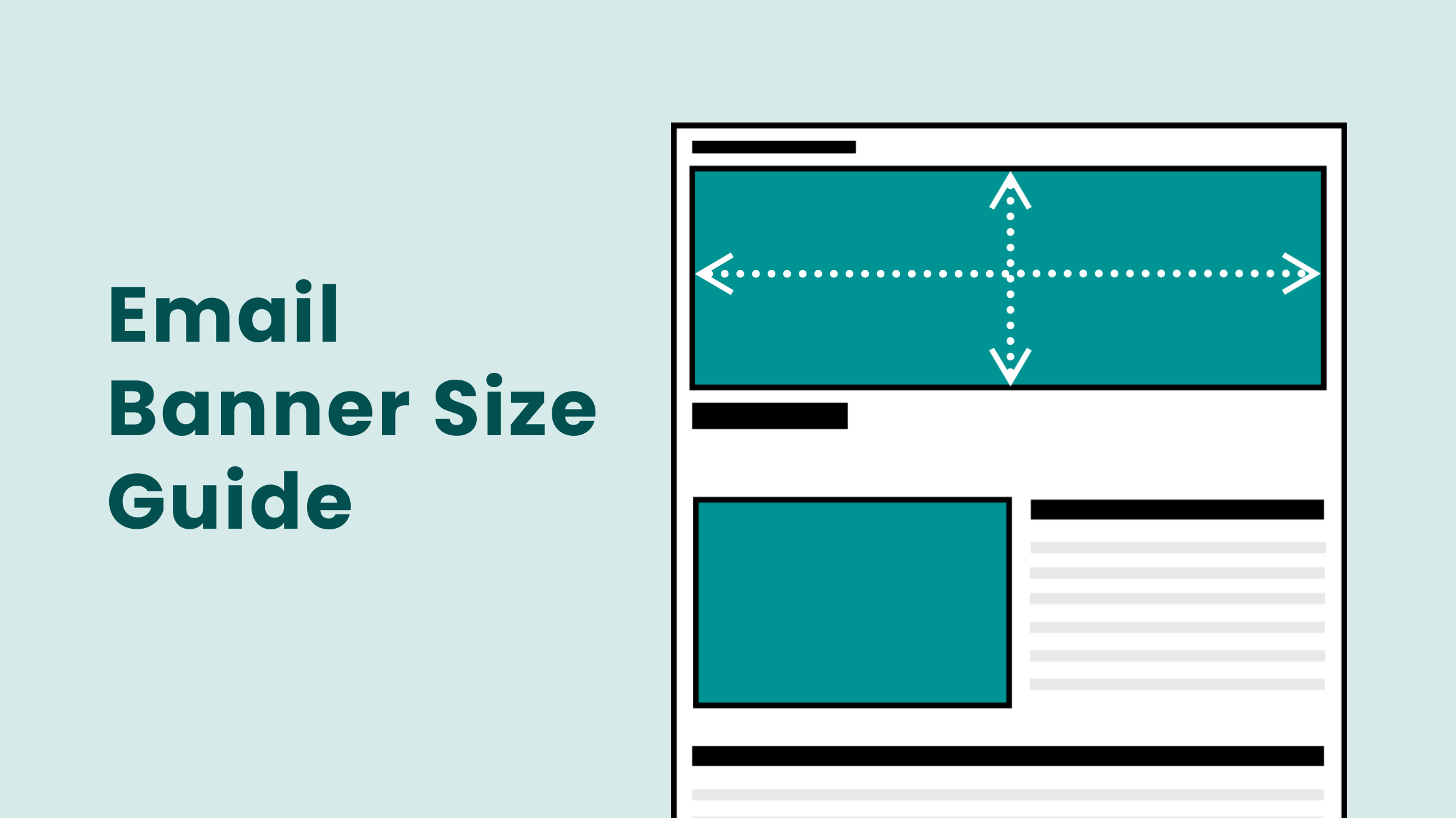
Email Banner Size Guide with Best Practices and Examples

Email is still one of the most crucial marketing tools companies use to inform and advertise their products. Yet, we need to be more knowledgeable about email banners, also known as email headers. A well-designed email banner can spark the interest of the recipient. However, a cropped or pixelated banner can ruin your design. That’s why, email banner size dimensions are important.
Email Banner Size
- Ideal Email Banner Size for a Desktop is 600 (wide) X 200 (height) pixels, and the maximum size is 650-700 X 200 pixels.
- Ideal Email Banner Size for Mobile is 350 (wide) X 100 (height) pixels.
- Email Banner File Size is 40 KB in the PNG format.
- Email Signature Banner Size is 300-400 (wide) X 70-100 (high) pixels.
Email Banner Design Best Practices
- Make on-brand Banners
- Keep Your Banners Simple with Enough White Space
- Use Clear and Readable Fonts
- Use Eye-catching Color Combinations
- Ensure that the Banners Have High-quality Visuals
- Align the Banners with Email Campaigns
We have brought a complete email banner guide to give you detailed information about the email header size. In addition, learn about the best practices and get inspired by examples and templates to create the best email banners.
Table of Contents
What is an Email Header
The email banner or header is the image at the top of an email. When you receive a mail, it consists of text and a picture at the top. It is the first thing a customer sees, setting the tone of the mail. It can grab the reader’s attention at once and communicate the purpose of the mail.
To illustrate, look at this example of TechSmith, which contains the brand name, logo, and text.
What Should be Included in the Email Header
Ideally, an email banner should have eye-catching visuals and an engaging copy. It can be about the upcoming sale, new changes, or a birthday wish. In all these cases, the banner may also contain the brand name, logo of the company, and link to the website to leave a mark on the viewer. Also, an email header with a solid call to action button can lead to sales.
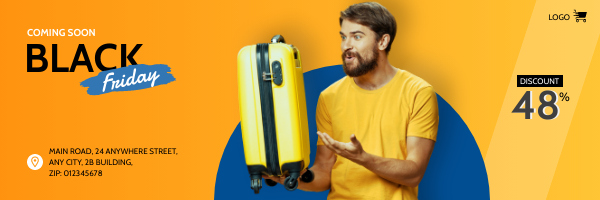
Remember, the email banner rests at the top to promote the brand and increase sales. To illustrate, check out this email banner template informing you about all the crucial details.
Get This Template and More
Why Does the Email Banner Size Matter
Suppose you design a visually appealing header but must remember to stick to the email header specs. Well, things can go south with your email
banner design. And, of course, you don’t want to leave a wrong impression on your consumer. A clean and attractive banner helps you gain the consumer’s confidence about the brand’s authenticity.
Moreover, following the banner email size ensures that the banner retains all the essential design elements without altering the structure of the email. Also, the wrong size would fail to deliver the right message and alter the screen orientation of the mail. Poor email display due to the incorrect email header image size will restrict the user’s engagement with your emails. These are enough reasons to follow the email banner size pixels dimensions whenever you create one.
Email Banner Dimensions
When we talk about email banners, the email advertisement size matters. A person can view your mail either on a phone or desktop. Therefore, we need an optimized newsletter banner size for email to show a clear picture across various devices. This section will discuss the email banner dimensions or email blast size in detail.
Email Banner Size for Desktop
The Desktop screen display varies from the mobile display when you open your inbox. Thus, you should visualize what your email header design looks like. The dimensions of the email banner are crucial for creating a design. The ideal email header size for a desktop is 600 X 200 pixels. However, if you want larger sizes that can scale up, you can design an email header with recommended email image dimensions of 650-700 X 200 pixels.
Email Banner Size for Mobile
Today, people open 55% of all emails on their mobile phones. Optimizing the dimensions of the email banner is essential to retaining the visibility of your design. The ideal banner size for mobile display for email graphic size should be 350 X 100 pixels. However, the email flyer dimensions can vary depending on the email software and client.
Email Banner File Size
We have discussed the dimensions of the email banner, but the ideal email size format and file size are also important for uploading the image. After all, uploading the right email header banner size is one of the most crucial aspects. Thus, you must ensure that your email header design file is in PNG format with a file size of 40 KB.
Email Signature Banner Dimensions
We often use email signatures at the end of the email. The ideal email logo size or banner size for email signature is 300-400 wide and 70-100 high.
Email Banner Examples and Templates
Ready to design your email banner? Look at these email advertising ad sizes examples and DocHipo Email Banner Templates for inspiration. DocHipo offers a variety of banner templates, each with an ideal size for email graphics suitable for different occasions and industries. Sign up for free with DocHipo to design your email banner within minutes!
1. Clean and Minimalistic Design
You can choose a simple, clean design with a bold message about your brand. Such designs ensure the audience focuses on the most crucial aspect without getting distracted. To keep the email banner simple, include an image, subtle colors, and bold text. Here is a fine example of a minimalistic email banner design.
Also, look at these Business Email Header templates from DocHipo to better understand minimalism in designs.

Get This Template and More
Try this banner template for the ideal newsletter header size.

Get This Template and More
2. Vibrant and Colorful Email Banner
Email headers can be more varied constantly. With a vibrant email banner, you can grab the viewer’s attention. Colors evoke emotions in viewers, especially when you want to inform them about an exciting event, coupon, or promotion with an email flyer. Further, such banners can help intensify the message in the mail. For instance, this bold pink design with the perfect email flyer size portrays a joyful vibe.
To illustrate further, look at these Birthday Email Header templates with email design dimensions that can make your day cheerful.

Get This Template and More

Get This Template and More
3. Showcasing the Product
Your marketing campaigns require to inform consumers about upcoming sales. Create a shopping frenzy while showcasing the image of the product. While designing such email headers, mention essential information and write an eye-catching copy. Also, ensure the overall marketing email flyer size and design syncs with the product image, like in this example from Pepperfry.
Design email banner with DocHipo’s Sale Email Header templates, where colors strategically complement the product image.

Get This Template and More

Get This Template and More
4. Seasonal and Festive Themes
Don’t forget to send wishes to your customers with changing seasons. Nonetheless, it shows a brand’s thoughtful gesture to make them feel special. Moreover, you can remind the consumers about the seasonal sales. Look at this colorful, festive email banner from BigBasket.
There is no need to design one from scratch; check out some festive templates, such as Sale Email Header templates. Here is an example from the gorgeous collection.

Get This Template and More
Check out the diverse collection of Christmas Email Header templates.

Get This Template and More
5. Highlight the CTA in the Banner
Your banner can generate leads with a solid call to action button. It can be anything from ‘shop now’ to ‘join us today.’ While designing the banner, ensure that the CTA button stands out. Keep the design simple yet tempting with a convincing copy to lead the consumer to act. Further, ensure the consumer does not face page loading issues after clicking the CTA. You can also lead your viewers to your website, like this example of an email banner.
Check out these DocHipo templates with email design size to better understand CTA in the email banner.

Get This Template and More

Get This Template and More
Further, create buttons in DocHipo with this video tutorial.
6. Promote an Event
Want to create a buzz around an upcoming event? Create an exciting email banner with an ideal email invite size to spark consumers’ interest. Mention the essential details about the event, such as the event name, brand name, and website information within the banner. Focus on how attending the event will help its target audience and create an enticing text.
Use this Business email banner with email invitation size for your upcoming event.

Get This Template and More
7. Reusable Email Banner Design
Apart from various campaign-specific mail banners, you can also create a design to reuse in the banner. Such designs help in increasing brand recognition among consumers. For instance, Microsoft Start uses its iconic header with a brand name, logo, and slogan for every email.
Take inspiration from these Real Estate Email Banner templates, where you can use the layout multiple times for email invite dimensions with a change in the background image.

Get This Template and More

Get This Template and More
8. Email Banner using Unique Typography
Your text can emote a lot when you use unique typography. It also helps in emphasizing the most essential words in your design. Your audience will relate to the banner better with stylish typography.
Look at these Thanksgiving Email Header templates to better understand the shift in tone while reading the text.

Get This Template and More

Get This Template and More
9. Appealing Graphic Elements in the Banner
You can make an eye-catching design using only shapes, icons, stickers, and illustrations. With DocHipo’s design widget library, get your hands on hundreds of such assets you can utilize for free. Take inspiration from the eye-catching graphics in this email banner.
Also, look at these Christmas Email Header templates in emailer size, which amazingly use icons and stickers.

Get This Template and More

Get This Template and More
10. Email Banner with Navigational Menu
Using the menu bar for other pages in your email banner is a great way to direct your users to other platforms for your brand. It makes your header more engaging and interactive for the users, thus grabbing their attention instantly.
Email Banner Design Best Practices
We are sure our template examples have given you the right direction to create an email banner with suitable email blast dimensions. Moreover, follow the email image size best practice before starting your design journey.
Make On-brand Banners
Make it a thumb rule to create on-brand banners. Add a brand name, logo, colors, etc, to your banner in email. Also, ensure that you are consistent with all the brand elements in every email header.

Get This Template and More
Align every email header design with your brand using DocHipo’s brand kit. The Brand Kit helps you to add brand logos, colors, images, fonts, and videos in one place for easy access to your team members. Learn How to Build a Brand Kit: A Comprehensive Guide with Examples.
Or, watch this video in DocHipo to create a brand kit.
Keep Your Banners Simple with Enough White Space
While designing, remember that less is more. Give ample space for various design elements adjusting them with email template size width and height. Avoid using too many design elements, which can clutter the entire design. White space enhances readability and visual appeal.
Take inspiration from DocHipo’s Food Email Banner templates for the size for email invite.

Get This Template and More

Get This Template and More
Use Clear and Readable Fonts
Use fonts that are easy to read in the normal banner size. Also, collaborate design and typography effectively to enhance the visual appeal. Try maintaining the character length between 45 and 75 characters to avoid wordiness in the standard email dimensions. Maintain consistent brand fonts for the headings, subheadings, and design body, such as this gorgeous email header.

Get This Template and More
Use Eye-catching Color Combinations
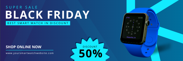
Use colors in your layout that grab the attention. An easy way to select suitable color combinations is to take the help of color wheel theory. Try various combinations, and once selected, maintain the harmonious palette for a professional look.
Check out color combinations of Black Friday Email Header templates.
Get This Template and More

Get This Template and More
Ensure that the Banners Have High-quality Visuals
To avoid pixelation, use high-quality visuals for the banner. Upload professionally photographed images or stock images to your designs. Also, check that you employ the most suitable image for the banner size in pixels. To illustrate, check out this email banner showcasing the luxurious house for sale with a good image size for email.

Get This Template and More
Align the Banners with Email Campaigns
Ensure that the email header complements the overall message and feel of the mail. You should coordinate the layout with specific email campaigns using email banner maker. After completing the design, always test email marketing dimensions before sending it to customers.
Managing email campaigns is easy with DocHipo’s integration with Mailchimp.
Common Myths About Email Banner Size
There are many myths about the ideal size of email banner. Let’s bust some of the most common myths.
Email Banner Needs to be Within 600 Pixels
There was a time when desktop screens had resolutions of up to 1024 pixels. However, today, the resolutions have changed to 1920X1080 pixels. Although many designers follow the golden rule of 600 pixels, that is the recommended email header size. You are allowed to go beyond it up to 700 pixels.
Height isn’t Relevant for the Banners
We are too concerned about the width of the email. However, the height of the email also needs attention. Your email banner dimensions should not exceed 200 pixels. Even when you use a single image as your entire email, ensure that the email header banner size (200 pixels) contains the gist of the mail. Also, keep the mail body and mail footer within the specific length of 1728 pixels. Your user should not feel tired by scrolling through the mail.
Size Affects the Background Colors
Most email marketers have the misconception that if the image width exceeds 600 pixels, the background colors of the design fade away. However, this is different. Gmail and Outlook retain the image colors even when the image is around 700 pixels.
Create Email Banners with DocHipo
Create an email header within minutes with DocHipo. DocHipo’s exclusive email header templates offer an email banner for various occasions and industries. Our professionals have already done the heavy lifting to create gorgeous customizable templates for you. Sign up with DocHipo and create email banner with three simple steps.
1. Choose Your Template
After signing up, you will land on the homepage of DocHipo. Search for the email header templates in the search bar.
Next, select a template design aligning your purpose to get started with the customization.
Find your templates within seconds in DocHipo.
Once you have chosen the template, you will come across the DocHipo editor, where the canvas size is the ideal banner email size.
2. Customize the Template
In the DocHipo editor, you can easily customize your template with the design widgets library, offering a variety of shapes, icons, lines, stickers, illustrations, etc.
Moreover, using the contextual editing bar, edit your templates’ text, background, color combination, and effects.
Learn to add, edit, or delete text in DocHipo.
Also, check out the widget effects you can apply to your designs.
Further, explore thousands of stock images and add your favorite one aligning with your template design.
Learn about DocHipo’s integration with the stock photo library.
You can also save email header size Mailchimp for organized email marketing.
3. Download Your Design
After customizing your design, click on the three dots in the upper right corner of the editor and select download.
Now, download it in the PNG format with normal quality for web use, and you are ready to upload your email banner.
Get started with DocHipo to create beautiful documents.
Key Takeaways About the Email Banner Size
In this blog, we have discussed the ideal email banner image size for desktop, which is 600 X 200 pixels, and for mobile, the banner size is 350 X 100 pixels. We have also taken inspiration from a few examples and templates to develop a better sense of designing an email banner.
Further, you can take note of some of the best practices one should follow while creating an email header. However, making a banner design from scratch is not everyone’s cup of tea. A reliable shortcut is to use a graphic design tool like DocHipo. It offers hundreds of templates for various business-related documents, social media, marketing, web banners, etc. Sign up with DocHipo and get started with designing for free!
FAQs
What is a good size for an email banner?
An ideal size for a desktop email graphic dimensions is 600-700 pixels wide by 200 pixels high. However, a good email header size for mobile is 350 (width) X 100 (height).
What size should an email banner be?
An ideal email banner for desktops should be 600-700 pixels wide and 200 pixels tall. Further, the email banner size should be 350 X 100 pixels for mobile.
How do I make an email banner?
The easiest way to create an email banner is with the help of customizable email banner templates. Graphic design tools like DocHipo offer templates for various purposes. In three simple steps, you can easily create an eye-catching email banner design with DocHipo:
- Choose your email banner template
- Customize your banner template with hundreds of fonts, color schemes, images, icons, illustrations, etc.
- Download your email banner design.


