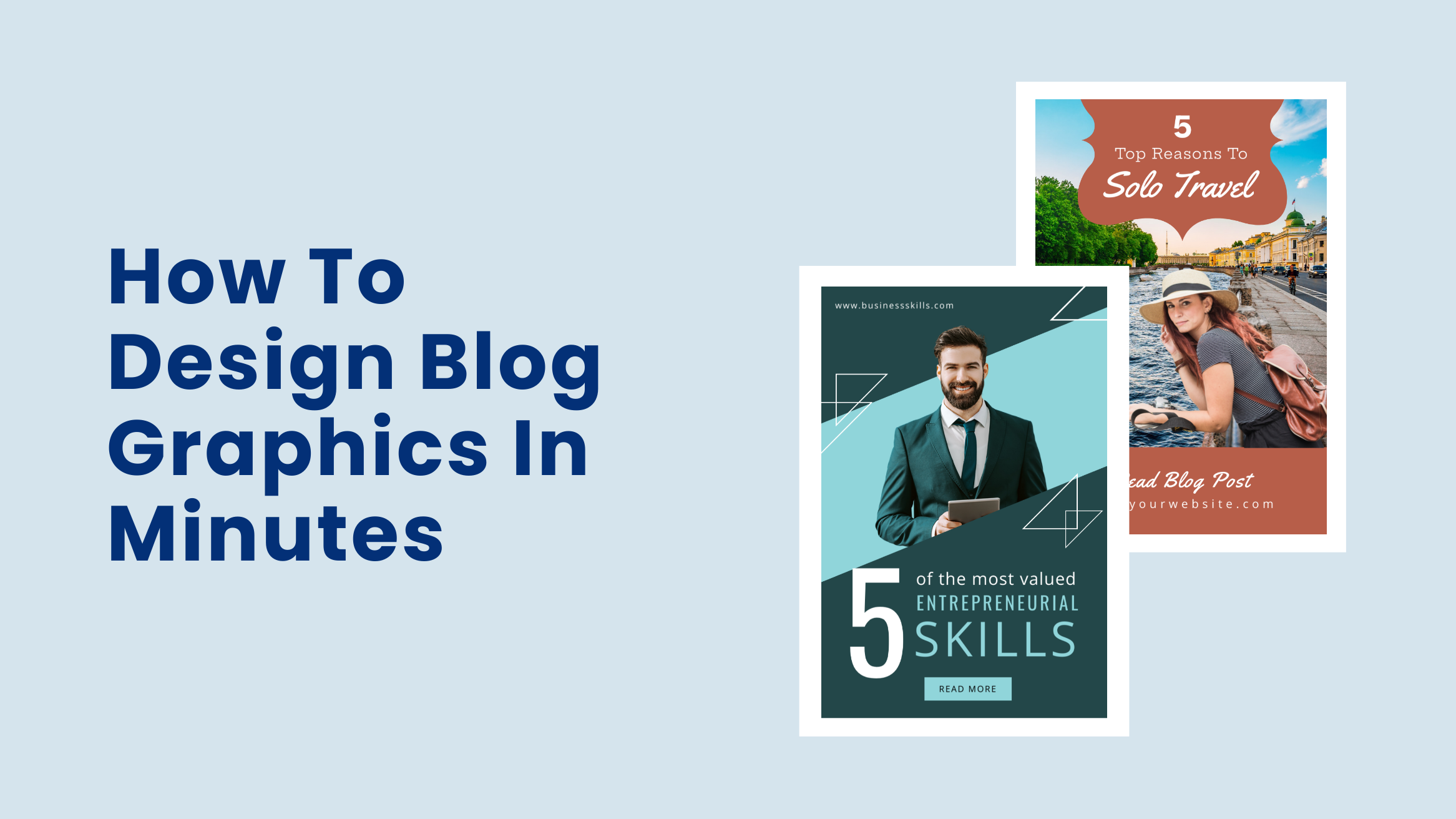
How To Design Blog Graphics In Minutes

Your blog posts should resolve your readers’ queries. To hook them till the end of your post, you must take care of the readability and design blog graphics that appeal to the readers. Blog posts with premium quality and valuable graphics increase readability and shareability.
But you may not have the time or even a budget to design graphics for blogs every time you write a blog post. You might lag behind your competitors, who already create lasting impressions on their readers. It may cause you to lose readers, leads, and sales.
The good news is that with DocHipo, you don’t need to trade your time or hire designers whenever you need a new blog header or in-post blog images.
How To Design Blog Graphics
- Choose a Blog Graphic Template: Pick one that closely aligns with your industry or topic.
- Customize Your Text: Add your blog graphic title and content in crisp and concise form.
- Pay Attention to Fonts and Typography: Use your brand fonts to increase brand recognition and create neat typography that interests readers.
- Pick the Right Imagery for Your Blog Graphics: Choose images, illustrations, or icons that convey the topic the easiest way possible.
- Changing the Background Color: Choose a background image or color where the text can pop up.
- Customize Your Color Scheme: Choose your brand colors or those that complement the rest of the design elements.
- Download Your Blog Graphic: Download in a watermark-free high-resolution PNG or JPG file.
Through this blog post, you’ll learn to design blog graphics that capture readers’ attention and don’t let them bounce from your posts.
Table of Contents
Let’s start with some blog graphic design tips.
Tips for Designing Graphics for Your Blog
Follow the best practices below and start designing or customizing the DocHipo blog graphics templates immediately.
Pick the Right Imagery for Your Blog Graphics
You could opt for images, illustrations, or other graphic elements like icons, textures, etc. Your option will depend on which conveys the topic the easiest way possible and which goes best with your branding. Whatever imagery you select must be meaningful and relevant to your blog post topic.
If you use stock images, try to use uncommon ones you haven’t seen. DocHipo’s in-house library of stock images will help you find a massive array of unique images that go perfectly with your content.
For example, the Business Blog Graphic Template showcases a perfect picture of a small business that speaks for the topic.

Get This Template and More
Next, the mouthwatering images of Chinese dishes attract readers’ attention and encourage them to explore the content further.

Get This Template and More
To make it more interesting, you can do a color overlay using pictures as your background.

Get This Template and More
Also, incorporate overlay on images more creatively, like in the templates below.

Get This Template and More

Get This Template and More
You can incorporate appealing graphic elements such as illustrations, icons, shapes, etc., along with suitable images to add creative interest.
For example, look at the application of the image, football icons, and triangular shapes in the DocHipo Sports Blog Graphics Template.

Get This Template and More
Choose Your Colors
The color is to grab the attention. But avoid using too many colors as it can make the blog graphics design cluttered.
If you’re wondering, “What colors should I use?”
Ideally, pick a single dominant color. For the rest of the design, you may use lighter variations of the same color. But when you need it, you may experiment with more colors. Leverage monthly graphic design services to maintain brand consistency while incorporating fresh, creative elements that keep your visuals engaging.
Using your brand colors to design blog graphics is a good idea. If your brand color comprises two to three colors, you may choose one as the focal point of your blog graphic design. Otherwise, you can also pick colors that complement your brand colors or the imagery you’re putting up. You may create variations by mixing and matching colors for each blog image.
For instance, look at the DocHipo Blog Graphic Template, which has an eye-soothing and sophisticated design.

Get This Template and More
Similarly, notice how blue adds trust to the following Business Blog Graphic Template.

Get This Template and More
The green in the Food Blog Graphic Template reflects mother nature and freshness related to healthy recipes.
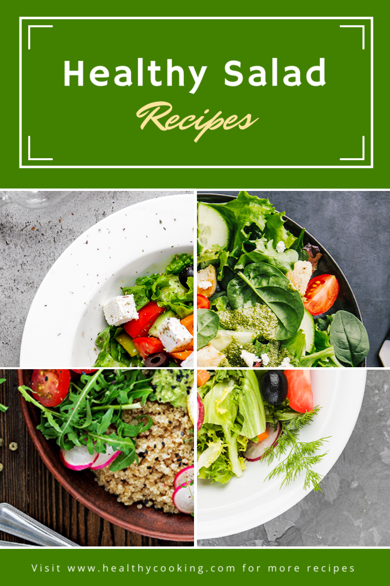
Get This Template and More
Likewise, observe how our designer has brilliantly used colors to give the below a bright and bold look.

Get This Template and More
You may read Best Color Combinations And How To Use Them In Your Design.
Pay Attention to Typography and Fonts
For blog headers, adding text to the image is a compelling way to let potential readers know what they can expect to read. You can add the blog title to the image or try typographic arrangements to make it more eye-catching.
Check out our DocHipo Blog Headers for inspiration.
Check out How To Choose Fonts For Your Design for guidance on how to pick the right fonts.
Further Reading
Look at the following in-post Blog Graphics Templates and notice the fonts used.

Get This Template and More

Get This Template and More

Get This Template and More
How to Design Blog Graphics with DocHipo?
If you’re trying DocHipo for the first time, sign up for free with your company email address and password. Once you log in with those credentials, you’ll be on the ‘All Templates’ page. Let’s walk you through the three-step customization process.
STEP 1: Choose a Blog Graphic Template
Start typing ‘Blog Graphics’ in the search bar and click on it once it appears in the result.
The Blog Graphic Templates are currently categorized into business and sports niches.
To create your Blog Graphic from scratch, click the ‘Blank Template.’
If you want to save time, hover your cursor on any template you like, or that goes with your business needs to preview and select it.
After choosing the template you want to work with, provide a name and a brief document description.
After that, click on the ‘Next’ button to get on the canvas.
STEP 2: Customize the Blog Graphic Template You Have Chosen
Zoom in the canvas according to your convenience using the plus or minus icon in the bottom left corner.
Now, you can customize your chosen Blog Graphic Template the way you want with just the basic design sense. Let’s get started.
Changing the Illustrations
The ‘Illustrations’ widget is available under the ‘Graphics and Media’ option on the left sidebar.
Illustrations are classified into two categories- solo and scene.
You can either search for illustrations in the search bar provided.
Otherwise, select the theme of the illustrations from the drop-down menu.
Here, we select marketing.
Select the existing illustration and delete it.
All the illustrations are appealing and effectively communicate your message. Choose the one that best suits your purpose.
After that, you can resize and adjust its position using the super-easy-to-use drag-and-drop tool.
After adjusting the position and deleting unnecessary elements, the Blog Graphic looks like the following.
Watch our video below to learn more about the Illustration library in DocHipo.
If you’re using images to design blog graphics, you must check out Simple Ways To Enhance Images With DocHipo.
Changing the Background Color
First, select the background and click on the little squared background icon in the above editing panel.
You can put the color hex code on the left sidebar beside the color icon. Click on the color bucket icon to choose from the theme colors.
If you are still unsatisfied with the color change, click the color palette icon to experiment with the custom colors.
Blog Graphic design after changing the background color:
Watch the demonstration of creating stunning backgrounds in DocHipo.
Customize Your Color Scheme
To change the color of any part(s) of the new illustration, select it and click on the little color icon in the above editing panel, and all the colors used in the illustration will appear.
We also changed the color of other design elements to maintain color harmony. Now it looks like the following:
Customize Your Text and Fonts
Double-click on the text and replace it with your own words to edit it.
Also, if you want to add more texts, click on the ‘Text’ widget on the left sidebar. You can add text in three formats- heading, subheading, and body text.
Click on the editing panel above the canvas, and text editing options like font name, size, color, alignment, etc. will appear.
For more text editing options, like changing its opacity, adding links, arranging in order, etc, click on the horizontal three dots in the editing panel.
Watch the below demonstration from our YouTube channel.
Other Design Widgets
You may need to add more elements to convey your key message according to your business needs. The other design widgets available in DocHipo are icons, stickers, shapes, lines, etc., under the ‘Graphics and Media’ tab.
Below, I’m sharing the demonstrations for using these design elements in DocHipo to help you customize your Blog Graphic the way you please.
You may also refer to The Ultimate Guide to Using the DocHipo Editor.
STEP 3: Download Your Blog Graphic
Once content with your Blog Graphic design, click on the three horizontal dots on the top-right side to preview it and check if everything is all right. After that, you may share it with your team members, download it, save it to MailChimp, etc., as needed.
You can download any document you design with DocHipo in multiple formats such as PNG, PNG Transparent, JPG, PDF, MP4, and GIF.
So, after choosing your preferred file type and document quality, click on the ‘Download’ button.
Here’s how you can download documents in JPG format.
Before Customization:
After Customization:
Final Words
Eye-catching, relevant, and easily understandable Blog Graphics will increase the readership and shareability of your blog post. I hope you found the customization process with DocHipo super simple and fun. So, now it’s time to put your blog Graphic design ideas into action. Sign up for DocHipo and explore all the beautiful blog graphic templates designed to ease your workload. Leverage the needed design widgets to create stunning visuals for your blog.


