Blog Banner Design: How to Create A Blog Banner For Sports Blog

Have you been itching to start a sports blog? It is one of the best ways to share your passion with the rest of the world and connect with people who have similar interests. There are tons of topics to choose from while starting a sports blog. From tracking player’s performance, teams, and stats to sharing sports strategies, equipment, and many others. However, choosing hot topics is not enough to start a blog that people will love. There are several other factors to consider. Blog banner design is one of the crucial ones amongst them.
How to Create a Banner For a Sports Blog
- Choose Your Colors: Choose contrasting colors that match your context.
- Create A Stunning Background: Opt for a solid color or a captivating photo background to significantly enhance the visual appeal of your banner.
- Select Fonts: Incorporate stylish fonts that match your blog topic and highlight the most important words.
- Incorporate Other Visual Elements: Keep your banner simple and use different design elements like icons, stickers, and illustrations carefully.
Statistics show that 49% of marketers primarily use visual content on their websites and blogs. And Blog Banner is an integral part of the visual content on your website that can not be compromised at any cost. A blog banner is the first thing that will grab your audience’s eyeballs and hook them up with your post.
However, sometimes it becomes difficult to have both graphic design and writing skills. With DocHipo’s free online Blog Banner Maker, you can easily design stunning banners for your sports blog without having any design skills.
Continue reading to learn how to create a blog banner for your sports blog using DocHipo.
Table of Contents
Blog Banner Design Ideas
In addition to helping you with the blog banner design process, we were hoping you could learn how to do it perfectly. Therefore, we have come up with these blog banner design ideas and some blog banner templates for you. Go through them to design the perfect banner for your sports blog.
Choose Your Colors
If you already own a business dealing with sports equipment and accessories or anything related to sports, you must have brand colors. You can use those brand colors, or else you can choose some colors as your brand color and use them in your blog banner design. This is one of the most effective ways of choosing colors for your blog banner.
Alternatively, you can follow these two guidelines always:
- Choose colors that match your context.
- Choose colors that create enough contrast between each other.
Since colors are a form of communication, you must take your time to define what message you want to convey through it. What do you want it to express? Is it values? Feelings? Or personality? In other words, identify the objective of designing the blog banner, and it will help you select colors. Here’s an example for you.

Get This Template and More
However, if you are still trying to figure out what colors to use in your blog banner design, this article about the best color combinations will help you out.
Create A Stunning Background
The Background is the backbone of your blog banner design, on which you put all the other design elements to get the final design. Without a background, your blog banner design is incomplete. There are two types of Background:
- The Solid Background
- The Photo-Background
Continue reading to know further about these two.
The Solid Background
Below is an excellent example of a blog banner with a solid background.

Get This Template and More
Look at the blog banner above. The solid Background enhances the message and creates a natural contrast to the Background. There are no distractions from the headline, and the white fonts stand out clearly against the yellow Background.
The Photo Background
Here is an example of a photo background.

Get This Template and More
Photo backgrounds are the best as they are more engaging and helps convey the message more effectively. In the blog banner above, the picture of a bike rider with a stunning landscape perfectly matches the context. You can use picture backgrounds whenever you want, and the blog banner templates in DocHipo will let you do that easily.
Learn everything about creating stunning backgrounds in DocHipo.
Select Fonts
Incorporating stylish fonts that match your blog topic right into your blog banner design can be the fastest way to get your message across.

Get This Template and More
The banner above is for a state Rugby championship. The shape in its Background highlights the State Championship. Hence, in this case, the word “RUGBY” is the primary focus, and therefore it’s larger and bolder than the other fonts. Furthermore, the call to action “Register Now” is in yellow to get highlighted without taking too much space.
Learn how to create a typography hierarchy and different typefaces from these articles to perfect your blog banner design.
Incorporate Other Visual Elements
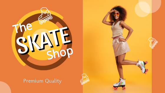
When it comes to blog banner design, you must be very careful while choosing the other visual elements to include in your banner. Usage of too many shapes, lines, font frames, and other design elements can ruin your blog banner design. Always try to keep it simple and use different design elements carefully.
Get This Template and More
You can take inspiration from the blog banner above. Here we have used minimal design elements and maintained the simplicity of the banner while focusing on the main message.
Blog Banner Design In DocHipo
Now for the fun part! Let’s dig into making a custom blog banner using the Blog banner templates in DocHipo. Designing a blog banner in DocHipo is fun and easier than you think. Here are the three steps to design a blog banner in DocHipo.
Step 1: Select Your Template
Go to the Homepage of DocHipo and type your email address in the box or click on the Sign-up button from the upper right corner of your screen, as shown below.

Once you sign up for an account in DocHipo, you will enter the all templates page in DocHipo. You can choose your blog banner template in two ways: Either click on the “Web Banner” option from the left pane and select “Blog Banner” or type “Blog Banner” in the search box and click on the result.
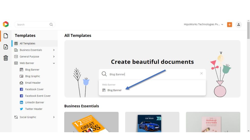
Click on the Sports category to browse all the blog banner templates under the same.
Now, hover your mouse over the template you like. Click on the “Preview’ option to look at the template before customizing it. Click on the select button to proceed with the template of your choice.
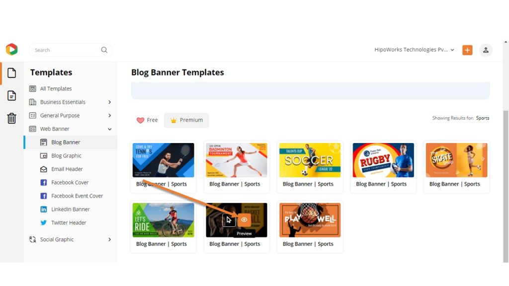
Additionally, don’t forget to look at the revamped templates section in DocHipo that we have designed to make your templates selection process more manageable.
Step 2: Customize Your Template
Customization is the most important part of your blog banner design process. This is where you do the magic to grab your audience’s attention. You can customize everything that you can see in your template. Here’s how:
Background
As we have already mentioned, the Background is the most critical design element in your blog banner design. Hence, it would be best if you created it mindfully. Click on the Graphics and Media option and then choose Background.
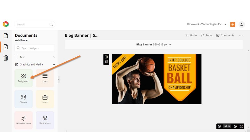
Now, choose a color from the left sidebar or create your own color by clicking on the custom color option. DocHipo also lets you paste hex codes in the box to get any color you want in your Blog Banner design. Additionally, you can add texture to the list if you want. Here is a video for you:
Color
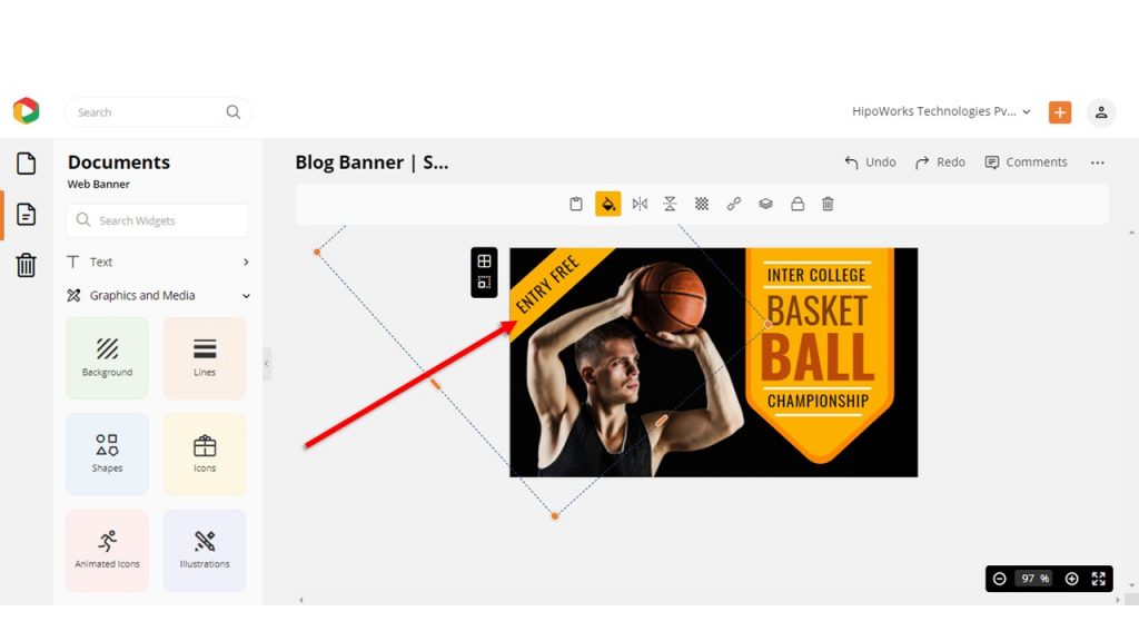
To change the color of any design element, simply click on the same and then click the color button from the edit panel and choose the colors you want. We always recommend using colors that complement each other.
Text
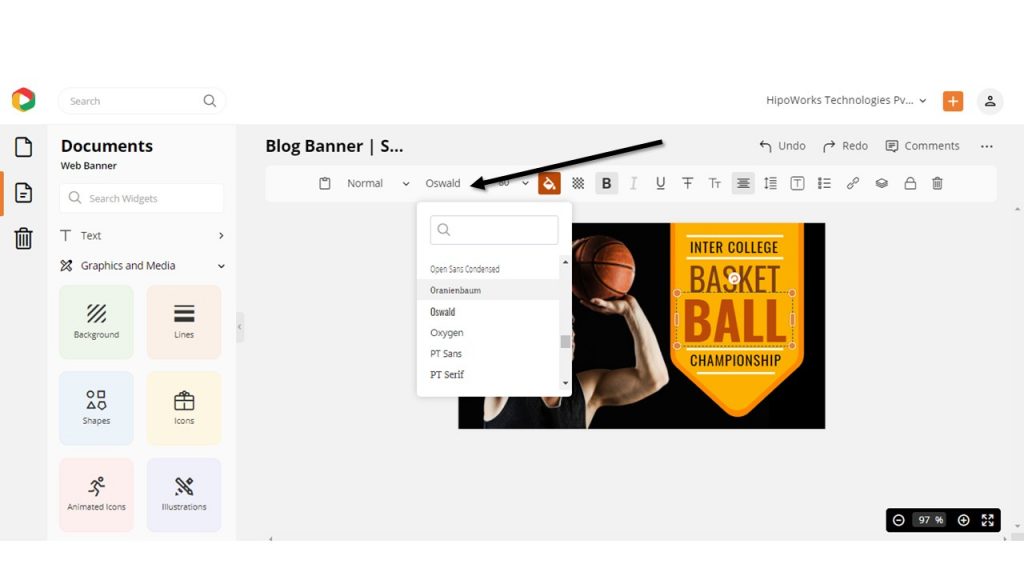
To change the font style and size in your blog banner template, simply click on the text that you want to edit. Go to the font style option on the edit panel and select your font style.
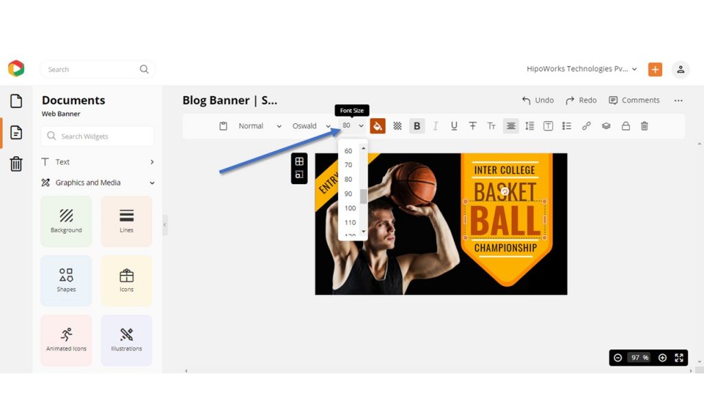
Moreover, the font size option is just next to the font style. Click on it and select the font size you want.
Also, change the color of the fonts by clicking on them and choosing colors from the edit panel.
Here is how to add, edit, or delete text in DocHipo.
Images
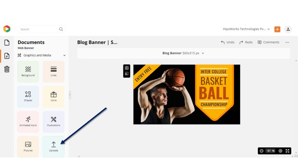
To replace the imagery in the template with the one you want, click Graphics and Media and choose Uploads from the list.
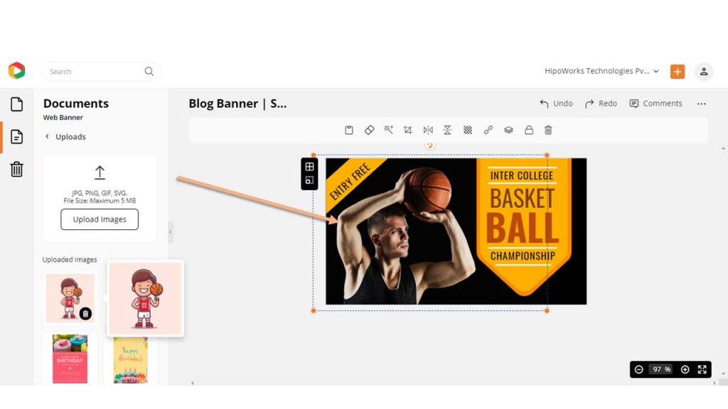
Now, upload the picture you want to insert and then click on the image you want to replace. Select and hold the image from the left menu and drag it on the picture you want to replace and release. The picture will be automatically replaced with the new one, and then you can adjust accordingly.
Additionally, you can remove backgrounds from your picture using the DocHipo Background Remover and enhance them using the DocHipo Photo Editor.
Here is a video to learn how to remove Background from your pictures with a single click.
Here we have edited a blog banner template for you to understand it better.
Before:

After:

Step 3: Download The Blog Banner
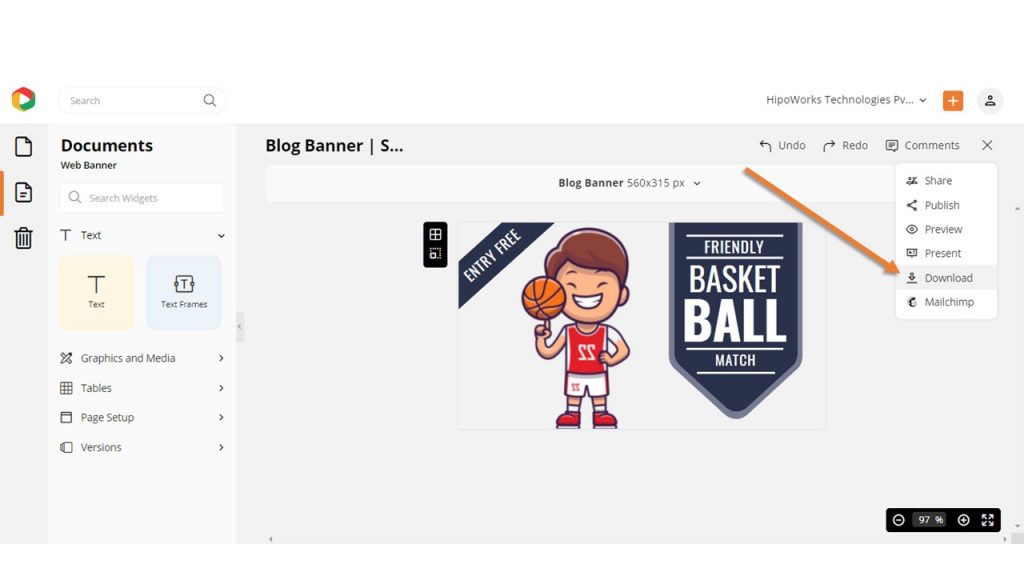
Now, it’s time to download your blog banner design so that you can publish your blog post without delay. Click on the three dots from the upper right corner of your screen, and then click on Download from the drop-down menu.
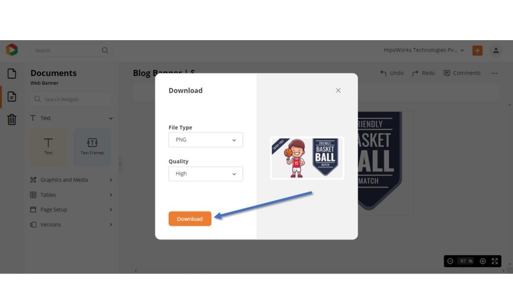
Choose your desired file format and quality, and then hit the download button. As you will use the banner on your blog post, we recommend downloading it in high quality.
Further Reading
To Conclude…
Study shows that people only read 20% of your content on a blog. People just skim through the content rather than going word by word. Therefore, to increase engagement on your blog, start adding as many visuals as possible to the posts. Understanding how to engage your audience and blog banner design is the first step towards the same.
Hopefully, the article helped you learn how to design blog banners for a sports blog. With DocHipo, you can create a beautiful blog banner design that will set you and your writing skills apart from the crowd.
So, thousands of sports lovers are eagerly waiting for your blog—sign-up to DocHipo today and design stunning sports blog banners to get noticed by a huge audience.
FAQ
What elements are important in designing a sports blog banner?
Whether the blog is about sports news, guides, providing event details, and so on, the blog title and visuals are crucial to intrigue potential readers to click on the banner. Work on choosing the most appropriate images or graphics, color schemes, fonts, and typography to make them curious enough to check the complete blog post.
Which color schemes work well for sports blog banners?
You can choose your brand colors for designing your sports blog banners. Otherwise, first, identify the objective of designing your blog banner and define the message you wish to communicate. Next, consider color schemes that match your context and make your design lively. You can experiment with popular colors like red, orange, blue, gray, green, yellow, and so on for sports branding through blog banners.
Are there any recommended tools or software for creating a sports blog banner?
You can create a sports blog banner using online graphic design tools like DocHipo. You’ll find many intriguing sports blog banner templates with striking color schemes and typography. All you need to do is choose a template that closely aligns with your needs and customize how you please. DocHipo’s intuitive editor allows you to edit text, images, graphics, color schemes, fonts, and more.


