
20 Best Visual Advertising Techniques to Optimize Your Ad Strategy

Starting your journey in visual ads and feeling a bit lost on which visual advertising techniques create winning campaigns? You’re in the right place! Go on, read through this blog, and find answers that will turn bog-standard concepts into compelling visual ads. Period. It’s like a personalized crash course. We’ve crafted just for you, packed with proven visual techniques and exciting surprises.
Best Visual Advertising Techniques
- Color Psychology: Uses color to evoke specific emotions and moods.
- Visual Hierarchy: Organizes elements to guide the viewer’s focus.
- Focal Point Techniques: Creates a central focus to draw attention.
- Typographic Composition: Uses font and text arrangement for visual appeal.
- Rule of Thirds: Divides the design into a grid for a balanced composition.
- Composition: Combines various design principles for harmony.
- Animation: Engages viewers with dynamic visuals.
- Motion Graphics: Ideal for brand awareness and engaging storytelling.
- Visual Path: Guides the viewer’s eye through the design.
- Direct and Three-Quarter Gaze: Boosts credibility and engagement.
- Trompe l’oeil Effect: Creates 3D illusions on flat surfaces.
- Body Language: Uses nonverbal cues to convey messages.
- Storytelling: Resonates with consumers on a personal level.
Read the full blog to explore the remaining visual advertising techniques essential for your brand.
In today’s saturated market, brands often struggle to capture their audience’s attention without effective visual advertising techniques. A recent survey revealed that 90% of information transmitted to the brain is visual, emphasizing the critical role of compelling visuals in advertising success. Therefore, techniques like color psychology, focal point, and visual path in advertising are prolific because they engage viewers and convey messages quickly and memorably.
This blog will explore various advertising techniques with examples, showcasing their power and benefits in enhancing your commercial strategy. Get ready to optimize your ad strategy with insights from a seasoned marketing expert!
Table of Contents
Power Up Your Ads: Best Visual Advertising Techniques with Compelling Examples
After comprehending the common considerations related to visual advertisements and their implications, the next step is to explore “what are the techniques of advertising” for visuals and analyze exemplary instances of these methods.
1. Color Psychology in Advertising
Different shades of colors play a key role in shaping a consumer’s first impression of a brand or product. Color psychology in advertising examines how different color combinations impact human emotions and behavior. You’ll be fascinated to see how various colors, hues, and tones evoke distinct feelings that influence mood and decision-making. These effects can differ based on individual preferences and cultural context.
Advertising color psychology is used everywhere, from billboards to Google ads, to create distinguishable brand colors. Therefore, you should be careful when picking the right colors to match your business goals and target audience.
Wondering, “What is the most attractive color for advertising?” The list is long, but these four colors are at the top of the list when it comes to conveying emotion through colorful visuals.
- Red: Provokes strong emotions, boosts appetite, and symbolizes passion, love, and energy.
- Yellow: Signifies mental clarity, optimism, and cheerfulness.
- Blue: Indicates serenity, creativity, and calmness and helps build trust and security.
- Orange: Conveys excitement and warmth but also hints at caution.
Here’s probably the best-fitted poster visual advertisement template, where color psychology evokes warm and instant responses from viewers.

Get This Template and More
People often connect their feelings about specific colors (like black representing luxury) to a product, which shapes their view of your brand.
Here’s why many brands prefer to use color psychology in advertising.
- Up to 90% of initial impressions are based on color.
- Using color can increase brand awareness and recognition by 80%.
Leveraging color psychology can help you evoke your desired emotions without saying a word. Consequently, this is a powerful approach for new businesses working on their brand identity.
Example

You should always pop your discounts in colors that catch viewers’ attention! Moreover, this ad creatively uses shadows to add a fun twist, grabbing your attention with its playful use of color and design.
The overall design is so captivating that you can’t help but keep looking at it despite its simplicity. The green perfectly symbolizes health and balance, which is ideal for a brand selling superfoods.
In contrast, black signifies power, reflecting the energy you’ll feel after nourishing your body with essential vitamins and minerals.
2. Visual Hierarchy in Advertising
Visual hierarchy is a catalyst of success in digital advertising. With attention spans shrinking, your message needs to hit home fast.
So, what is visual hierarchy? It’s all about organizing and prioritizing visual elements in an ad to guide the viewer’s eye and communicate your message effectively.
Use techniques like size, color, contrast, white space, alignment, and reading patterns to create a solid visual hierarchy for advertising. Firstly, size can draw attention to key elements. Additionally, color and contrast can make important details stand out. Furthermore, white space helps to reduce clutter and enhance readability. Next, alignment can guide the viewer’s eye in a logical sequence. Finally, understanding reading patterns ensures that the viewer processes the information in the intended order. Ultimately, these elements work together to create a clear visual flow and highlight the most important information.
Here is one template where a visual hierarchy is created so that every eyeball can find the message.

Get This Template and More
The aim is simple: make your ad easy to understand, boost brand awareness, and influence consumer decisions. A well-executed visual hierarchy design can improve recall, speed up comprehension, and create stronger emotional connections with your audience.
If you want to know more about visual hierarchy in design and other fundamental principles, don’t miss ten graphic design tips that will make your work easier and your ads more creative!
Example

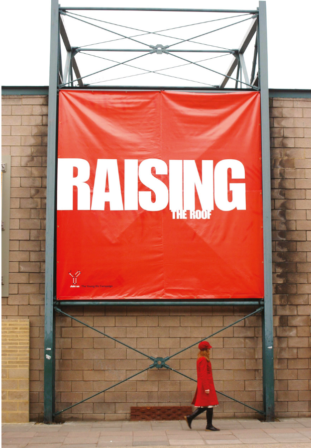
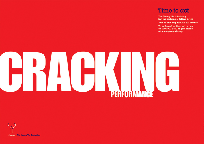

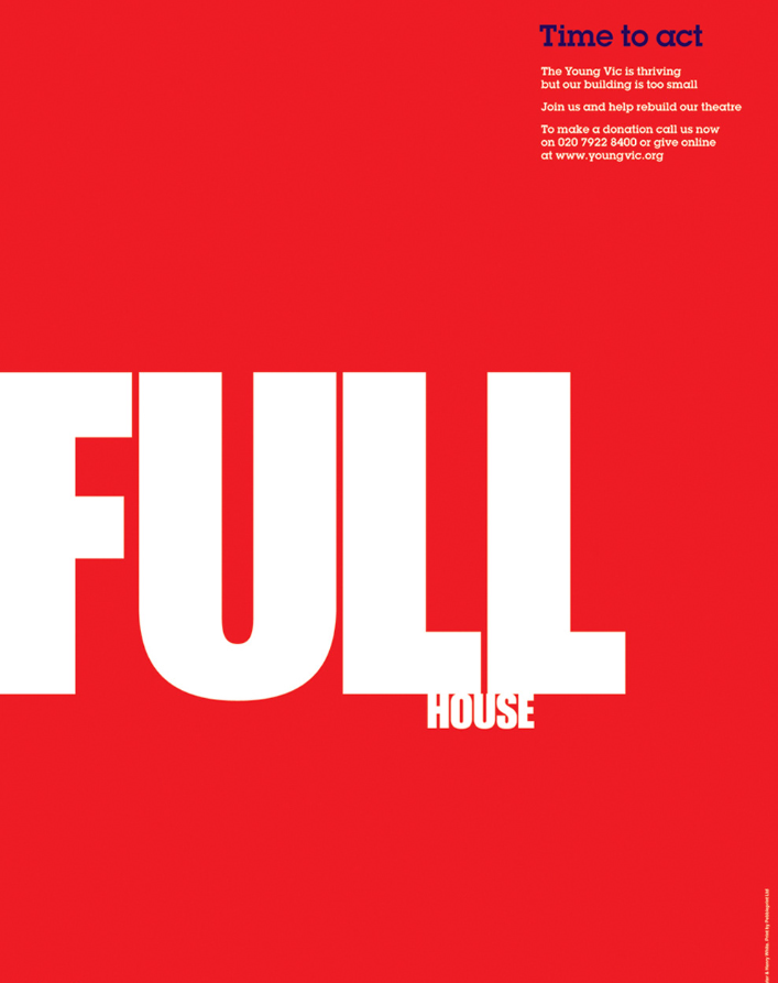
Check out this fantastic example of visual hierarchy in advertising. The Young Vic theatre’s fundraising campaign, “Time to Act,” cleverly uses wordplay from theatre critiques to highlight the theatre’s current inadequate state and the urgent need for expansion and rebuilding.
Everything in this campaign, from color contrast to typography, perfectly aligns with the principles of visual hierarchy. Moreover, the font size and unique typography aesthetics in these visual advertising examples blend seamlessly to capture attention and convey the message effectively.
3. Focal Point Techniques in Advertising
Disclaimer: Before becoming a design enthusiast, I had yet to learn about the focal point design principle. I used to think a focal point was just something in a camera lens. I know, what a bummer! Honestly, now I’m more into the focal point method than the focal point of light! So, what is the focal point of an advert?
A “focal point” is the central element that captures the viewer’s attention and conveys the primary message or call to action. In design, it’s the principal focus of an image.
So, why use focal point in design?
You should know that the focal point is key when crafting an ad, brand, or marketing strategy. It’s like the center story of your ad. It highlights your main idea and draws the audience’s eye.
Identifying a focal point is as crucial as choosing colors from the color wheel and the right typography style. Your viewers need a clear spot to focus on while they take in your message.
You can create a strong focal point in various ways. For instance, techniques like the rule of thirds and the golden mean are great starting points for this design principle. Additionally, you can also easily create a focal point in your design by using colors, different shapes, and lines.
Do we need to include any advertising trends? Oh, yes. Which focal point technique in advertising involves keeping the focal point focused and making the background blurry, or vice versa?
If you want to keep the focal point focused while making the background blurry, use the visual technique called “depth of field” manipulation or “selective focus.” You’ve to keep a particular element in the image in sharp focus while the rest of the image is intentionally blurred.
Want to know what an ad looks like with technique? It looks simply stunning, just like the Instagram post template.

Get This Template and More
Example

The human eye naturally follows the color path. For instance, bright and vibrant shades grab attention far more effectively than muted tones. Therefore, this example of a focal point experiment is perfect for understanding its strategic approach.
This ad smartly uses color to guide your gaze to the most important element, making you feel a bit uneasy and highlighting something unusual.
It demonstrates that the focal point isn’t about random color choices or elements because they look nice. When used strategically, color becomes a powerful tool to spotlight key information, direct viewers where you want them to go, and evoke emotional responses.
4. Typographic Composition in Visual Advertising
As we explore different visual advertising techniques, it’s time for the most popular one!
So, what is typography in advertising?
Almost every ad out there has a typographic element. Typography is the art of designing and arranging text to make it visually appealing. With so many ads bombarding consumers daily, using typography to grab attention and convey your message is crucial.
Now, let’s understand the prime concept in design: how is typography used in advertising?
One key aspect is font pairing—the combination of fonts used in your design. It can either elevate your ad or make it fall flat. The text colors must also harmonize with the background to create a balanced look.
Take a sneak peek at the exclusive Facebook post ad for the fashion industry.

Get This Template and More
There are many cool typographic techniques to try. For instance, you can manipulate letters to form shapes or add textures inside the letters. These tricks can make your ads stand out and engage your audience.
Like Facebook ads, the amount of text is crucial in some cases. The Facebook algorithm prefers a specific text-to-image ratio in the ads you submit.
So, you need to be mindful of the text you include. Ensure your visual sends the message without too much text, or Facebook might not run it.
The right typography can make a significant impact. Specifically, it connects with your audience, conveys emotions and messages, and boosts brand recognition. Moreover, typography choices – like font, size, color, and spacing – set the tone and mood of your marketing message. Ultimately, they communicate your brand’s personality and help you stand out from competitors.
Therefore, sometimes typography in advertising can be the star of the show. Take this Cadbury ad, for example. The product they’re selling is tiny in comparison to the bold text.
Example:

This rounded, bubbly typography in a striking contrast color grabs your attention instantly. Moreover, it’s a prime example of typography in branding, using specific brand colors and fonts. Consequently, the campaign spreads the word that if you want the biggest eggs for Easter, grab Cadbury eggs to share with your loved ones. Furthermore, the eye-catching typography adds excitement and makes it feel like part of the celebration. Ultimately, this approach helps the brand make a lasting impression, making it easy for customers to remember.
5. Rule of Thirds in Advertising
The rule of thirds is necessary for graphic designers, videographers, photographers, and other creatives. This simple guideline helps you frame and compose images that look balanced and naturally pleasing to the eye.
So the big question is: what is rule of thirds and examples?
It’s a slick way to split up an image or design using a grid. Picture your screen divided into three rows and columns, creating nine neat boxes. It’s like the grid on your phone’s camera, making framing a breeze. Let’s learn about how you use the rule of three in ads.
First, grab your image dimensions. Divide both the height and width by three, then mark these intervals along the edges.
Now, if you draw straight lines through these vertical and horizontal marks, they will intersect at four key points, where our eyes naturally go when we look at an image or design.
Why does this matter? It makes your designs more dynamic and pleasing to the eye. So, there you have it! Embrace the rule of thirds and watch your compositions come to life.
Example:

The rule of thirds is a fundamental composition trick that instantly elevates your photos. It’s like the secret sauce for making your images pop! Whether you’re into advertising or marketing photography, this technique is your go-to for creating compelling visuals that capture attention, and this product picture weaves all the elements together.
Check out how to strategically place two main spots for the advertised product.
These spots are the first things your eyes are drawn to when you look at the banner, following the natural left-to-right reading pattern. The third spot is where we put the call to action, the banner’s main message.
6. Composition in Advertising
Composition in visual communication is an all-in-one principle that involves a constellation of design concepts. It combines all kinds of cool graphic design stuff like color contrast, visual hierarchy, and the rule of thirds. It’s basically a mix of everything necessary in visual advertising that perfectly harmonizes the design and message.
Great composition doesn’t always stick to color contrast or the rule of thirds. Sometimes, you can create a stunning, balanced design using a high-impact technique: leading lines. These lines guide the eye to the focal point of your design, directing attention to different tiers or critical information. I found the perfect example of visual advertising techniques to introduce you to the silent linchpin of visual ads.

Now, let’s talk about another crucial aspect: scale and hierarchy. This concept, one of the core principles of graphic design, is essential when building your composition. In visual advertising, the composition is everything. It establishes a visual hierarchy, guiding the viewer’s eyes through a deliberate visual path to make your message clear and compelling. So, whatever the best visual advertising techniques you use, the end result should be how you create a visual hierarchy to communicate the right thing.
But, if you are the “Knowledge Yoda” in visual marketing, don’t forget to get your hands on concepts like the Fibonacci spiral and Gestalt principles.

Another trick to create a visually balanced composition is to use the “safe area” visual techniques. Here’s the beauty YouTube banner template from DocHipo to clarify what it means. Trust me, it’s the easiest of all visual advertising techniques. Use it easily to promote your beauty vlogs, podcasts, or similar content!

Example:

As I’ve mentioned, there are many ways to create a balanced composition. The primary guideline for composition in visual storytelling is the Gestalt principles, which include visual rules like simplicity, synchrony, and association.
Take the above ad, for example. The composition places the mother on the left side, with the sun shining on her from the right. The text is set beneath her, giving it a sense of importance.
This ad cleverly uses techniques like the rule of thirds, focal points, and visual hierarchy to convey its message effectively.
7. The Appeal of Animation in Advertising
One of the biggest perks of using animation advertising is its power to evoke emotions and create memorable brand experiences. Animated characters and stories uniquely connect with audiences, building a sense of loyalty and attachment to your brand.
Animation is a powerful visual technique to simplify complex ideas and connect with people on an emotional level. It makes your message clear and memorable. Essentially, animation brings a series of still images to life, creating moving visuals that emphasize cinematic effects and emotional storytelling.
As a booming visual artist, you must wonder, “What is the role of animation in advertising?”
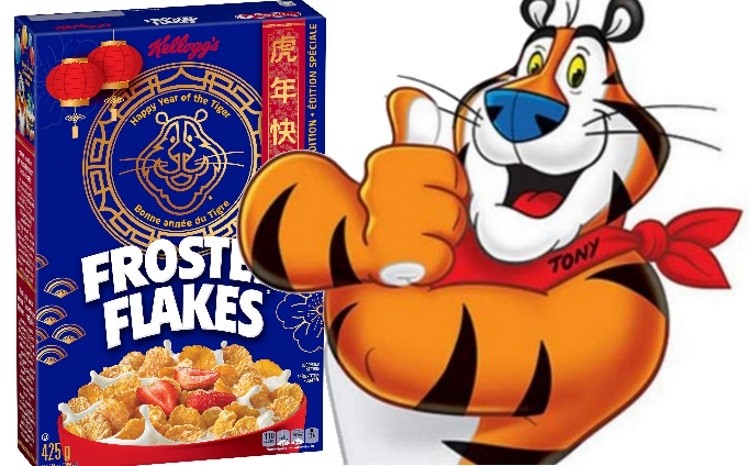
Using animation in visual advertisement examples can elevate your brand’s essence and showcase your values and personality to your target audience. It creates a unique identity for your product. If you ask me, a brand mascot would be a perfect example of animation and advertising in sync. A brand mascot represents your brand and makes it unforgettable.
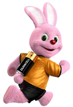
Remember Tony the Tiger featured on every box of Kellogg’s Frosted Flakes? Or, the Duracell Bunny from Duracell ads, an anthropomorphic pink rabbit powered by Duracell batteries that never stops! Yeah, I bet you remember these famous, cute cartoon advertising characters because they were friendly, funny, and human-esque.
DocHipo also designed customizable templates with branding mascots so that you won’t be stuck on one creative marketing project for days.
Get This Template and More
Watch this video and use animations easily in your social ads.
It’s obvious that you might be wondering how to know if amination is the right visual technique for creating a winning ad for your brand. Well, let’s find out: where are animated adverts used?
Animation is a top pick for brands aiming to craft ads that stick. It is ideal for TV and social media like LinkedIn, YouTube, Facebook, Instagram, or X; it ensures your campaigns are memorable and engaging. The primary objective? Boosting brand awareness, plain and simple. So, if your ad campaign is for the people in the first stage of the marketing funnel, you can definitely have your shot with an animation advertising video.
Example

This Christmas animation advertising video will leave you speechless, maybe in tears, if you feel like the anthropomorphic porcupine who feels left out because it’s a bit different from the rest of the breed. Anthropomorphism, giving human qualities to inanimate objects or animals, is one of the best examples of advertising techniques in animation. The power of visual narration and the emotional appeal of animation never go unnoticed!
8. Motion Graphics in Advertising
But very few people actually know the difference between motion graphics and animation. Although animation is the umbrella term for any kind of animated visual storytelling, motion graphics is just one of the forms of animation! So, “What is motion graphics advertising?”
They turn ideas into engaging visuals using pictures, graphics, videos, sounds, infographics, and texts in motion. When you add motion effects to your graphic elements, that becomes motion graphics. If you want to wiggle your illustration or spin your logo, you are doing motion graphics! This approach simplifies complex details, making it easier for potential clients to understand your message and take action. Plus, these visuals are perfect for sharing on social media and enhancing your website content.
Thinking about “How are motion graphics used in advertising?” Well, if your goal is to create brand awareness and persuade the audience to align with your brand offers, say yes to motion graphics. As a visual artist, you’ll love the creative freedom these branding techniques offer. Using motion graphics along with prominent animation visual advertising techniques involving cartoon characters and emotional storytelling generates urgency, boosts brand awareness, launches new products, and highlights value propositions in a unique and engaging way.
Example:

The Google Home launch video is a prime example of how to captivate viewers with sleek motion graphics. This motion graphics advert perfectly showcases the brand and its product with clean, simple visuals and smooth, synchronized motions. It effortlessly simplifies the process and sets clear expectations for the audience.
The video’s charm and magnetic appeal blew motion graphic artists away. Its seamless simplicity and flowing design left a lasting impression, making it a standout in the world of product launches.
9. Visual Path in Advertising
Think of visual paths like the GPS for your eye, picking important information cues and guiding you straight to what matters most in any graphic.
Whenever you glance at an ad, flip through a magazine page, browse a website, or check out a landing page, your eyes naturally follow a specific route.
Now, let’s break it down. There are two main paths to keep in mind. First up, we’ve got the Z shape. It starts at the top left, cruises to the right, dips diagonally left, and finishes strong by heading right again.
Then, there’s the F shape. Like how we read, it starts left, moves right, and then drops down in a neat F pattern.
Here is an excellent example of an F-shaped visual path created in the food Instagram ad template in DocHipo.

Get This Template and More
These paths are your secret for keeping viewers engaged and ensuring your message hits home every time.
Example:

Check out the landing page example below to see the Z path in action. You’ll start at the headline, catch the intention, and hit the button to make a choice.
10. Direct and Three-Quarter Gaze in Visual Advertising Techniques
Based on my years of experience in visual communication, I’ve found that “direct gaze” is a game-changer. This term refers to when the subject of an ad, whether in a picture or video, looks directly at the viewer. It’s a powerful technique that grabs attention and creates a personal connection with the audience.
Check out the profound representation of direct gaze in advertising with DocHipo’s Cyber Monday Facebook post template.

Get This Template and More
If you have just started exploring visual advertising techniques, you’re probably asking yourself, “What is direct gaze used for?”
Direct gaze in ads creates instant credibility by tapping into our psychology. As humans, we tend to trust people who look us in the eye. Marketing is all about understanding psychology and leveraging data, so this visual technique gives you an edge in compelling your audience. When launching or retargeting functional products like insurance, cleaning supplies, or safety equipment, use informational ads featuring a model looking directly at the viewer. This direct gaze boosts credibility and makes your message more convincing.
Another technique to consider is the three-quarter gaze. This can be directed either inward or outward, depending on the message you want to convey. It’s a unique way to add depth and interest to your visual ads.
Let’s check out the magnetic black friday Facebook ad template for a three-quarter gaze demonstration.

Get This Template and More
Or, this jaw-dropping fashion LinkedIn post template by DocHipo.

Get This Template and More
Example:

This ad nails it with a direct gaze, making the viewer feel seen. Right next to this is another version of the same woman, but with her eyes closed, showing a different attitude. The contrasting moods of these two images highlight the power of the direct gaze, making the side with open eyes even more compelling.
Now, let’s watch a celebrity endorsement mixed with other visual advertising techniques, including the three-quarter gaze.

You’ll often find a mixed bag of persuasive advertising techniques with visual techniques to make the advert top-notch. Here, this gaze highlights the ad’s main focus, directing attention to a key object or action on screen.
11. Trompe l’oeil Effect
This French phrase, meaning “deceives the eye,” is a brilliant visual art technique that creates the illusion of a real object or scene. It’s an optical illusion that tricks the eye into thinking a flat surface, like a wall, is three-dimensional. This technique is a hit in visual advertising for its mind-bending, illusive texture, achieved through photorealistic painting and careful use of perspective.
Let me grab your attention with this incredible food poster.

Get This Template and More
Example:

This print ad cleverly plays a visual trick on your mind, making McDonald’s hamburger look like a 3D reflection. It’s so drool-worthy that you’ll want to download the app and get it with just a click. The blurry background, along with the hands and mobile frame, sets the stage perfectly. Plus, that mouth-watering hamburger uses an old visual art technique to boost your appetite.
12. Body Language Technique
Body language, a persuasive advertising technique with visual mastery, includes body movements, postures, eye contact, smile, and every other detail of the facial expression and physical attitude reflected in an ad. These familiar nuances greatly impact viewers’ minds and encourage them to purchase because they reflect the correlation with lifelike expressions.
Let’s learn something more about these body language advertising techniques. Do you know: “Why is body language important in marketing?”
Body language is like a burst of energy, constantly sending messages to those around you. Your expressions act as signals, revealing your mood, intentions, and the information you want to share.
Ever heard of the 7-38-55 rule? It’s a fascinating insight into how we communicate. It turns out that only 7% of communication is done through words. The rest? It’s all about how we say it and what our bodies are doing. The tone of voice makes up 38%, and body language a whopping 55%. Mastering this non-verbal language, especially when interacting with customers, colleagues, and employees, can give you a significant edge. It provides valuable insights that words alone might miss.
Body image in advertising is key because it connects with our psychology, using persuasive visuals to show why we need a product or service. DocHipo harnesses this visual advertising technique to create the stunning Instagram story template below. It not only boosts your mood but also draws your eyes to special offers.

Get This Template and More
Example:

Pulling heartstrings with pop culture is Popchips’s real jam. This ad campaign featured Katy Perry to connect with teens. When you look at the poster, you catch a vibrant, refreshing, stunning attitude with a direct gaze at you, spreading a carefree, nonchalant message.
13. Storytelling in Advertising
Let’s break down the power of storytelling in marketing. Simply put, visual storytelling uses facts and narratives to connect with your audience. Some stories stick to the facts, while others add a bit of flair or improvisation to make the core message more engaging and relatable.
An ad campaign shouldn’t just create a need for the product; it should tell a story that resonates with consumers. Storytelling has been a staple in traditional media for generations. You’ve seen it countless times. To craft standout ads, blend storytelling with other visual techniques.
Brands can spin a tale in many ways. They can share their origin story or highlight real customer experiences. Sometimes, a story needs no words—just the right music and visuals can do the trick.
Example:

Burger Kings’ “A Little More Confusing Times” strikes a chord not only with the kids but also with our inner child. It starts with a chain of naive questions that kids often wonder. I’m sure you, too, asked one of these questions as a kid! Storytelling is an art, and Burger Kind taps into that technique so seamlessly that you can’t help but smile at kids’ innocence.
14. Repetition
Repetition in advertising serves a dual purpose: boosting visibility and enhancing memorability. It is all about hammering home your message multiple times to raise brand awareness and consumer recall. It might sound simple, but repetition is a super powerful tool when done right. By consistently repeating your message, you ensure it sticks in the minds of your audience, making your brand unforgettable.
Repetition is vital in visual advertising and applies in various ways to maximize impact.
First, you can air a TV commercial multiple times daily across different channels to ensure it reaches a broad audience. Another approach is sending the same ad to be printed in several niche magazines, capturing the attention of readers interested in your industry. Additionally, placing the same ad on billboards around the city, country, or even internationally increases visibility.
Remember, to reach online audiences, you should submit digital ads to Google Ads or media outlets like Mediavine. Also, consider creating and distributing a large quantity of merchandise with your brand assets printed on it. It helps keep your brand in front of potential customers.
Furthermore, you can make different versions of the same ad with various characters or body positions to keep the content fresh and engaging. Lastly, increase the frequency of your Facebook ads to ensure they appear more often and stay top of mind for your audience.
If you want to create effortless social media ads, you can use visual repetition techniques like color and text rhyming. Here’s an iconic fashion LinkedIn post template with repetitive color patterns.

Get This Template and More
You can also use this technique snappily in your ads with video collages. It will leave a continuous imprint on your audience. Try DocHipo’s first-rate video collage feature now, and watch the short tutorial video before you try it.
Using these strategies, you can effectively leverage repetition advertising to reinforce your brand message and achieve tremendous success in your advertising efforts.
Example:

Check out this stellar example of repetition advertising. First off, notice how the brand repeatedly used the Coca-Cola bottle shape. Plus, the Coca-Cola name pops up on three out of four bottles. Take a closer look, and you’ll see the liquid flows in the same direction in the first two bottles and reverses in the others, balancing the design. Also, notice how they’ve repeated the fonts—it’s another brilliant touch.
15. Association Advertising Technique
Have you ever heard of association principal advertising? It’s a clever tactic in which brands link their product with something familiar to influence sales.
The idea is that the graphic’s visuals create connections for the viewer. These representations can evoke feelings, ideas, places, or even nostalgia.
For association marketing to work, thorough research is crucial. You need to deeply understand your consumer before deciding on the correct association.
Take, for example, antibacterial hand soap. An ad might show kids having a blast playing in the mud, creating the idea that getting dirty is fine—as long as they can wash their hands with soap afterward.
If you want to promote movie nights, check out DocHipo’s movie night invitation template. This template uses the association principle in advertising.

Get This Template and More
Look how effortlessly the team associated popcorn with movie night to connect with a good feeling for a family downtime.
Example:

In this association advertising example, the connection works on two levels. Completely different elements, such as condensed milk, music, and AI, come together to tell a surprisingly relatable story.
Viewers can connect with the nostalgia of growing up with La Lechera, linking it to the music of their time. Celebrating 100 years of La Lechera shows how smart associations can make an ad’s story hit home for the audience.
16. Point of View Technique
This advertising technique immerses the viewer by making them feel like they’re experiencing the action firsthand. It’s a favorite in video advertising.
This point-of-view (POV) technique has various levels. For instance, a camera attached to a SteadyCam at eye level creates a natural, immersive feel, making viewers feel like they’re right in the scene.
GoPro cameras strapped to helmets in extreme sports are another widespread use of this technique. The thrilling footage often ends on social media or in longer, inspiring videos. Brands like RedBull and GoPro are pros at this.
Their videos might not resemble traditional ads, but they sell the lifestyle, making viewers want to be part of the adventure.
Example:

POV visual technique is a quintessential approach in new-age advertisements. If your brand is associated with travel, sports, or adventure, this is one of your go-to visual advertising techniques.
17. Emotional Appeal in Ads
Using emotional appeal, or pathos, is a smart way to tap into a viewer’s feelings to sell a product or service. Whether love, empathy, and the promise of happiness, fear, anger, or even envy, emotional appeal has always been a powerhouse tool for advertisers. Think about those commercials with touching scenes of family and friends, cute pets, or anything that tugs at your heartstrings—or even stirs up negative emotions. These ads spark an emotional response, making them incredibly effective.
You need to know your customers to use this advertising technique. You can use images to evoke a range of emotions, whether happiness, jealousy, or worry. Just choose the right visuals and pair them with text targeting those feelings.
Example:

The “Brake—Don’t Text and Drive” ad campaign brilliantly taps into emotional appeal by highlighting the serious and often tragic consequences of distracted driving. This powerful image and message evoke fear, concern, and a sense of responsibility; the advertisement aims to make viewers feel the weight of their actions.
18. Testimonials and Badges for Trust
To promote your services and products, you can display testimonials from your existing customers, such as reviews, case studies, social media mentions, and shares. Social proof is mainly used for online advertising, but it can also be used in print.
Influencer marketing and endorsements are fantastic ways to build trust. Influencers do the marketing for the brand in their own words, recommending the product to their followers.
A case study is a slightly technical, lengthy article published on the website that showcases how real people successfully use the product. Nowadays, you can also post case studies on social media. DocHipo presents various industry-specific multi-pager case study templates, like the following.

Get This Template and More
Watch this video to create highly credible and accessible case studies in minutes!
These social badges are also a great visual way to add social proof to display ads, email newsletters, posters, or flyers.
Example:

Nike has done it again, showcasing what they do best. They’ve crafted a short, inspiring montage video featuring employees and moments at Nike, all set to a moving soundtrack. It mirrors the powerful ads they consistently create year after year.
In the video, various employees share their stories about joining Nike and what drew them to the company. These personal anecdotes are paired with behind-the-scenes glimpses of life at Nike and inspiring messages to attract new candidates to their mission. What makes this video so effective is its alignment with Nike’s core values:
- Innovation
- Striving to be your best
- Belief in the power of sport to change the world
After watching the video, you can’t help but want to join their culture. This is the hallmark of a successful employee testimonial.
19. Artificial Reality
Interactive advertising is gaining traction with the rise of augmented reality (AR). Many TV shows now have AR apps that let viewers experience the show’s setting firsthand.
This type of advertising, also known as “covert advertising,” doesn’t sell anything directly. Instead, it promotes the brand’s idea and raises awareness.
One key thing to remember about AR advertising is that it always requires an app to function.
Brands have been getting creative with their AR marketing. Take Timberland, for instance. They installed life-size screens in their windows. The AR app allowed people to see their appearance in Timberland clothes.
The app dressed users in Timberland outfits by snapping a photo at the window. It was like an AR dressing room with minimal effort from the consumer.
Example:

IKEA lets you place their furniture in your home using augmented reality (AR). This ad shows how different pieces of furniture will look and fit in your space before you buy with the IKEA Place app.
20. Symbolism
Symbolism is a technique, i.e., closely related to association. Visual marketing that uses symbolism often employs metaphors and similes. These literary tools create comparisons and allusions that resonate with viewers.
For instance, imagine a hand cream ad using a visual metaphor to compare its scent to fresh spring flowers. This approach can create a powerful, memorable image.
However, the use of symbolism can range from subtle to overly complex. The latter is effective only for brands with a loyal following who understand the nuances. You don’t want to confuse potential customers.
Icons, for example, offer a simple yet effective form of symbolism. They represent objects and concepts without a single word. Add a touch of animation to make these icons pop and grab your audience’s attention.
Example:

This innovative Kit Kat Bar Graph campaign beholds our attention and puts a broad smile on our haggard faces with brilliant visual symbolism. It depicts a straightforward interpretation of how most employees feel about their anxiety level on a typical working day. The Kit Kat Chocolate bars with each bite symbolize the rise of your dopamine level by wiping out monstrous anxiety with each enjoyable break. Doesn’t this metaphor get you grooving? That’s the visual psychological power of symbolism in advertising.
Know Which Video Advertising Techniques Are Suitable for Your Ad Campaign
Start by identifying your target audience and understanding their preferences. For instance, short, catchy ads work well for social media platforms like Instagram and TikTok, where viewers have shorter attention spans. On the other hand, longer, more informative videos are better suited for YouTube or LinkedIn, where audiences are looking for in-depth content.
Consider using storytelling to create an emotional connection with your audience, making your message more memorable. Animation can simplify complex ideas, while AR videos add a personal touch. Remember to leverage data and analytics to refine your approach, ensuring your videos not only engage but also convert viewers into customers.
You’ll optimize your ad campaign’s impact and reach by aligning your video techniques with your audience’s habits and platform strengths.
Wrapping Up…
I’m sure I have covered all the latest and time-tested visual advertising techniques for famous brands. Hopefully, you’ve enjoyed reading and learning about these exceptionally potent creative approaches to take your ad campaigns to a new height! If you ever feel stranded with bleak ideas and a nonstop rush of deadlines, sign up and try DocHipo templates, as they make design easy!
FAQ
What is the role of visual effects in advertising?
The role of visual effects in advertising is to grab the audience’s attention and create a memorable impression. Visual effects such as motion graphics, 3D graphics, parallax scrolling, and augmented reality (AR) can make the advertisement more engaging and appealing to the viewers, making it more likely to be noticed and remembered.
What is snob appeal in advertising?
Snob appeal in advertising is a technique for persuading consumers to buy a product or service by implying that possessing it will elevate their social status or make them feel superior to others. It often leverages the desire for luxury or exclusivity.
What is composition in advertising?
Composition refers to the arrangement of visual elements within an advertisement. It involves placing and organizing elements such as images, text, and graphic elements to create a visually appealing and effective ad.
How do advertisements attract an audience?
Advertisements attract viewers through compelling visuals, persuasive messaging, and strategic placement to capture attention. The effective use of color psychology, visual hierarchy, storytelling, and engaging content plays a crucial role in drawing the audience in and leaving a mark on their minds.
What is the focal point technique in advertising?
The focal point technique in advertising creates a central focus to draw attention and guide the viewer’s eye, making certain elements stand out effectively. This technique aims to highlight the most essential part of the ad, ensuring that the message or product you promote is prominently featured and easily noticeable, enhancing the overall impact of visual advertisements.
Which advertising technique is most effective?
Determining the most effective advertising technique depends on various factors, such as the target audience, advertised product or service, and overall campaign goals. Different methods may work better in other situations. Before determining the most effective technique, it’s essential to consider the specific context and objectives of the advertising campaign.

