Best Color Combinations And How To Use Them In Your Design

Whether you are about to build a new brand from scratch or launch a new product, color combinations always significantly impact your overall message and effectiveness. According to color psychologists, specific colors can grab people’s attention, create an emotional connection and ultimately make a long-lasting impression. Finding the best color combinations for your marketing or branding is not an easy task. It requires a lot of research. But don’t worry, we will always try our best to minimize your efforts.
Best Color Combinations
Color Combinations with Two Colors
- Oxford Blue (#000C3B) and Rose Red (#BC0556): Symbolizes luxury, power, nobility, and ambition.
- Black (#000000) and Orange Yellow (#FDBF2D): A contrasting combination that enhances mental stimulation while balancing it with black.
- Space Cadet (#2D2F4A) and Salmon Pink (#FF9E9E): Space Cadet is solid and durable, whereas Salmon Pink is trendy.
- Jet Black (#2D2926) and Tart Orange (#F84242): This combination has a powerful and ferocious vibe.
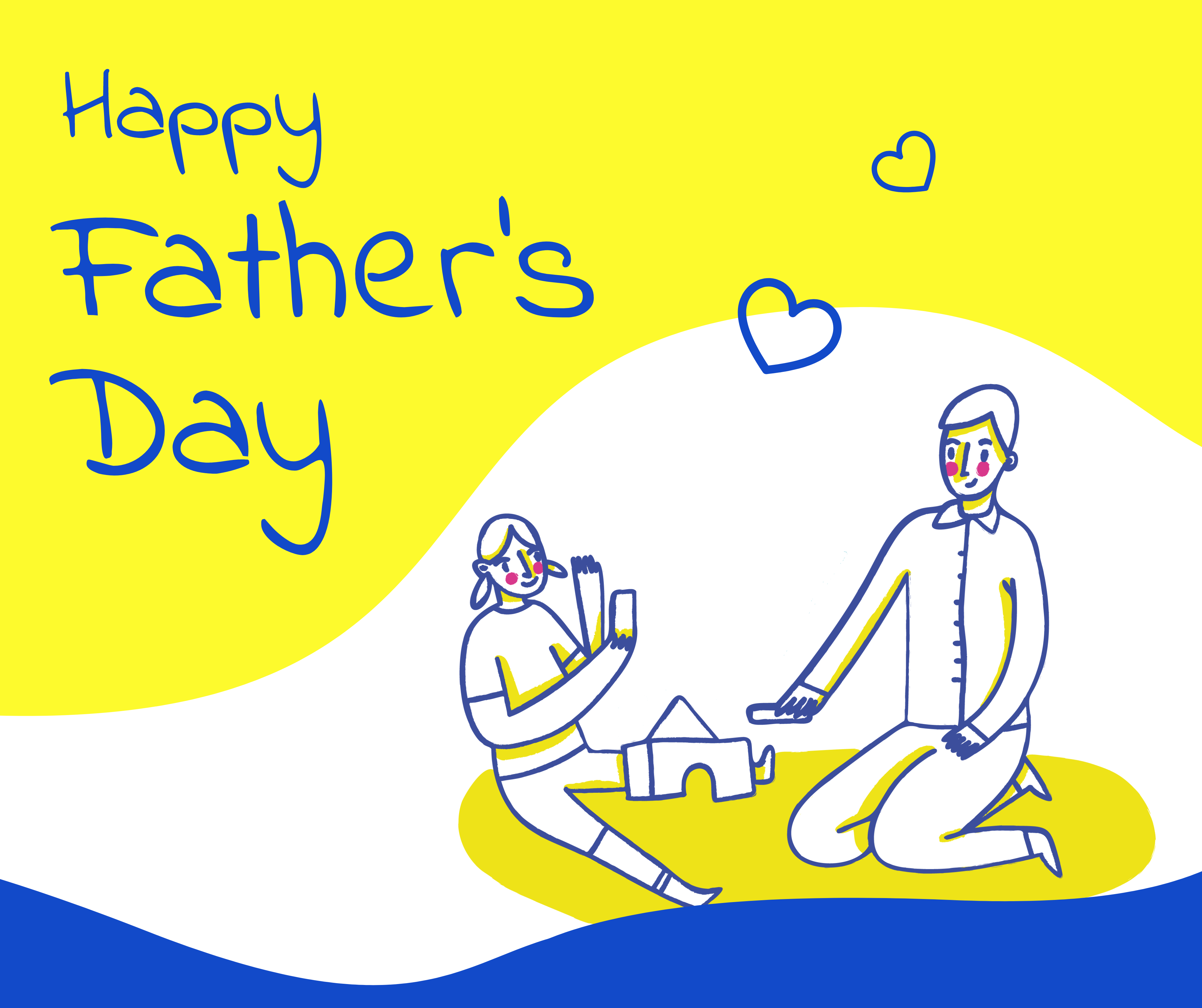
- Cerulean Blue (#2251C0) and Maximum Yellow (#FAF92A): A vibrant combination that perfectly fits parties and casual events.
Color Combinations with Three Colors
- Red Salsa (#FE4853), Persian Plum (#732529), Dim Grey (#6E6E6E): The combination radiates a fiery glow with a touch of ash.
- Light Coral (#F38A8C), French Sky Blue (#85B2FF) and White (#FFFFFF): A soft and feminine color combination that symbolizes youth and new life.
- Blood Red (#6D0303), Blue Yonder (#597091), and Old Rose (#B07777): A stunning contrast to the warmth of Blood Red with their cool shades.
- Brink Pink (#F9547C), Yellow Pantone (#FFE32B), Cerulean Crayola (#08AEE0): The combination symbolizes hope, kindness, and heaven sky radiating a positive feeling.
- Emerald (#4BC888), Red (#FF0000), and Cyber Yellow (#FFD000): A combination of bright colors evokes a sense of joy and merriment.
Read further to learn more about color combinations with four colors.
This article will help you explore some of the best color combinations and how to use them in your design using DocHipo.
Table of Contents
Why Are Colors Important In Marketing?
Whether it’s about designing graphics for your marketing content or designing your website and landing page, colors are essential things in design, if not the most important. Other elements such as fonts, lines, shapes, texture, space, and concept are important in their way. But nothing can please the viewer’s eye as much as the colors do.
Statistics show that consumers judge a product within 90 seconds of interacting with it, and 60%-90% of that judgment is based on color. Another study shows that the purchasing intent is hugely affected by the color combination that the brand uses.
The reason behind this is nothing else but the human brain itself. The colors are produced by light and have a kind of electromagnetic energy. This energy affects both the human mind and body. Hence, colors can add the right mood, structure, and temperature to your design.
Colors are an essential part of Visual Marketing and email design. Click Here to know more about it and improve your marketing strategy effortlessly and effectively.
Best Color Combinations With Two Colors
With the endless options of color combinations available, choosing the right color can be a daunting task. So, you can start with a color combination that uses two colors. Furthermore, sometimes a color combination with two is more effective than a more extensive palette. Here are some of the best color combinations with two colors.
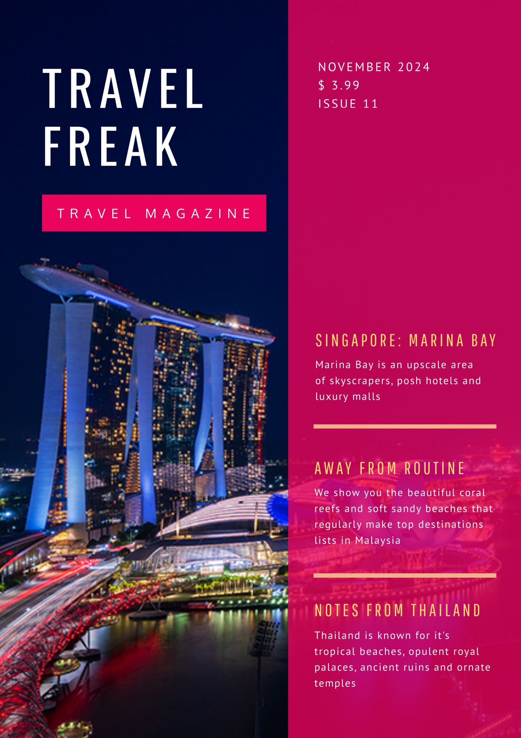
Oxford Blue (#000C3B) and Rose Red (#BC0556)

Rose Red is a soft and pinkish shade of Red. Since the color has a connection with rose flowers, rose red is seen as the shade of romance and love. The Oxford blue is a blackish purple. These two colors combined symbolize luxury, power, nobility, and ambition.
Get This Template and More
Black (#000000) and Orange Yellow (#FDBF2D)

Black and Yellow are probably some of the most common contrasting color combinations. You can use both colors for many different design types. While Yellow is well known to stimulate mental activity, combined with Black makes it a design that can explain things easily. Being a mysterious color, Black represents the unknown. However, the Orange-Yellow is a more welcoming color.

Get This Template and More
Space Cadet (#2D2F4A) and Salmon Pink (#FF9E9E)

The color Space Cadet is a dark shade of blue. On the other hand, pink is the driving color of salmon. Hence, Salmon Pink is just a close relative of the pink color family. Space Cadet has solid and durable characteristics due to its primary color features. On the other hand, Salmon Pink is a trendy color. Together they combine to form a super stylish color combination.

Get This Template and More
Jet Black (#2D2926) and Tart Orange (#F84242)

Tart Orange is a beautiful medium-light shade of Red that radiates from the design. When combined with the Jet black, the powerful glow of Tart Orange gets highlighted. Ever wondered why the Targaryens in Game of Thrones uses black and red as their colors? Because this color combination has a powerful and ferocious vibe. You can use this combination to create a fiery design for your business.

Get This Template and More
Cerulean Blue (#2251C0) and Maximum Yellow (#FAF92A)

The Cerulean Blue and Maximum Yellow are some of the best color combinations that perfectly fit parties and casual events. The Maximum Yellow shocks the senses alongside the equally electric Cerulean Blue. Hence, if you plan to design something for a casual event, this is the color combination for you.
Get This Template and More
Best Color Combinations With Three Colors
Color combinations that use three are a little harder to find. Because there are many options to choose from and all of them are not good. Generally, the combination of two contrasting colors and one complimentary color creates a three-color combination. Hence, here are some three-color combinations that we have come up with to help you understand which one works best for you.
Red Salsa (#FE4853), Persian Plum (#732529), Dim Grey (#6E6E6E)
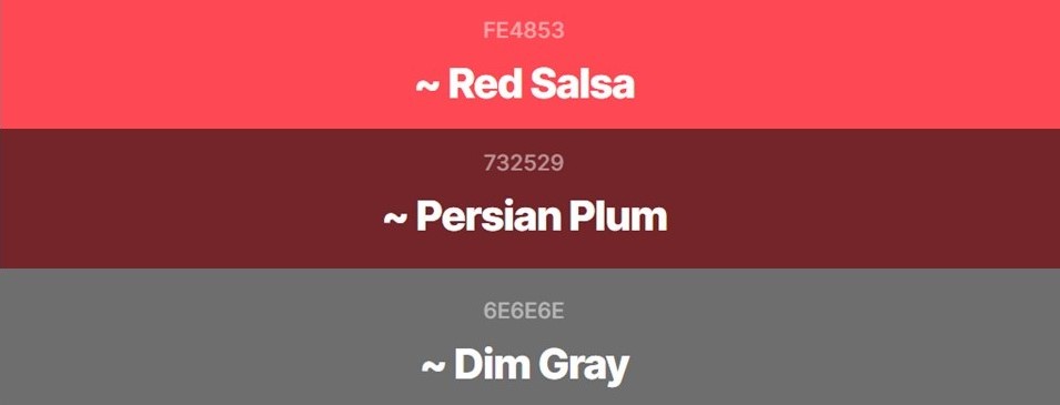
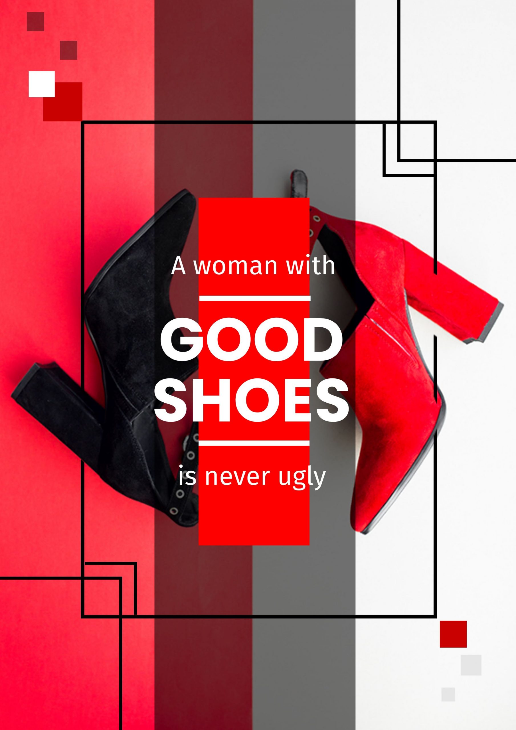
This color combination provides a fiery glow to any design that it’s applied on. The Dim Grey is a classic and gorgeous companion to the more enthusiastic Red Salsa and Persian Plum. Additionally, with the focusing effect of Red, humans get attracted to this color more than any other color. Most of the brands use various red shades to design call-to-action or logos that can attract people, just like the following Template that DocHipo offers.
Get This Template and More
Light Coral (#F38A8C), French Sky Blue (#85B2FF) and White (#FFFFFF)
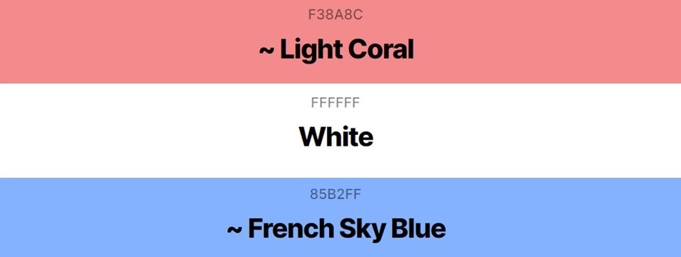
White is combined here with Light Coral and French Sky Blue. It is a soft and feminine color combination that symbolizes youth and new life. Furthermore, it is often used as a symbol of purity due to its innocent and light appearance. Additionally, it can be said that the color combination has a fragrance that transcends the design.

Get This Template and More
Blood Red (#6D0303), Blue Yonder (#597091), and Old Rose (#B07777)
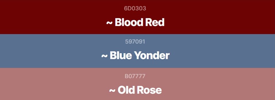
Blood Red is featured here alongside Old Rose and Blue Yonder. Blue Yonder is a pure, soft sapphire blue, and the Old Rose is a medium-light shade of pink. Blue Yonder and Old Rose offer a stunning contrast to the warmth of Blood Red with their cool shades.

Get This Template and More
Brink Pink (#F9547C), Yellow Pantone (#FFE32B), Cerulean Crayola (#08AEE0)
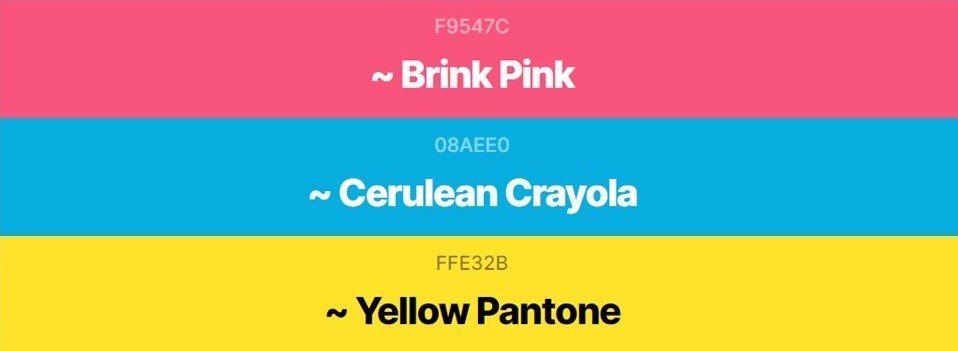
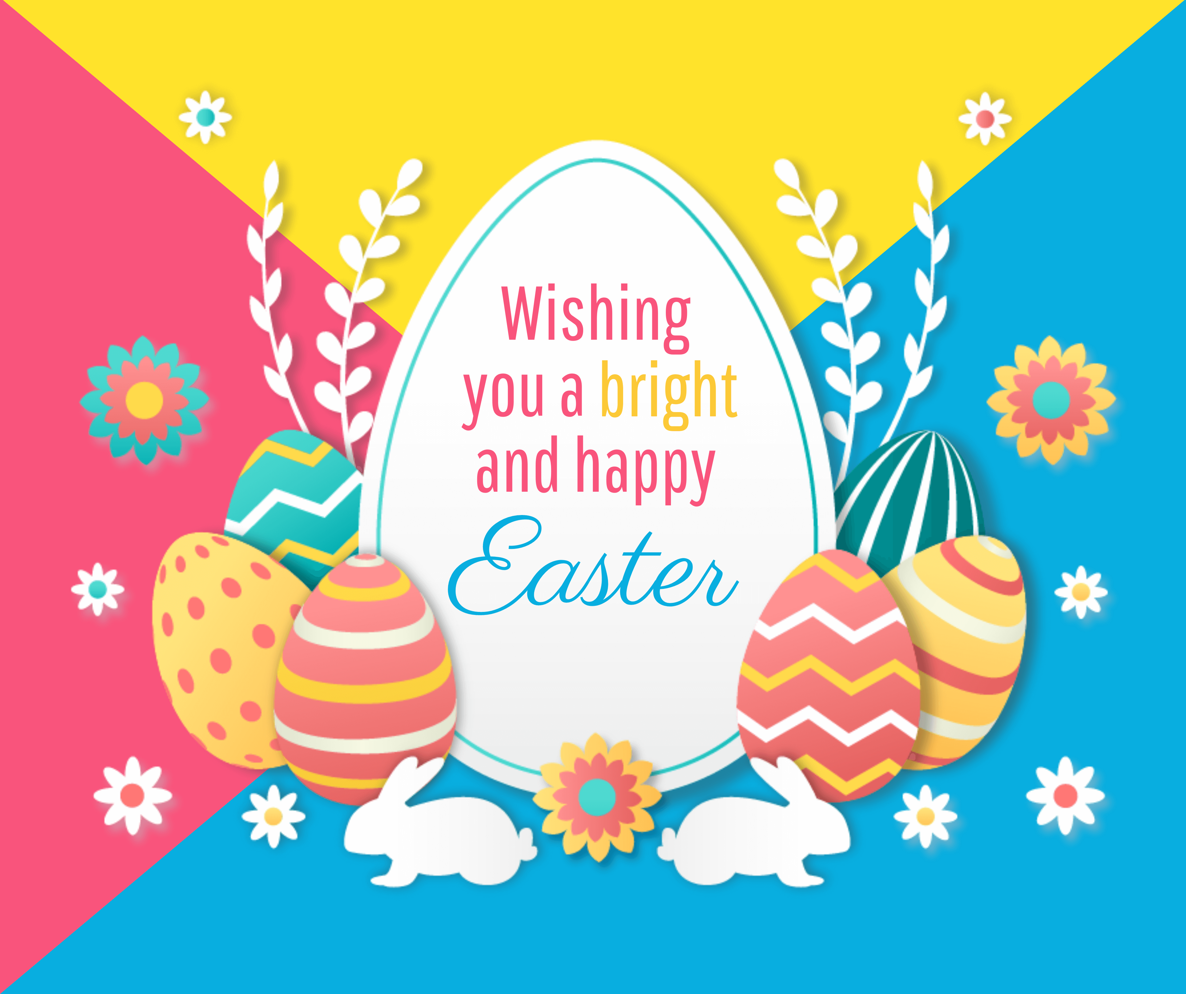
The Brink Pink symbolizes love, kindness, and femininity. Yellow Pantone is the color of Strength and Hopefulness, and the Cerulean Crayola is a representation of Heaven sky. This combination doesn’t have to work hard to create a great first impression on the viewers.
Get This Template and More
Emerald (#4BC888), Red (#FF0000), and Cyber Yellow (#FFD000)
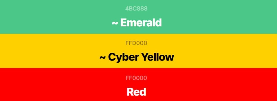
Due to its associations with precious gemstones, Emerald is considered a classic color that symbolizes royalty, refinement, and wealth. Red is widely regarded as a color of love, passion, and sexuality. And Cyber Yellow refers to a shade of medium to dark Yellow that symbolizes Cheerful. Marketers can use this color combination to draw attention and evoke a sense of happiness and joy.

Get This Template and More
Best Color Combinations With Four Colors
Mango Tango (#FF8243), Lapis Lazuli (#26619C), Yellow Orange (#FFAE42), and Bud Green (#7BB661)
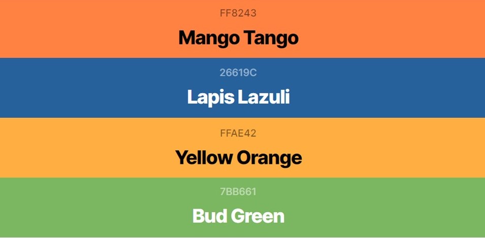
Mango Tango: a medium-light shade of orange. Lapis Lazuli: a dark shade of Blue which derived its name from a metamorphic rock that people use as a gemstone. Yellow Orange: the color of amber that sits between orange and yellow means it can be thought of as a stepping stone between two hues and the Bud Green: a shade of green that used to be the spring green before 1987. Each color is gently complimenting each other, bringing a peaceful meaning to the design. Thus, making it one of the best color combinations to use.

Get This Template and More
Middle Blue Purple (#8578B7), Maximum Yellow Red (#FDC346), Light Coral (#F38A8C), Pale Cerulean (#9DC3E3)
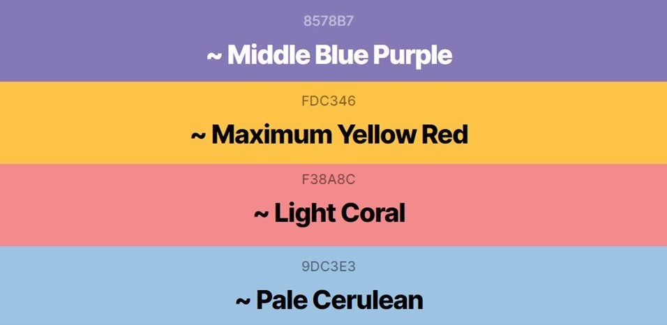
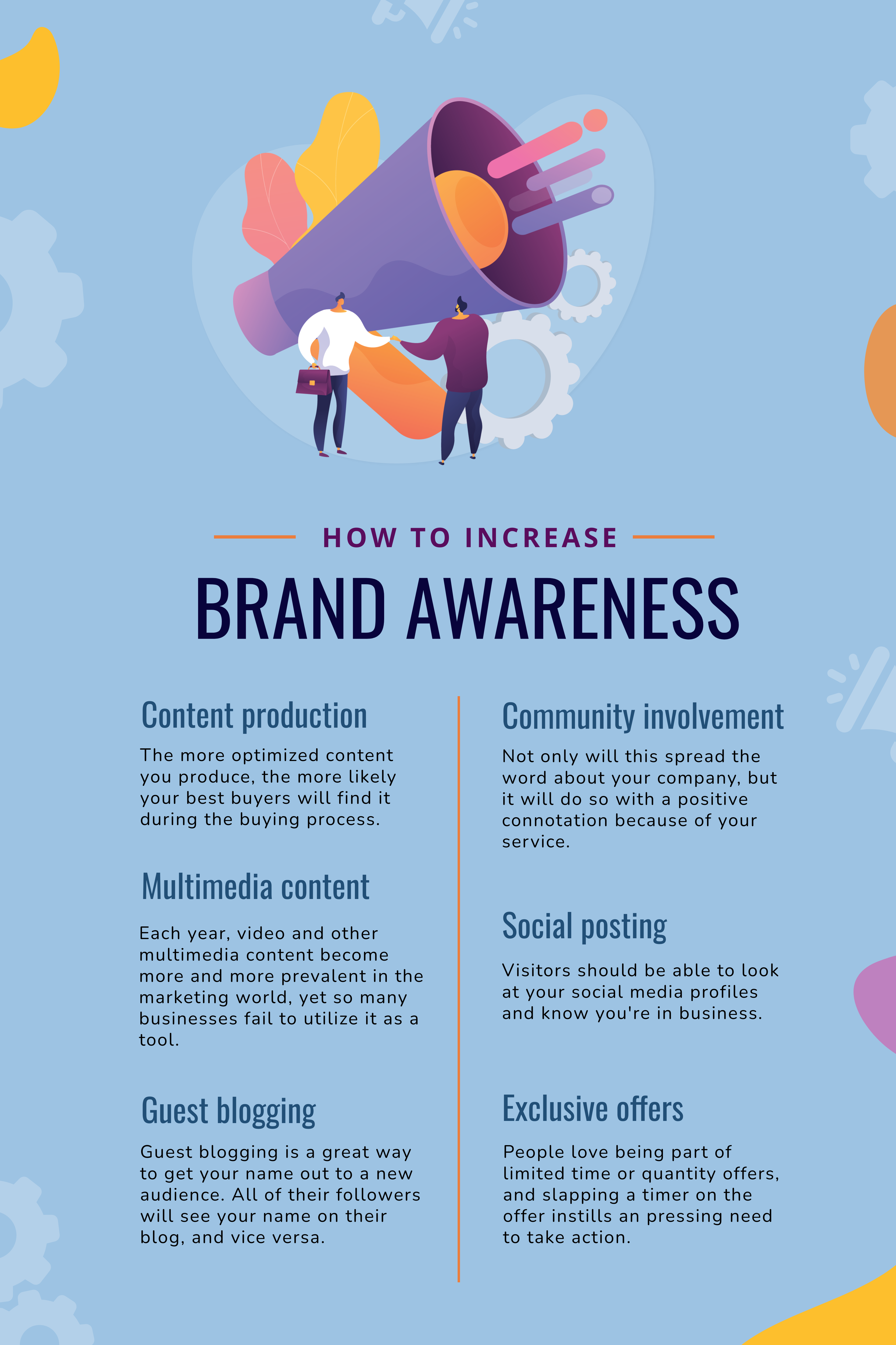
Middle Blue Purple is the color of the blue color spectrum, and Maximum Yellow Red is the color of excitement, enthusiasm, and warmth. Pale Cerulean is the color of the cyan color spectrum and belongs to the pale, deep blue color spectrum. Light Coral is one of the trending colors, and it has appeared many times in our best color combinations list. It is perceived as a bright color that blends the femininity of pink with the energy and optimism of orange. You can use this color combination to convey a significant message in your design.
Get This Template and More
Yellow RYB (#EFFD07), Orange (#F37D00), Keppel (#0EB5A2), Cinnabar (#EA3F37)
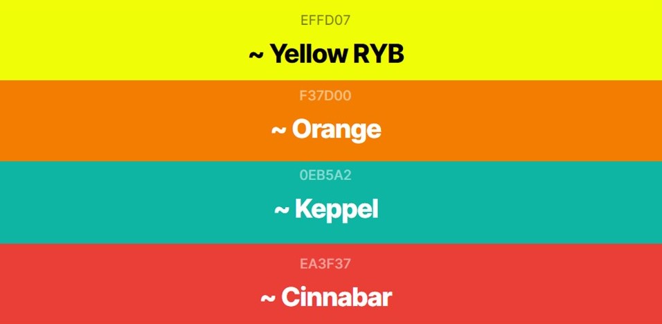
Here RYB refers to the traditional primary colors of pigment: Red, Yellow, and Blue. Yellow RYB is the traditional color combined with Orange, Keppel: a saturated light cold bluish cyan color and Blue makes another best color combination. Are you looking for a color combination for your design that demands attention due to its energetic features? This is the best color combination for you.

Get This Template and More
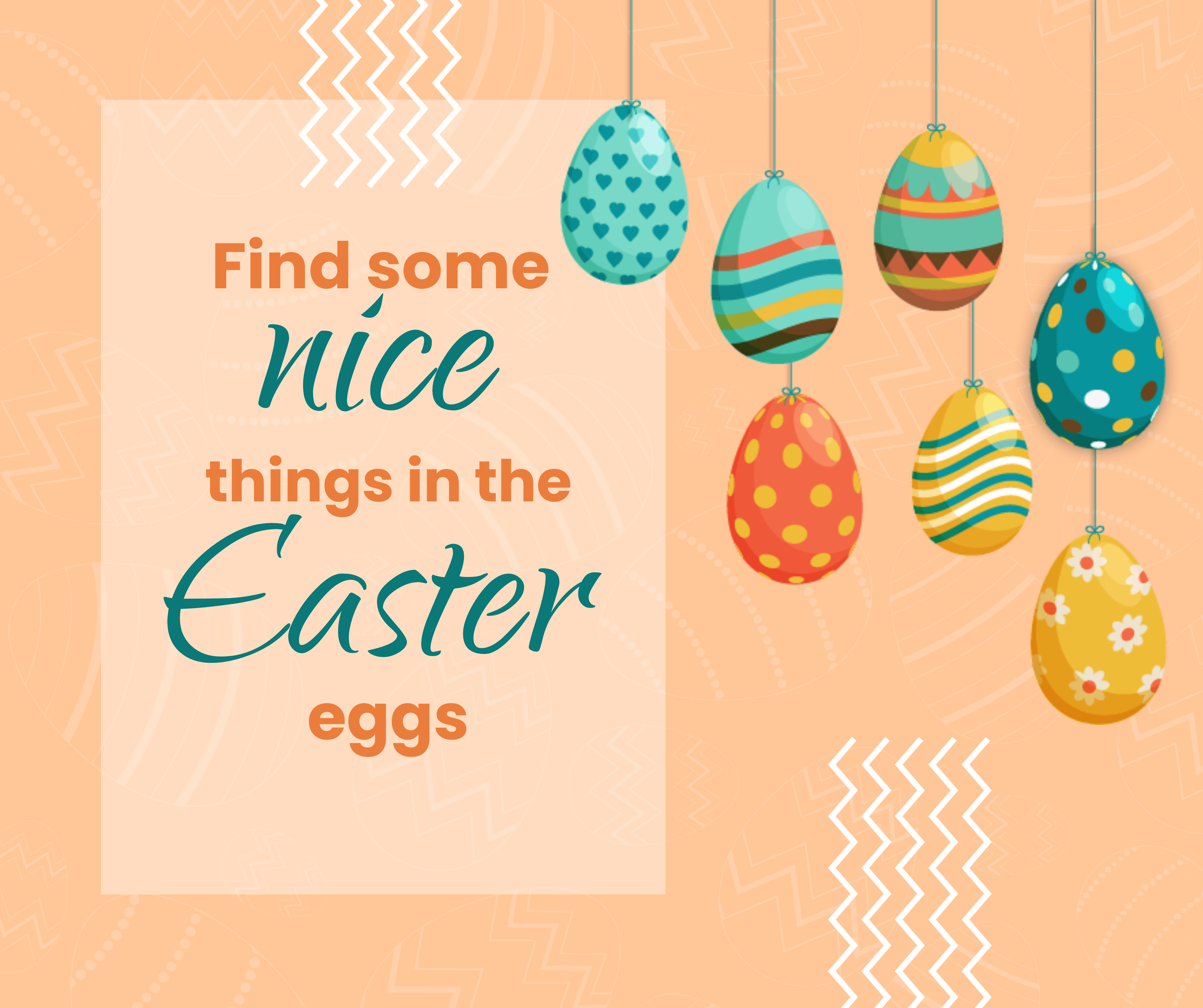
Peach Puff (#FBDBBD), Cadmium Orange (#E68C35), Peach Crayola (#FAC597), Viridian Green (#31978E)
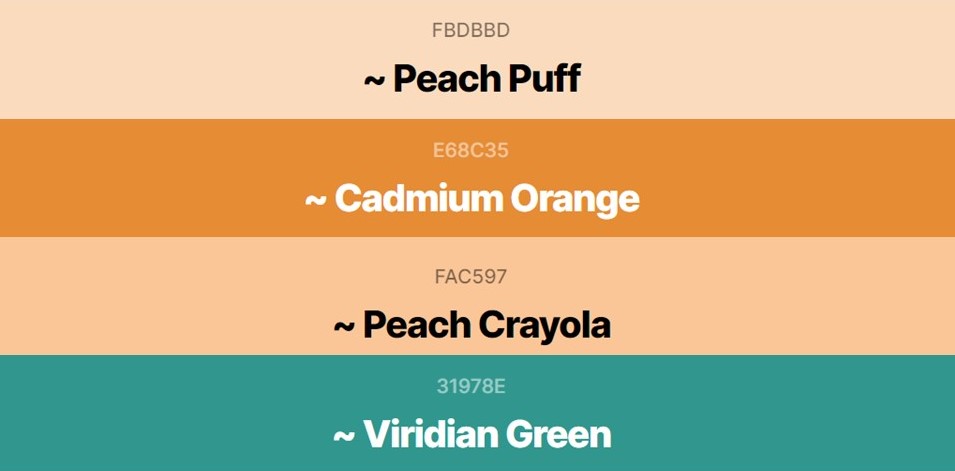
Peach Crayola is a color used in painting to imitate the hue of the living human body. That’s why the color is also named Flesh Tint. But when combined with the other three colors, it provides a sense of Celebration and Joy.
Get This Template and More
Ruby Red (#9B111E), Orange Yellow Crayola (#FBD96C), Bronze (#BD823D), Dark Olive Green (#6D7434)
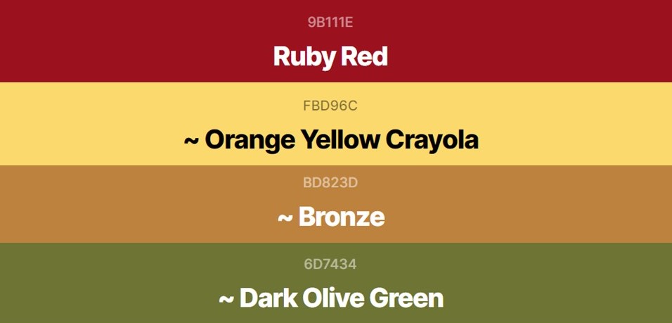
Ruby Red represents the color of the polished gemstone Ruby and is a shade of Pink or Red. The Yellow-Orange Crayola conveys excitement and happiness. Bronze as a color has a strength to indicate stability, sturdiness, and security. And the Dark Olive Green represents the traditional color of peace. Use this color combination anywhere you want according to their meanings.

Get This Template and More
How To Use These Colors In Your Design With DocHipo
Though the color combination of DocHipo’s templates is already aesthetically pleasing, you can choose your colors to customize any template you want. Let me show you how you can do that.
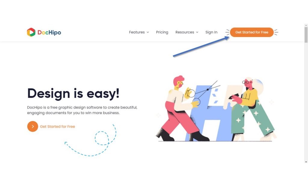
Step 1: Sign Up For DocHipo
Go to the homepage of DocHipo and click on the “Get Started For Free” to sign-up for free using your email address.
Step 2: Select Your Template
After landing inside the DocHipo application, you will find a wide variety of templates to choose from. For example, you want to design a YouTube Thumbnail for your YouTube channel. Type “YouTube Thumbnail” in the search box and click the result to access a wide array of templates.
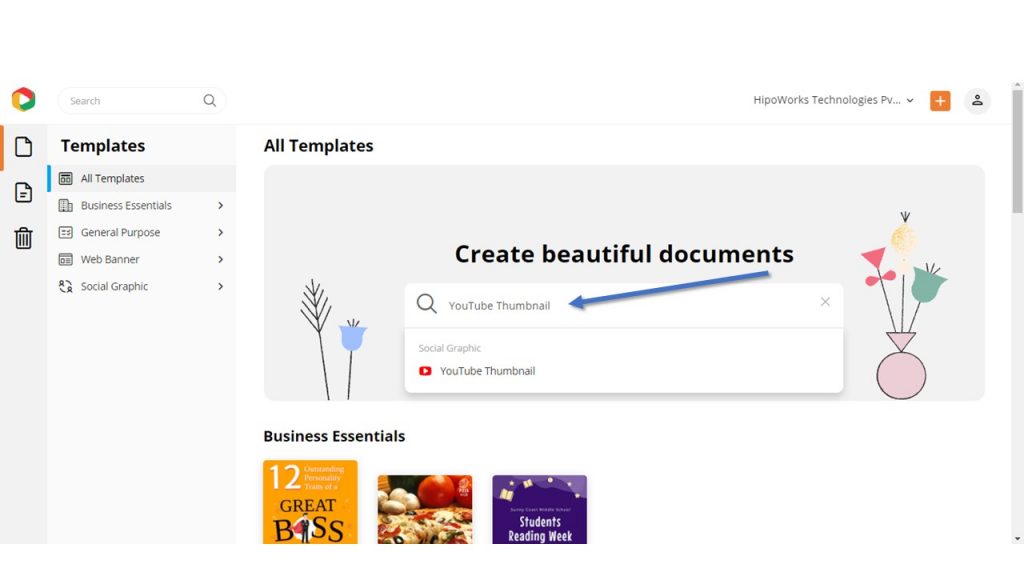
Watch the video below to find templates in DocHipo.
Select the Template of your choice by clicking on it. Additionally, you can preview the template before customizing it.

Step 3: Change The Colors
Now, click on the design elements or background, and the edit panel will open up on the top of the Template.
If you want to change the background color, then click on the background. A single box will appear on top with the background color on it. Click on the same.

Similarly, to change the color of the design elements, click on them and then click on the color icon from the panel.

Now either copy the Hex codes that we have mentioned above or manually enter any other Hex code of colors of your choice. For the background color, paste the code on the box that appears on the left pane.

Similarly, for other design elements, paste the color code in the box on the dropdown menu.
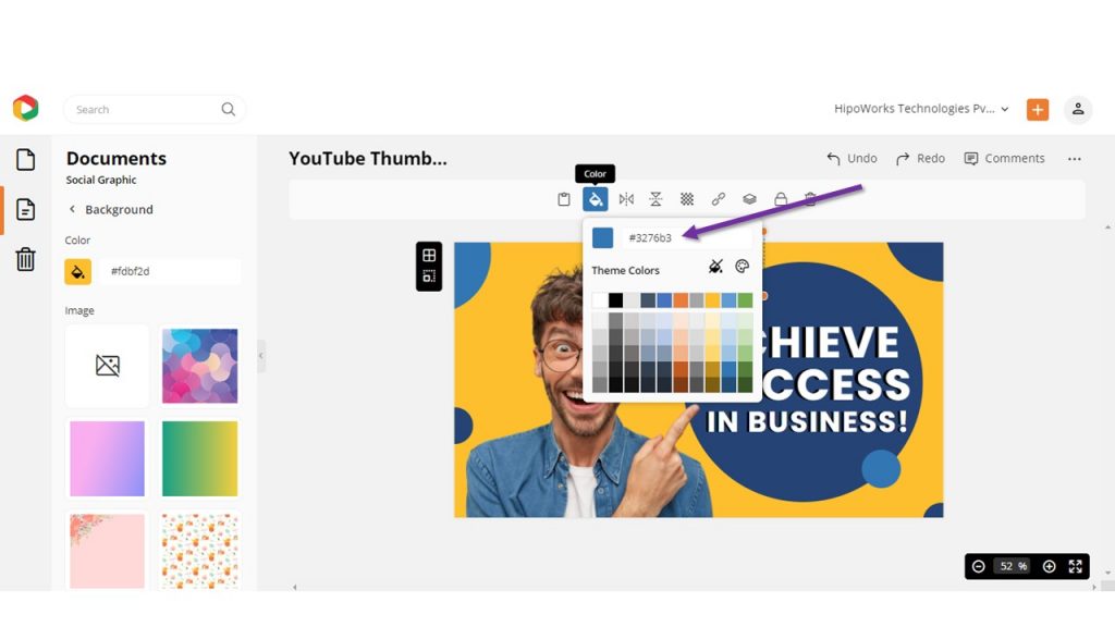
Furthermore, you can choose your custom colors. Just click on the custom color icons and move the pointer on the custom color panel.
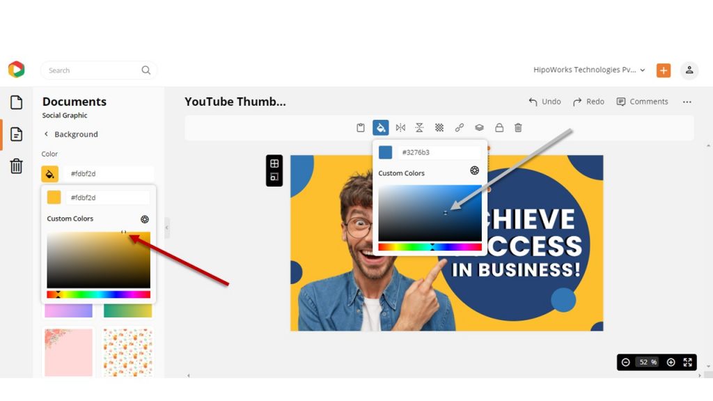
For example, I have taken a YouTube Thumbnail template to replace the color combination with Space Cadet (#2D2F4A) and Salmon Pink (#EEA47FFF).
Original Template:

After Editing:

Step 4: Download The Design
Click on the three dots from the upper right corner of your screen and then select Download from the drop-down menu.

Choose your desired file format and quality and download your design to your computer.

Last Thoughts…
We have discussed a lot about colors, from some of the best color combinations to applying them to your design. Be it sleek and simple or eclectic and edgy, choosing the right color combination will always help you create a great impression on your consumers as a business. Maybe you are trying to design a website, a business card, or a logo for your brand. Whatever you plan to design, hopefully, the color combinations that we have mentioned above will help.
Furthermore, DocHipo is there to help you. Just copy the Hex codes from this article and paste them to your template, and it will be modified immediately.
Go ahead, explore the magical world of DocHipo today by signing up for free.
FAQ
Why is choosing the right color combination important in design?
Choosing the right color combination is essential in design because it significantly impacts your brand message and effectiveness. 60%-90% of consumers’ judgments about a product and their purchasing intent are based on color. Specific colors catch people’s attention, set the right tone and mood, evoke certain emotions, and create a long-lasting impression.
How do I balance colors in my design?
You can implement the 6:3:1 Rule that suggests you use a dominant color in 60% of the design space, then a secondary color in 30% area, and fill the remaining 10% with an accent color.
What are some color tools I can use to help me with my design?
Coolors is one of the best color tools for your design. You can browse through thousands of beautiful color schemes, create, filter, save, and export them easily.

