13 Proven Tips for Creating Stunning Social Media Posts

Did you know that almost 42% of the world’s population uses social media? Another study has broken this down and shows that 90.4% of millennials, 48.2% of baby boomers, and 77.5% of generation X are active social media users. You can connect to all these groups with beautiful social media posts.
How to Create Stunning Social Media Posts
- Set Clear Goals: Define the purpose for a focused, clutter-free design.
- Size Matters: Optimize graphic size for each platform.
- High-Quality Visuals: Use appealing visuals to captivate the audience.
- Consistent Style: Maintain a cohesive image style.
- Color Scheme: Use colors to create emotional connections.
- Appropriate Fonts: Choose readable fonts reflecting brand personality.
- Typography: Choose specific fonts and ensure readability and cohesive design.
- Contrast: Use contrasting colors for visual appeal.
- Visual Hierarchy: Prioritize key messages in design elements.
- Breathing Space: Keep designs uncluttered with ample space.
- KISS Principle: Keep messaging simple and straightforward.
- Creativity: Experiment with designs and colors freely.
- Templates: Utilize pre-designed templates for efficiency.
No matter what industry you are working in or what products or services you offer, almost invariably, a large chunk of your target audience is active on social media. Therefore, social channels have become (quite understandably) one of the significant marketing mediums for any business today. And, the cherry on top, it’s super fun! There’s no better way of reaching out to your audience, engaging them in conversation, wishing them on occasion, or sometimes marketing new products or services than social media posts.
But, when it comes to social posts, does a lazy one-line text suffice? Not really. According to experts, visually appealing social media posts are more likely to get noticed and engaged with. While there’s no set formula for text-visual ratio, a 50-50 balance is something you can opt for.
In this blog post, we’ll discuss thirteen tips for creating stunning social media posts, along with loads of templates as examples.
Table of Contents
Why is Social Media Post Design Important?
Social Media Post Graphics are the visual content shared on various social media platforms. Powerful visual content conveys a message or an idea impactfully and immediately. It improves brand recognition and increases audience engagement.
You must create a solid social media presence as a brand or business. Your posts’ design will help you establish your brand image visually. Using attractive and engaging visuals will stop your audience’s scroll and intrigue them to act on it.
Tips for Creating Stunning Social Media Posts
Follow the below social media post graphic design tips and best practices.
Tip #1: Have a Clear Goal in Mind whenever You Create a Social Media Post
Having clarity of your social media post goals will give you direction for designing the graphics. This direction will help you to be mindful of your design and help you create social media post graphics, focusing on one key idea. Hence, you can keep your design clutter-free from unnecessary elements and prevent viewers from getting confused. Your social media posts can make your audience aware of your products or services, motivate them with uplifting quotes, entertain them, and so much more.
For example, you can promote your new product(s) using the following Beauty Instagram Post and Sale Instagram Story Templates.

Get This Template and More

Get This Template and More

Get This Template and More
Check out our quick demo on creating Instagram stories in minutes.
Next, you can promote any class or course by leveraging the Instagram Post and Instagram Story Templates below.

Get This Template and More

Get This Template and More
Are you conducting a workshop? Take inspiration from the following simple and heart-melting Diwali Instagram Post Template.

Get This Template and More
You can convey your thoughts and re-establish a message on specific occasions or any day you want. For example, look at the simple yet powerful message in the Pride Day Instagram Post Template.

Get This Template and More
Next, the Women’s Day Facebook Post Template celebrates every woman with such a thoughtful idea.

Get This Template and More
This way, you can maintain an active social media presence and gain your audience’s trust.
You can get your brand’s social media posts out with irresistible offers and drive sales. For example, check out our lively Christmas Instagram Post Template.

Get This Template and More
You can use our text frames to create a unique design, highlighting your sale offers.
Your goal could also be driving insane engagements on your social media posts. Using the Christmas Square Post and Instagram Story Templates, you can host giveaways and contests.

Get This Template and More

Get This Template and More
Your social media post’s purpose could be inviting your audience to participate in your events and giving them a reason to have fun. Look at the Food and New Year X/Twitter Post Templates for inspiration.

Get This Template and More

Get This Template and More
Tip #2: Size Matters for Social Media Posts
Well, when it comes to social posts, it does! Be it Facebook, Instagram, Pinterest, LinkedIn, or any other social platform; all these channels have a definite size for all posts. When you upload a picture or a graphic, in most cases, the platform automatically adjusts the size of the file and publishes it.
This can be a nightmare if, for example, your contact information (which was probably on the down right corner) gets cropped out or that epic punchline ends up with one or two missing words! Always optimize your graphic size for the relevant platform to ensure your posts appear exactly how you want.
Want a shortcut? DocHipo comes equipped with the right size for all social channels. Simply choose the one you are working with, and it’s done!
You can refer to our video on changing page sizes.
Further Reading
- Instagram Story Dimensions: A Comprehensive Guide and Ideas for 2023
- The Perfect Twitter Header Size with Examples and Best Practices
- The Ideal YouTube Thumbnail Size with Best Practices and Examples
- Social Media Post Size Guide 2023
- Most Underrated Social Media platforms that are often overlooked in Marketing Campaigns
Tip #3: Use High-Quality, Attractive Visuals Only
Always use high-quality, attractive visuals to create a difference in your audience’s feed. Use images that make people wow about your products, compel them to take action, buy and make them their own.

Get This Template and More
No food lover can resist the urge to have one immediately after looking at the Food Instagram Story and Square Post Templates below.

Get This Template and More

Get This Template and More
Capture different moods or evoke certain emotions through your social media post image.
For example, look at the super adorable Mother’s Day Facebook Post design that you’ll feel like sharing with your mother the moment you see it.

Get This Template and More
Here’s how you can create Facebook Posts in DocHipo.
Next, Valentine’s Day Instagram Story Template captures the beauty of companionship with a partner.

Get This Template and More
Similarly, our Diwali Instagram Story Template captures the joyous mood of a happy family celebrating Diwali.

Get This Template and More
The below New Year X/Twitter Post evokes mood and excitement for a party.

Get This Template and More
Here’s how to upload images in DocHipo.
Alternatively, you can use stock images in your design. You can use DocHipo filters to make your pictures even more attractive.
Tip #4: Be Consistent with Your Image Style
If you’re starting out, you can experiment with your image style. Then, research through polls, surveys, etc., to know what your audience wants to see. Also, check your analytics to take note of what worked best for you, what did your audience vibe with the most, and eventually stick to that image style. Optimizing your overall creative assets will improve your brand aesthetics.

Get This Template and More

Get This Template and More

Get This Template and More
Tip #5: Use an Appropriate Color Scheme and Background
Colors have a universal appeal. No matter how diverse your target group is, you can create a connection across cultures, communities, and geographical boundaries with colors. While you can use occasion-specific colors (for example, red for Christmas, green for Easter, etc.), you can use your brand color too to create an identity and connect.
In DocHipo’s Facebook Post Template, see how green instantly connects with nature.

Get This Template and More
The color scheme in the Sale Instagram Story is perfect for the chilly winter season.

Get This Template and More
The color choice makes social media post design so fresh and lively.

Get This Template and More
The Halloween Facebook Post’s background color is perfect for making it look spooky.

Get This Template and More
Here’s a quick tutorial on how to use different colors, backgrounds, and patterns in DocHipo.
Further Reading
Tip #6: Pick Appropriate Fonts
Just like colors, fonts also reflect a personality. So, always ensure your social media post design reflects its appropriate theme. While choosing the right font or font pairings, prioritize readability so that your viewers get your message without making any extra effort. The third thing you should consider is your brand personality. Make sure that the fonts you choose align with your brand’s vibe. You can use different font styles and sizes to emphasize certain design aspects.
The Christmas Instagram Story Template chose the font we’re used to associating with Christmas.

Get This Template and More
The font choices in the Halloween Facebook Post Template perfectly reflect a scary Halloween night vibe.

Get This Template and More
Tip #7: Pay Attention to Typography
Choosing the right fonts that work cohesively can bring your social media post designs to life. You can use three typefaces at maximum in your design. Keep the font sizes that fit well within the social media platform you’ll post the design.
You can take inspiration from the following social media post templates and practice the art of typography.

Get This Template and More

Get This Template and More

Get This Template and More

Get This Template and More
Tip #8: Implement Contrast
High-contrast images work like magic. It helps the image strike a balance, makes the text easier and effortless to read, and makes the overall design attractive. Using colors is one of the easiest ways to apply contrast in your social media post designs.
For example, in the New Year X/Twitter Post Template, the contrasting golden color looks gorgeous on the black background. Isn’t it?

Get This Template and More
Similarly, we used a white font in contrast to the dark green background making the message readable, prominent, and visually appealing.

Get This Template and More
Tip #9: Create a Visual Hierarchy
Each design element used in your design is crucial to convey your overall message. You can get your most important message across with a visual hierarchy. It starts with having clarity on your goals. Keep your key message or element as the focal point. After that, place the second or third pieces of information in the order of their importance.
This New Year X/Twitter Post draws the audience to the message “SALE” first and then to the secondary messages such as “NEW YEAR”, discount percentage, and so on.

Get This Template and More
Wedding Pinterest Template creates a visual hierarchy by working on the text formatting, such as making it bold or changing its font size.

Get This Template and More
Now observe the visual hierarchy in the Food Square Post Template below.

Get This Template and More
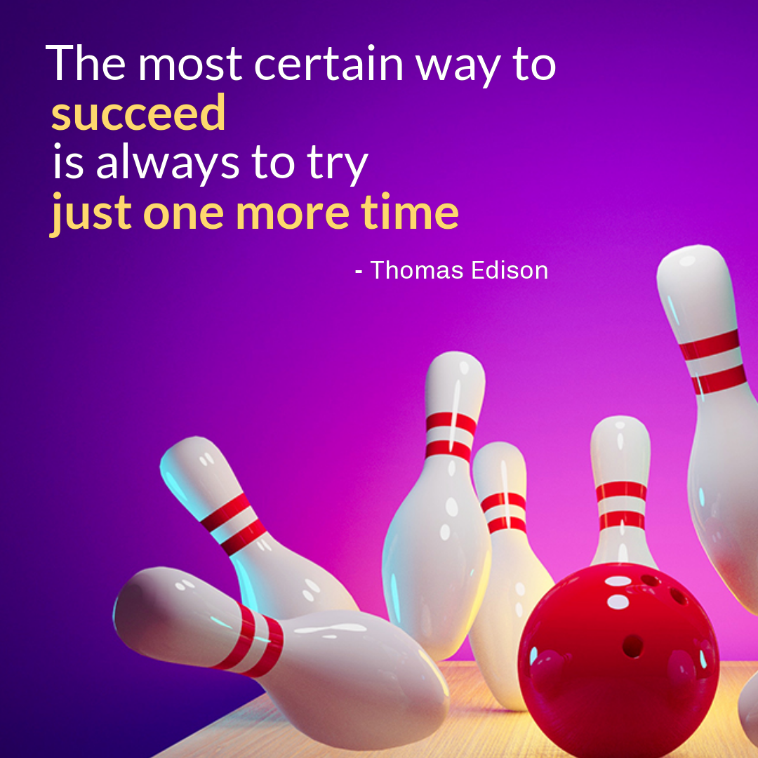
This applies to simple motivational social media quote posts where the focus point is the quote itself, followed by the author’s name or any other secondary message.

Get This Template and More
Check out Typography Hierarchy to learn more about it.
Tip #10: Keep Space for the Design to Breathe
Don’t be carried away with using irrelevant or unnecessary elements in your design.
“Designers and marketers know they have ‘achieved perfection not when there is nothing left to add, but when there is nothing left to take away.”
– Antoine de Saint-Exupery
Giving ample amount of space to each design element holds an aesthetic value. It makes your design look clean, uncluttered, and professional.
Tip #11: Embrace the KISS Principle
KISS is an acronym for “Keep it simple, stupid.” Regarding social media posts, keeping your message as simple as possible is the key. While human beings have an average attention span of fewer than 8 seconds, on social media, it is even more flitting. So, the simpler, the more straightforward your messaging is, the better the chance that your audience will grasp it.
Here’re some DocHipo templates that will show you how to use one idea at a time and create a captivating design around it.
For example, look at the simplicity and elegance in Beauty Instagram Post and Wedding Pinterest Graphic Templates below.

Get This Template and More

Get This Template and More
Tip #12: Be Creative with Your Social Media Posts
This one is the most important one! Social media is the playground of creativity. So, don’t be afraid to experiment. Play around with versatile designs, vibrant colors, and quirky themes. And with DocHipo in place, you don’t even need a designer. Shuffle different colors, queer designs, and elements to churn up great social media posts.
Check out these awesome (and a little unusual) social media templates from DocHipo!

Get This Template and More

Get This Template and More
Tip #13: Leverage Social Media Post Templates
Templates are life savers, especially if you’re a busy entrepreneur juggling multiple tasks. Even if you’re a content creator, coming up with stunning social media post graphics is tiresome.
Pre-designed templates come in handy as you need to choose the one that closely matches your needs and tweak it a little as your heart desires. That’s it!
DocHipo provides you with eye-catching social media templates for Facebook, Instagram, X/Twitter, Pinterest, Tumblr, YouTube, LinkedIn, etc.
Each category covers various industries, occasions, and use cases.
Explore all our social media post templates, and I’m sure you won’t be able to wait to use them in your design.
Check out The Ultimate Guide to Using the DocHipo Editor to Design Your Documents.
Final Words on Social Media Post Designs
Social media marketing is fun. Creating and sharing beautiful posts, engaging with your audience, and leading them by example is undoubtedly rewarding. And with DocHipo in place, you can create stunning social graphics in 10 mins tops. Sign up today to take your social media engagement to the next level! DocHipo is absolutely free to get started.


